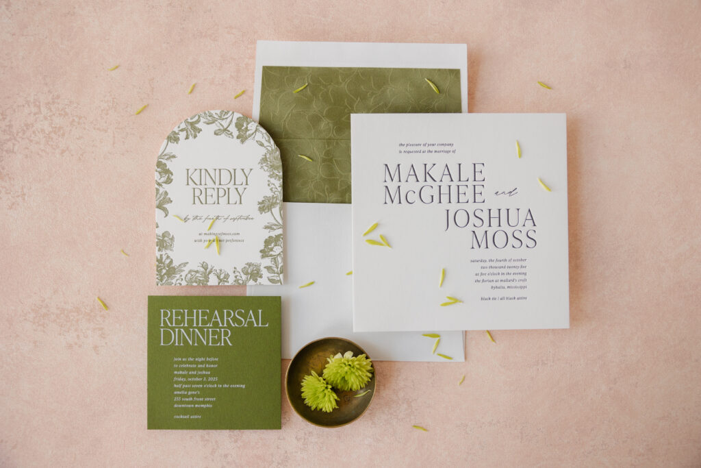
An earthy color palette, minimalist composition, and romantic touches have us swooning over these modern square letterpress wedding invitations. While the invitation has a minimalist vibe, all of the supporting elements add intrigue. We worked with our dear friend Lindsey of Mrs. Post Fine Stationery & Gifts to create this lovely wedding stationery suite.
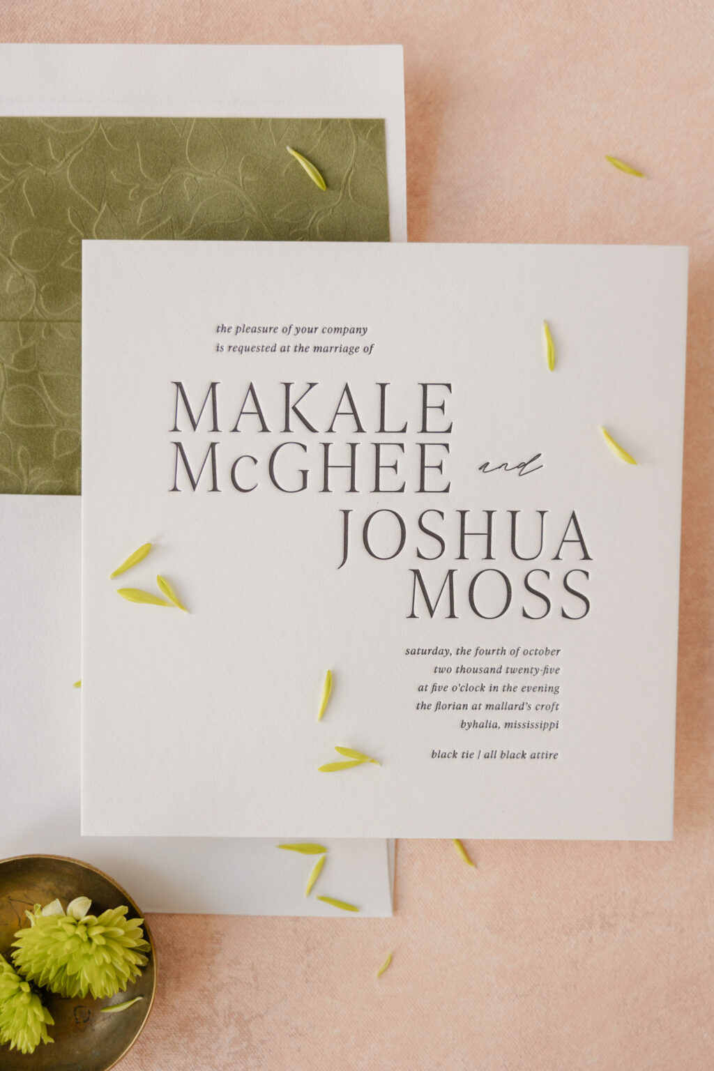
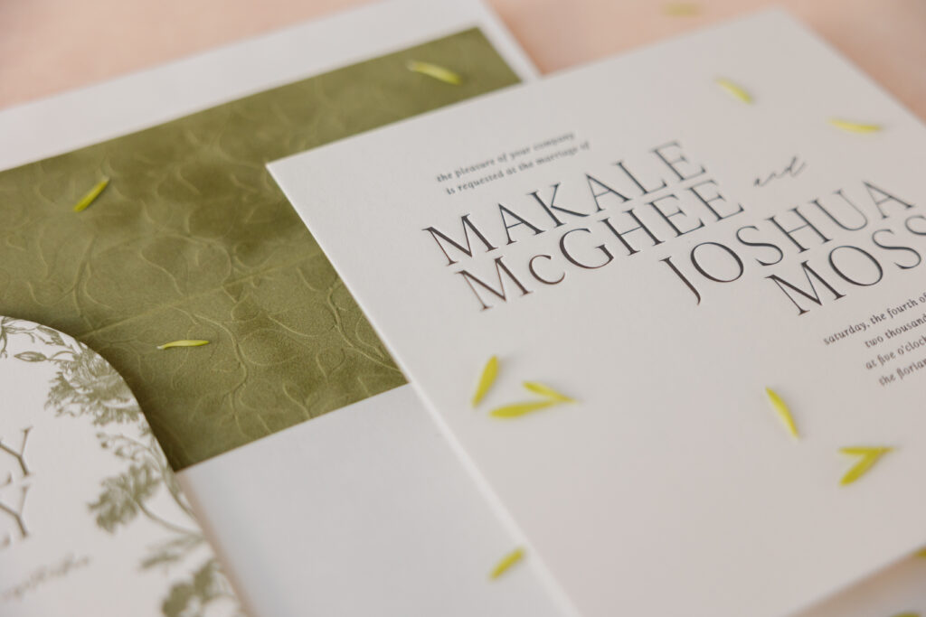
Makale and Joshua chose to customize our Derian design. The invitation is sophisticated and modern thanks to the square card and mostly serif fonts. The way the text flows is subtle, yet it gives the design a refined edge. Plenty of white space definitely proves that less is more.
envelope addressing: black digital on the front and the back
job #: 77891
Tag
digital ink: white
fonts: ivy presto + modern symphony script
paper: bella moss 1-ply
card size: 2” x 2”
die-cut shape: bp-91
job #: 77891
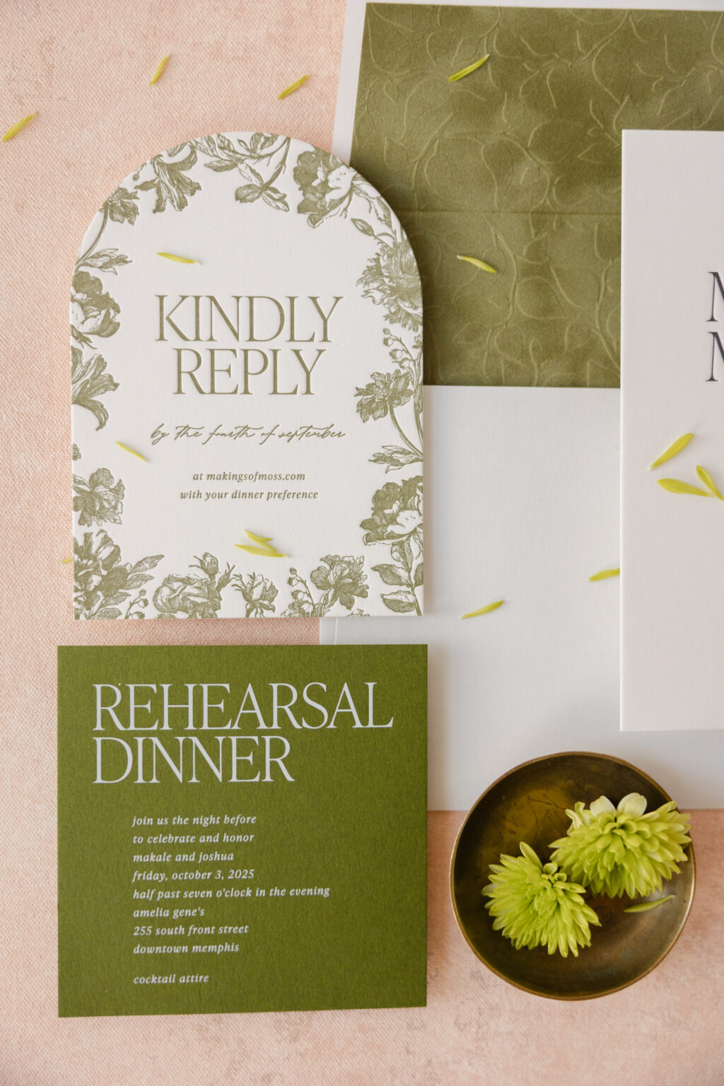
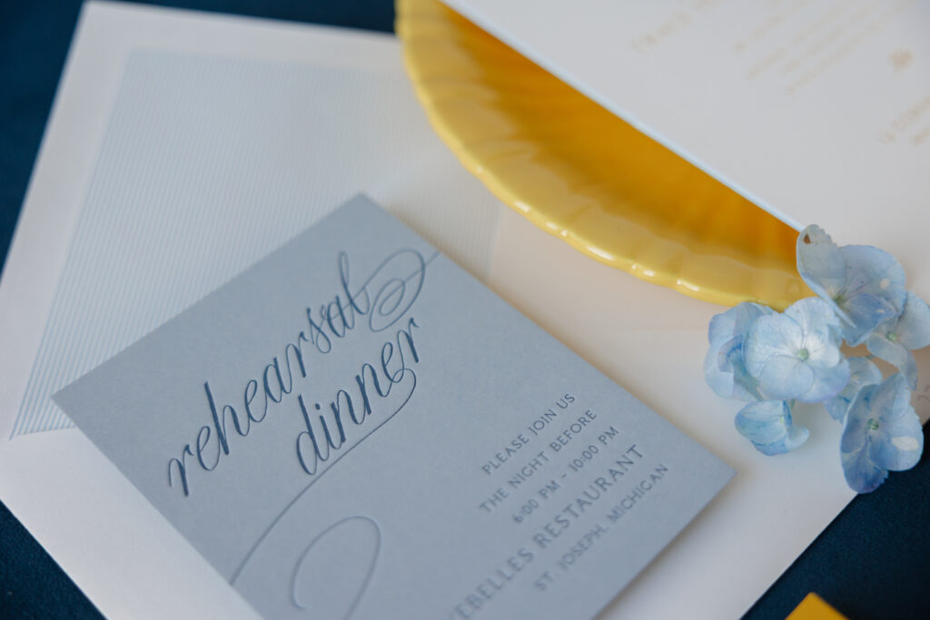
All of the pieces maintain the same fonts and typography for consistency, but they take the design in a more romantic direction. The reply card was inspired in part by our Harkness rehearsal dinner invitation. A loose botanical border frames the text, while an arch die-cut shape keeps the look refined and modern. The rehearsal dinner invitation features white digital printing on our moss stock for a look that is trendy yet formal.
Reply Card
letterpress ink: hunter
fonts: ivy presto + modern symphony script
paper: bella smooth cotton 2-ply white
card size: 4” x 5.5”
die-cut shape: cd-395
job #: 77891
Rehearsal Dinner Invitation
digital ink: white
fonts: ivy presto + modern symphony script
paper: bella moss 1-ply
card size: 4.19” x 4.19”
job #: 77891
The envelope liner is all about texture and features a blind-embossed floral pattern on our Bella velvet in sage. The soft velvet is tactile all on its own, while the raised printing adds even more dimension. The pattern itself is relatively simple, keeping it aligned with the minimalist aesthetic.
These modern square letterpress wedding invitations strike a nice balance between contemporary minimalism and romantic vintage garden style, making them especially fitting for an intimate, design-forward wedding. Are you taken with the look of an embossed velvet envelope liner, or do you love a sleek, streamlined aesthetic? Work with one of our dealers to create your perfect wedding stationery.
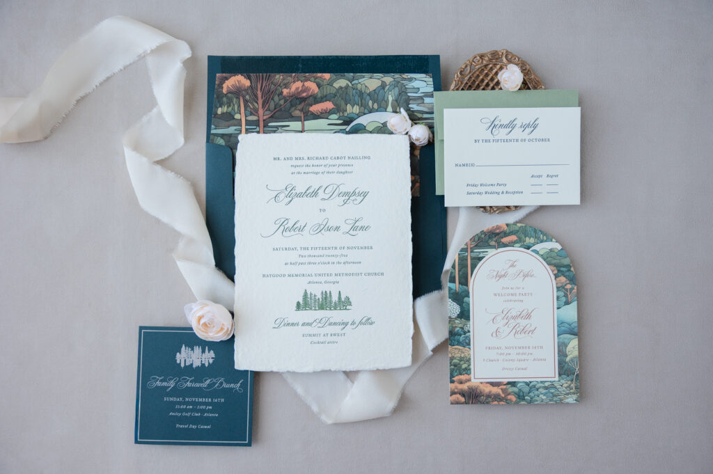
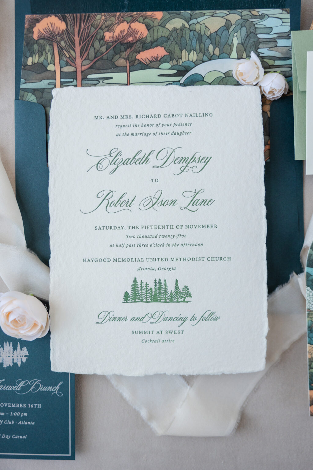
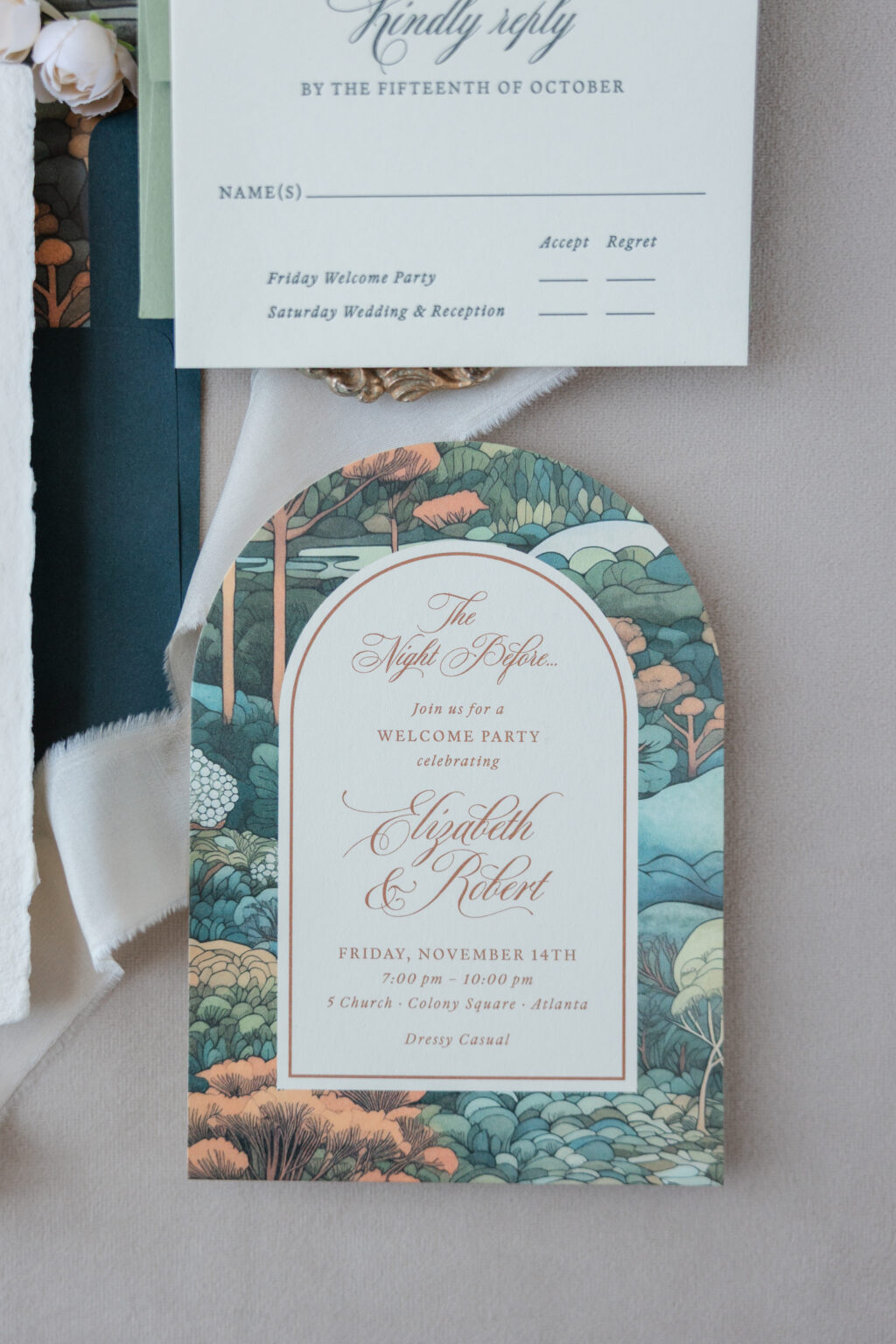
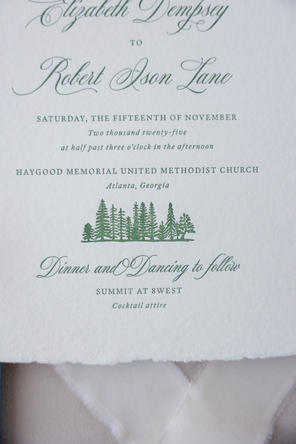
Inspired by our Kinsley design, Elizabeth and Robert elevated their wedding stationery with an elegant script font, woodland artwork, and lovely Art Nouveau influences. The couple worked with our dear friend Jenny of Jenny’s Paper, Ink to create their romantic letterpress wedding invitations.
Invitation
letterpress ink: vine
fonts: mozart + guyot press
paper: bella handmade ivory
card size: f-8 deckle edge
envelope liner: custom pattern in cmyk digital on ivory text
envelope: evergreen text
envelope addressing: ivory digital on the front and the back
job #: 77974
Reply Card
letterpress ink: holly
fonts: mozart + guyot press
paper: bella smooth cotton 1-ply ivory
card size: a-5
envelope: spruce text
envelope addressing: holly digital on the front and the back
job #: 77974
The sweeping script font and illustrated landscape motifs have a distinctly Art Nouveau feel. Even the delicate deckle edge of the handmade paper fits the organic vibe, introducing an almost unruly natural element. The script font’s gentle flourishes add softness and elegance against the more structured serif typography. Muted jewel tones paired with our warm ivory stock give the suite a sophisticated, slightly autumnal palette.
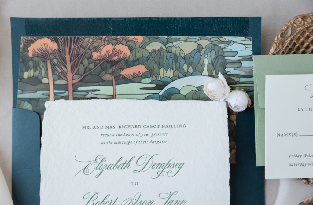
Layered trees, rolling hills, and stylized foliage create a storybook-inspired landscape that makes the envelope liner worth a closer look. The landscape artwork also appears as a major feature of the welcome party card. Coupled with the arch die-cut shape, this card is absolutely lovely.
Welcome Party Card
digital inks: cmyk + nutmeg
fonts: mozart + guyot press
paper: bella smooth cotton 1-ply ivory
card size: a-6
die-cut shape: cd-179
job #: 77974
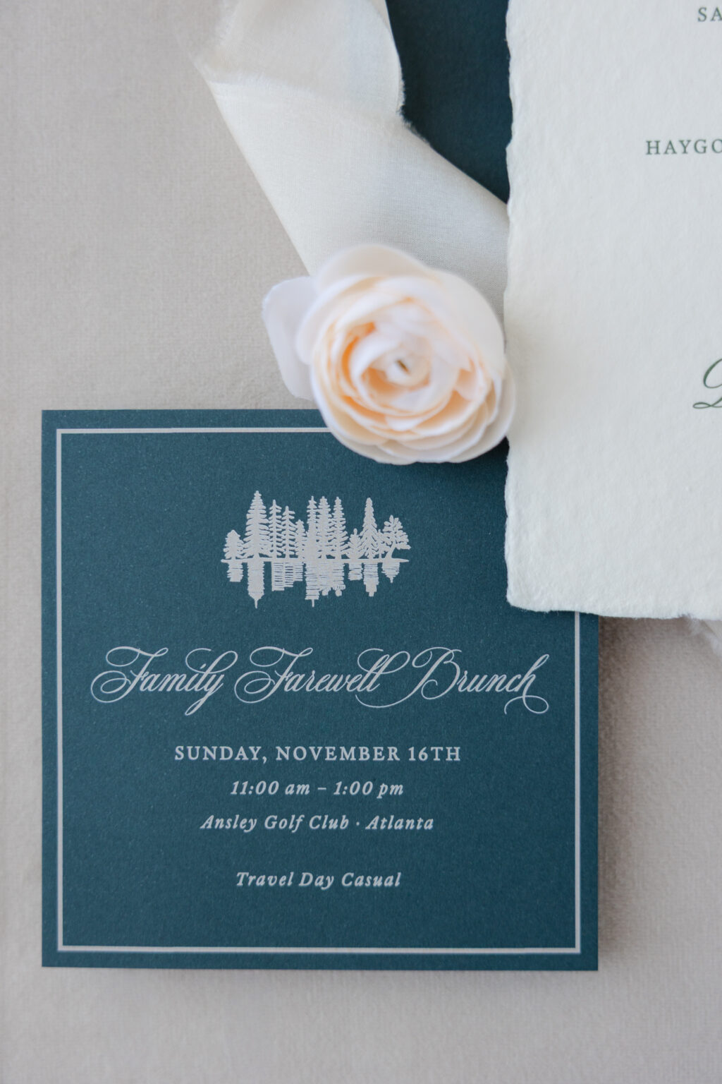
Brunch Card
digital ink: ivory
fonts: mozart + guyot press
paper: bella evergreen 1-ply
card size: 4” x 4”
job #: 77974
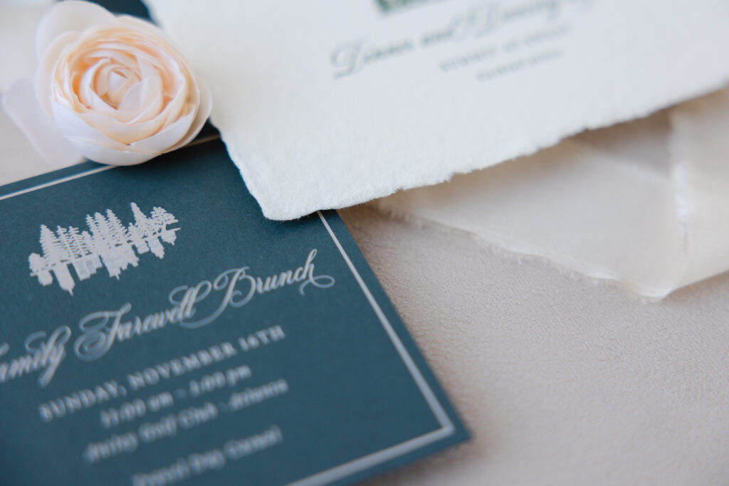
Another charming detail is how the tree artwork of the invitation is reimagined for the brunch card to show the trees’ reflection in water. The artwork creates consistency across the pieces, while the slight variation keeps both fresh and original and still incorporates a natural, organic element into the design.
Do you love the look of handmade paper, sweeping script fonts, and classic design details? Whether you daydream about Art Nouveau letterpress wedding invitations or a different style altogether, work with one of our dealers to bring your vision to life.
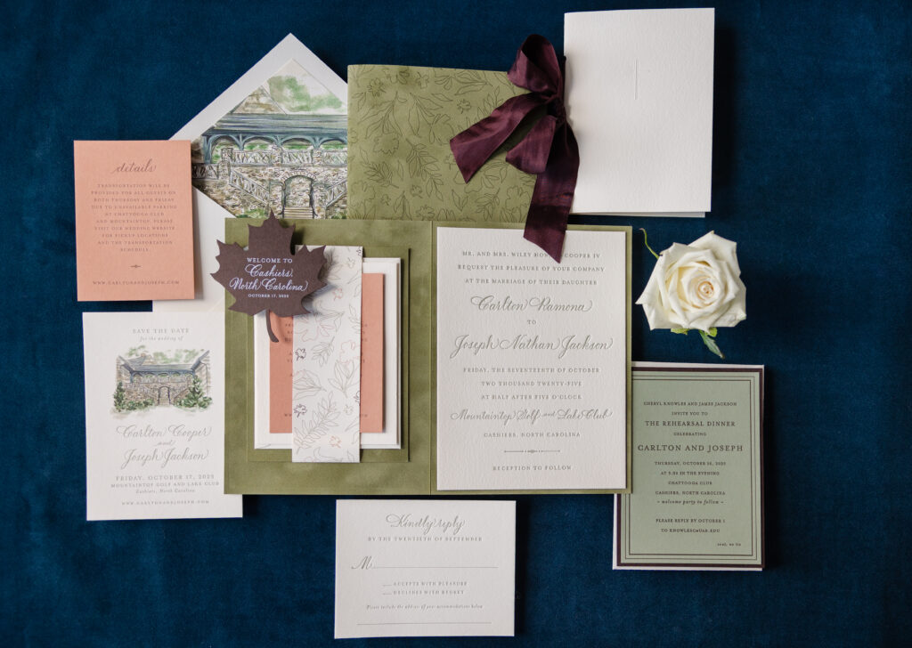
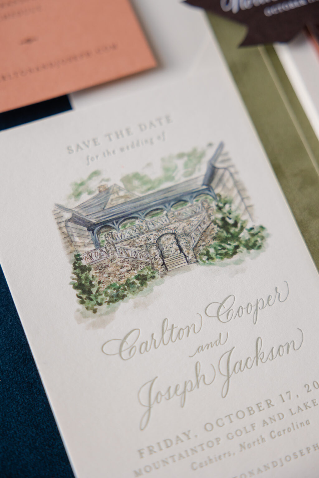
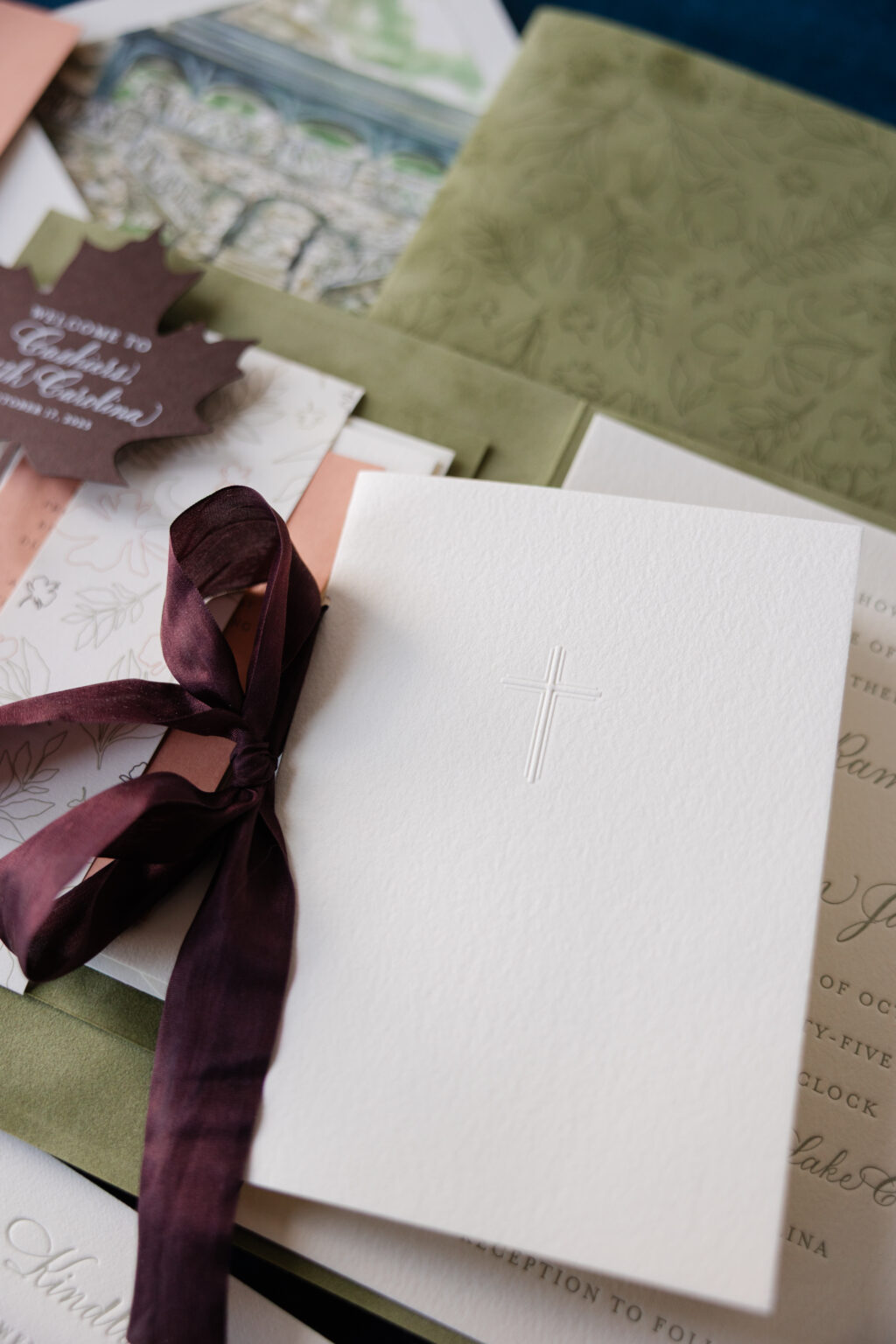
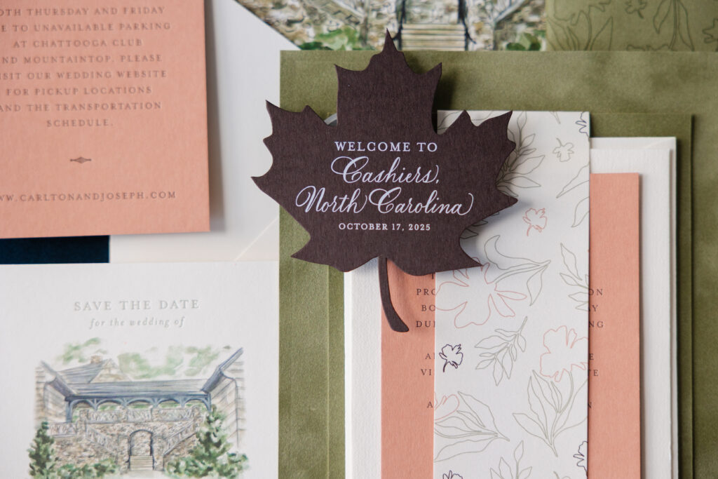
From the save the date to the day-of pieces, we were so happy to be part of creating Carlton and Joseph’s wedding stationery. The couple worked with our dear friend Mary of Mariee Ami on this romantic fall wedding invitation suite complete with so many charming details. Seriously, there is so much color and texture, and the muted, earthy palette is sophisticated and on point for this autumn wedding.
Save the Date
letterpress ink: spruce
digital ink: cmyk
fonts: supplied
paper: bella smooth cotton 1-ply ivory
card size: a-6
envelope: supplied
envelope addressing: ivory digital on the front and the back
job #: 76841
If you love venue artwork, then you have to take a look at their save the date. A stunning watercolor-inspired illustration of the venue sets the tone. Letterpress printing in our spruce ink perfectly complements the digital printing on the venue artwork.
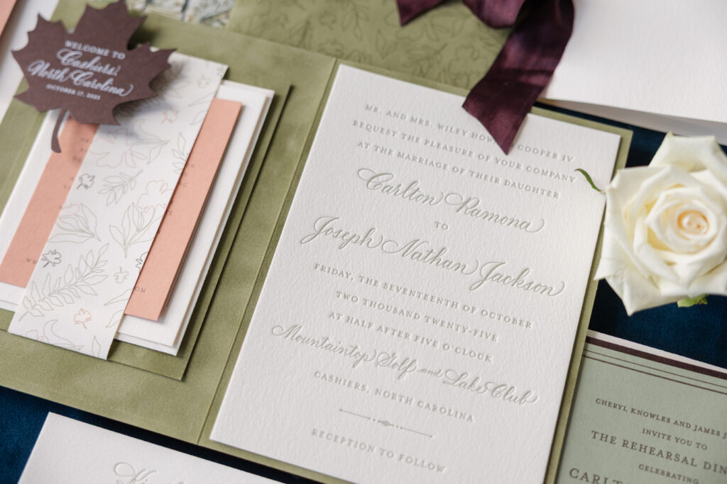
finishing: duplex mounting card layers together with belly band and mount to inside left of folder
job #: 78011
Belly Band
digital ink: cmyk
paper: bella text ivory
size:8.5” x 2”
finishing: assemble with mounting card
job #: 78011
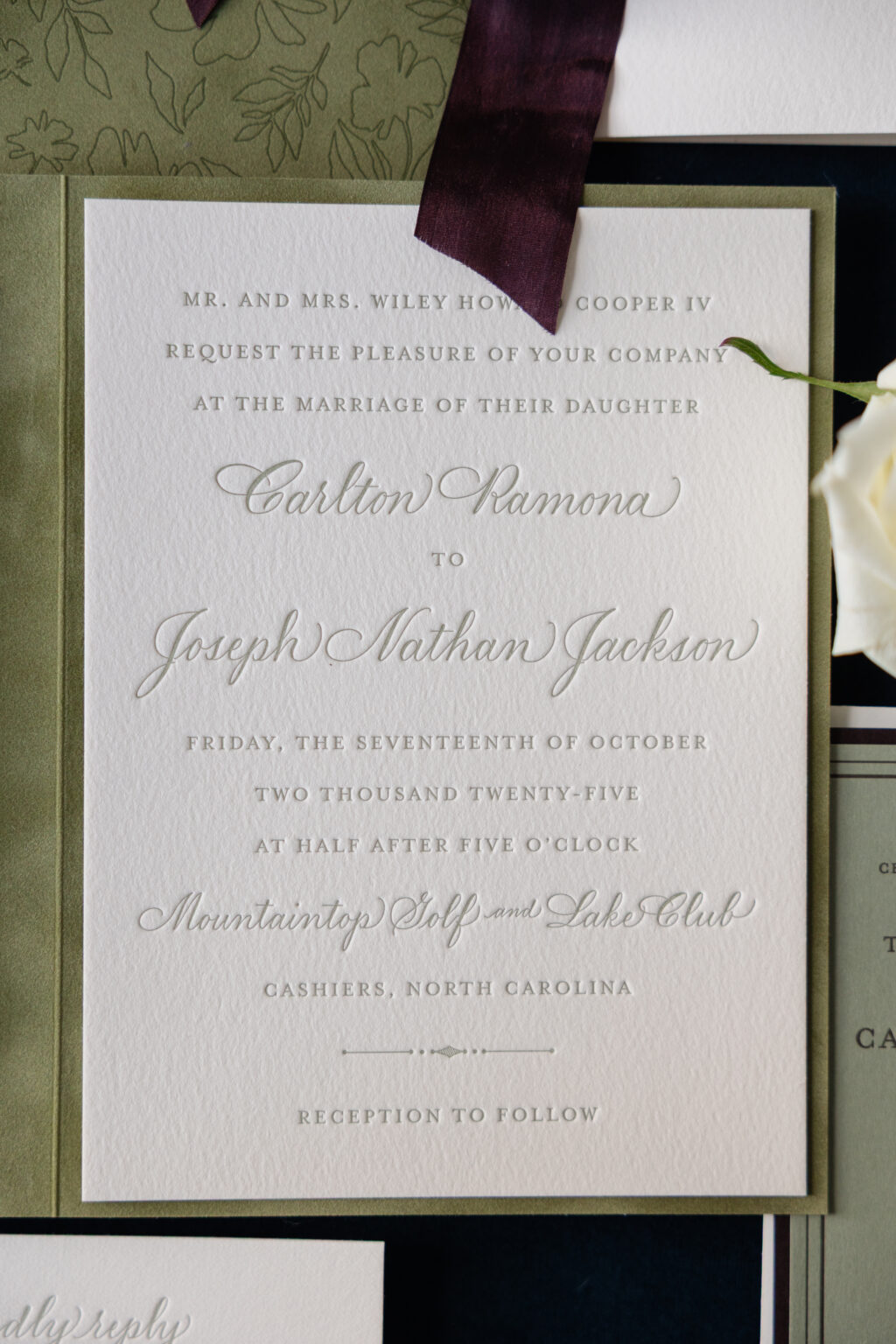
The invitation is traditional and polished. Refined serif lettering is paired with elegant, flowing calligraphy for the couple’s names, creating a formal look. The invitation is secured inside a custom folder, inspired by our Royce design. The opposite side features a belly band to secure the details and reply cards. Decadent velvet gives the folder a tactile element. Charming botanical artwork adorns the exterior, adding softness and a whimsical feel while tonal printing is subtle, but impactful.
card size: 4.31” x 5.94” (front) / 4.56” x 6.19” (back)
envelope: spruce text pointed flap
envelope addressing: espresso digital on the front and the back
job #: 78421
Details Card
letterpress ink: espresso
fonts: supplied
paper: supplied
card size: a-5
job #: 78011
Reply Card
letterpress ink: spruce
fonts: supplied
paper: bella cotton 1-ply ivory
card size: a-2
job #: 78011
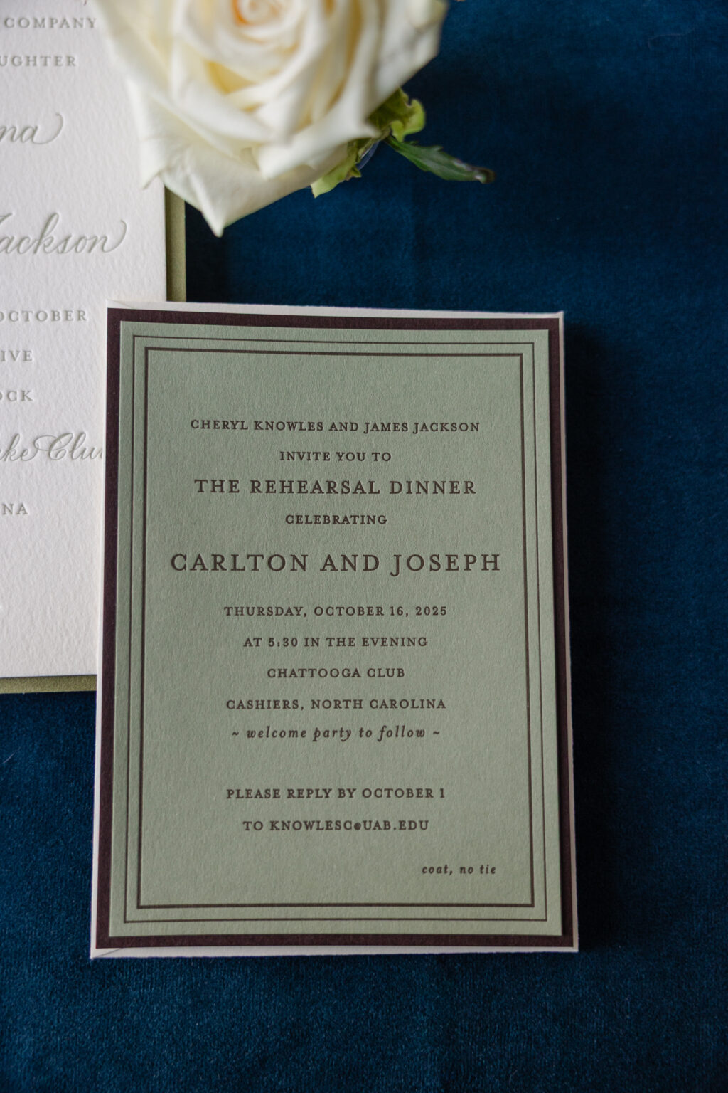
The rehearsal dinner invitation is equally lovely. This card features our Bella spruce stock for the front and our walnut stock for the back. The back card is slightly larger, so when the cards are duplexed together, the walnut paper perfectly frames the spruce stock, adding texture and dimension.
Program Cover
emboss: blind
paper: bella cotton 1-ply ivory
size: a-6 folded
ribbon: supplied
finishing: hole drill (3/16”) / assemble with program insert pages and ribbon
job #: 79116
Program Page
digital inks: spruce (front) / spruce (back)
paper: bella ivory text
size: a-6 folded
finishing: hole drill (3/16”) / assemble with program cover and supplied ribbon
job #: 79116
Tag
digital ink: white
paper: bella walnut 1-ply
card size:3.5” x 4”
die-cut shape: cd-398
job #: 79116
Would you love to feature a folder in your wedding stationery design? Or do you like the look of a larger backer card for an invitation? Whatever you dream up for your romantic fall wedding invitation, we can help make it happen. Work with one of our dealers to get started.
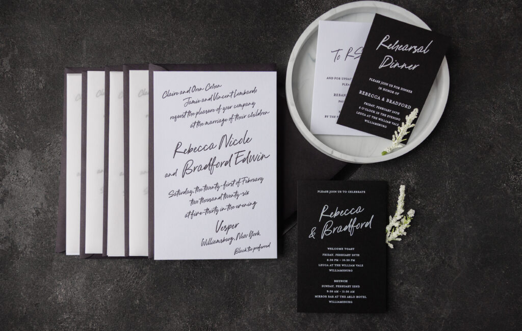
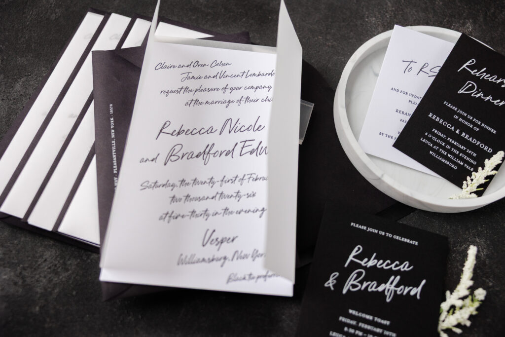
Dramatic contrast and soft, romantic details give Rebecca and Bradford’s modern minimalist invitations a sophisticated, brooding, atmospheric look that is both intimate and black-tie ready. This couple worked with our dear friend Susan of Ethan Niles to create their perfect wedding invitations.
Invitation
letterpress ink: black
font: pink champagne + mrs eaves
paper: bella smooth cotton 2-ply bright white
card size: 5.44” x 8.315”
envelope: ebony euro flap (customer supplied)
envelope addressing: white digital on the front and back
job #: 79043
Gatefold
paper: glassine
size: 5.44” x 8.315”
job #: 79043
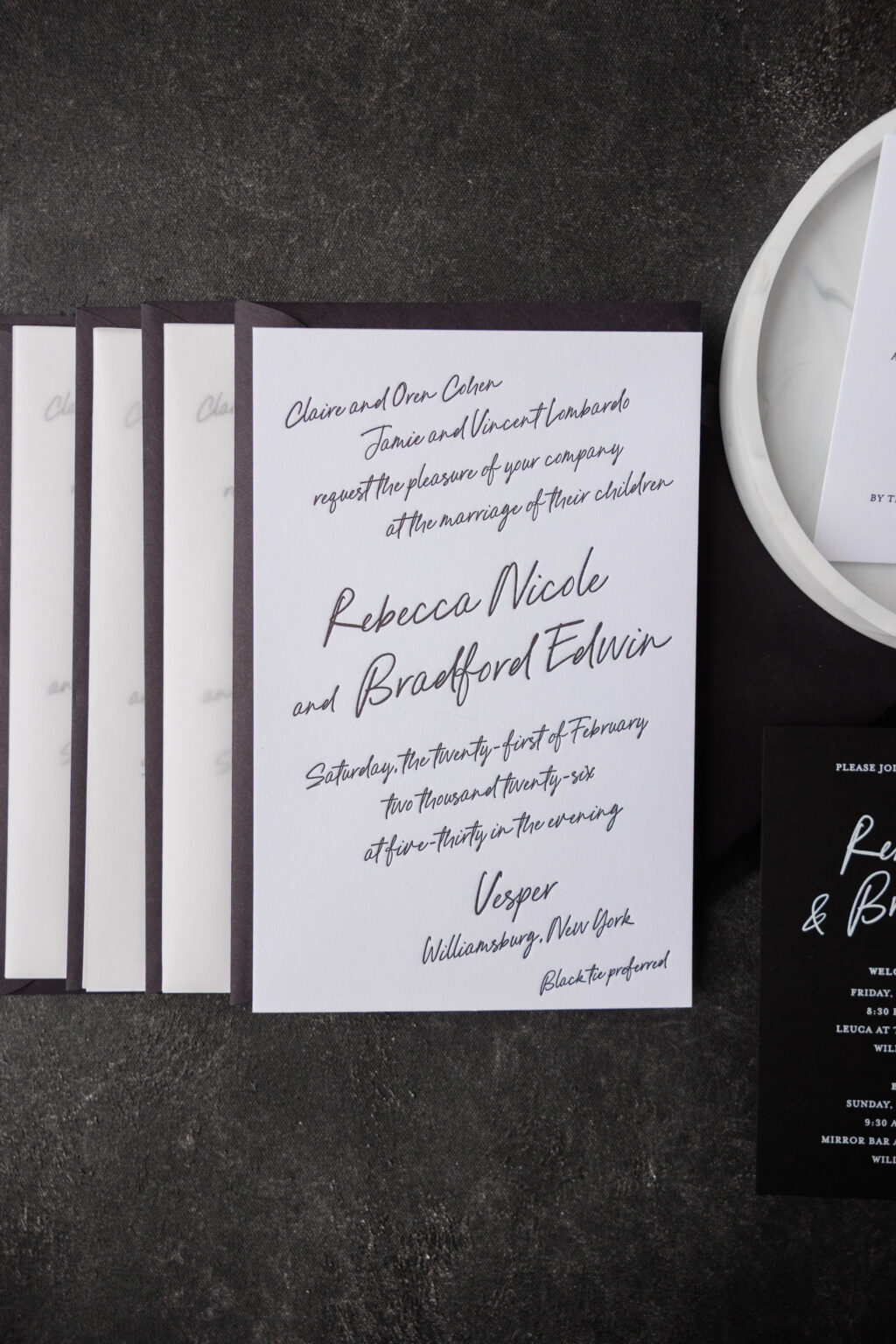
We love the look of black letterpress printing on our bright white paper. It’s high-contrast, classic, and simply striking. The loose script font has an intimate, handwritten feel, which is further emphasized by the way each line of text slightly slants up. The look is romantic and full of personality, yet it’s also spot on for this black-tie-preferred wedding held at the elegant VESPER. Glassine is used as a gatefold, adding luxury and drama to the reveal when guests open their invitation.
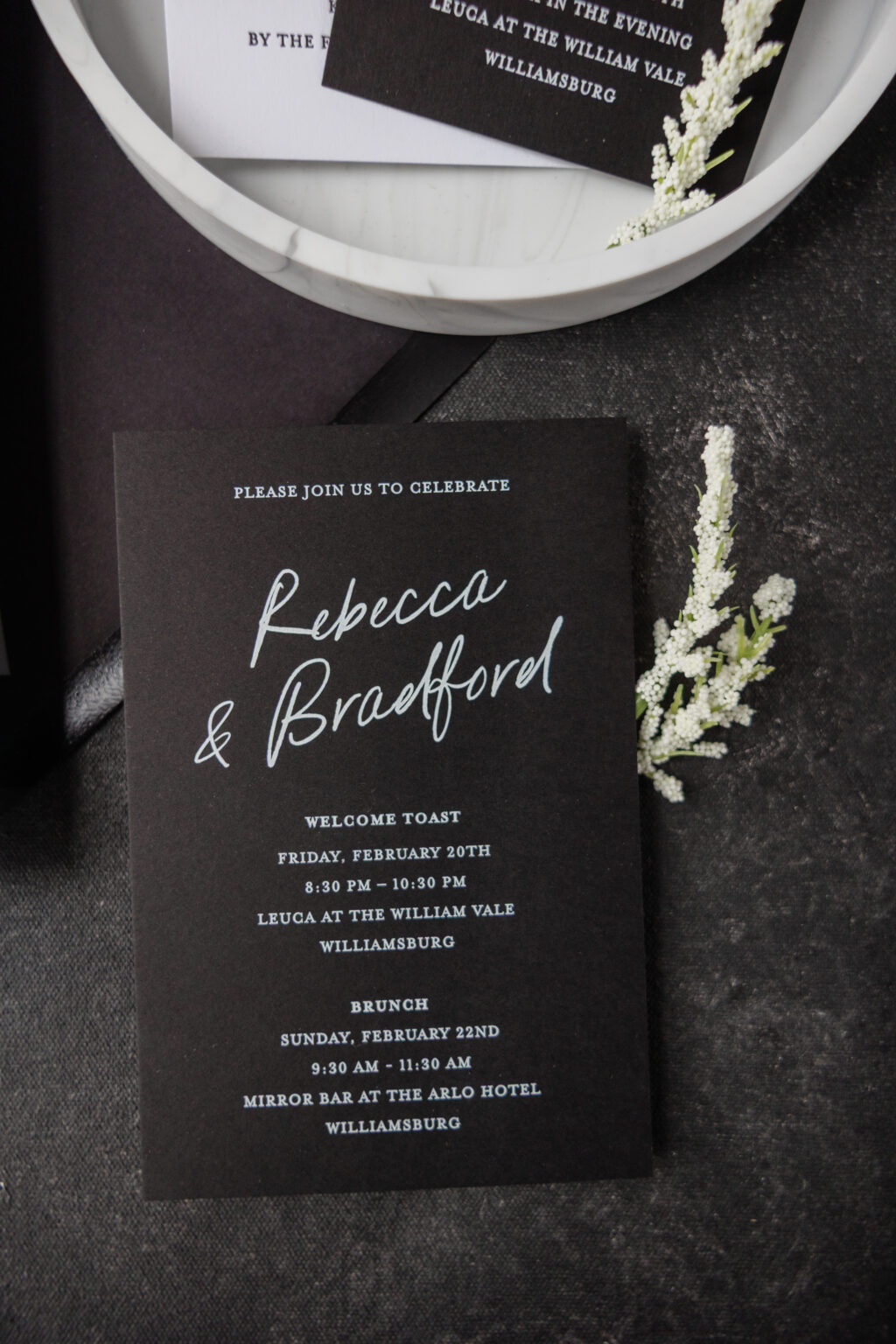
Welcome Party Card
digital ink: white
font: pink champagne + mrs eaves
paper: bella ultra black 1-ply
card size: 4” x 6”
job #: 79043
Details Card
letterpress ink: black
font: pink champagne + mrs eaves
paper: bella smooth cotton 1-ply bright white
card size: a-5
job #: 79043
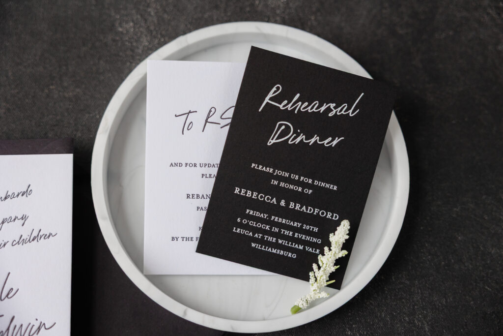
Rehearsal Dinner Invitation
digital ink: white
font: pink champagne + mrs eaves
paper: bella ultra black 1-ply
card size: a-5
job #: 79043
The details card closely follows the invitation design by featuring black letterpress printing on our Bella smooth cotton bright white stock. The rehearsal dinner invitation and welcome party card flip the script, featuring white digital printing on our ultra black stock. This choice feels edgy and modern, while remaining cohesive with the entire suite. The use of a serif font in addition to the script font for these supporting cards provides contrast with the invitation and further accentuates the drama of the invitation.
Do you daydream about script fonts and black-tie wedding stationery? Do you want modern minimalist invitations that exude a luxury yet moody vibe? Work with one of our dealers to create your perfect wedding invitations.
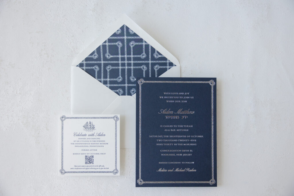
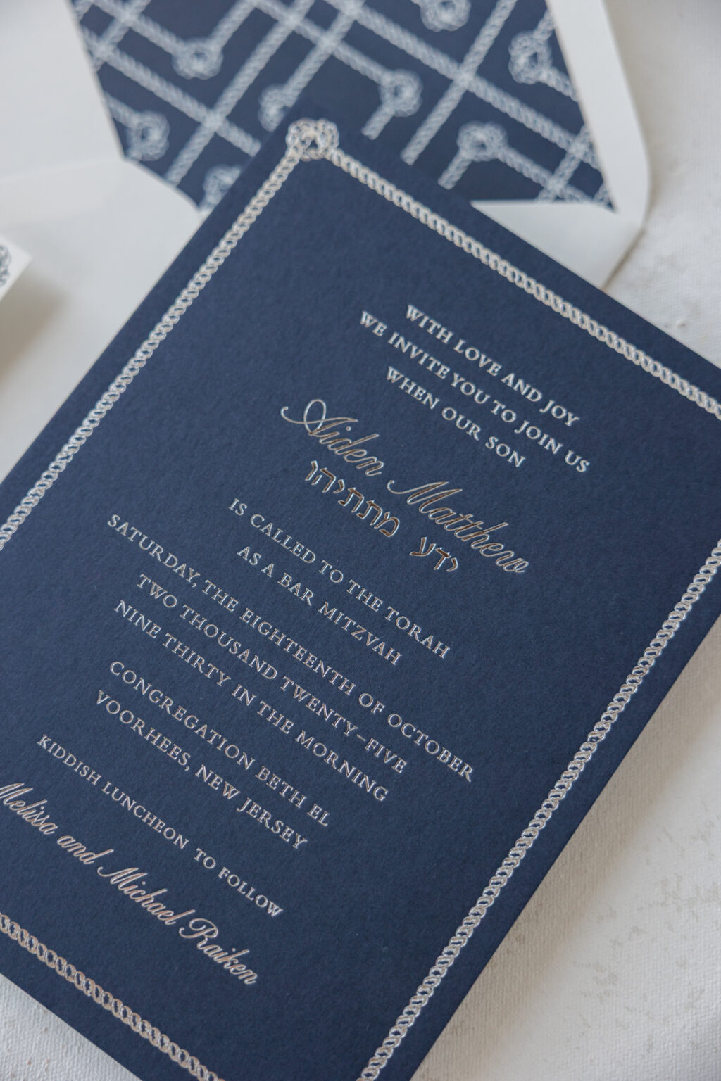
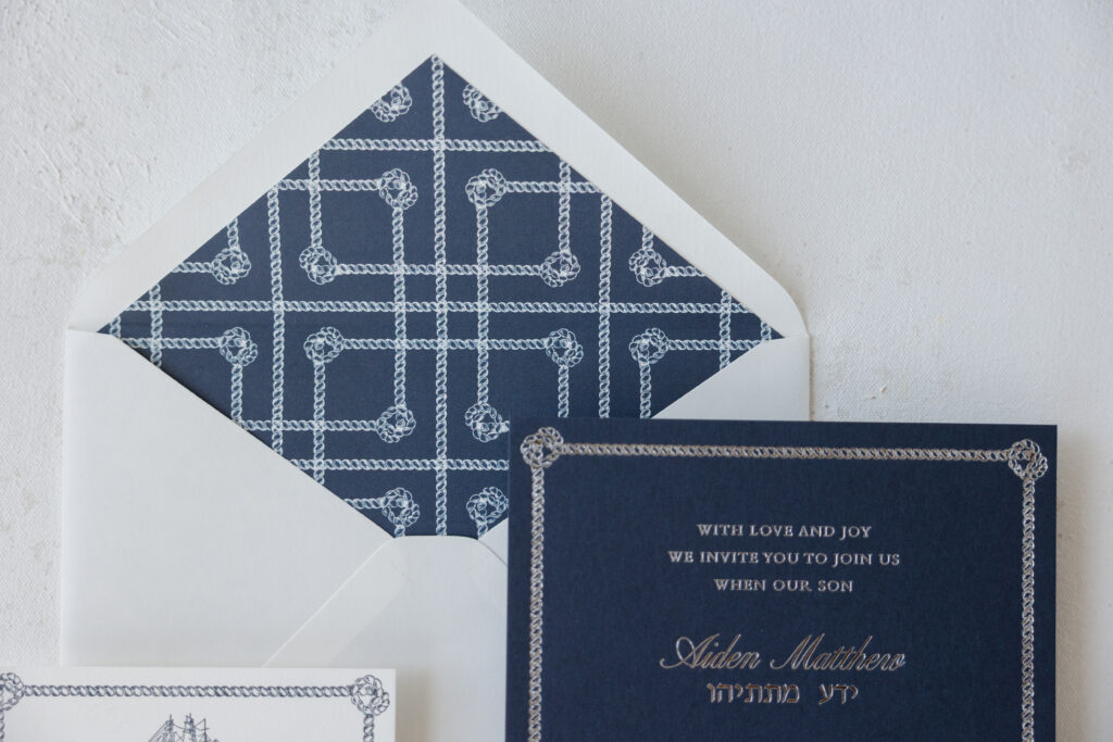
Aiden’s nautical Bar Mitzvah invitation is formal and traditional while still having personality and style. The look is preppy and nautical-inspired, with a sophisticated sensibility. This custom design came to us from our dear friend Colleen of Pen and Paper, and we’re thrilled to share it with you.
Invitation
foil stamping: silver shine
fonts: altesse std regular + רעננה + bembo
paper: bella dark blue 2-ply
card size: f-8
envelope liner: starboard pattern in denim digital on white text
envelope: white cotton text pointed flap
envelope addressing: denim digital on the back
job #: 78015
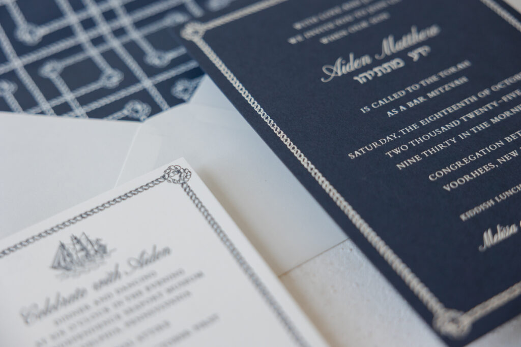
Details Card
letterpress ink: denim
fonts: altesse std regular + bembo
paper: bella smooth cotton 1-ply white
card size: sq-5
job #: 78015
Formal serif lettering is paired with graceful script for the names, creating a traditional, polished feel. Silver shine foil adds a subtle shimmer to elevate the look while maintaining a timeless elegance. The foil stands out against our dark blue paper and reinforces the nautical vibe. Selecting the 2-ply stock gives the card heft and presence while also allowing for a prominent foil-stamping impression.
This nautical Bar Mitzvah invitation borrows the rope envelope liner from our Starboard design, as well as the rope border from the Starboard reply card. The maritime theme of this invitation set is much more toned down than the inspiration design, but it’s still distinctive and adds character.
Did you know you can select different elements from our existing designs to create something unique that fits your vision? Work with one of our dealers to create your perfect Bar Mitzvah invitation.
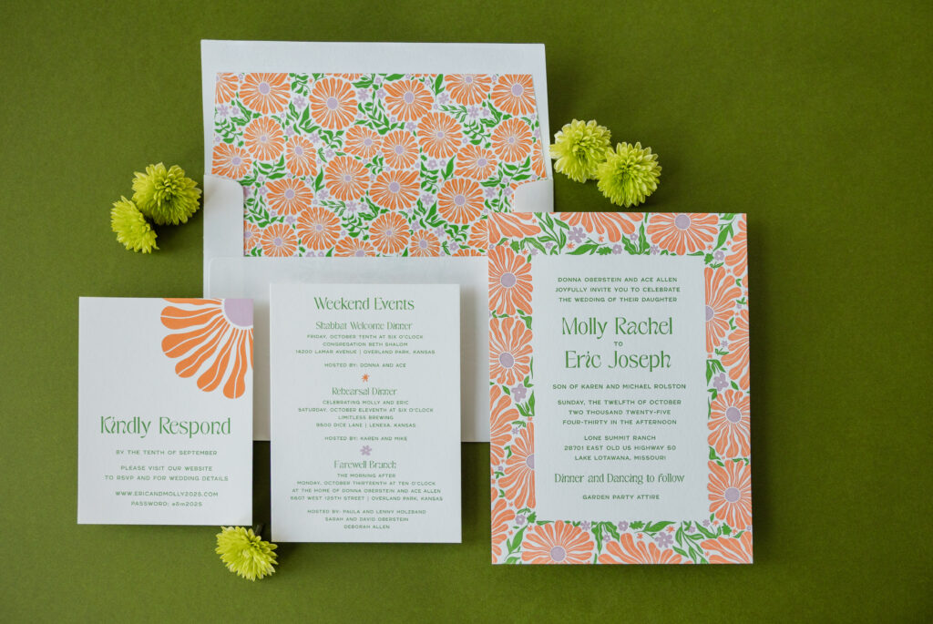
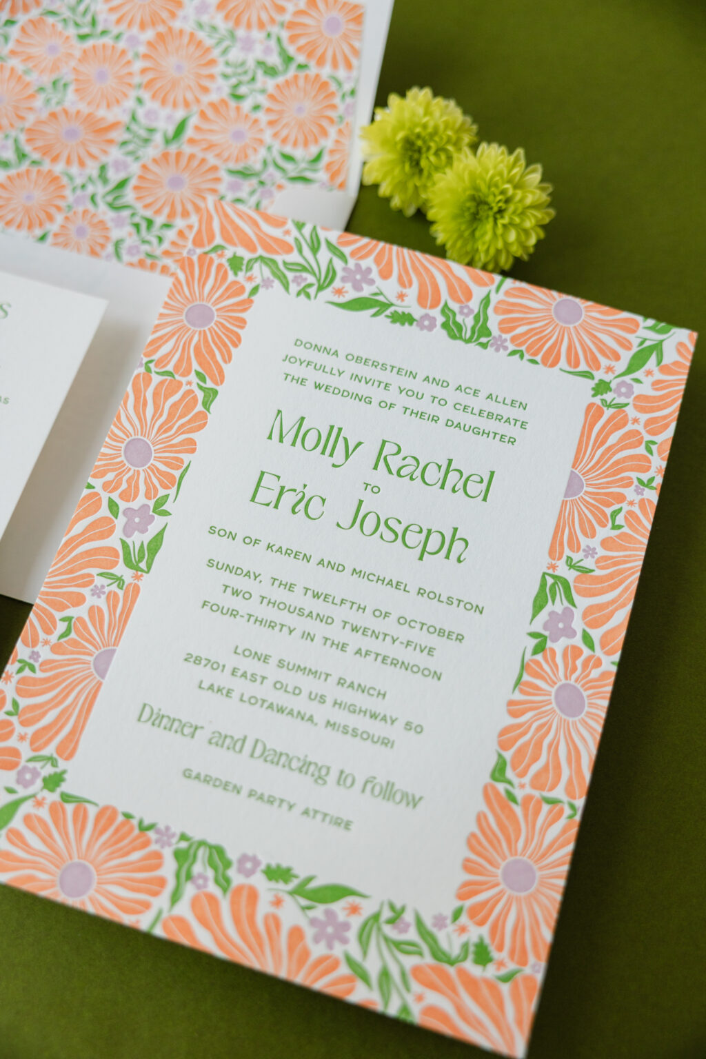
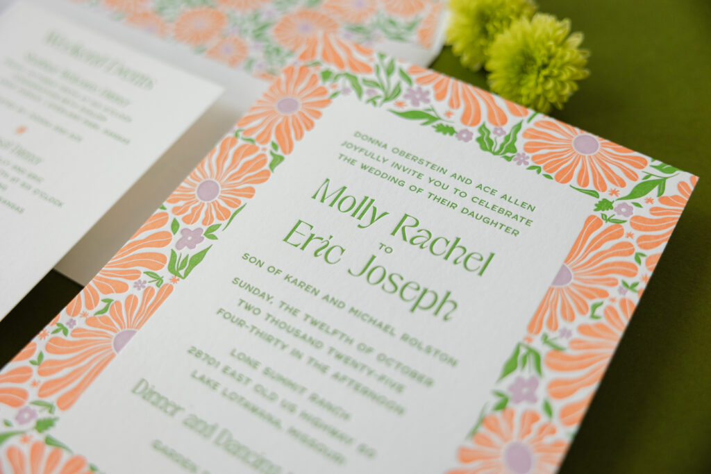
A striking color palette, plenty of vintage-inspired floral artwork, and expert printing had us obsessing over Molly and Eric’s wedding stationery. This couple worked with our dear friend Susie of First Impression to customize our Cyrus design, and we are so happy they did. Their playful botanical wedding invitations are cheerful, sophisticated, and full of personality.
Invitation
letterpress inks: garden + petal + persimmon
paper: bella smooth cotton 1-ply white
card size: f-8
envelope liner: cyrus pattern in garden + petal + persimmon digital on white text
envelope addressing: garden digital on the front / garden + petal + persimmon digital on the back
job #: 77824
Details Card
digital inks: garden + petal + persimmon
paper: bella smooth cotton 1-ply white
card size: a-6
job #: 77824
Reply Card
digital inks: garden + petal + persimmon
paper: bella smooth cotton 1-ply white
card size: a-2
job #: 77824
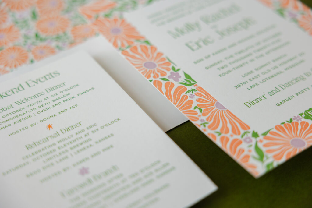
The whimsical daisy-like botanical pattern is absolutely eye-catching. The vibrant color choice of garden, petal, and persimmon ink only makes it more so. Each letterpress color requires its own press run, and the tight registration, or the spacing between the flowers and foliage in the pattern, showcases the skill of our press operators while also making the pattern almost jump off the card.
The floral border is exuberant, while the typography is restrained and spacious, creating a nice balance between maximalist pattern and minimalist composition. The floral arrangement is reminiscent of a vintage textile, especially when paired with the Art Nouveau-inspired font used for the couple’s names.
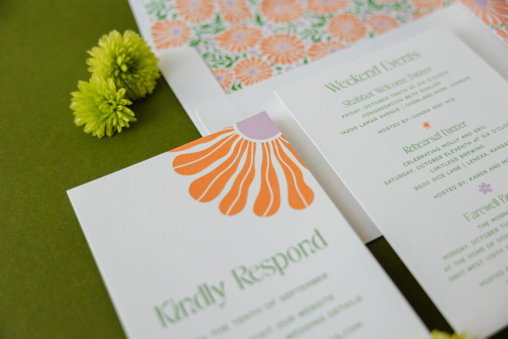
The details and reply cards feature much more subtle floral artwork, so they stay consistent with the look without competing with the invitation. Both of these cards are digitally printed. Although they use a different printing method, they still color-match the letterpress inks on the invitation.
Are you dreaming of an energetic color combination, a vintage-inspired pattern, or do you love the idea of invitations that feel festive, sociable, and welcoming? Work with one of our dealers to create your playful botanical wedding invitations.
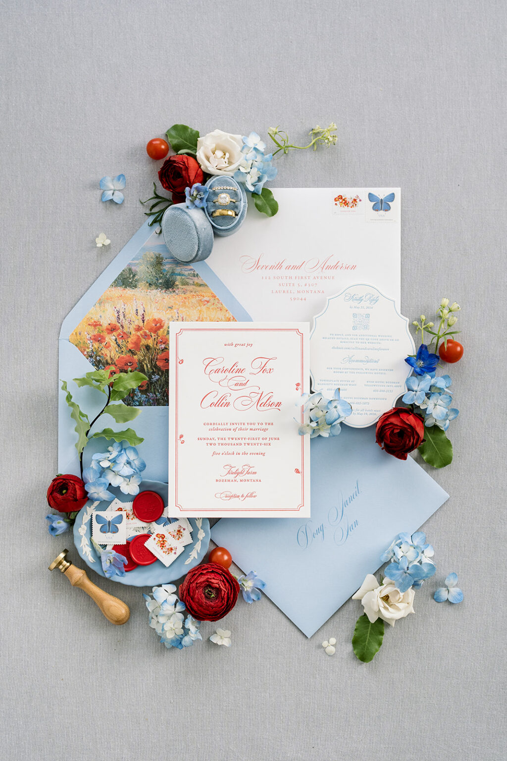
Caroline and Collin’s refined rustic wedding invitations are so charming and effortlessly luxurious that we could not wait to share them with you. The couple worked with our dear friend Janeil of Seventh and Anderson to create their custom wedding stationery.
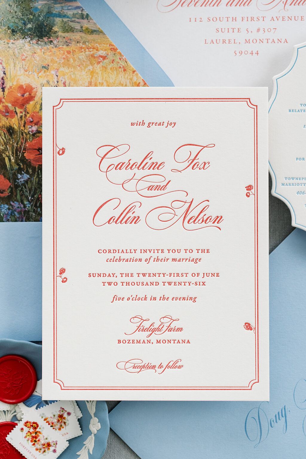
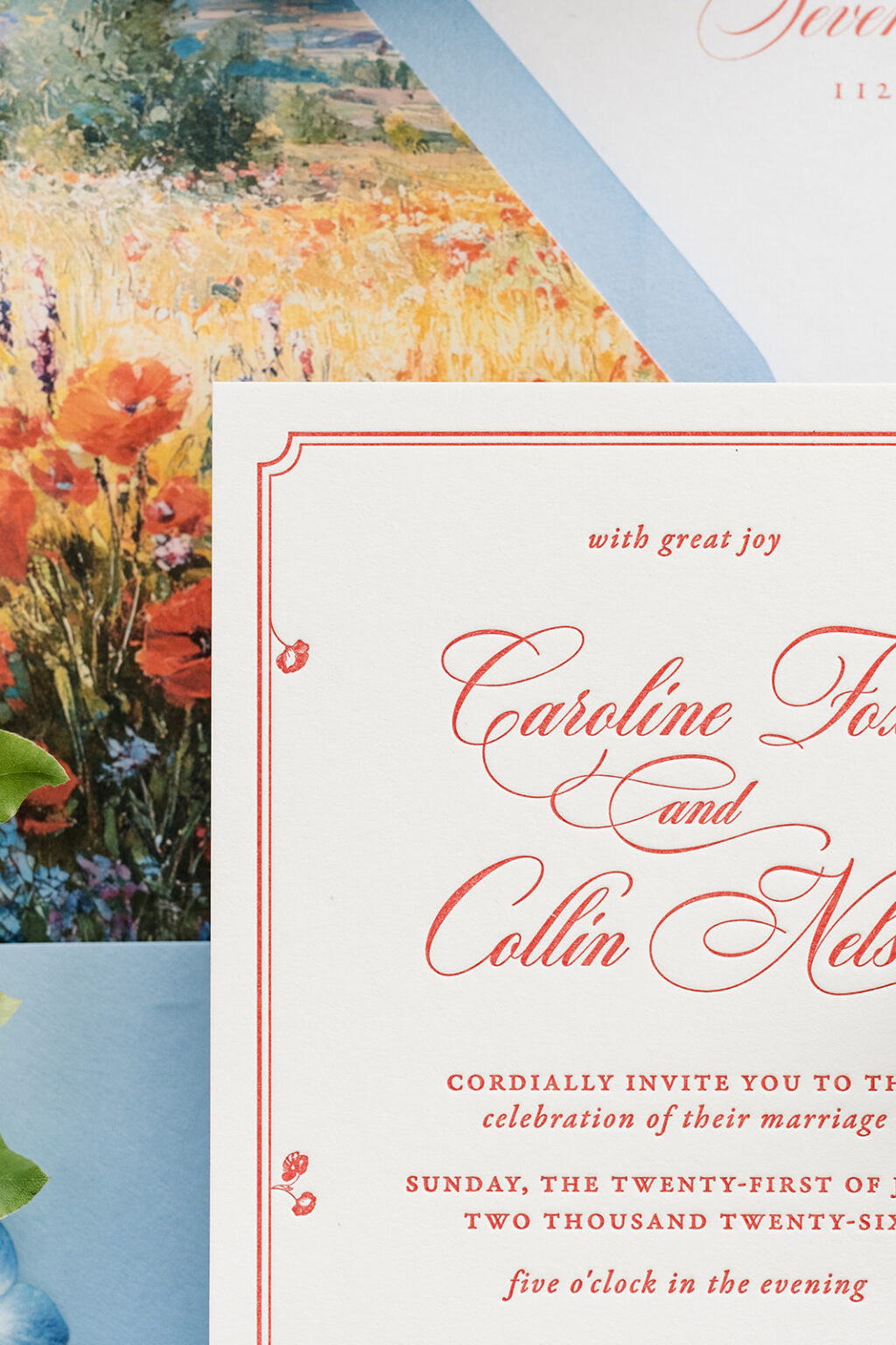
A flowing script font with looping flourishes adds a romantic touch. This bold script font is paired with delicate serif typography, creating an elegant, traditional look. The double-line border is formal and classic, while the floral accents are whimsical and unexpected, but they completely fit the vibe.
Invitation
letterpress ink: chili
paper: bella smooth cotton 2-ply white
card size: a-7
job #: 81896
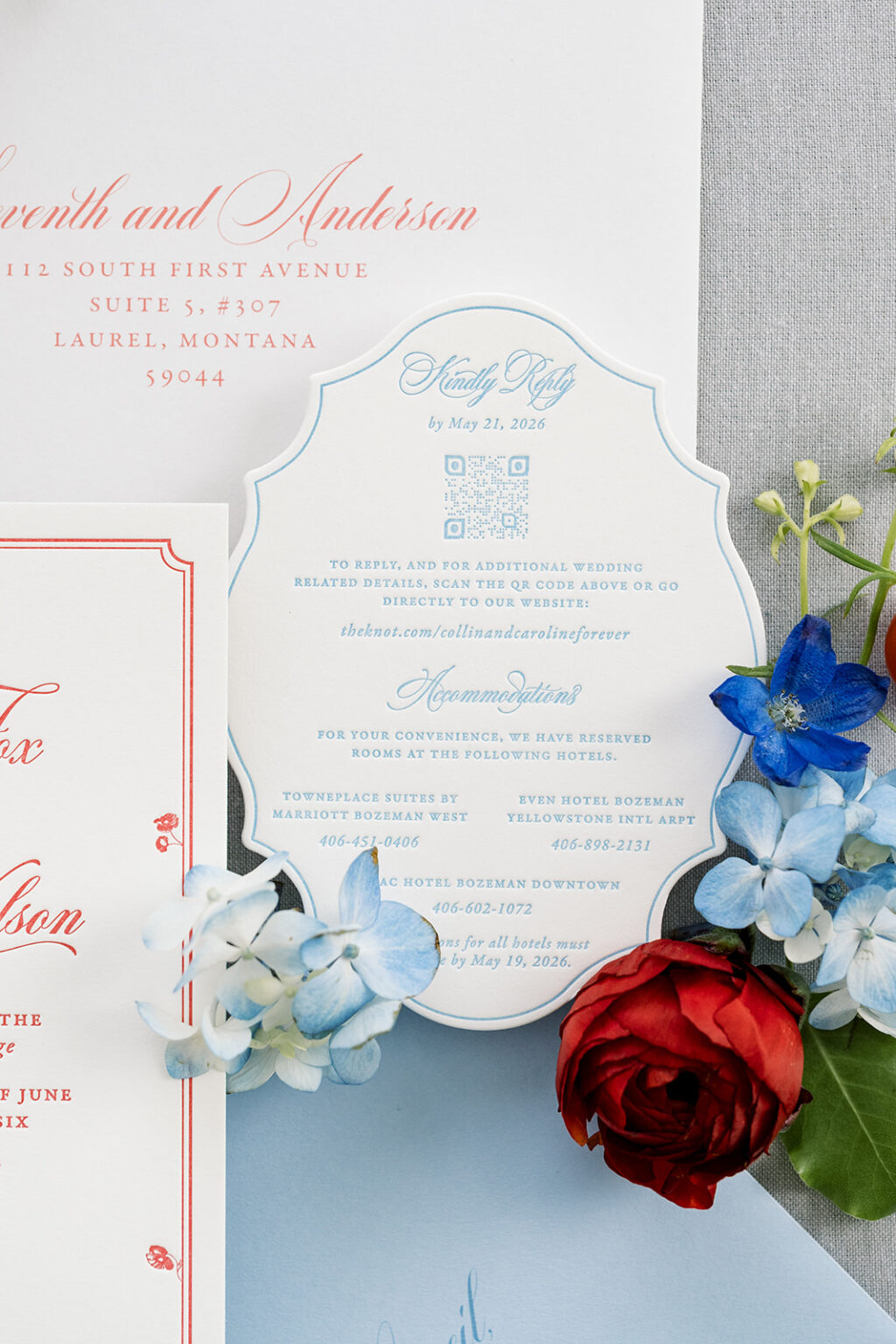
Details Card
letterpress ink: wedgewood
paper: bella smooth cotton 2-ply white
card size: a-2
die-cut shape: bf-196
job #: 81896
One-color printing gives the invitation a modern monochromatic look that still fits the aesthetic of a wedding in southwest Montana. Our chili letterpress ink is vibrant and pops on our Bella smooth cotton stock. This 2-ply paper holds a crisp letterpress impression and has a soft, satiny feel.
The details card follows the same design direction, so there is a cohesiveness between the cards. What sets the details card apart is the die-cut shape. The swooping scallop edge is dramatic in the best way possible. A thin line border perfectly follows the curves, keeping with the refined feel.
The overall mood of these refined rustic wedding invitations is artistic, intimate, and slightly nostalgic. It was a pleasure to work with this couple and Seventh and Anderson, and we look forward to what Janeil brings us next time. Do you love the refined rustic aesthetic? Or do you like the idea of looping fonts, whimsical borders, and darling die-cut shapes? Work with one of our dealers to create your perfect wedding stationery.
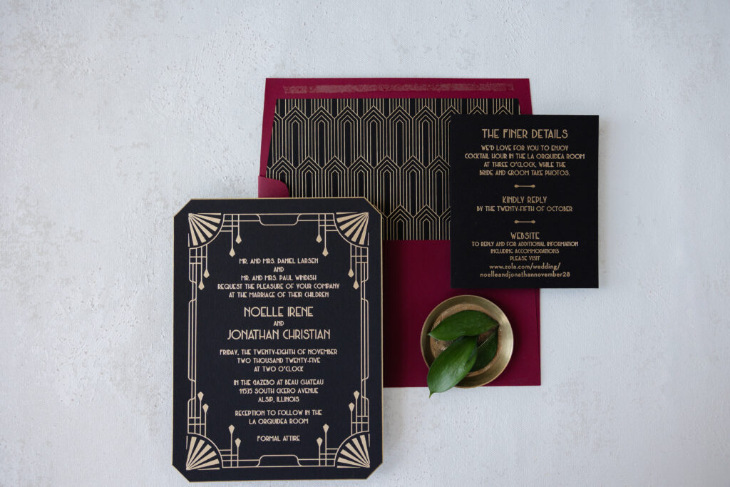
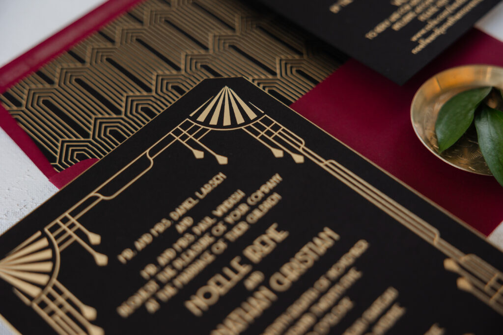
Art Deco glamour with a modern, formal aesthetic and a rich, dramatic color palette had us swooning over Noelle and Jonathan’s invitations. The couple was initially inspired by our Sherah design. While you can still see elements of that design in their invitations, they made some big, bold changes, taking everything in a completely different design direction, and we’re so happy they did because the final result is stunning and lovely. Noelle and Jonathan worked with our dear friend Colleen of Fitzgerald’s Fine Stationery to design their luxe Art Deco wedding invitations.
Invitation
foil stamping: champagne matte
font: metropolis regular
paper: bella ultra black 2-ply
card size: f-8
die-cut style: franklin
bevel edge: 45-degrees
edge paint: metallic gold
envelope liner: sherah pattern in champagne matte foil on ultra black text
envelope: currant text (paper discontinued; our bordeaux is a similar alternative)
envelope addressing: ivory digital on the front and the back
job #: 77807
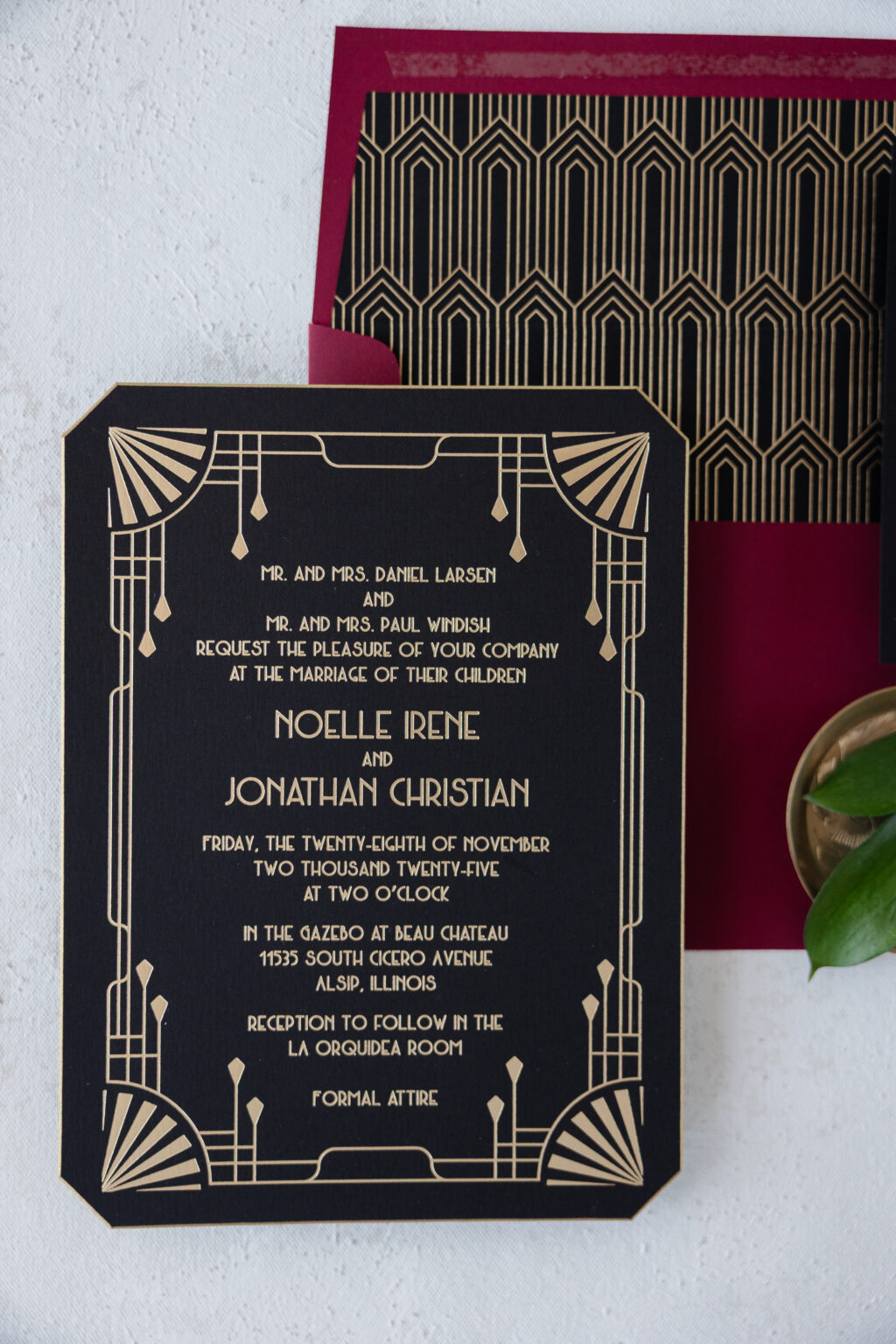
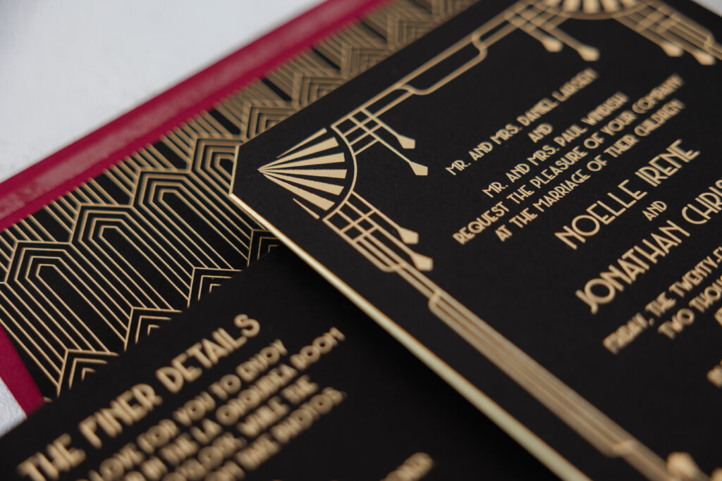
This invitation is full of classic Art Deco elements, from the border’s stepped lines and fan motifs to the envelope liner’s geometric diamond pattern. Champagne matte foil on our ultra black paper delivers shimmer and just the right level of sophistication. The use of one foil color for all of the printing ensures the decorative details stand out.
The narrow, geometric typeface fits the overall look while introducing an elegant symmetry and a slightly theatrical character.
Our Franklin die-cut shape was part of the inspiration design, and perfectly fits the couple’s vision. The edges were then beveled and painted metallic gold, adding an extra luxe detail while maintaining that Art Deco glamour and a vintage vibe.
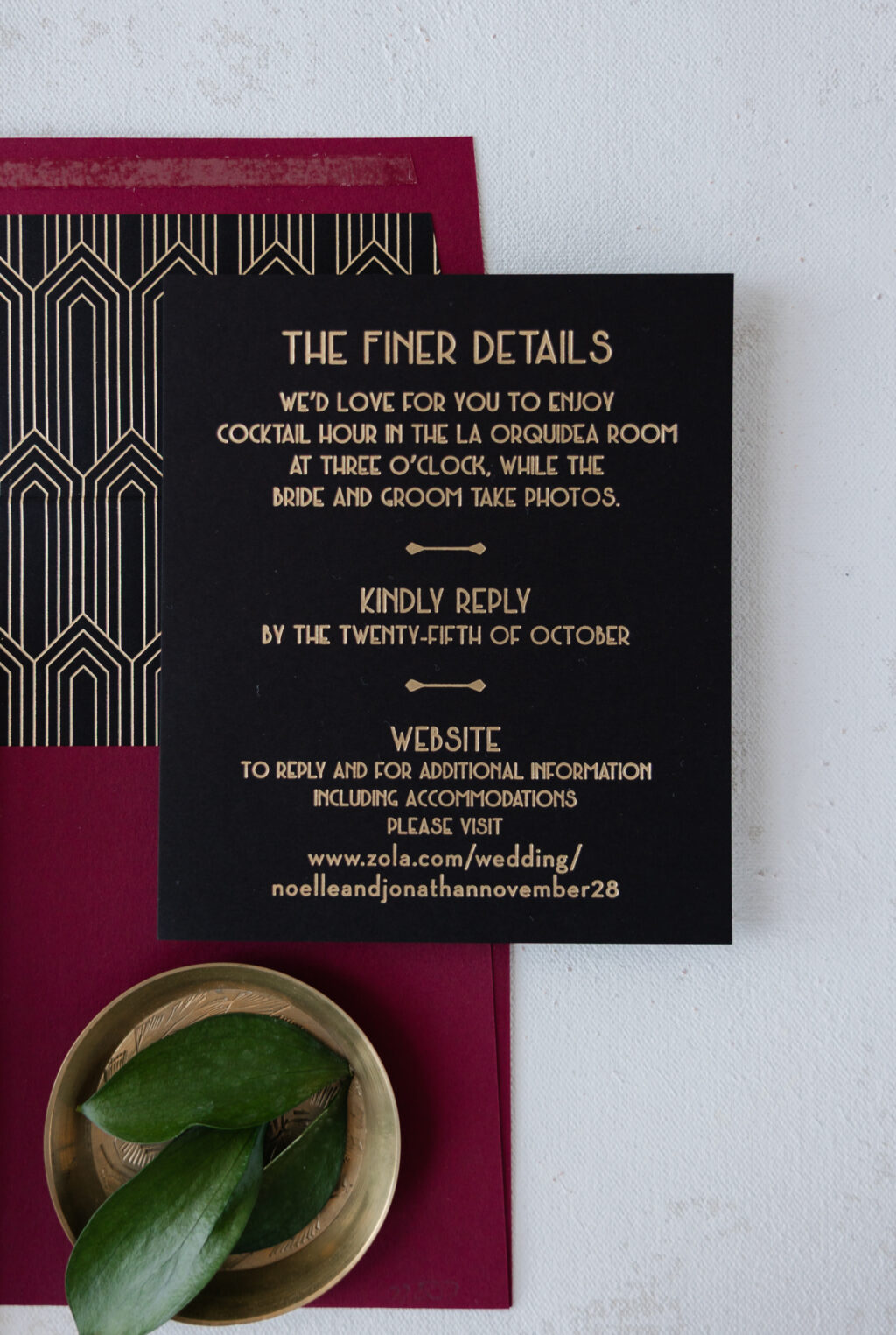
Details Card
foil stamping: champagne matte
font: metropolis regular
paper: bella ultra black 1-ply
card size: 4.5” x 5.25”
job #: 77807
Despite the vintage inspiration, Noelle and Jonathan’s luxe Art Deco wedding invitations feel contemporary. Do you want something refined and timeless? Work with one of our dealers to create your perfect wedding invitations!
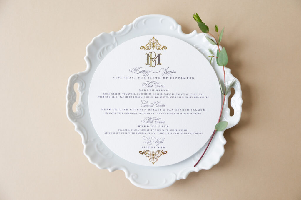
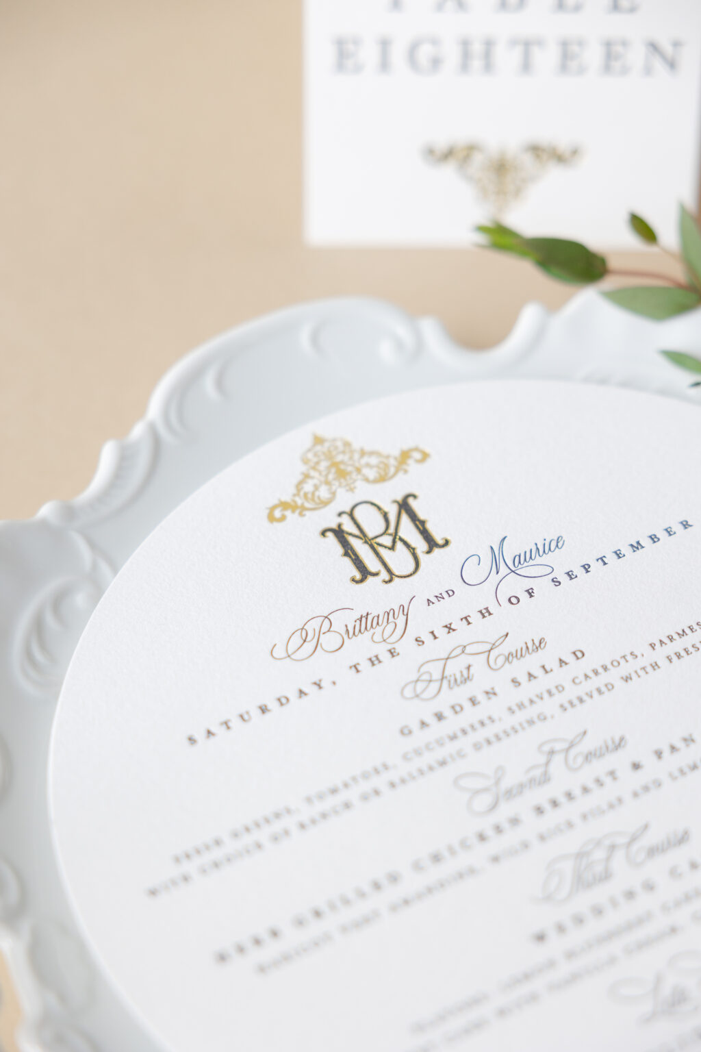
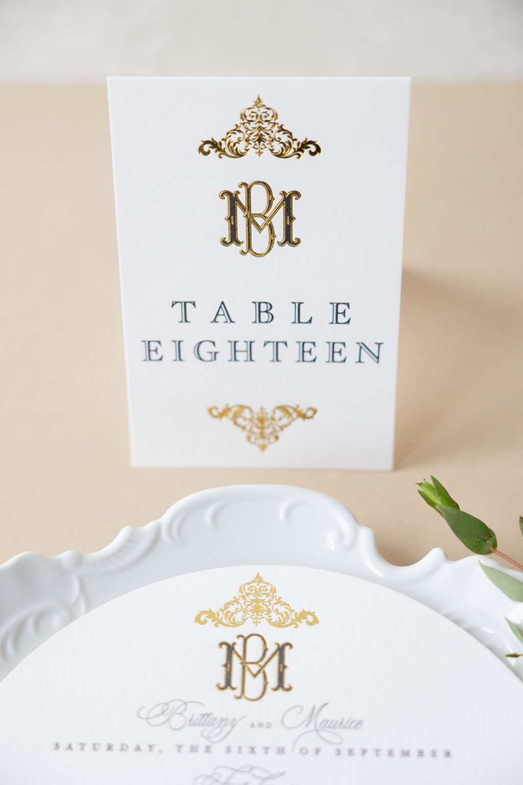
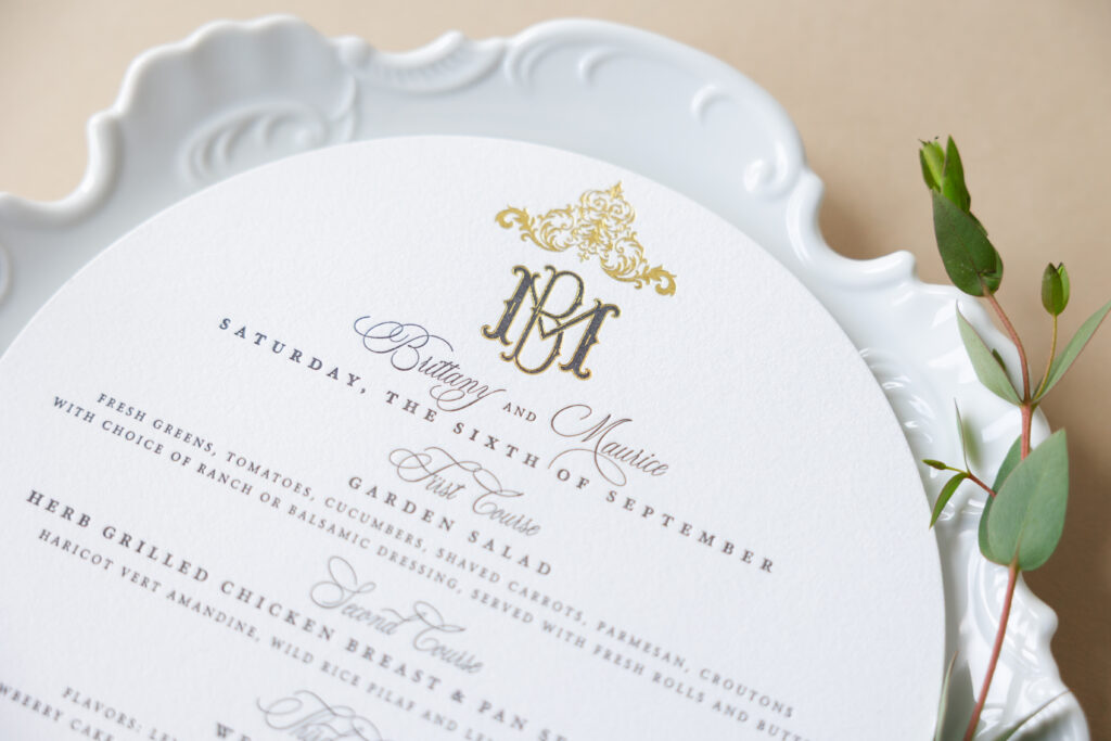
We had the absolute pleasure of printing the save-the-dates and invitations for Brittany and Maurice, so before we even saw the order for their day-of pieces, we knew it would be lovely. This couple worked with our dear friend Alison of Cute Buttons Gift and Paper Boutique for their regal day of set.
Menu
letterpress ink: black
foil stamping: gold shine
fonts: stipa willington script + heofler text engraved two + itc stone serif
paper: bella cotton 1-ply white
size: 8”
die-cut shape: sm-34
job #: 77745
Both the menu and table card feature a custom monogram bearing the couple’s first initials. The ornate monogram is sophisticated and intimate. Black letterpress printing is paired with baroque-inspired accents in gold shine foil. A detailed scrolling flourish placed at the top and bottom frames the text, adding a formal, regal look with an old-world elegance.
Table Cards
digital ink: black
foil stamping: gold shine
fonts: stipa willington script + heofler text engraved two + itc stone serif
paper: bella smooth cotton 1-ply white
size: 4” x 6” folded
finishing: score
job #: 77745
The menu typography features an elegant script font with decadent flourishes, along with widely spaced serif lettering, balancing romance with formal sophistication.
Do you love the look of these menus and table cards? Or do you want to take this inspiration to help create your perfect wedding invitations? Work with one of our dealers to create your very own wedding stationery, including a regal day of set.
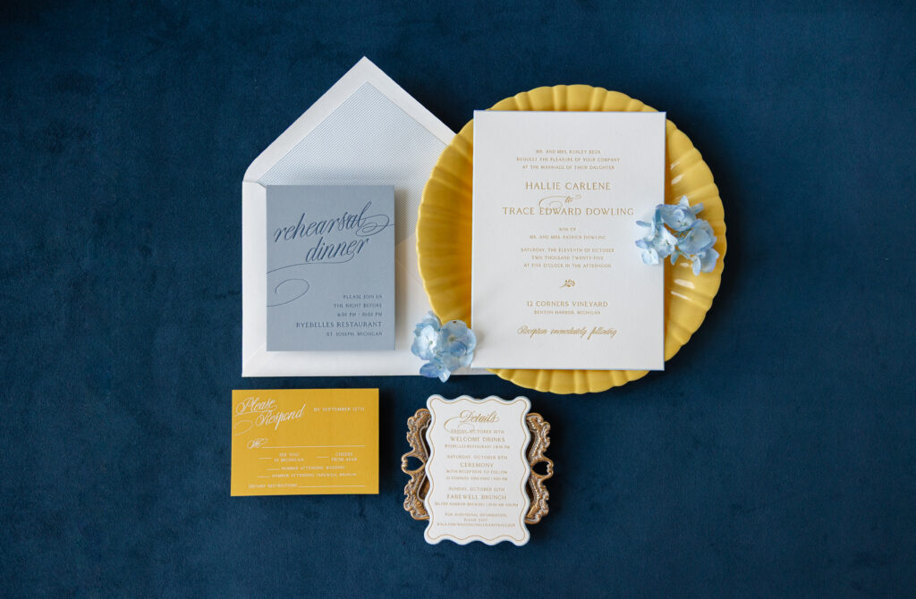
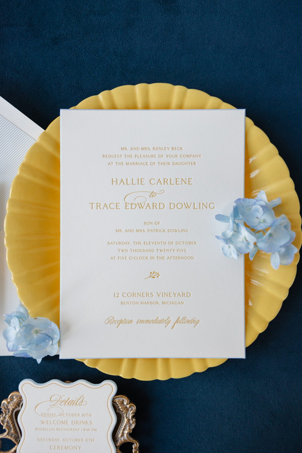
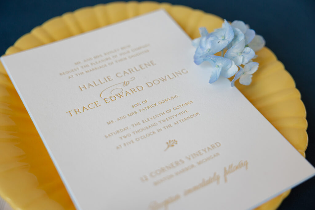
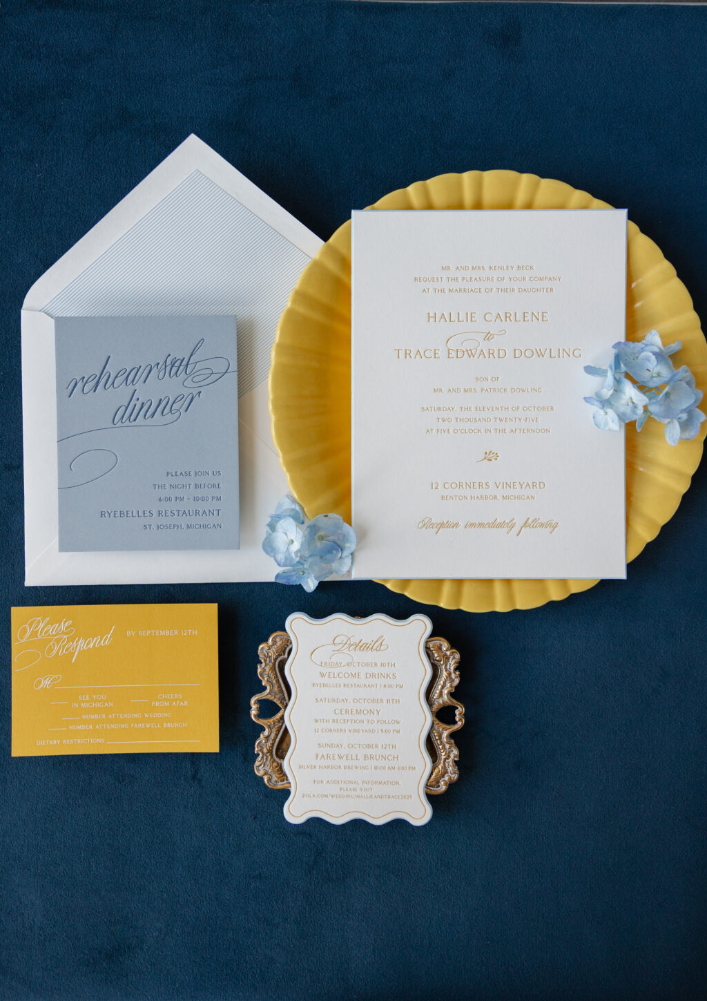
This invitation suite blends a classic wedding stationery aesthetic with a bold, playful color palette and striking typography, perfect for this Michigan wedding. The couple, Hallie and Trace, worked with our dear friend Becci of RSVP in the Village to create their sophisticated wedding invitations.
Invitation
letterpress ink: goldenrod
fonts: coldiac + copperlove
paper: bella smooth cotton 2-ply white
card size: f-8
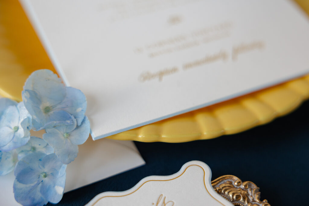
bevel edge: 45-degrees
edge paint: french blue
envelope liner: chesney stripe pattern in french blue digital on white text
envelope: white cotton text
envelope addressing: goldenrod letterpress on the back
job #: 77388
This couple selected different cards from our collection of designs to assemble a truly unique wedding stationery suite. The invitation is a customization of our Burklyn design. The typography is very traditional. It gives the invitation a balanced and symmetrical feel. Goldenrod letterpress ink is stately but also an unexpected burst of color.
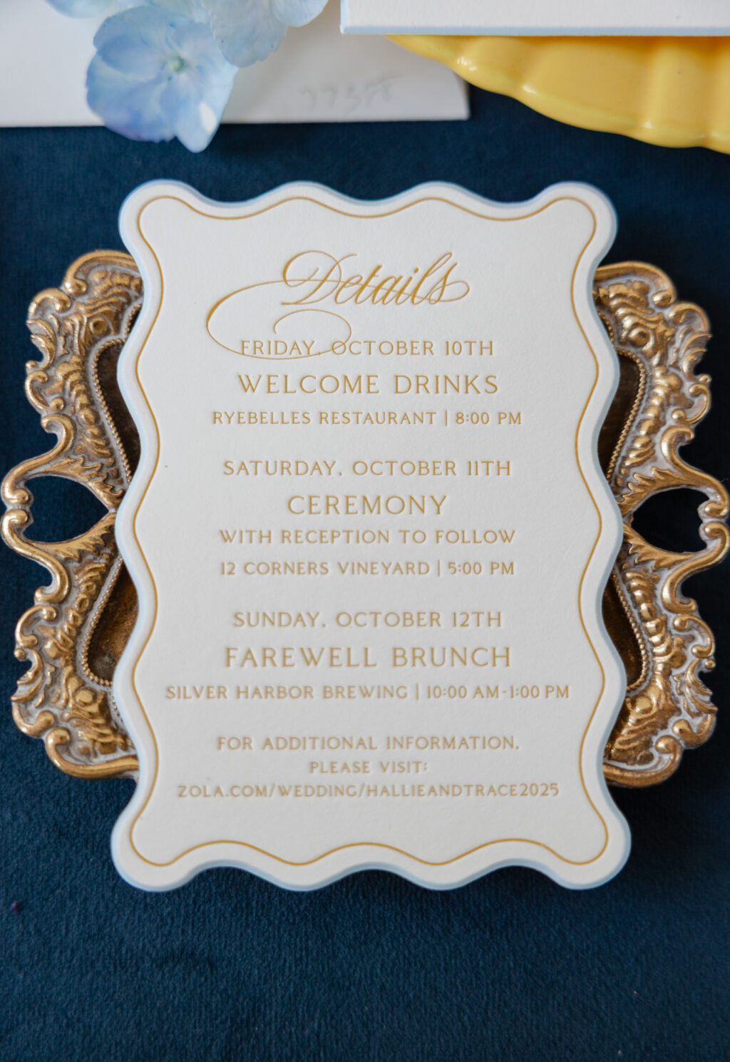
Details Card
letterpress ink: goldenrod
fonts: coldiac + copperlove
paper: bella smooth cotton 2-ply white
card size: a-5
custom shape bevel: 45 degrees
edge paint: french blue
job #: 77388
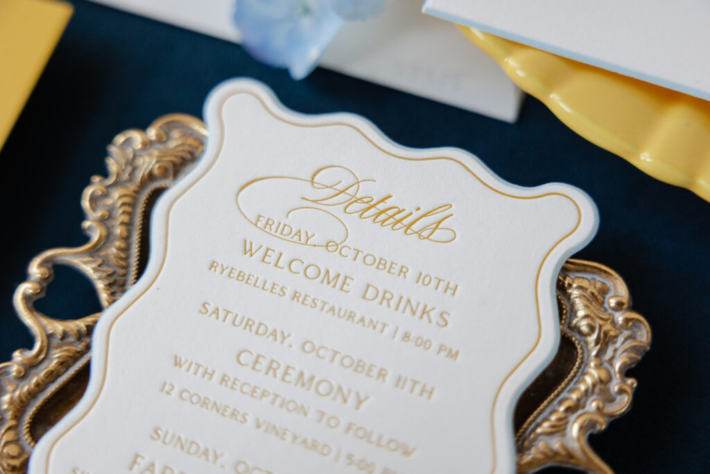
The details card draws inspiration from the Lainey details card and closely follows the invitation design, featuring goldenrod letterpress on Bella smooth cotton 2-ply paper in white. The standout feature is a custom shape bevel. The scalloped shape is whimsical, and edge painting in French blue highlights the gentle curves and the bevel edge.
The reply card flips the colorway of both the invitation and details card and features white engraving on our maize 2-ply paper. This switch is fun, bold, and vibrant, and upholds the playful vibe.
Rehearsal Dinner Invitation
letterpress ink: yale
fonts: coldiac + copperlove
paper: bella cloud 2-ply
card size: a-2
job #: 77388
Reply Card
engraving ink: white
fonts: coldiac + copperlove
paper: bella maize 2-ply
card size: a-5
envelope: white cotton text
envelope addressing: goldenrod digital on the front
job #: 77388
Tonal printing is the highlight of the rehearsal dinner invitation. Yale letterpress ink on our cloud paper is understated for a sophisticated, trendy look. The swooping flourishes of the script font add drama. The reply card and rehearsal dinner invitation feature the same layout as the corresponding pieces in our Harriet suite. While this couple selected cards from various suites, they kept the fonts the same to maintain cohesion throughout.
This wedding invitation suite is charming and elegant, and expertly merges bold color, a sweeping script font, and traditional print methods. Do you like the idea of swapping ink and paper colors across the cards in your suite? Would you love to feature a custom shape bevel? Work with one of our dealers to create your perfect wedding invitations!
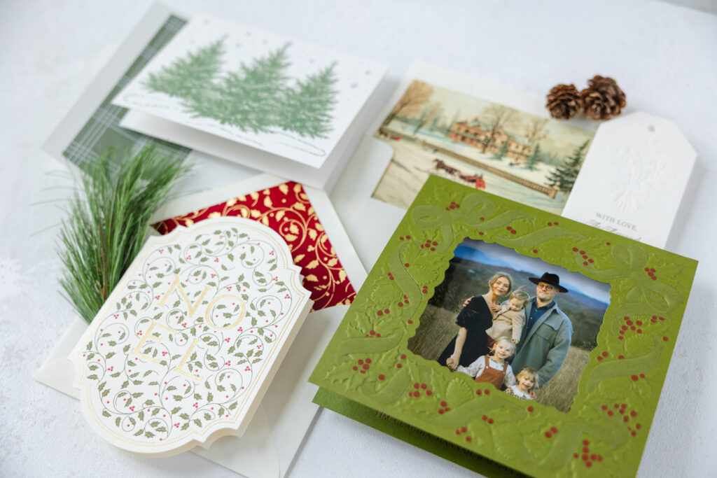
Our Holiday Release is here, and we cannot wait for you to see everything. This release features 25 designs, from traditional to modern looks, plus holiday party invitations. There are even some brand-new Valentine’s Day cards. We’ve featured our new papers and velvets, new engraving inks, plenty of laser cutting, a few new envelope shapes, and lots of beautiful new illustrations.
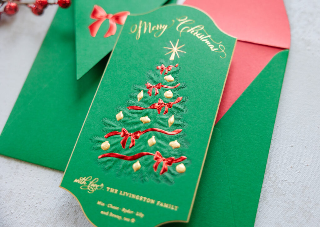
Our Livingston design is dazzling and expertly showcases the abilities of sculpted embossing. The tree artwork is brought to life with blind sculpted embossing. The fine details of the pine needles are stunningly vivid. The ribbons and ornaments appear in sculpted foil embossing for a festive shine. Metallic gold edge painting highlights the 45-degree bevel.
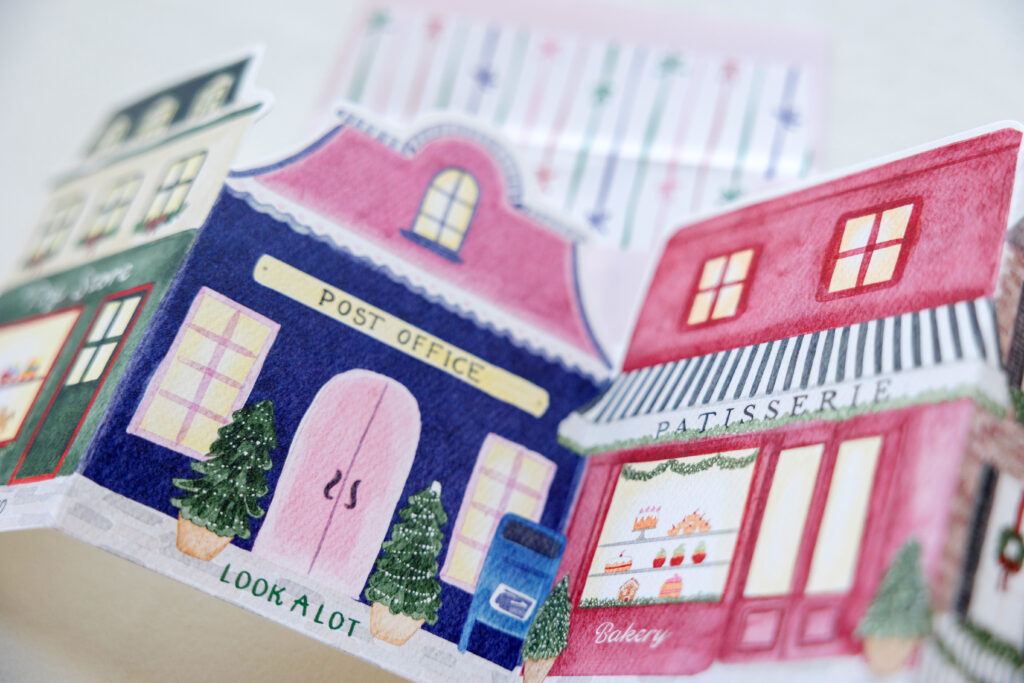
Presley unfolds to reveal a charming village, with each panel carrying part of a holiday greeting. Lovely watercolor illustrations feature a high level of detail and give this holiday card a warm, inviting feel.
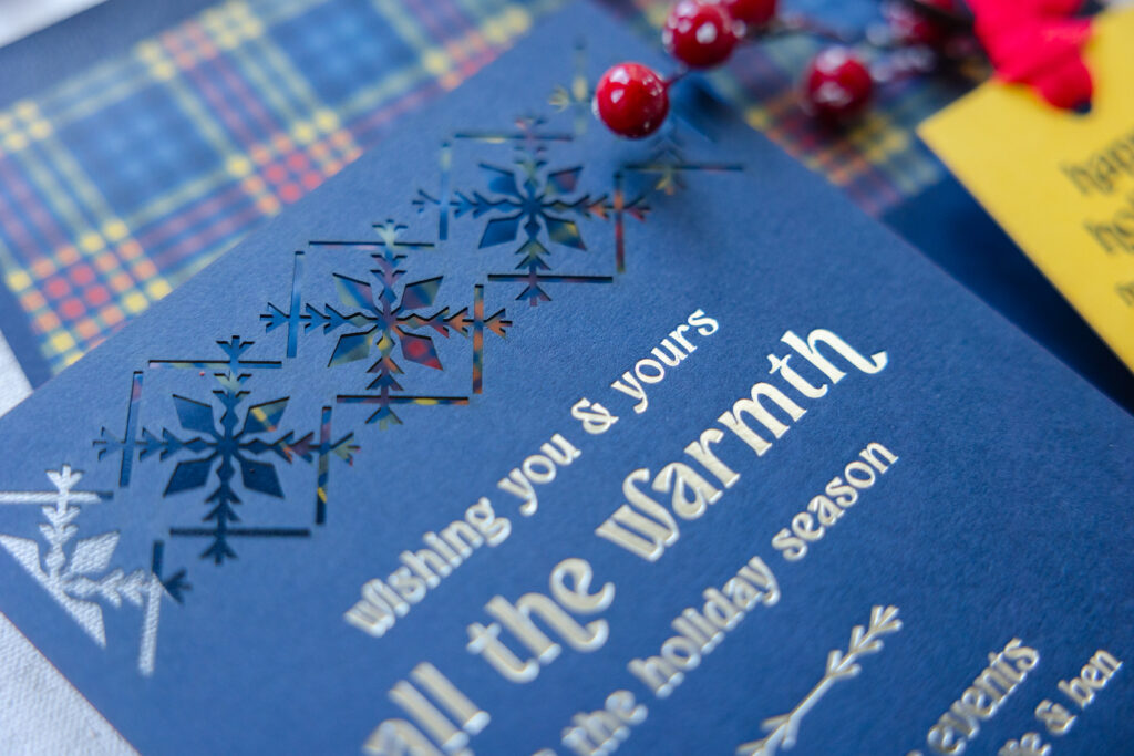
Lars delivers a modern Scandinavian vibe. An intricate laser-cut snowflake pattern serves as a border along the top and bottom of this holiday card. The geometric pattern balances the minimal typography, while the bold font adds personality. The plaid envelope liner introduces a cozy hygge vibe.
You can see all of our holiday designs here, and you can also get more details on our 2026 holiday promotion. Order early to take advantage of a discount and free digital envelope addressing.
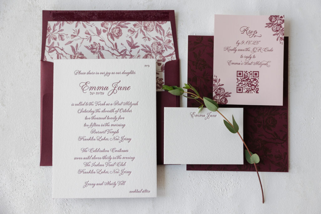
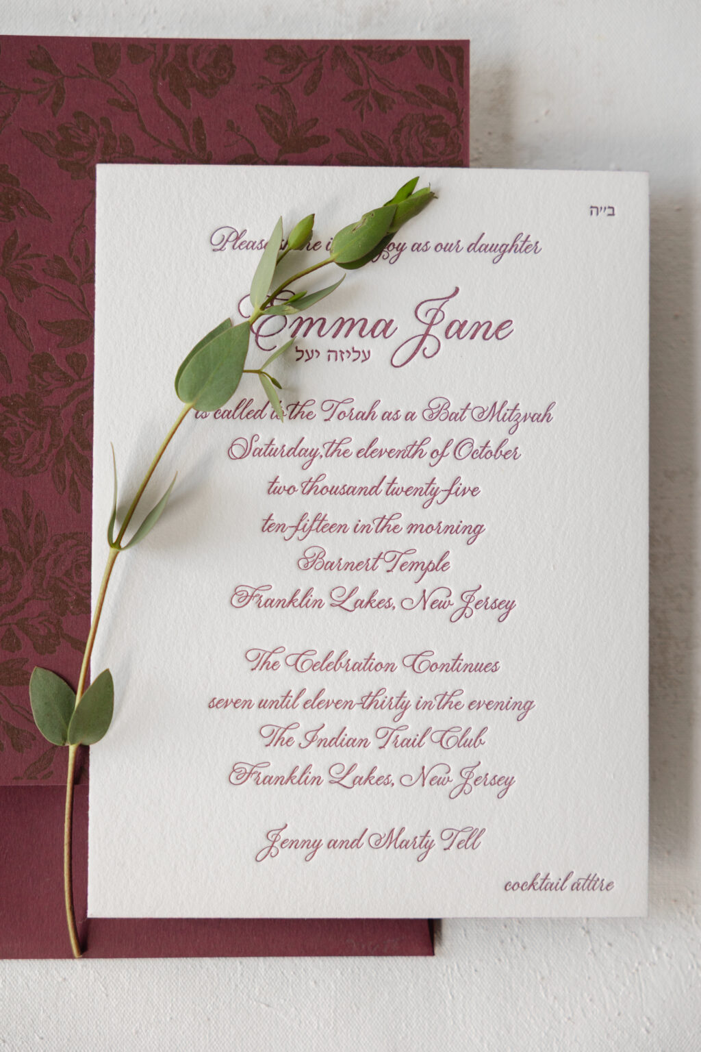
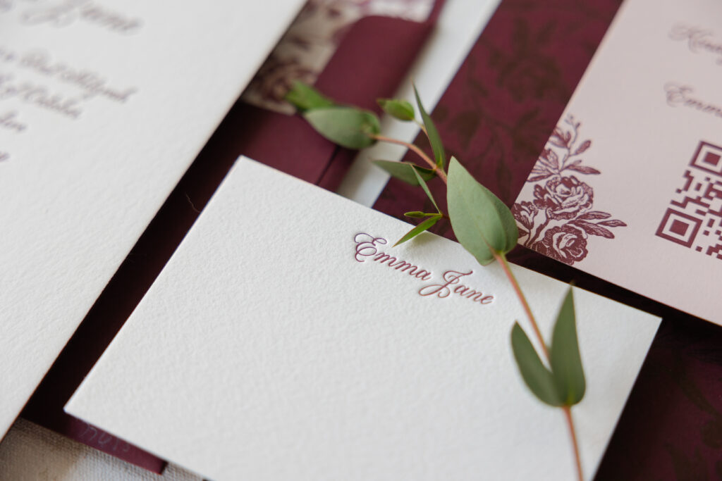
Emma’s Bat Mitzvah invitation is refined and sophisticated thanks to a rich monochromatic color palette and delicate botanical artwork. Our dear friend Julie of Julie Maloof Designs brought us this custom design, and we are so happy to have been a part of this stunning invitation with floral accents.
paper: bella cotton 2-ply white (front) / bordeaux 1-ply (back)
card size: f-8
edge paint: bordeaux
finishing: duplex front to back
envelope liner: tristan pattern in blush + old rose + rosebud digital on white text
envelope: bordeaux text
envelope addressing: white digital on the front and the back
job #: 77688
Reply Card
letterpress ink: bordeaux
paper: bella ballet 1-ply
card size: a-2
job #: 77688
Thank You Card
letterpress ink: bordeaux
paper: bella cotton 2-ply white
card size: a-5
envelope: ballet text
envelope addressing: bordeaux letterpress on the front
job #: 77688
The graceful script font has just enough flourishes to feel charming while still establishing a formal tone. Bordeaux letterpress ink adds a sophisticated drama and a touch of femininity. The invitation features two different stocks duplexed together to create a decadent 3-ply card. The invitation’s front features bordeaux letterpress on our white cotton 2-ply paper. The back also features bordeaux letterpress, but on our bordeaux 1-ply paper. The tonal printing is gorgeous and on-trend. The vintage-inspired floral pattern on the back of the invitation also serves as the envelope liner. You’ll spot some of the artwork as accents on the reply card. Featuring the artwork in these places keeps everything intentional and cohesive without feeling over the top.
It was an absolute pleasure to work on Emma’s Bat Mitzvah invitation suite. The design blends modern sophistication with vintage botanical charm. Do you have an idea for your custom invitation? Do you like the concept of tonal printing or a pattern printed on the back of the invitation? Work with one of our dealers to create your perfect invitation.