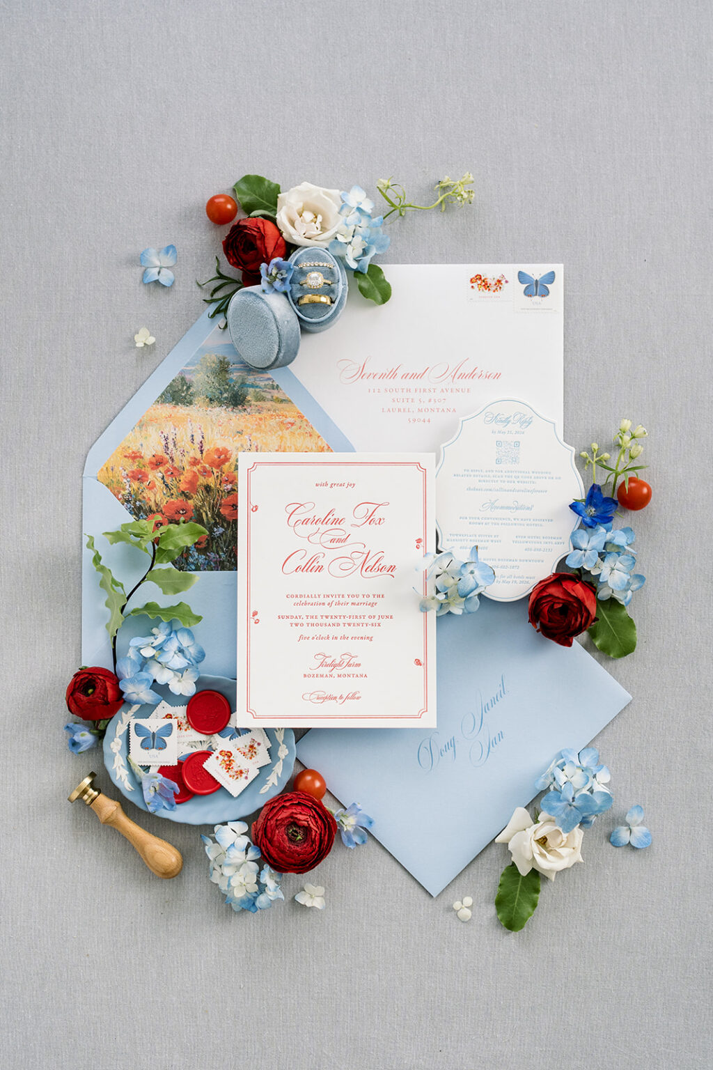
Caroline and Collin’s refined rustic wedding invitations are so charming and effortlessly luxurious that we could not wait to share them with you. The couple worked with our dear friend Janeil of Seventh and Anderson to create their custom wedding stationery.
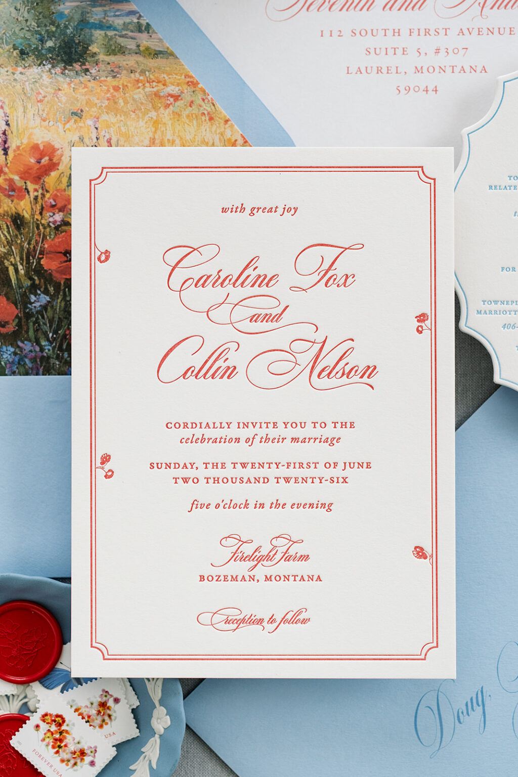
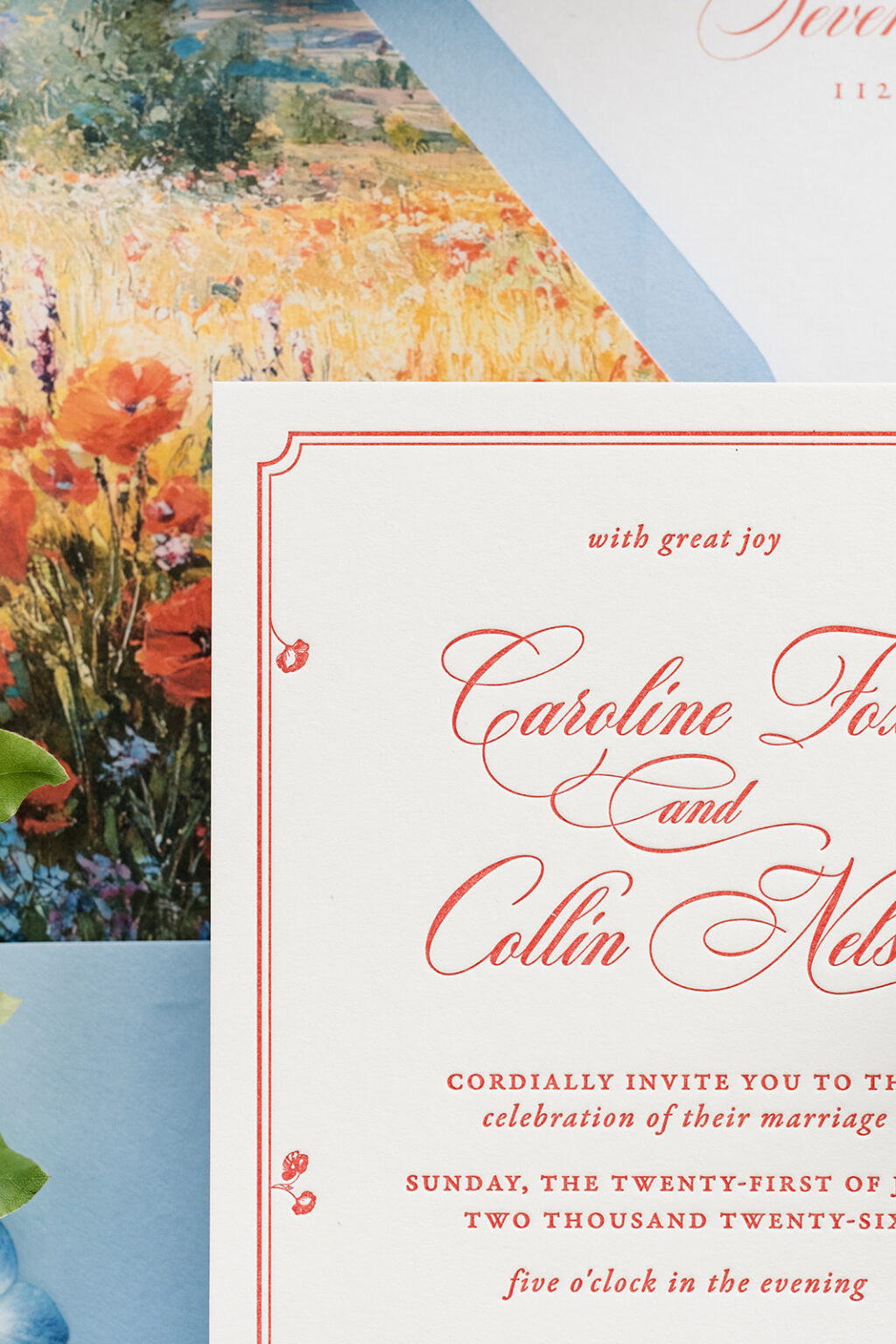
A flowing script font with looping flourishes adds a romantic touch. This bold script font is paired with delicate serif typography, creating an elegant, traditional look. The double-line border is formal and classic, while the floral accents are whimsical and unexpected, but they completely fit the vibe.
Invitation
letterpress ink: chili
paper: bella smooth cotton 2-ply white
card size: a-7
job #: 81896
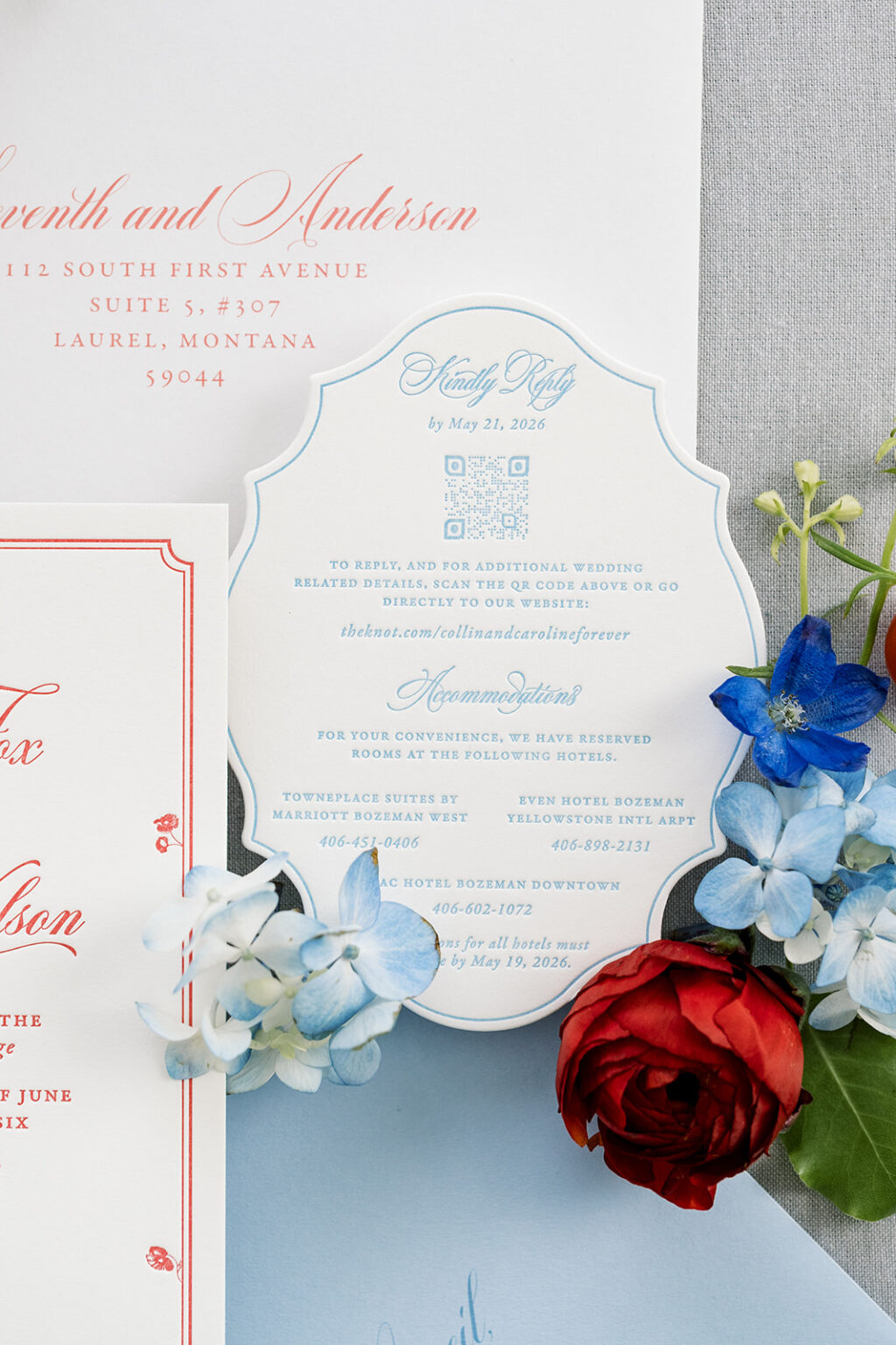
Details Card
letterpress ink: wedgewood
paper: bella smooth cotton 2-ply white
card size: a-2
die-cut shape: bf-196
job #: 81896
One-color printing gives the invitation a modern monochromatic look that still fits the aesthetic of a wedding in southwest Montana. Our chili letterpress ink is vibrant and pops on our Bella smooth cotton stock. This 2-ply paper holds a crisp letterpress impression and has a soft, satiny feel.
The details card follows the same design direction, so there is a cohesiveness between the cards. What sets the details card apart is the die-cut shape. The swooping scallop edge is dramatic in the best way possible. A thin line border perfectly follows the curves, keeping with the refined feel.
The overall mood of these refined rustic wedding invitations is artistic, intimate, and slightly nostalgic. It was a pleasure to work with this couple and Seventh and Anderson, and we look forward to what Janeil brings us next time. Do you love the refined rustic aesthetic? Or do you like the idea of looping fonts, whimsical borders, and darling die-cut shapes? Work with one of our dealers to create your perfect wedding stationery.
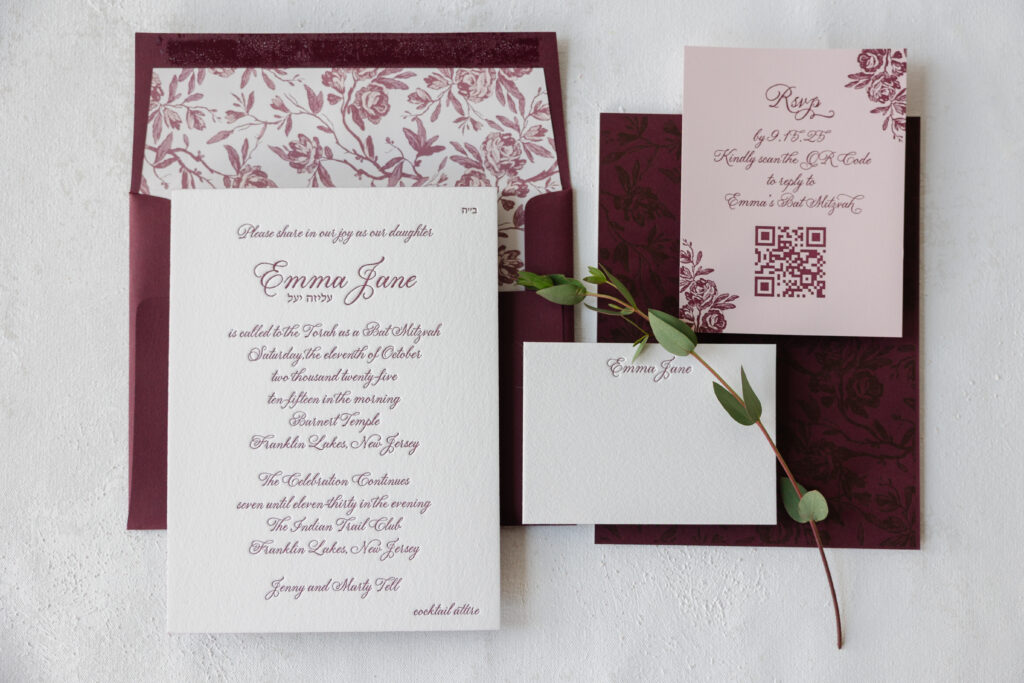
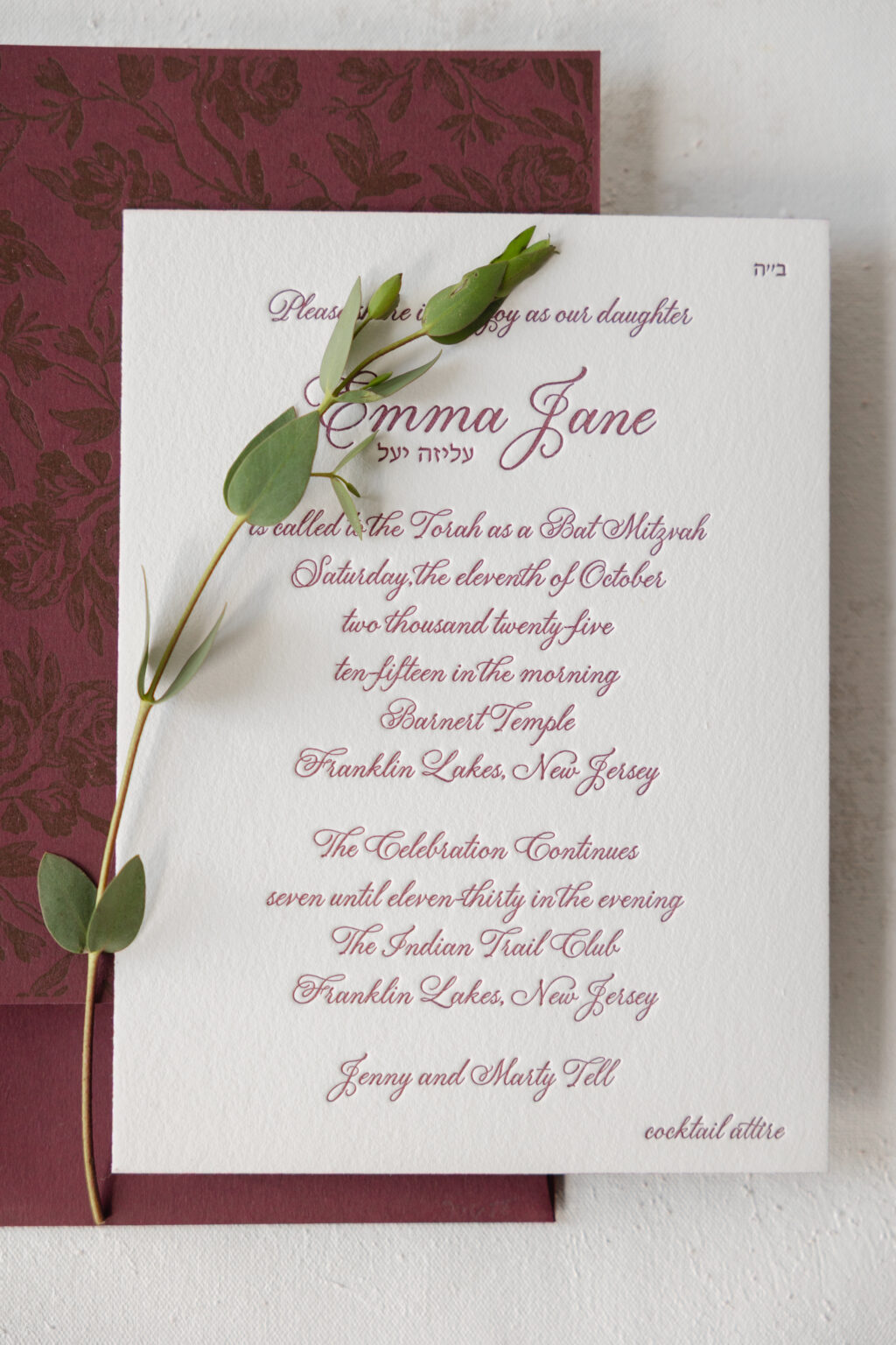
Emma’s Bat Mitzvah invitation is refined and sophisticated thanks to a rich monochromatic color palette and delicate botanical artwork. Our dear friend Julie of Julie Maloof Designs brought us this custom design, and we are so happy to have been a part of this stunning invitation with floral accents.
paper: bella cotton 2-ply white (front) / bordeaux 1-ply (back)
card size: f-8
edge paint: bordeaux
finishing: duplex front to back
envelope liner: tristan pattern in blush + old rose + rosebud digital on white text
envelope: bordeaux text
envelope addressing: white digital on the front and the back
job #: 77688
Reply Card
letterpress ink: bordeaux
paper: bella ballet 1-ply
card size: a-2
job #: 77688
Thank You Card
letterpress ink: bordeaux
paper: bella cotton 2-ply white
card size: a-5
envelope: ballet text
envelope addressing: bordeaux letterpress on the front
job #: 77688
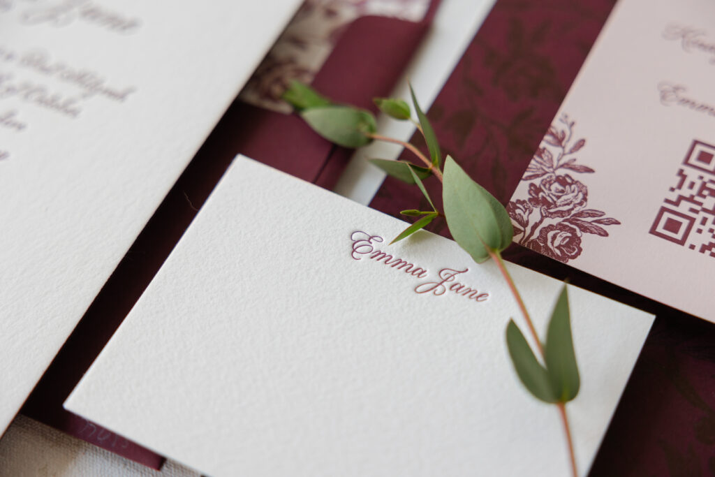
The graceful script font has just enough flourishes to feel charming while still establishing a formal tone. Bordeaux letterpress ink adds a sophisticated drama and a touch of femininity. The invitation features two different stocks duplexed together to create a decadent 3-ply card. The invitation’s front features bordeaux letterpress on our white cotton 2-ply paper. The back also features bordeaux letterpress, but on our bordeaux 1-ply paper. The tonal printing is gorgeous and on-trend. The vintage-inspired floral pattern on the back of the invitation also serves as the envelope liner. You’ll spot some of the artwork as accents on the reply card. Featuring the artwork in these places keeps everything intentional and cohesive without feeling over the top.
It was an absolute pleasure to work on Emma’s Bat Mitzvah invitation suite. The design blends modern sophistication with vintage botanical charm. Do you have an idea for your custom invitation? Do you like the concept of tonal printing or a pattern printed on the back of the invitation? Work with one of our dealers to create your perfect invitation.
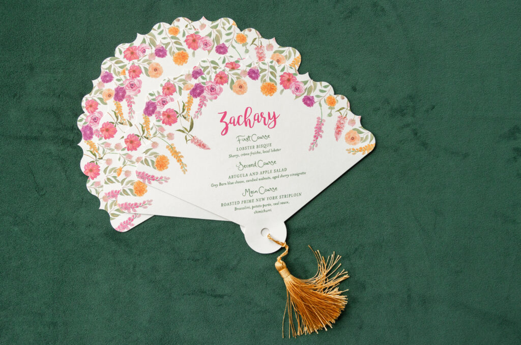
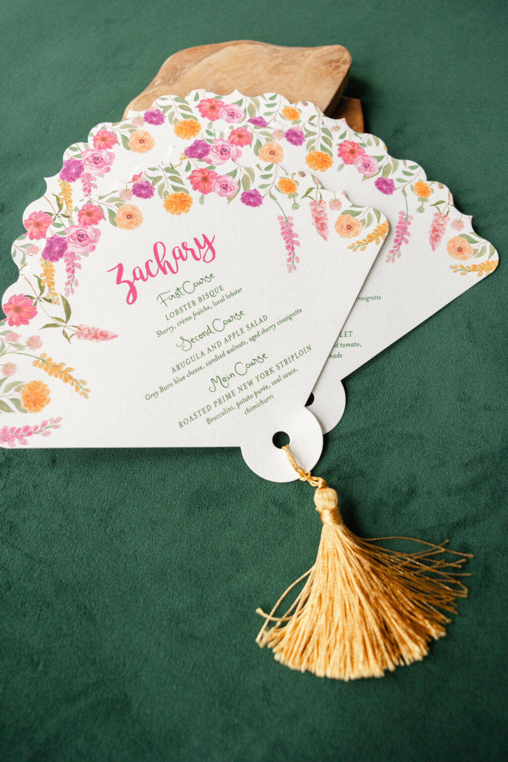
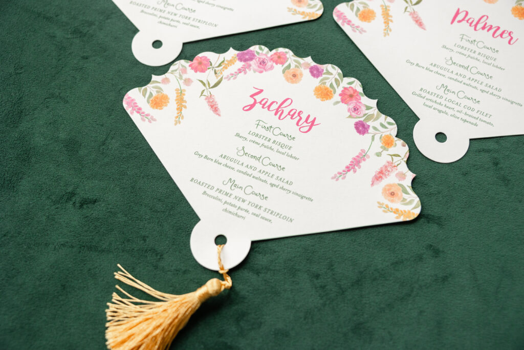
This floral die-cut menu is as charming and joyful as it is useful and functional. The look leans into an expressive, colorful, curated aesthetic, and we can’t take our eyes off it. This menu came to us from our friend Leslie of If It’s Paper.
The scalloped edge die-cut gives the menus a decorative silhouette and ensures this piece stands out. The fan shape feels vintage, and the bold floral border is perfect for this late-summer wedding. The floral artwork is loose and organic, creating a fresh, modern vibe.
Invitation
digital inks: punch + cmyk + vine
fonts: bromello + mrs eaves ot italic + amour de brigitte
paper: bella smooth cotton 1-ply white
card size: 8” x 10”
die cut shape: cd-29
tassel: customer supplied
job: 78059
The script font infuses energy and personality into the design. The more delicate serif font elegantly balances the typography. Different versions of the menus were printed, depending on each guest’s meal selection. Each menu also bears a guest’s name, allowing it to serve as a place card. The tassel adds a whimsical, maximalist, tactile element with a festive feel.
The design is fun and romantic yet formal and elegant. Do you need day-of pieces, like menus and place cards, for your celebration? Do you want something that picks up where your invitation design left off? Work with one of our dealers to create all of our day-of printed items.
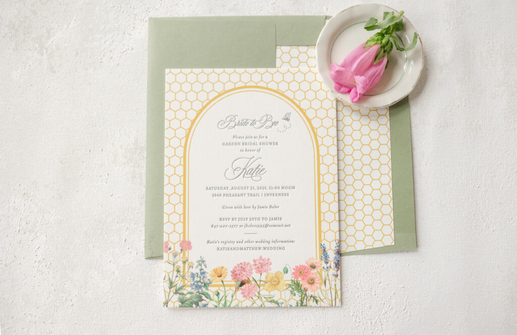
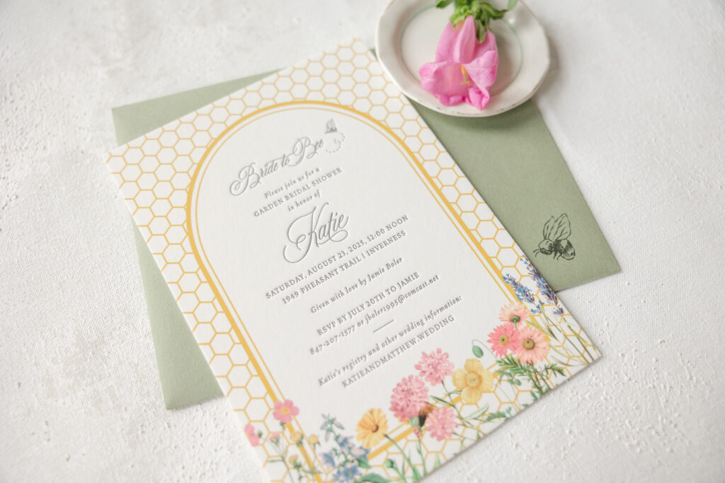
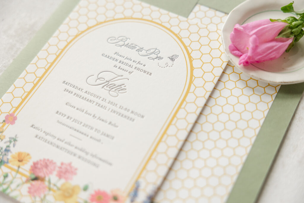
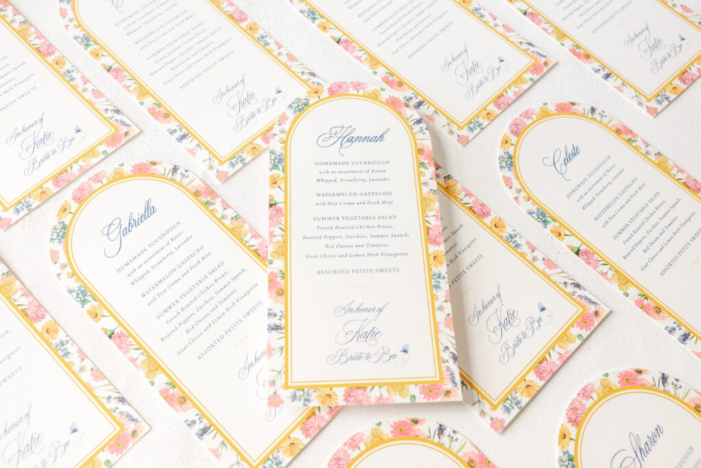
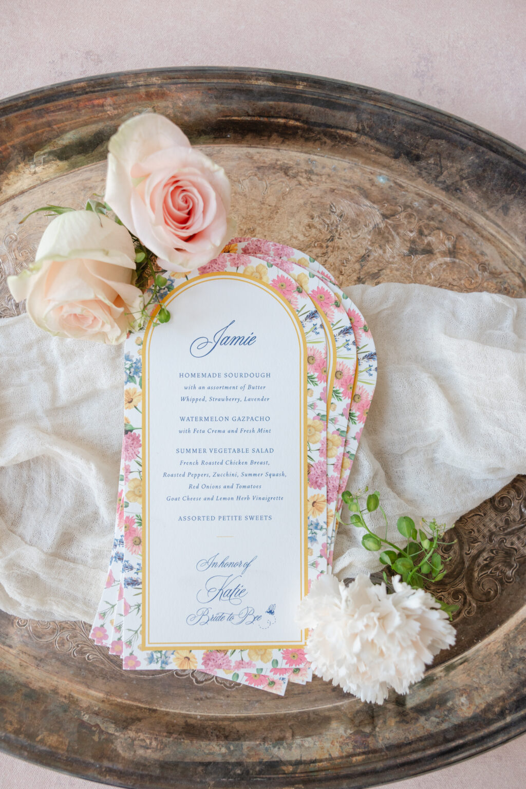
A sweet design with a touch of whimsy and a polished, refined edge has us enamored of these bridal party invitations. The coordinating menus are equally charming and feature a personalized touch for each guest. These invitations, celebrating the bride-to-be, came to us from our friends at Great Events.
A charming bee motif on the envelope’s exterior sets the tone for these garden party invitations. The honeycomb pattern grounds the design while adding a modern, geometric structure. The fresh and modern double-line arch border separates the background from the text, creating an airy, open feel. Soft florals along the bottom break up the crisp lines of the background and the rounded top of the border. The clever ‘bride to bee’ text and the bride’s name appear in a swooping script font that is both elegant and romantic and has a slightly vintage vibe.
The arch frame from the invite also appears on the menu, providing consistency between the printed pieces. This time, the garden-inspired floral artwork is transformed into a background. A die-cut shape mimics the border’s gentle curve. Each guest’s name is printed on the menu, allowing the card to serve as a placecard as well.
Invitation
digital inks: charcoal + goldenrod + cmyk
fonts: juliette script + vendetta
paper: bella smooth cotton 2-ply white
card size: a-7
envelope liner: custom pattern in goldenrod digital
envelope: spruce text
envelope addressing: charcoal digital on the front and the back
job: 77059
Menu
digital inks: royal blue + goldenrod + cmyk
fonts: vendetta ot light/light italic + bp juliette regular
paper: bella smooth cotton 1-ply white
card size: 4.5” x 9.19”
die cut shape: cd-216
job: 78116
Darling honeybee accents and floral flourishes give these garden party invitations a playful, nature-inspired look that is perfect for a bridal shower. Do you want to include accents on the envelope that offer a sneak peek of the design? Or day-of pieces that reflect the theme while also featuring a personalized touch? Work with one of our dealers to create your perfect bridal shower party invitations.
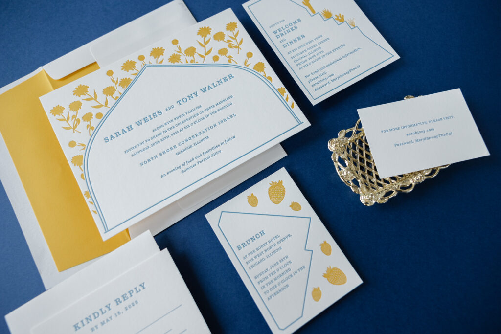
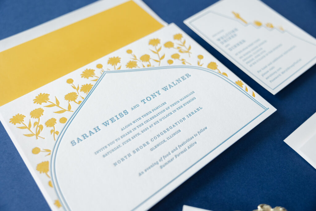
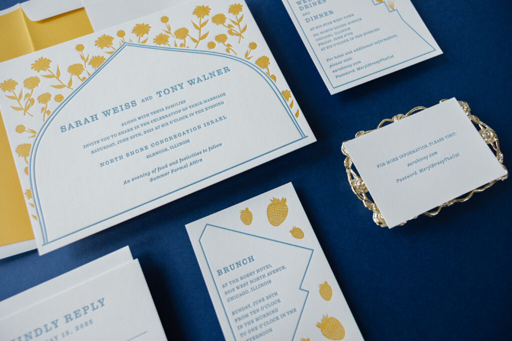
Sarah and Tony’s wedding invitation suite blends traditional wedding formality with contemporary design sensibility. The couple worked with our dear friend Colin from Pulp and Ink to create these modern heirloom wedding invitations.
Structured arches and framed panels nod to classic architecture and subtle Art Deco geometry, lending balance and ceremony to each piece. Each unique border represents the iconic and distinctive shapes of the buildings hosting the various events of the wedding weekend. This is a touching personal detail that makes the design extremely unique to the couple.
Invitation
letterpress inks: goldenrod + wedgwood
fonts: clarendon text
papers: smooth cotton white 2-ply
card size: f-8
envelope liner: goldenrod text (no printing)
envelope: white cotton text
envelope addressing: wedgewood digital on the front and the back
job: 75208
Reply Card
letterpress ink: wedgwood
fonts: clarendon text
papers: smooth cotton white 1-ply
card size: a-5
envelope: white cotton text
envelope addressing: wedgewood digital on the front
job: 75208
The pairing of our Goldenrod and Wedgewood letterpress inks feels elegant and airy, while carrying a sense of timelessness. The formal and relaxed serif font and generous spacing are refined and modern.
Welcome Card
letterpress inks: goldenrod + wedgwood
fonts: clarendon text
papers: smooth cotton white 1-ply
card size: a-2
job: 75208
Brunch Card
letterpress inks: goldenrod + wedgwood
fonts: clarendon text
papers: smooth cotton white 1-ply
card size: a-5
job: 75208
Website Card
letterpress ink: wedgwood
fonts: clarendon text
papers: smooth cotton white 1-ply
card size: 4” x 2.75”
job: 75208
The motifs across the invitation, welcome card, and brunch card are printed in a heavy flood of color, creating a decorative summer vibe with hints of old-world charm.
Are you interested in subtle details that elevate the design of your wedding invitations? Do you want something custom that showcases your love story? Work with one of our dealers to receive expert guidance and assistance to create truly memorable invitations.
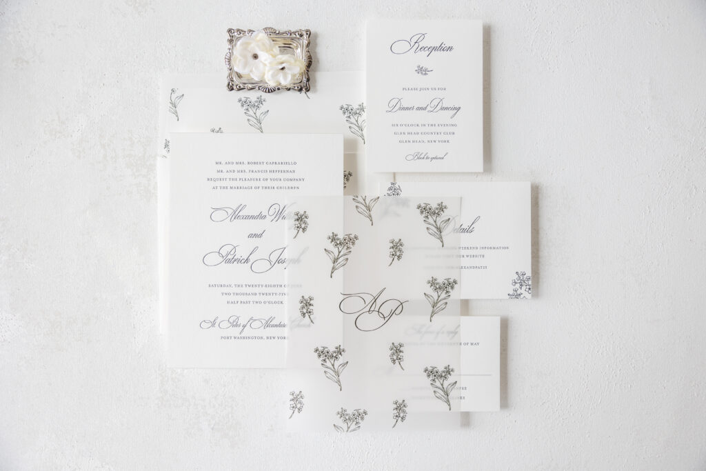
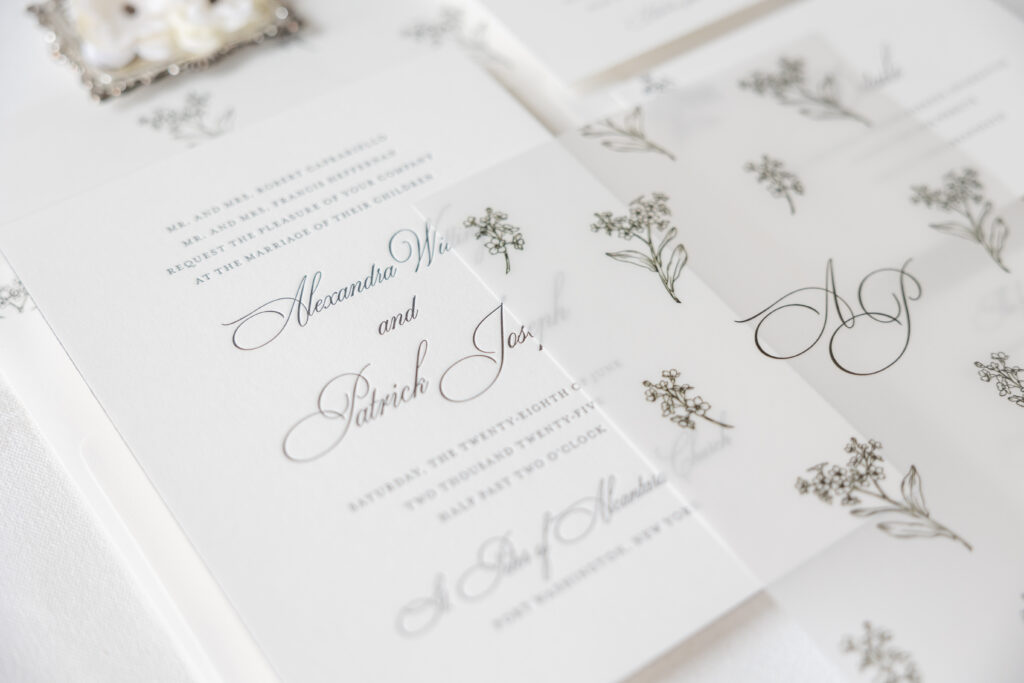
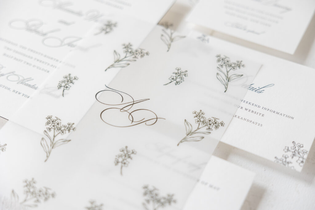
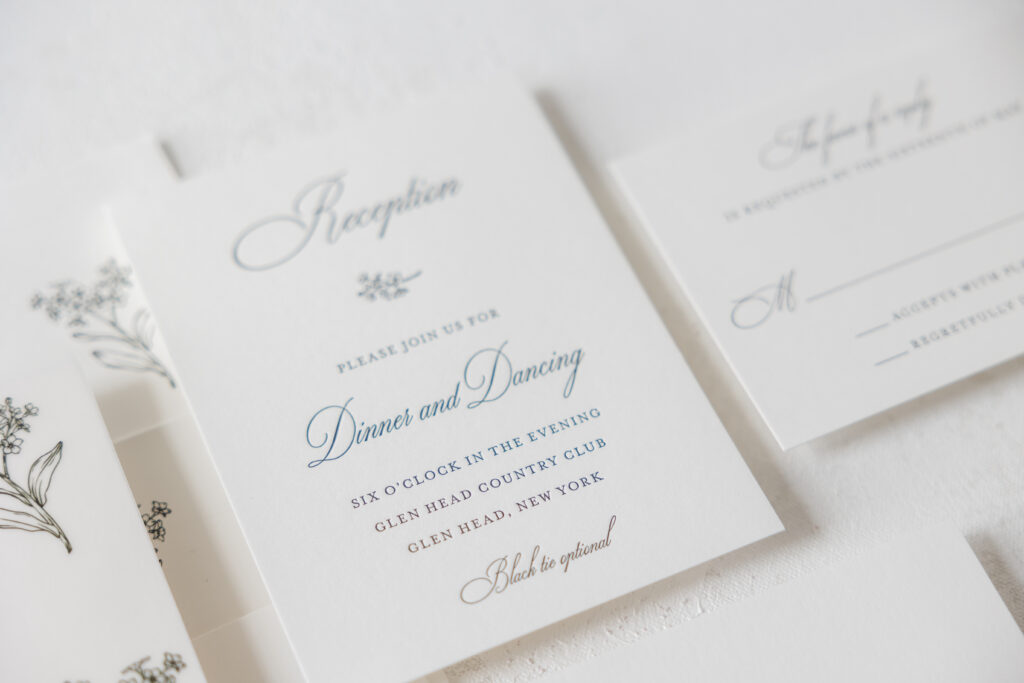
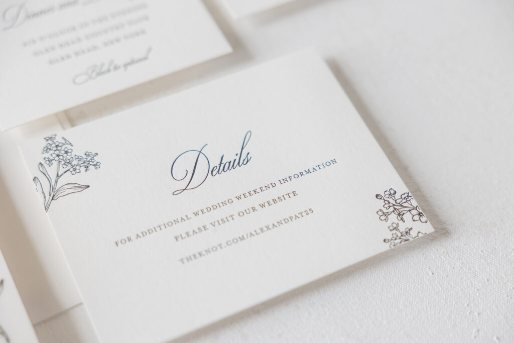
Alexandra and Patrick worked with our dear friends at Proper Notice to create their sophisticated letterpress invitations. This custom design is luxurious and stylish, and includes a lovely vellum overlay.
The elegant invitations are timeless. The traditional layout features the bride and groom’s names along with the venue in a flowing script font. Black letterpress lends the design a traditional and formal feel, while the 2-ply stock holds a deep and crisp impression.
Invitation
letterpress ink: black
fonts: ecatherina + mrs eaves
papers: bella smooth cotton 2-ply white
card size: f-8
edge paint: black
envelope liner: custom pattern digitally printed in black on white text
custom envelope: cotton text
envelope addressing: black digital on the back
job: 75254
Overlay
digital ink: black
font: ecatherina
papers: 40# vellum
card size: f-8
job: 75254
Reception Card
letterpress ink: black
fonts: ecatherina + mrs eaves
papers: bella smooth cotton 1-ply white
card size: a-2
custom envelope: cotton text
envelope addressing: black digital on the front
job: 75254
Reply Card
letterpress ink: black
fonts: ecatherina + mrs eaves
papers: bella smooth cotton 1-ply white
card size: a-5
job: 75254
Details Card
letterpress ink: black
fonts: ecatherina + mrs eaves
papers: bella smooth cotton 1-ply white
card size: a-2
job: 75254
The bride and groom’s initials appear in the same font on the vellum overlay. Custom floral artwork also adorns the overlay. The flower sprigs are repeated to create a completely unique pattern. The same pattern is replicated on the envelope liner. Floral accents on the details and reception cards add some whimsy and consistency across the invitation suite.
Are you thinking about creating a custom pattern or adding a vellum overlay to your letterpress invitations? We can help you make that happen. Contact us directly or work with one of our dealers to create your dream wedding invitations.
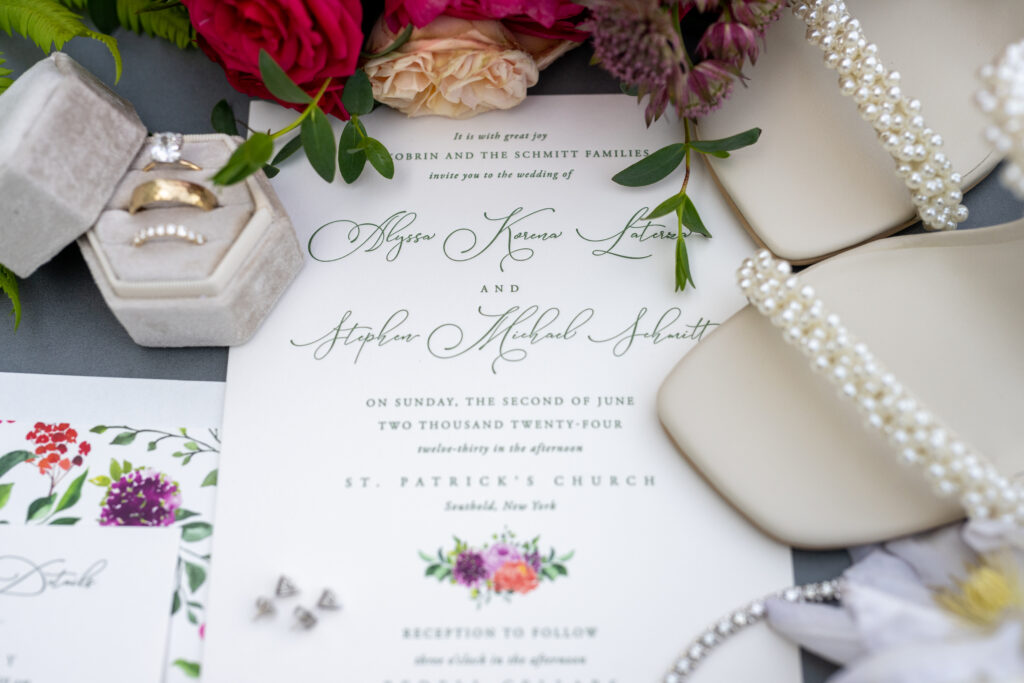
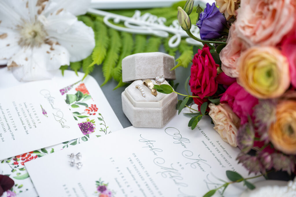
We had the pleasure of working with our friends at Arni Paperie to create a lovely wedding invitation suite for Alyssa and Stephen. Custom floral artwork gave the entire suite a cohesive feel and perfectly complemented the reception venue, the rustic yet palatial Bedell Cellars in Cutchogue, New York.
This wedding suite is entirely custom. The floral artwork of the liner is a custom pattern that adds a wow factor as guests open their invitations. The floral motif on the invitation features flowers from the liner to tie everything together. Our 2-ply smooth cotton paper shows the deep impression of the vine letterpress printing, including the delicate lines of the Sophia script font used for the bride and groom’s names.
It is always a delight to work with Mel of Arni Paperie. Best wishes to Alyssa and Stephen!
We have a wide array of envelope liner patterns, but do you have an idea for a custom pattern? Let us know, and our design team can help bring your dream to life!
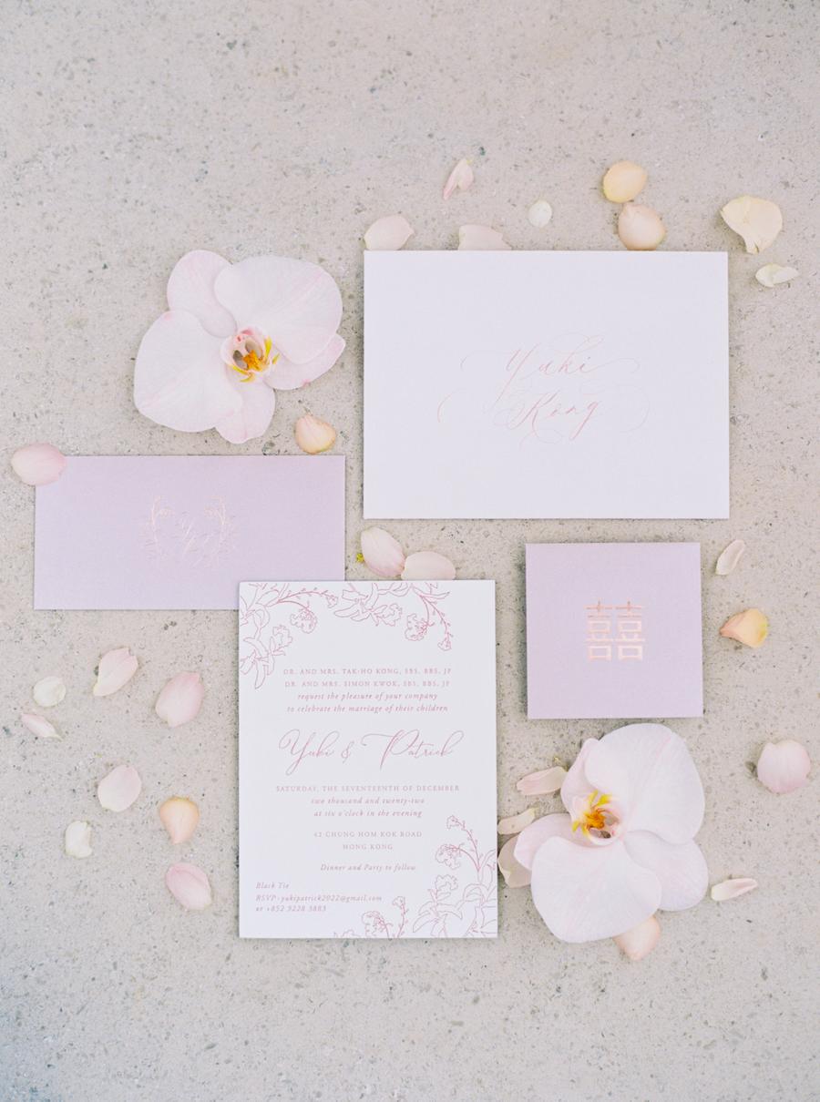
Featured in Style Me Pretty, Yuki and Patrick’s Hong Kong wedding overflowed with lovely floral arrangements and elegant details down to the invitations. Planned and designed by The Wedding Company Hong Kong, this wedding was romantic and timeless.
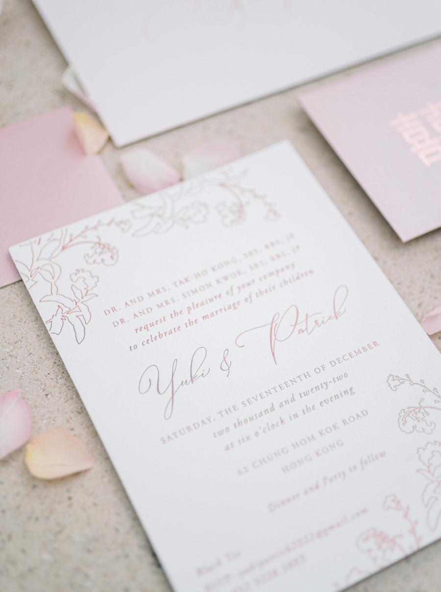
The monochromatic invitations and ceremony cards are printed on our Bella cotton 2-ply and feature quartz matte foil stamping for the text and floral accents. The script font used for the bride and groom’s names mimics the thin lines of the floral artwork. Both pieces are bilingual. English is on one side and Chinese on the other, as a way to include and honor the joining families. Double-sided printing is always a great way to address a bilingual guest list while also ensuring both cultures are represented.
The floral motif carried through to a vellum belly band to secure the cards together. Quartz matte foil edging provided even more glamour while maintaining consistency across the suite.
We always look forward to working with The Wedding Company Hong Kong and wish Yuki and Patrick the best! Do you want to create custom foil stamped invitations or how to design bilingual wedding invitations? Contact us to learn more!
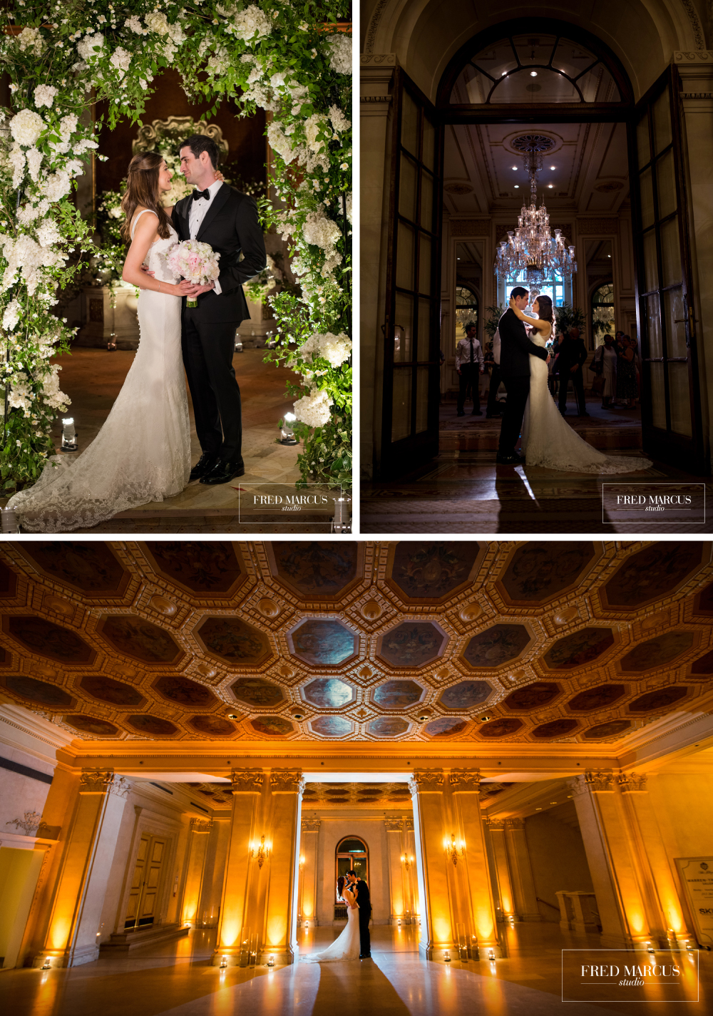
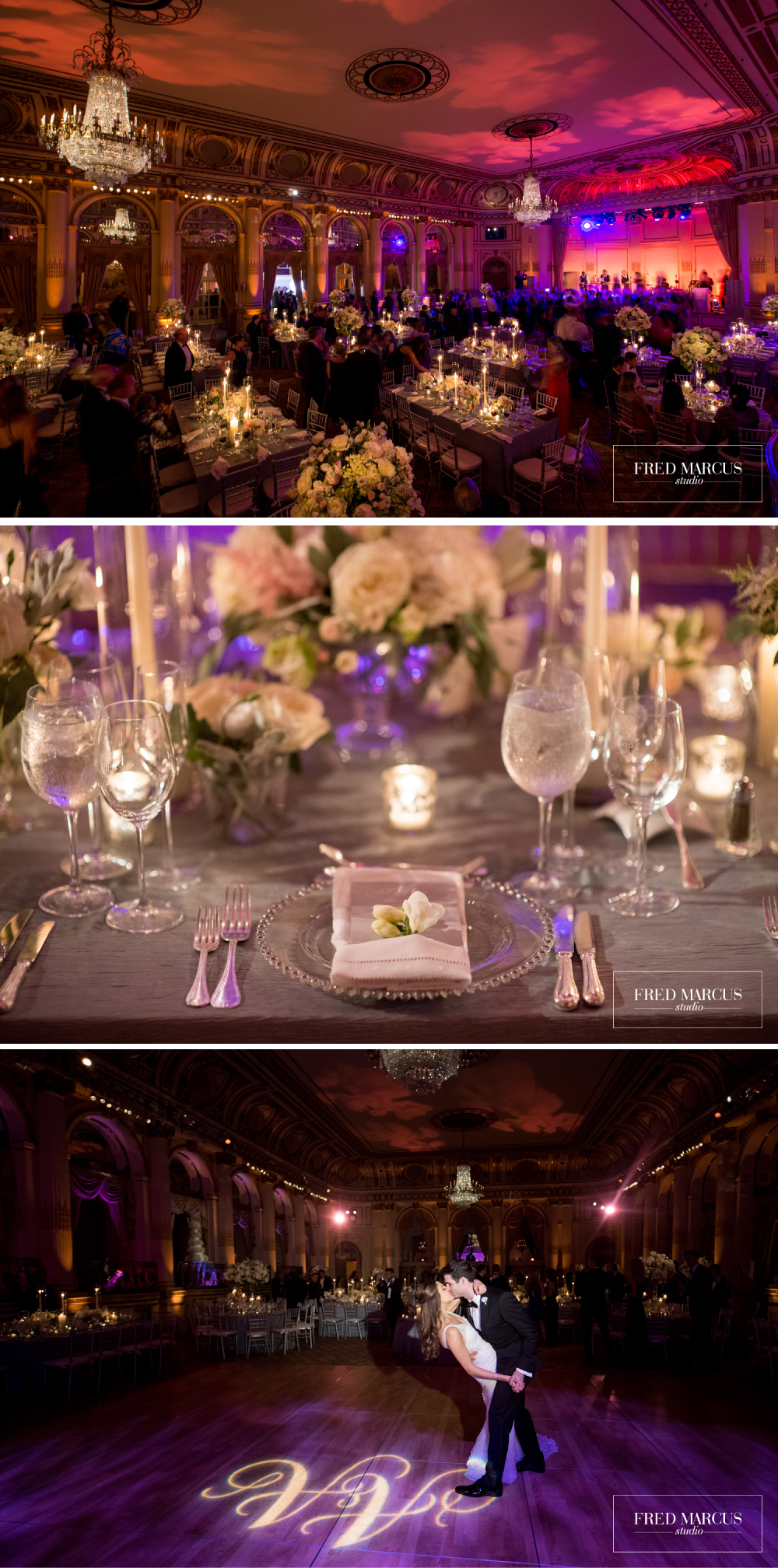
We had the pleasure of working with Alyssa and Andy to create their elegant wedding invitations featuring romantic floral accents and a subtle color palette. The couple chose our Tristan design which set the tone for a luxurious summer affair at The Plaza in New York City. Find out more about their big day below:
Can you share with us a bit about your wedding and the inspiration for the event?
I was really inspired by our venue. The Plaza felt so iconic, so I wanted all of the details to be really beautiful and classic without being stuffy. Because our wedding was in the spring, I was looking for a lot of flowers to give the room a lush and springtime feel. Our florist did an amazing job creating the look for the day with centerpieces that had a really loose, garden-like quality.
What advice do you have for couples currently planning a wedding?
It’s so easy to get stressed out by all of the details because planning a wedding is obviously a ton of work. So I would say the most important thing during planning is to enjoy the process and try not to take yourself too seriously. At the end of the day, everyone is going to have an incredible time and it really won’t matter if you went with the chocolate vs. caramel buttercream in your cake.
How did you choose your invitation design and ink colors?
Our wedding colors were blush and gray so we wanted our invitation to match that color scheme. We absolutely loved the faint pearl foil in the floral design because it looked so beautiful but understated and complemented the gray font perfectly. We also loved the silver belly band with our monogram to add a touch more color to the overall design.
What surprised you most about your wedding?
Everyone said that it would fly by, but for some reason I didn’t quite wrap my mind around just how quick the entire wedding would feel. It makes me even happier that we have amazing pictures and videos to help us relive that day.
What was your favorite moment?
My favorite moment was definitely the ceremony. There was something so special and unforgettable about marrying my best friend in front of a room full of our friends and family.
Favorite design element of your big day?
That’s a hard question because I love so many details of that day. I think I’d have to say that my favorite design element was my dress. It was custom made by Mark Badgley and James Mischka and they worked with me every step of the way to design my dream wedding gown down the delicate lace and teardrop shape of the train.
What’s next for the newlyweds?
After our wedding, we went on an amazing honeymoon in Italy going to the Amalfi Coast and Lake Como. We currently live and work in NYC and recently added a little puppy named Bailey to our family.