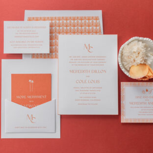
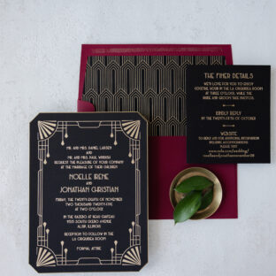
This invitation set is a masterclass in Art Deco glamour, with a subtle hint of sun-soaked California vibes. A back pocket adds function while adhering to the look. Meredith and Cole worked with our dear friend Judy of Papers Plus to design their bold Art Deco letterpress invitations.
Invitation
letterpress ink: persimmon
fonts: gotham + classico
paper: bella smooth cotton 2-ply bright white
card size: f-8
bevel edge: 45-degree
edge paint: persimmon
finishing: assemble with the back pocket
envelope liner: gatsby pattern in persimmon digital on bright white text
envelope: bright white cotton text
envelope addressing: persimmon digital on the back
job: 76597
Back Pocket
letterpress ink: persimmon
fonts: gotham + classico
paper: bella smooth cotton 1-ply bright white
card size: a-7 vertical back pocket
die-cut shape: ps-516
finishing: assemble with the invitation
job: 76597
Our persimmon letterpress ink is warm, especially when paired with our bright white Smooth Cotton paper. Our Smooth Cotton paper has a satiny feel and holds a striking letterpress impression. The typography is elegant and streamlined, blending refined lettering with crisp, modern spacing for an upscale look. A minimalist monogram adds a personalized, polished touch. Persimmon edge painting highlights the gentle slope of the beveled edge.
A geometric fan pattern for both the envelope liner and the border of the reception card perfectly embodies the Art Deco feel and creates consistency across the cards.
Reply Card
letterpress ink: persimmon
fonts: gotham + classico
paper: bella smooth cotton 1-ply bright white
card size: a-5
job: 76597
Reception Card
letterpress ink: persimmon
digital ink: cmyk
fonts: gotham + classico
paper: bella smooth cotton 1-ply bright white
card size: a-2
job: 76597
Merriment Card
digital ink: white
fonts: gotham + classico
paper: bella mesa 1-ply
card size: a-2
job: 76597
The merriment card is a fun twist on the design, since it flips the color palette and features white digital printing on our mesa 1-ply stock.
The darling monogram makes a second appearance on the back pocket, which is adhered to the back of the invitation. This pocket creates a spot to stash the auxiliary cards in the suite, ensuring a perfect presentation when guests open the envelope.
This bold Art Deco letterpress invitation suite evokes a retro, old-Hollywood charm and has us dreaming of stylish summer evenings and rooftop parties. Whether you want something vintage-inspired yet modern, or if you love the idea of a back pocket to secure additional cards, we can make it happen. Contact us or work with one of our dealers to create your dream wedding invitations.
We had the absolute pleasure of working with our friend Susie of First Impression on the design and printing of her daughter’s wedding stationery. Lovely design, velvet accents, and a charming floral motif carry throughout the various pieces. There were so many fun elements to Hannah and David’s wedding weekend, and we are proud to have been a part of it.
Invitation
letterpress ink: deep blue
fonts: branch + quiverleaf
paper: bella cotton 1-ply white / bella sky 1-ply / bella cotton 1-ply white / bella velvet french blue
size: f-8
bevel: 45-degree
finishing: duplex paper
envelope liner: supplied pattern blind emboss on french blue velvet
envelope: white cotton text
envelope addressing: deep blue digital on the front / deep blue letterpress + powder blue digital on the back
job: 77381
We already showcased the couple’s modern yet charming save the date, complete with a custom envelope liner featuring their beloved dog. The design of the invitation and day-of pieces picks up where the save the date left off, leaning into simplicity yet still feeling extravagant.
Mounting Card
paper: bella storm 1-ply
size: 4.81” x 6.44”
finishing: assemble with invite layers + belly band
job: 77381
Belly Band
deboss: blind
paper: bella velvet french blue
size: 1.75” x 8” flat, 1.75” x 6.5” assembled
finishing: assemble with mounting card + invite layers
job: 77381
The muted blue color palette ties all the pieces together, ranging from deep blue and powder blue letterpress inks to French blue velvet for the invite backer and envelope liner, and our Sky and Storm papers for the details card, place card, and welcome card, respectively. The soft blue hues are serene, romantic, and timeless.
The invitation design is formal and a perfect fit for the glamorous venue, The Century Club in Kansas City, Missouri. The generous layout is intentional and airy, setting the tone for the opulent but comfortable event. The use of a modern serif font for the names adds contemporary elegance, while a fun script font interjects some whimsy and personality, especially when mentioning the dress code.
The invitation is a staggering multi-ply card that features our cotton 1-ply white adhered to sky 1-ply, another layer of cotton 1-ply white, and finally, French blue velvet. The invitation also features a 45-degree bevel, and the alternating layers ensure a pop of blue is visible on the gently sloped edges.
Reply Card
emboss: blind
fonts: branch + quiverleaf
foil stamping: white matte
paper: bella storm 2-ply
size: sq-5
job: 77381
Shabbat Card
letterpress ink: deep blue + powder blue
fonts: branch + quiverleaf
paper: bella cotton 2-ply white
size: a-6
job: 77381
A mounting card secures a velvet belly band to the back of the invitation, providing a spot to hold the auxiliary cards. This ensures a neat presentation when guests remove the cards from the envelope. Blind debossing on the velvet belly band is decadent and further emphasizes the stock’s texture.
The whimsical floral pattern can be found throughout the suite, and the flower shape also appears on the escort cards.
Letterpress-printed stripes give the Shabbat Card a casual tone and distinguish it from the other cards. An elegant monogram on the front panel of the accordion fold details card further defines the refined aesthetic.
Accordion Fold Details Card
letterpress ink: deep blue
fonts: branch + quiverleaf
emboss: blind
paper: bella sky 1-ply
size: 4” x 4” folded, 4” x 16” flat
finishing: score
job: 77381
Program / Menu Cover
emboss: blind
paper: bella cotton 1-ply white
size: sq-6 folded
ribbon: 1.25” wide blue gray
finishing: score, 0.25” hole drill, and assemble with interior pages
Every part of this stationery suite, from the save the date to the invitation and day of pieces, is exquisite and luxurious, and also pleasantly charming and true to both the bride and groom and the special relationship they share. Thank you to Susie from First Impression for including us in such a special moment for your family and for working with us on this amazing wedding stationery.
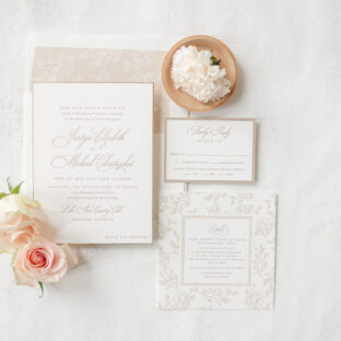
We can’t get enough of the warm, neutral color palette, sophisticated script font, edge beveling, and floral details of this gorgeous stationery suite. Jordyn and Michael worked with our dear friend Carolyn of Quintessence Fine Papers and Gifts to bring these understated letterpress wedding invitations to life. The style is elegant, romantic, and utterly stunning.
Invitation
letterpress ink: toast
fonts: ecatherina + galliard pro
paper: bella smooth cotton 2-ply white
card size: f-8
bevel: 45-degree
foil edge: mink matte
envelope liner: margaret pattern in khaki digital on white text
envelope: white cotton text
envelope addressing: toast digital on the front and the back
job: 75638
Toast letterpress ink evokes a warm, cozy feeling while still leaning into a subtle elegance. The look is gentle and almost ethereal, setting the perfect tone for the graceful, flowing script font. The grand flourishes of the ornate font elevate the design. A foil edge in mink matte enhances the bevel edging while maintaining the poised air of refinement.
Floral artwork for the envelope liner supports the romantic look. For the liner, the space between the flowers is printed to create the pattern in the void. The technique is reversed and transformed into a wide border for the details card, in which the flowers are printed to create the pattern.
Reply Card
letterpress ink: toast
fonts: ecatherina + galliard pro
paper: bella smooth cotton 1-ply white
card size: a-5
envelope: almond text
envelope addressing: toast digital on the front
job: 75638
Details Card
letterpress ink: toast
fonts: ecatherina + galliard pro
paper: bella almond 1-ply
card size: 6.19” x 4.56”
die-cut shape: bp-127
job: 75638
This custom design is lovely, and it’s always a joy to work with Quintessence Fine Papers and Gifts. Whether you want to customize one of our existing designs or create your own letterpress wedding invitations, work with one of our dealers for guidance and expertise throughout the process.
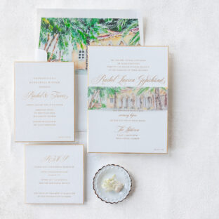
These invitations blend refined luxury with breezy tropical charm. The invitations are classic and opulent, while the belly band and envelope liner lend the entire invitation suite an elevated, tropical estate elegance. Rachel and Trevor worked with our dear friend Diane of Sincerely Yours Diane.
Invitation
foil stamping: gold matte
fonts: mozart script + mrs eaves
paper: bella smooth cotton 3-ply white
card size: f-8
bevel: 45-degree
foil edge: gold matte
envelope liner: supplied pattern in cmyk
envelope: white text
envelope addressing: black digital on the front and the back
job: 73082
Belly Band
digital ink: cmyk
paper: 40# vellum
size: f-8 vertical belly band (1.75” x 13.25” open, 1.75” x 6.24” closed)
job: 73082
The crisp, minimal layout is clean and airy. The flowing script font features extravagant flourishes to emphasize the couple’s names and key details. The gently sloping bevel edges are formal and sophisticated, perfect for a black tie wedding, while gold matte foil accents the bevel, highlighting the angle. The reply card and rehearsal dinner invitation closely follow the same design for a cohesive feel across the entire suite.
Rehearsal Dinner Invitation
foil stamping: gold matte
fonts: mozart script + mrs eaves
paper: bella smooth cotton 2-ply white
card size: 4.69” x 6.25”
bevel: 45-degree
foil edge: gold matte
job: 73082
Reply Card
foil stamping: gold matte
fonts: mozart script + mrs eaves
paper: bella smooth cotton 2-ply white
card size: sq-5
bevel: 45-degree
foil edge: gold matte
job: 73082
A lush custom watercolor illustration of the wedding venue, The Addison, appears on the envelope liner and the belly band. The warm-toned artwork is soft and creates a painterly, destination feel while providing guests a sneak peek of the grand estate. The sun-washed artwork sets a golden hour vibe and personalizes the overall suite, making it unique to this couple and their wedding.
Work with one of our dealers to create the perfect invitations for your wedding, whether you want something with tropical estate elegance or mountain chalet charm, or anything in between.
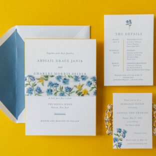
Delicate botanical illustrations paired with a springtime-inspired color palette and an elegant, stately design made us fall in love with these invitations. The couple, Abigail and Charles, worked with our dear friend Laura of Fine Lines of Katonah to customize our Burklyn design for their special day.
Invitation
letterpress ink: chambray
font: baskerville
paper: bella smooth cotton 2-ply white
size: f-8
bevel: 45-degree
edge paint: goldenrod
envelope liner: storm text (no printing)
envelope: white cotton text pointed flap
envelope addressing: deep blue digital on the back
job: 75419
Belly Band
letterpress ink: chambray
digital ink: cmyk
paper: 40# vellum
size: size: f-8 vertical belly band (1.75 x 13.25 open, 1.75 x 6.24 closed)
job: 75419
The typography is elegant and formal. Even the beveled edges give the invitation a traditional feel, but edge-painting the 45-degree bevel in our goldenrod ink adds color and a fun sense of whimsy. Edge painting also helps the bevel edges stand out.
The floral pattern on the belly band was created especially for this invitation and is composed of the blue flower motif from the inspiration design suite and the yellow flower motif, which is part of our available artwork. We can create patterns using our existing motif library or based on your direction. Do you want a flower that isn’t part of our collection? Or do you want to change the color or remove leaves from one of our existing floral motifs? Let us know.
The floral accent on the rehearsal dinner invitation gives the card a bit more of a casual feel, but it’s still lovely. The details card has a slight modern feel, thanks to the vertical line digitally printed in goldenrod that separates the dates from the events. The floral artwork at the top and the edge painting tie the overall design to the other pieces.
Rehearsal Dinner Invitation
letterpress ink: chambray
digital ink: cmyk
font: baskerville
paper: bella smooth cotton 1-ply white
size: a-5
edge paint: goldenrod
job: 75419
Details Card
letterpress ink: chambray
digital inks: goldenrod + cmyk
font: baskerville
paper: bella smooth cotton 1-ply white
size: 4.25” x 6”
edge paint: goldenrod
job: 75419
It’s the kind of wedding suite that feels just as perfect for a vineyard or lakeside venue as it would for an estate or backyard affair. The look is elevated, timeless, and deeply romantic. Do you want to include bevel edges or a custom pattern in your dream invitations? You can work with us or one of our dealers to create your perfect invitation design!
Meghan and Maxwell worked with our dear friend Rachel of Bering’s to design their traditional foil-stamped wedding stationery, befitting a black-tie affair. These invitations are elegant and timeless, and feature some whimsical detailsm including a bevel edge in foil, to elevate the overall look.
Invitation
foil stamping: gold matte
fonts: juliette + vendetta
papers: bella cotton 2-ply white
card size: f-8
bevel: 45-degree
foil edge: gold matte
envelope liner: elidge pattern digitally printed in mineral + cmyk on white text
envelope: white cotton text pointed flap
envelope addressing: antique gold digital on the front and the back
job: 75327
Belly Band
foil stamping: mineral + cmyk
papers: 40# vellum
card size: f-8 vertical belly band (1.75” x 13.25” open, 1.75” x 6.24” closed)
job: 75327
The typography has a refined feel, thanks to the serif and script fonts. Gold matte foil lends the design warmth and a sense of luxury. The invitation has a 45-degree bevel edge, gilded in matte gold foil. The use of foil highlights the crisp lines and slope of the bevel.
The reply card and reception card have the same sense of understated luxury. The thick foil-stamped borders frame the text and create consistency between these cards. To add interest, the foil border on the reply card runs along the edge. On the reception card, the foil border is set within the edge of the card.
A soft floral pattern on the belly band and envelope liner balances the formality of the design. Muted colors and delicate roses surrounded by butterflies are romantic and whimsical. The pattern lends the design a dreamy element.
Reception Card
foil stamping: gold matte
fonts: juliette + vendetta
papers: bella cotton 1-ply white
card size: a-6
job: 75327
Reply Card
foil stamping: gold matte
fonts: juliette + vendetta
papers: bella cotton 1-ply white
card size: a-2
job: 75327
A custom monogram lends the belly band some personal flair. The interlocking double ‘M’ monogram represents the couple, Meghan and Maxwell. This personal detail is unique and a lovely display of the couple.
The design is thoughtfully composed. All the details work together to create wedding stationery that is elegant yet personal. It is always a joy to work with Bering’s. Our dealers are highly skilled and can assist you throughout the design process, helping you create the wedding stationery of your dreams.
These custom invitations feature a classic and refined style. The distinctive oval shape adds a touch of uniqueness while maintaining a timeless elegance. The look is traditional, luxurious, and completely bespoke. The couple, Olivia and Franklin, worked with our dear Dorothy of Dorothy McDaniel’s Flower Market to create these oval engraved wedding invitations.
Engraving is a time-honored print method that involves pressing the paper into an etched metal plate to create a raised impression. It is historic and elegant. The use of engraving for this invitation in a script font and metallic silver ink is beautiful, sophisticated, and formal. The edges are beveled at 45º and then edge-painted in metallic silver to perfectly match the printing. Both of these embellishments add an understated opulence. Our 3-ply cotton paper is thick and luxurious, introducing a subtle texture. The paper displays a crisp impression and showcases the flourishes of the script font.
Invitation
engraving ink: metallic silver
fonts: aston script
papers: bella cotton white 3-ply
card size: f-8 oval
bevel: 45º
edge paint: metallic silver
envelope liner: metallic silver text
envelope: white cotton text 6.5” x 8.63” assembled, 11.5” x 20.13” flat (die #e-236)
envelope addressing: shale digital on the front and the back
job: 75030
The reply card keeps things straightforward and features metallic silver engraving. The same script font appears as an accent, while the majority of the text appears in a serif font. The envelope is custom-made to fit the large, oval invitation and features a simple metallic silver liner that complements the invitation and reply card.
Reply Card
engraving ink: metallic silver
fonts: aston script + addington
papers: bella cotton white 2-ply
card size:a-5
envelope: white cotton text pointed flap
envelope addressing: shale digital on the front
job: 75030
Overall, this wedding invitation is elegant and traditional, and is perfect for a black-tie celebration. Create your own timeless engraved wedding invitations or include elegant details like beveling and edge painting to take your invitation to the next level. Work with one of our dealers to create your perfect custom invitations.
We could gaze at this invitation set and take in the lovely details all day. This charming hand calligraphy letterpress wedding invitation was brought to us by our dear friend Kristyn and her team at Oliver’s Twist. This invitation is a customization of our Burklyn design, and a great example of how you can use our designs as a starting point to create something truly spectacular.
Laura and Leo changed the invitation to a horizontal orientation and swapped engraving with letterpress in their interpretation of this design. The couple also chose our Quinn hand calligraphy for their names and the ceremony location. Hand calligraphy is always unique and custom, and it’s a great way to add a personal touch to an invitation. The edge of the invitation is beveled at a 45-degree angle and then edged in gold shine foil. The sparkle of the foil adds a hint of glamour and makes the bevel edge stand out.
Invitation
letterpress ink: vine
fonts: archer + quinn hand calligraphy
paper: bella smooth cotton white 2-ply
bevel: 45-degree
foil edge: gold shine foil
size: f-8
envelope: holly text
envelope liner: custom burklyn pattern in cmyk
envelope addressing: digital addressing in white
Job #66220
Reply Card
digital: vine + cmyk
paper: bella smooth cotton white 1-ply
size: a-5
envelope: holly text
digital envelope printing: digital return address in white
Reception Card
digital: vine + cmyk
paper: bella smooth cotton white 1-ply
size: a-5
Website Card
digital: vine + cmyk
paper: bella smooth cotton white 1-ply
size: no. 17
Do you have a vision for our Burklyn design? Or one of our other designs? Are you interested in creating a hand calligraphy letterpress wedding invitation? Let us know what you envision, and we can help, or you can work with one of our talented dealers to create your dream invitations.
A dreamy color scheme and plenty of flowers set the perfect tone for Lauren and Mitchell’s wedding. This Brooklyn duo worked with Ashley Douglass Events, and the highly skilled and talented Ashley took care of all the details to create an intimate and unforgettable event. See all of the luxurious details, including the ombre invitations, in the feature on Carats & Cake.
The first thing guests noticed about the invitations was the digitally printed vellum gatefold. The bold floral pattern stood out, providing guests a preview of the florals they would see at the ceremony and reception. The gatefold was secured with a decadent silk ribbon. Once opened, the gatefold revealed the classic and yet whimsical invitations. Ombre letterpress printing transitioned from bright pink to persimmon. The beveled edges were painted in coordinating colors that followed the same fade from one color to the other.
Invitation
Base design: custom
Letterpress: bright pink + persimmon
Paper: white smooth cotton 2-ply
Bevel: 45 degrees
Edge treatment: ombre edge paint in bright pink to persimmon
Card sizes: F-8
Liner: CMYK process (custom supplied pattern)
Envelope: white pointed flap
Digital addressing: bright pink
Customization: Job #69386
Gatefold Wrap
Base design: custom
Digital: CMYK process
Paper: 40# vellum
Size: F-8 vertical gatefold
Printing notes: Scored
Embellishments: mother of pearl silk ribbon
Customization: Job #69386
All of the day-of pieces, from the programs and escort cards to the personalized menus, are in the same bright yet refined colorway.
Program
Base design: custom
Digital: bright pink/bright pink
Paper: white smooth cotton 1-ply
Card sizes: 10.5 x 8.5 flat 5.25 x 8.5 folded
Printing notes: scored
Customization: Job #71256
Escort Cards
Base design: custom
Digital: bright pink/bright pink
Paper: white smooth cotton 1-ply
Card sizes: No. 17
Customization: Job #71256
Menu
Base design: custom
Letterpress: persimmon
Digital: bright pink
Paper: white smooth cotton 1-ply
Card sizes: No. 10
Customization: Job #71256
The charming bar sign displayed the couple’s signature cocktails and custom artwork for a personal touch.
Bar Sign
Base design: custom
Digital: bright pink + CMYK process
Paper: white smooth cotton 1-ply
Card sizes: 8 x 10
Customization: Job #71256
It was a joy to create these colorful ombre invitations, and it was exciting to see how all the printed pieces fit into Lauren and Mitchell’s special day!
We had the pleasure of printing this stunning suite from our friends at Soirée Signatures in Mobile, Alabama. A 3-ply, double-sided, beveled invitation was slipped into a custom embossed pocket panel with a cut-out to highlight the couple’s duogram digitally printed on the reverse side of the invitation. The attention to detail is remarkable and truly showcases the talent behind these custom-designed pieces.
Even the menus received the luxury treatment, die-cut into custom shapes. Everything about this invitation suite is custom. The event was a special day full of so many beautiful moments and items, and we are honored to have played a part in creating some of the beauty.
We love seeing our clients’ ideas come to life! All of our designs can be customized to fit your vision, even creating your own design. Contact us to learn more and create a one-of-a-kind wedding invitation.