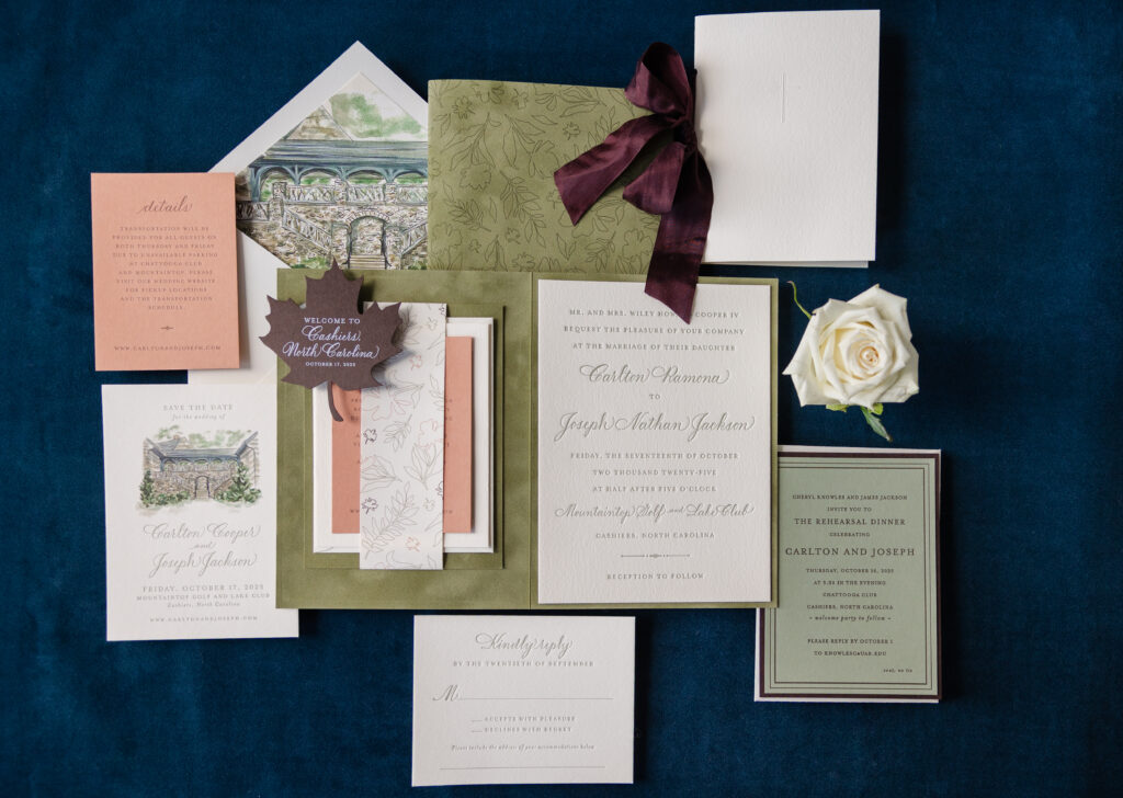
From the save the date to the day-of pieces, we were so happy to be part of creating Carlton and Joseph’s wedding stationery. The couple worked with our dear friend Mary of Mariee Ami on this romantic fall wedding invitation suite complete with so many charming details. Seriously, there is so much color and texture, and the muted, earthy palette is sophisticated and on point for this autumn wedding.
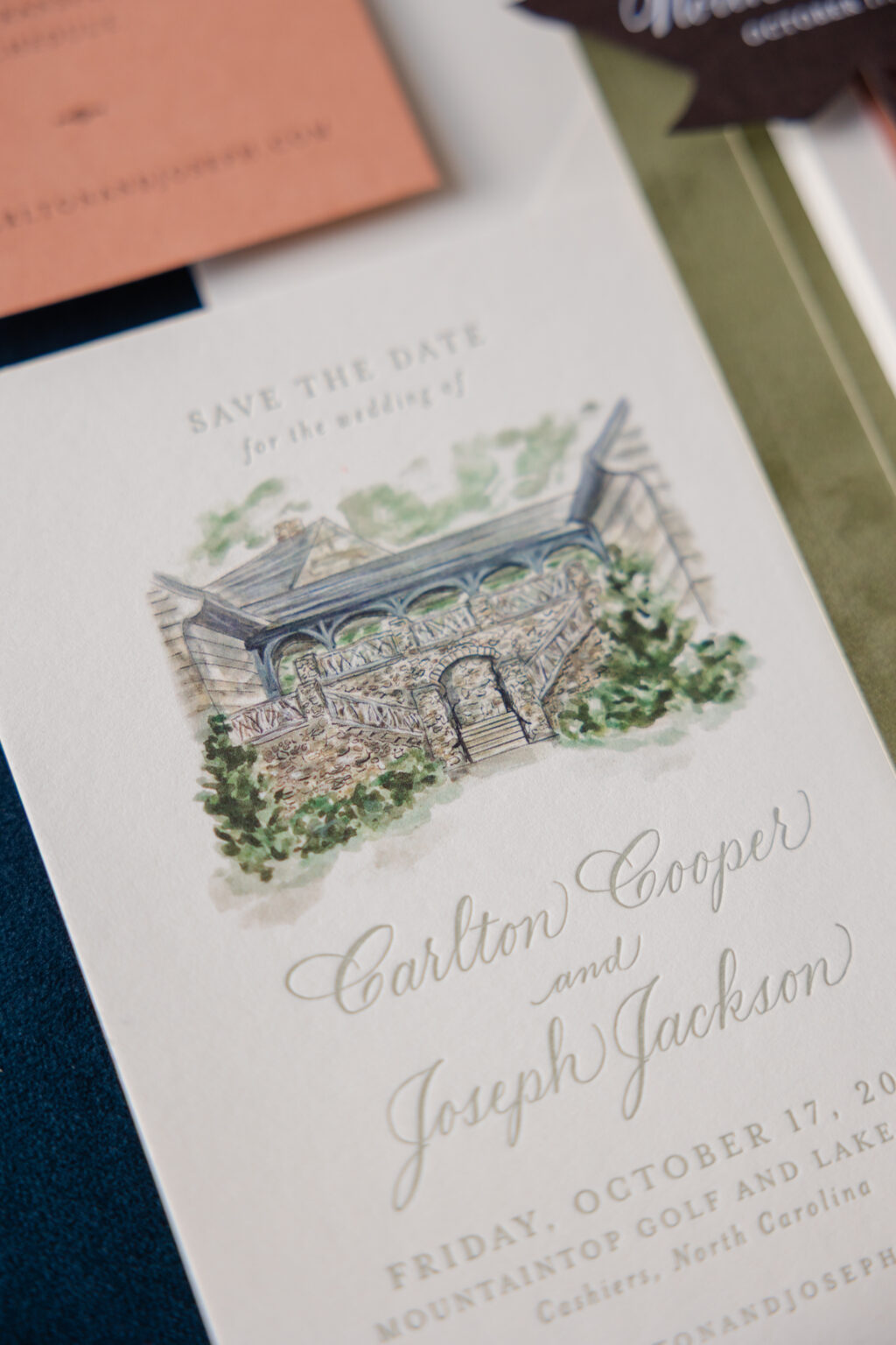
Save the Date
letterpress ink: spruce
digital ink: cmyk
fonts: supplied
paper: bella smooth cotton 1-ply ivory
card size: a-6
envelope: supplied
envelope addressing: ivory digital on the front and the back
job #: 76841
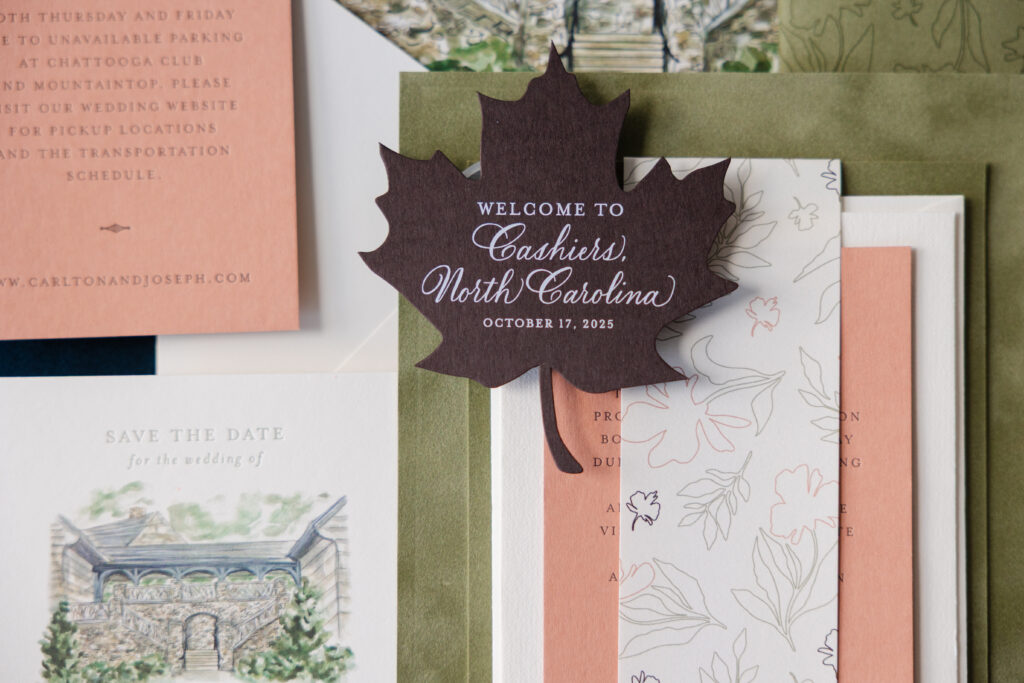
If you love venue artwork, then you have to take a look at their save the date. A stunning watercolor-inspired illustration of the venue sets the tone. Letterpress printing in our spruce ink perfectly complements the digital printing on the venue artwork.
finishing: duplex mounting card layers together with belly band and mount to inside left of folder
job #: 78011
Belly Band
digital ink: cmyk
paper: bella text ivory
size:8.5” x 2”
finishing: assemble with mounting card
job #: 78011
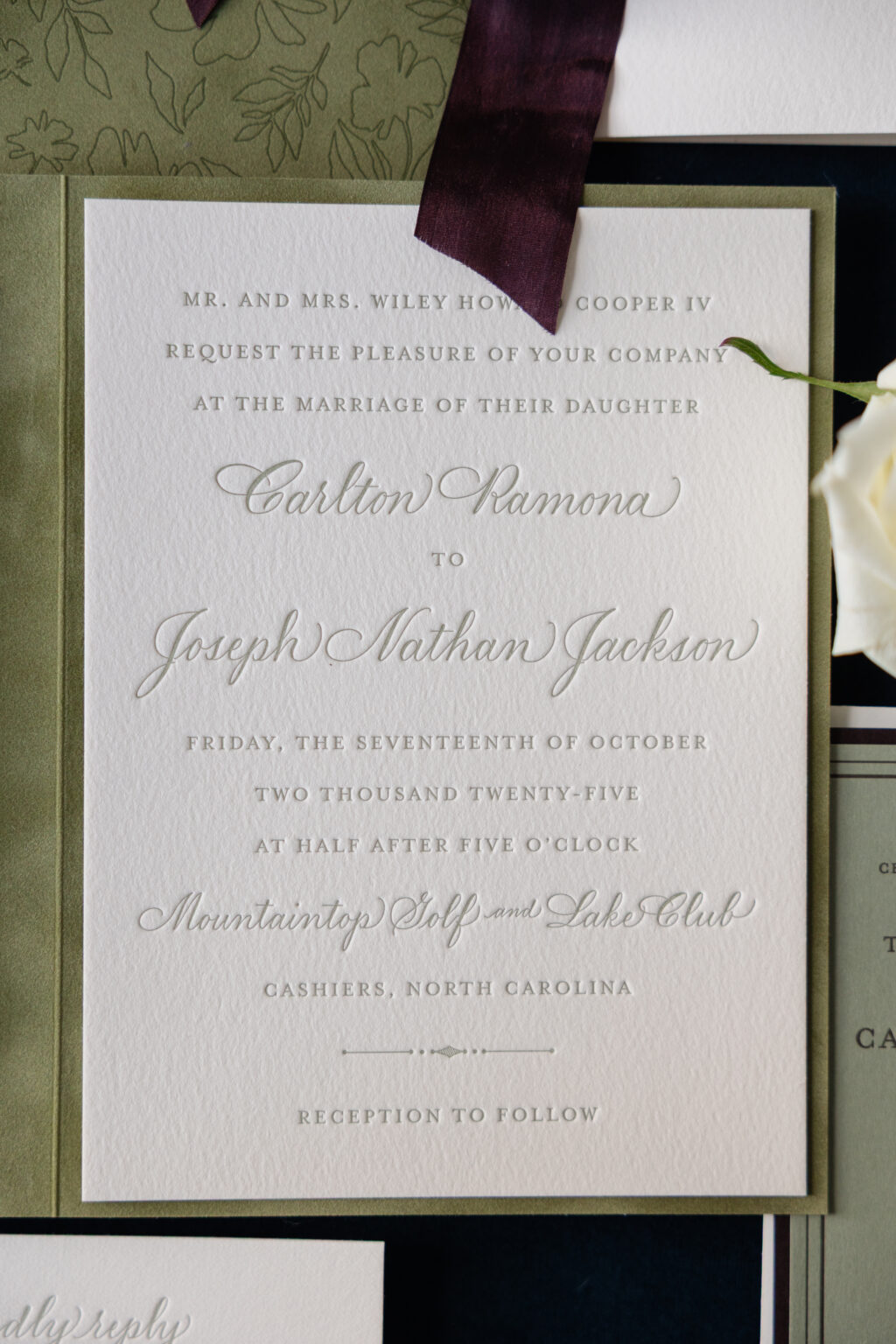
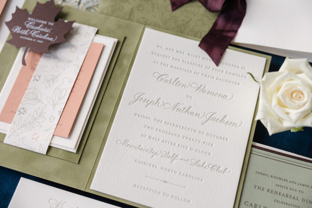
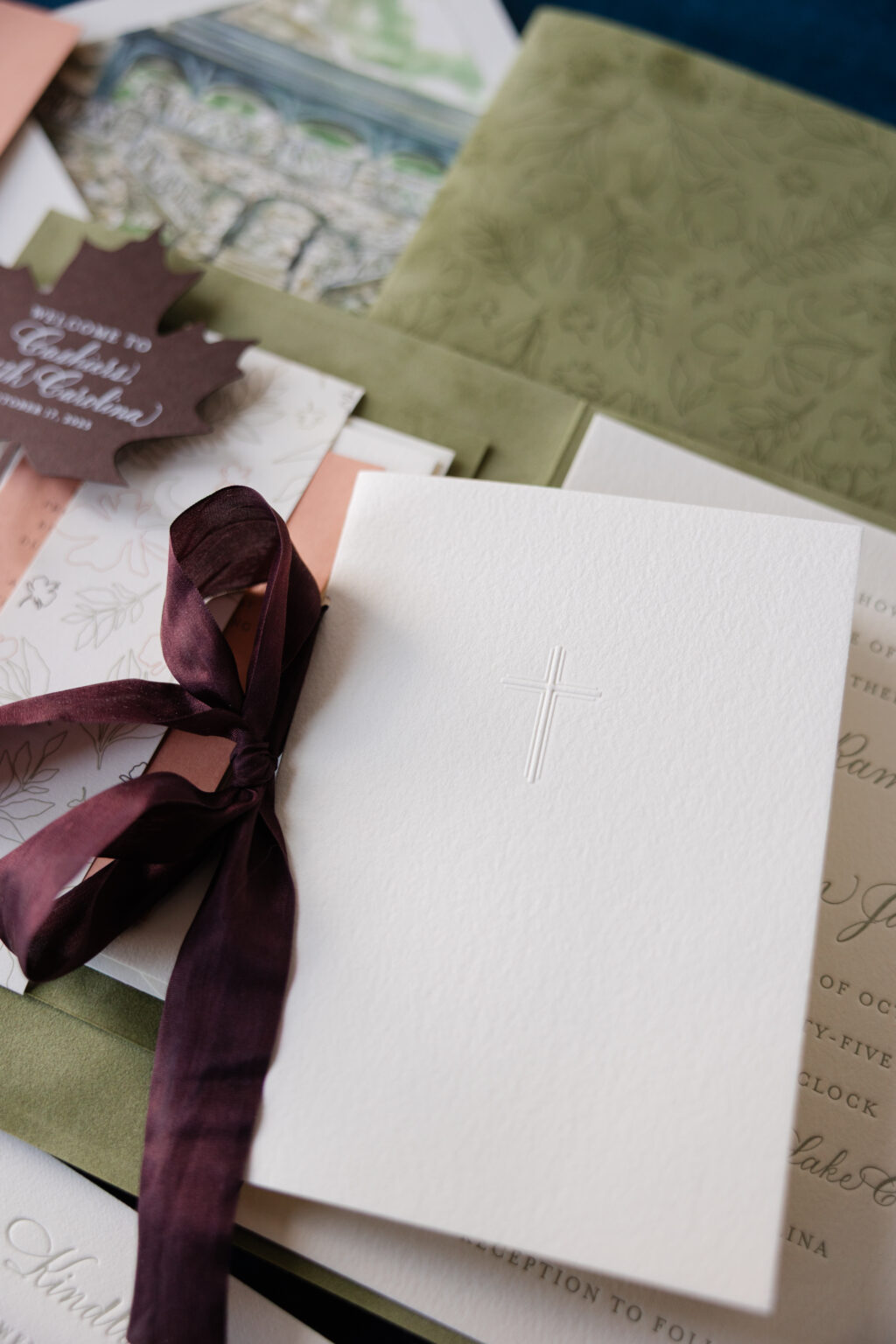
The invitation is traditional and polished. Refined serif lettering is paired with elegant, flowing calligraphy for the couple’s names, creating a formal look. The invitation is secured inside a custom folder, inspired by our Royce design. The opposite side features a belly band to secure the details and reply cards. Decadent velvet gives the folder a tactile element. Charming botanical artwork adorns the exterior, adding softness and a whimsical feel while tonal printing is subtle, but impactful.
card size: 4.31” x 5.94” (front) / 4.56” x 6.19” (back)
envelope: spruce text pointed flap
envelope addressing: espresso digital on the front and the back
job #: 78421
Details Card
letterpress ink: espresso
fonts: supplied
paper: supplied
card size: a-5
job #: 78011
Reply Card
letterpress ink: spruce
fonts: supplied
paper: bella cotton 1-ply ivory
card size: a-2
job #: 78011
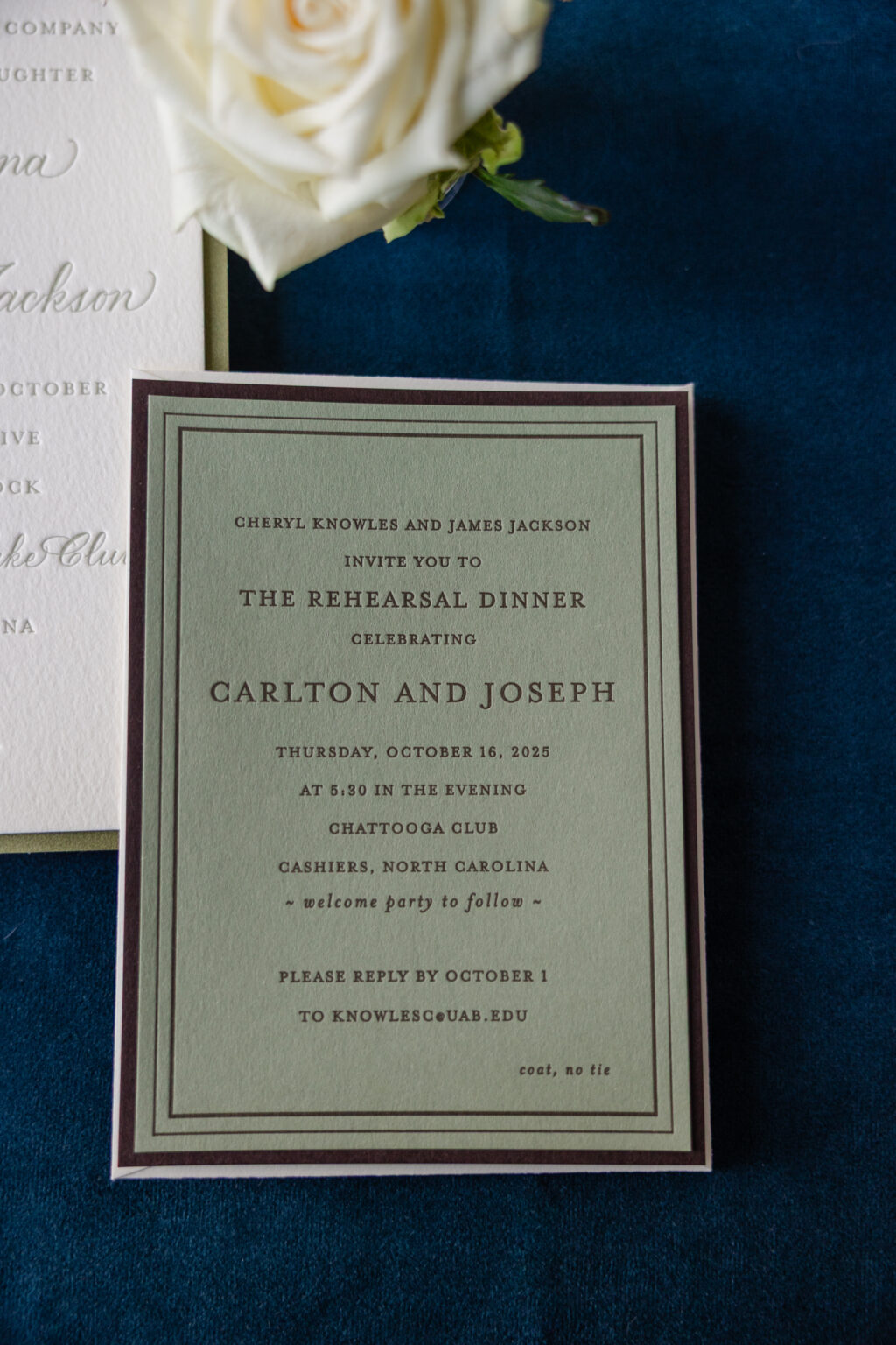
The rehearsal dinner invitation is equally lovely. This card features our Bella spruce stock for the front and our walnut stock for the back. The back card is slightly larger, so when the cards are duplexed together, the walnut paper perfectly frames the spruce stock, adding texture and dimension.
Program Cover
emboss: blind
paper: bella cotton 1-ply ivory
size: a-6 folded
ribbon: supplied
finishing: hole drill (3/16”) / assemble with program insert pages and ribbon
job #: 79116
Program Page
digital inks: spruce (front) / spruce (back)
paper: bella ivory text
size: a-6 folded
finishing: hole drill (3/16”) / assemble with program cover and supplied ribbon
job #: 79116
Tag
digital ink: white
paper: bella walnut 1-ply
card size:3.5” x 4”
die-cut shape: cd-398
job #: 79116
Would you love to feature a folder in your wedding stationery design? Or do you like the look of a larger backer card for an invitation? Whatever you dream up for your romantic fall wedding invitation, we can help make it happen. Work with one of our dealers to get started.
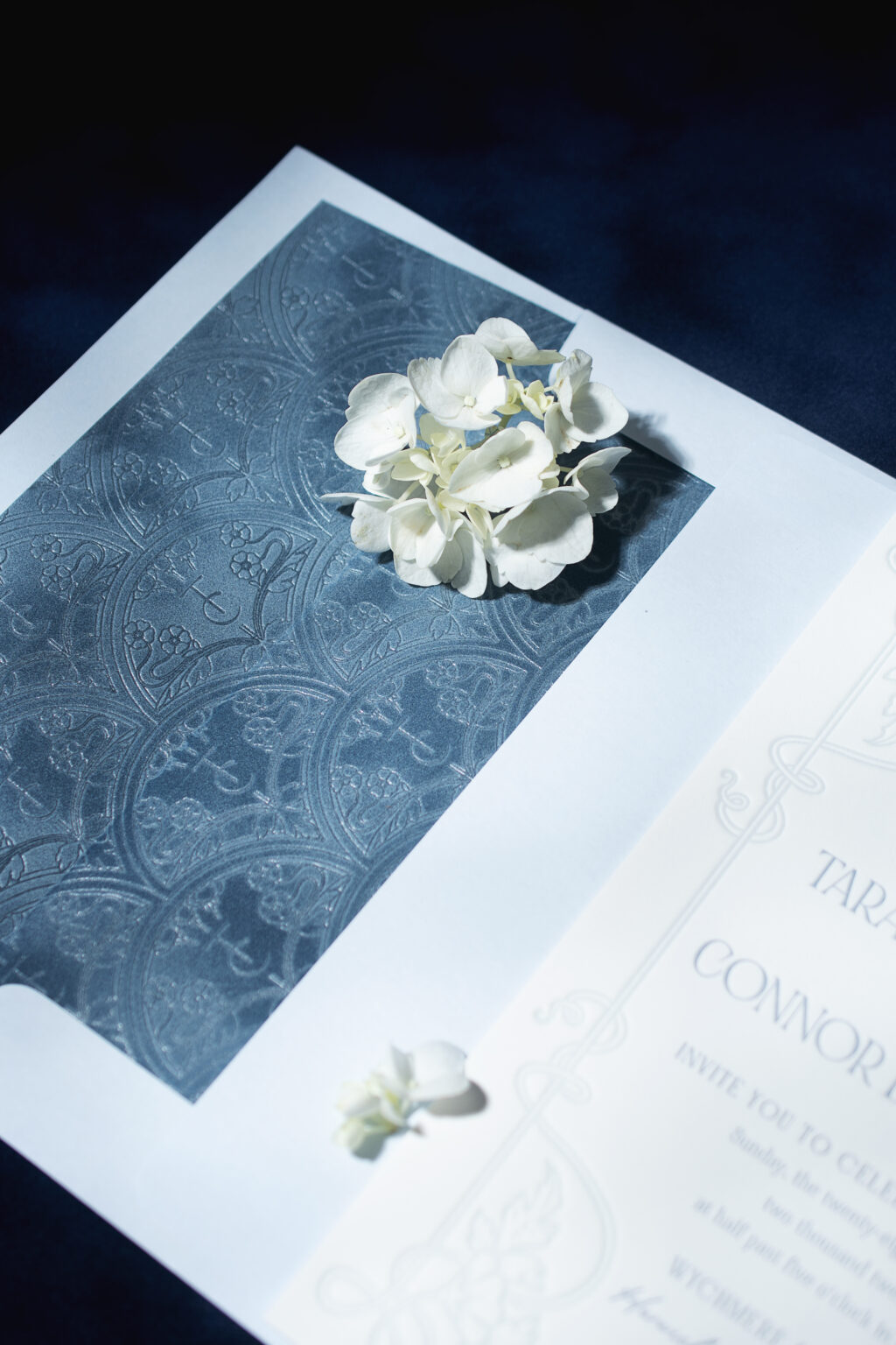
Art Nouveau refinement with a coastal flair ensures Tara and Conner’s ornate invitations, featuring a foil-stamped envelope liner, stand out for all the right reasons. This couple worked with our friend Colleen of Pen and Paper to customize our Matilde design for their summer wedding.
Invitation
letterpress inks: chambray + powder blue
font: noir et blanc regular + bigilla
papers: bella smooth cotton 2-ply white
card size: f-8
envelope liner: custom matilde monogram pattern foil-stamped in clear shine on french blue velvet
outer envelope: sky text
envelope addressing: yale digital on the front and the back
job: 77575
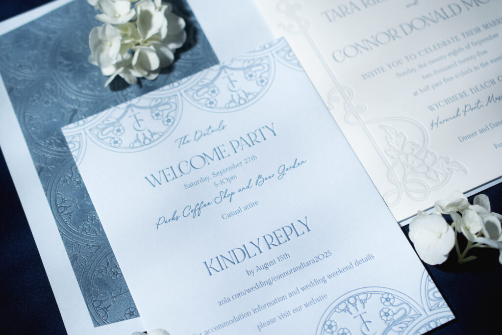
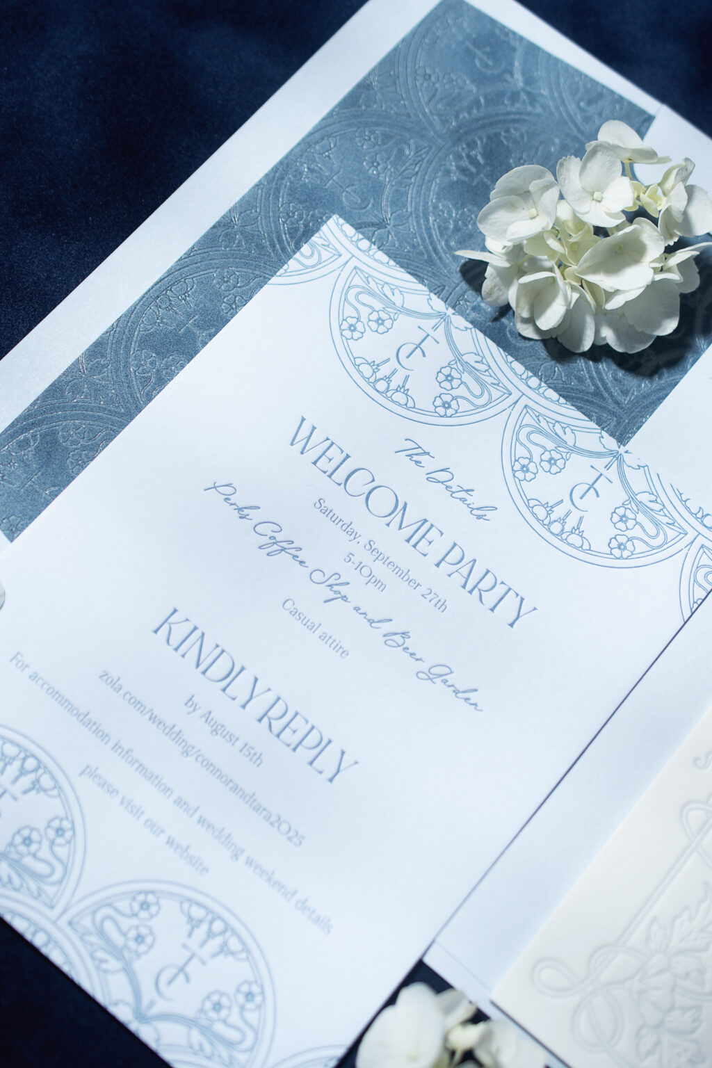
Details Card
letterpress ink: chambray
font: noir et blanc regular + bigilla
papers: bella sky 1-ply
card size: a-7
job: 77575
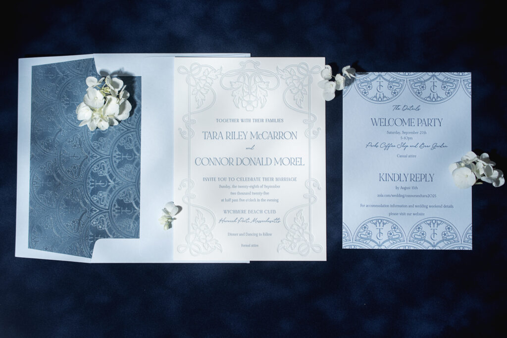
The scrolling frame surrounding the text has an organic, natural feel. Floral artwork elevates the look, creating an Art Nouveau vibe. Chambray letterpress ink introduces a muted coastal element, fitting for a wedding held in Cape Cod.
Tara and Conner’s details card borrows heavily from the original welcome party card, but adds a very personal touch. The neoclassical-inspired design is symmetrical and ornate, and was customized to include the couple’s initials within the pattern. The custom monogram effortlessly and flawlessly fits into the pattern.
The envelope liner showcases the same patterns, but this time, it’s foil-stamped in clear shine on our French blue velvet. The resulting envelope liner is subtle and tonal. The foil-stamped envelope liner is elegant, while the velvet adds a decadent texture to the overall design.
Do you daydream about romantic invitation designs that are quietly luxurious? Something polished and understated? Would you like to customize one of our patterns to include a personal detail, such as a monogram? Our dealers have a wealth of knowledge and design tips and can help you create the perfect invitations for your big day. Find a dealer and start creating your invitation design!
We worked with our friends at Alligator Soup to create these gorgeous holiday invitations. The invitation was printed on metallic opal, diecut in our winston shape, and printed in green shine foil. The backer card is wine velvet, printed in our Marseille pattern in gold matte foil. These were joined together with a gold grommet. The wine velvet is repeated as the envelope liner, creating a stunning invitation suite.
Amanda and Cole worked with our friends at Lee’s Paperie to bring their gorgeous wedding suite to life. Our white handmade cotton stock is used throughout. Our Toussaint sample inspired the design, complete with blind embossing and desert letterpress. The handmade envelope lined in velvet creates a luxurious mix of textures.
We had the absolute pleasure of working with Elliot and Joseph and their wedding planner Tzo Ai of Ang Weddings and Events to create their beautiful wedding stationery. We created a custom design inspired by our Vianna sample suite. The use of spruce throughout gave guests a first glimpse of the sophisticated, botanic filled event to come. Their wedding at Chelsea Square was absolutely stunning, and we’re thrilled to have been a small part of their special day.
Each year the Foil & Specialty Effects Association (FSEA) hosts the Gold Leaf Awards to highlight creativity in the printing industry. We are thrilled to announce that Lindsy’sSelene won Gold in the “Best Use of Foil/Embossing – Announcement/Invitation (Creative)” category.
foil stamping: gold shine (invitation + belly band) + prism shine (invitation) + gold prism (belly band) | fonts: neutra text + aire bold pro + melika letter | papers: navy velvet (invitation front) + bella smooth cotton bright white 2-ply (invitation back) + 40# vellum (belly band) | invite size: f-8 | liner: northern lights in cmyk | envelope: bella cotton bright white | digital addressing ink: denim