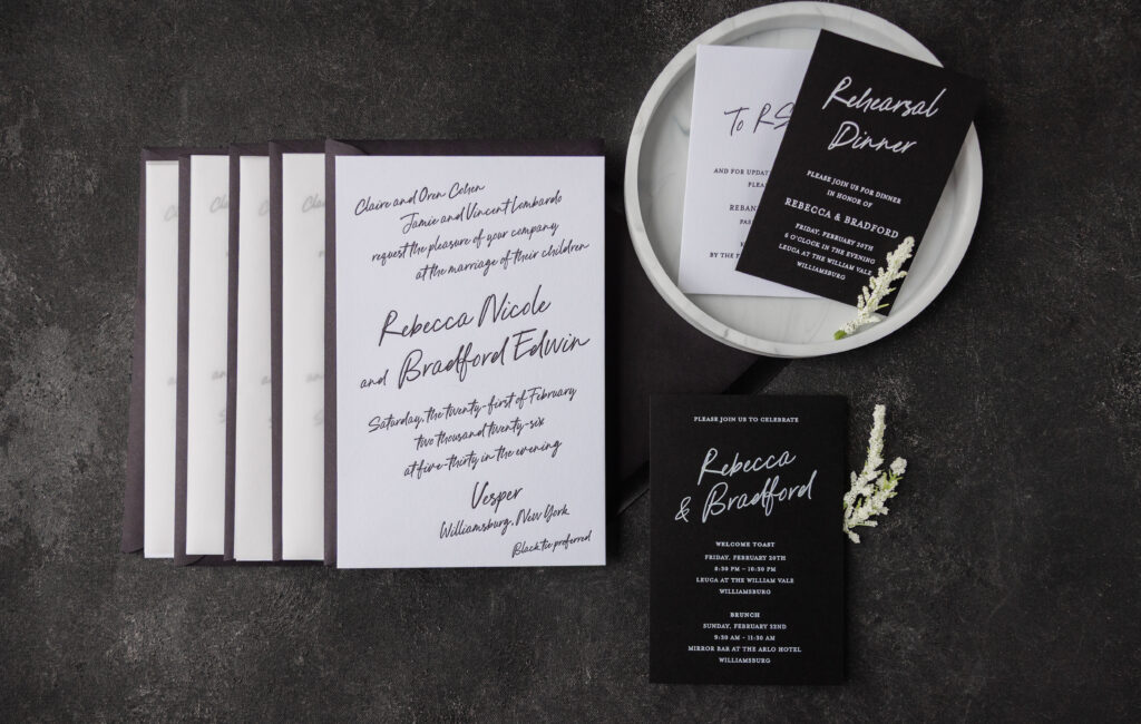
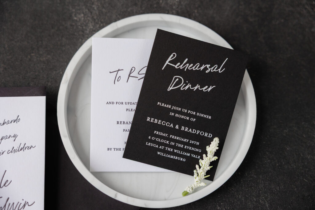
Dramatic contrast and soft, romantic details give Rebecca and Bradford’s modern minimalist invitations a sophisticated, brooding, atmospheric look that is both intimate and black-tie ready. This couple worked with our dear friend Susan of Ethan Niles to create their perfect wedding invitations.
Invitation
letterpress ink: black
font: pink champagne + mrs eaves
paper: bella smooth cotton 2-ply bright white
card size: 5.44” x 8.315”
envelope: ebony euro flap (customer supplied)
envelope addressing: white digital on the front and back
job #: 79043
Gatefold
paper: glassine
size: 5.44” x 8.315”
job #: 79043
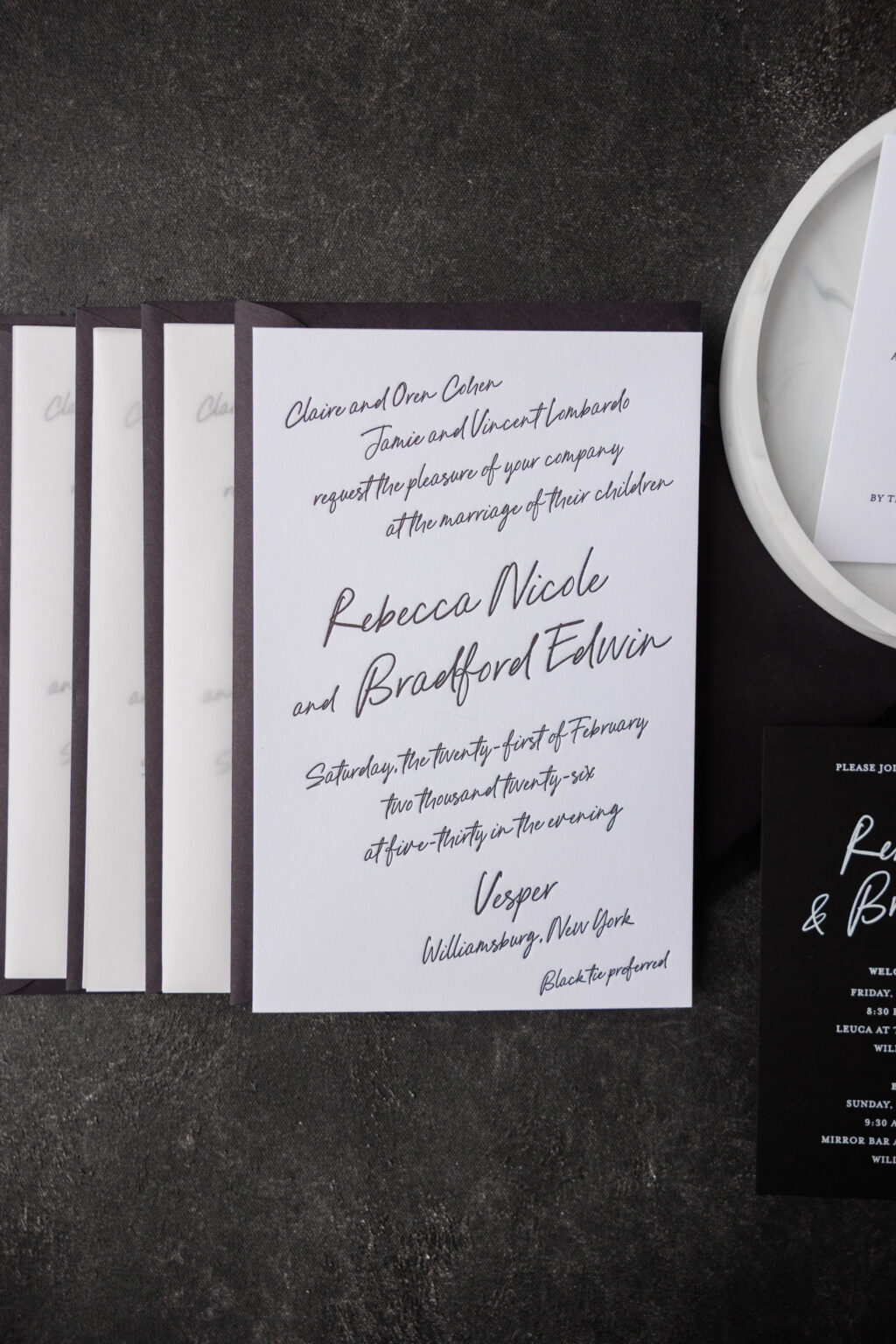
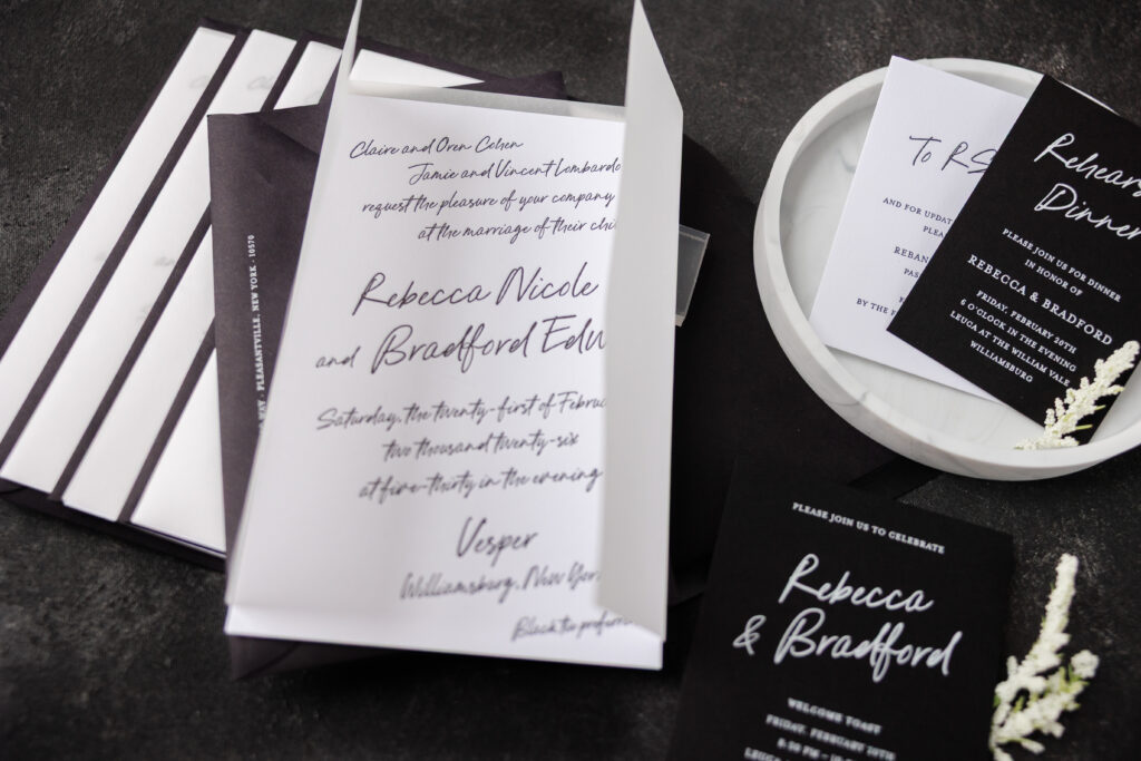
We love the look of black letterpress printing on our bright white paper. It’s high-contrast, classic, and simply striking. The loose script font has an intimate, handwritten feel, which is further emphasized by the way each line of text slightly slants up. The look is romantic and full of personality, yet it’s also spot on for this black-tie-preferred wedding held at the elegant VESPER. Glassine is used as a gatefold, adding luxury and drama to the reveal when guests open their invitation.
Welcome Party Card
digital ink: white
font: pink champagne + mrs eaves
paper: bella ultra black 1-ply
card size: 4” x 6”
job #: 79043
Details Card
letterpress ink: black
font: pink champagne + mrs eaves
paper: bella smooth cotton 1-ply bright white
card size: a-5
job #: 79043
Rehearsal Dinner Invitation
digital ink: white
font: pink champagne + mrs eaves
paper: bella ultra black 1-ply
card size: a-5
job #: 79043
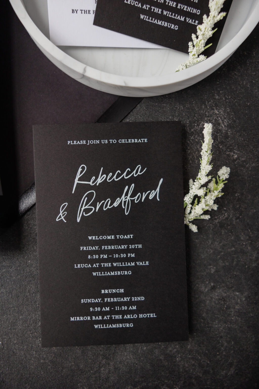
The details card closely follows the invitation design by featuring black letterpress printing on our Bella smooth cotton bright white stock. The rehearsal dinner invitation and welcome party card flip the script, featuring white digital printing on our ultra black stock. This choice feels edgy and modern, while remaining cohesive with the entire suite. The use of a serif font in addition to the script font for these supporting cards provides contrast with the invitation and further accentuates the drama of the invitation.
Do you daydream about script fonts and black-tie wedding stationery? Do you want modern minimalist invitations that exude a luxury yet moody vibe? Work with one of our dealers to create your perfect wedding invitations.
We worked with our friends at Dorothy Goldsmith Printing & Party to create Sarah and Brett’s stunning save the dates. Delicate vines from our Everly V.2 suite feature on the card and liner. Gold Matte foil stamping and black letterpress combine with classic fonts to create a stunning card. The gold bevel is the finishing touch to create a truly timeless set.
letterpress ink: black | foil stamping: gold matte | fonts: bodega script, adobe garamond pro | paper: bella cotton 2-ply | foil edging: 45 degree bevel in gold matte | save the date size: a-6 | liner: everly pattern in gold matte | envelope: bella cotton white | customization #69720
We worked with our friends at Sweet Paper to bring Bryce’s bar mitzvah invitations to life. Our Pura Vida sample was the starting point, to which we added the motif from our Arches save the date. The Regina liner in black is the perfect minimal pattern to complete this modern suite.
letterpress ink: black | paper: bella cotton white 2ply | fonts: at sackers gothic light + ibm plex sans Hebrew | envelope liner: regina pattern in black | envelope: bella cotton white square flap | customization #64412
Our friends at Arabesque of Naples worked with Melissa and Daniel to create their tropical black tie invitation suite. Our Kailua suite was the starting point for the design, and the detailed palm motifs from the reply and save the dates, were used for the enclosure cards. A sweet orange blossom motif finished the invite card, and all were printed in black letterpress to convey the formality of the event. The Kailua liner pattern in black digital perfectly compliments the suite.
letterpress ink : black | paper: bella cotton white 2ply + 1ply | fonts austin bold + italic | envelope liner: kailua pattern in black | envelope: bella cotton white square flap | customization #61608
Caitlin and Kelly worked with Colin at Pulp + Ink in Chicago to create their gorgeous wedding stationery. They customized our Everly v.2 design and updated it with crisp black letterpress. They carried the fonts and wreath motif through their day of pieces as well. The foil stamped and letterpressed menus were the perfect compliment to their stunning venue.
We worked with Elizabeth and David to create these classic black wedding invitations with illustrated accents. The couple decided on clean as well as timeless typography that allowed the illustration to stand out all on its own beneath. The illustration leaves the guests with a glimpse into the venue on the big day. Touches of script added to each card gave the set a more feminine touch. The set contained a rehearsal dinner, details card, and brunch card. Each piece complimented each other in black letterpress ink. Lastly, we have no doubt this couple’s wedding came together beautifully!
Andrea Streeter added a minimalist inspired wedding invitation to our line-up when she created the Wright design. A simple black and white color palette allowed for a more playful design layout. Crisp black letterpress and a Bella Cotton backdrop in White set the tone of the design. Non-traditional typography easily keeps the viewer’s eye moving around the page. While an organic line added right down the middle breaks everything into different parts. The overall design nods towards a mid-century aesthetic and keeps a retro vibe in mind. We can imagine this design used for a wedding filled with quirk and old souls.
We’re excited to introduce this nature inspired letterpress design called Pressed by Sierra Detrick. We’ll let Sierra take it from here to share more about her vision came to life. “I wanted to pair a naturalistic feel with something very traditional. I actually took a walk around my neighborhood and picked up greenery that I found interesting. A big thanks to all my friendly neighbors who let me hijack some of their plants! From there, I flattened each article, rolled over them with ink and pressed them onto paper. I did this many many many times. I’m in love with color, intricate pieces of art and anything derived from nature.”
It’s the season of engagements that require celebration and invitations! Take a peek at these watercolor engagement party invitations. Christina and David worked with Windmill Paper Boutique who helped bring their vision to life. Inspired by our Wardell Modern design, they added a blue backdrop as well as Rose Gold Shine accents. Finally, a solid foil liner shining brightly completed the engagement set.
Letterpress color: Black | Foil stamping color: Rose Gold Shine | Fonts: Allyson + Gotham | Design: Wardell Modern | Paper: 2 ply Bella Smooth Cotton | Size: SQ-6 | Liner: Classic Color in Rose Gold Shine | Customization: 43879 | Windmill Paper Boutique
Amy and Justin’s wedding was held at The Polo Club in Boca Raton; a venue surrounded by a plentiful amount of palm trees making these tropical wedding invitations a perfect fit for their big day. Using our Lani design as inspiration, a repeating palm pattern was printed around the outside of the invitation in blind deboss which made for a subtle yet memorable impact. Sarah Hanna’s Napa calligraphy style was used as an elegant accent to invitation shining beautifully in Tawny Matte foil. The insert cards were kept more simple in classic black letterpress with more calligraphy accents as a complimentary touch to the invitation. A custom foil envelope liner was added to keep guests wanting more the moment they opened their envelope, preparing them for a tropical affair to come.