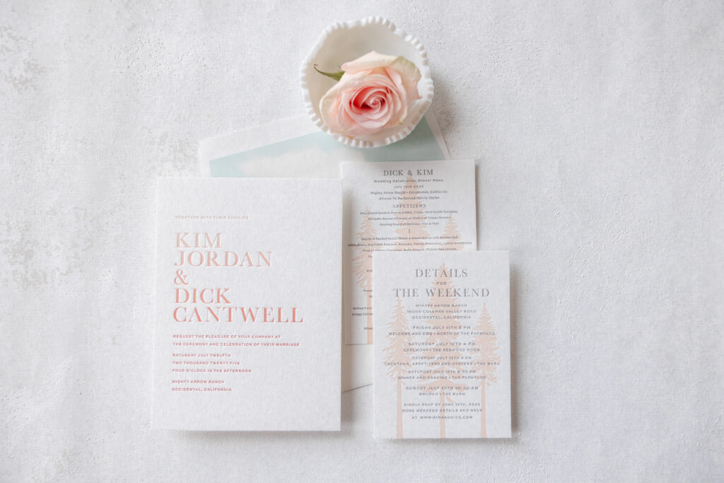
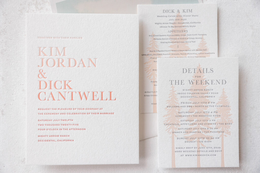
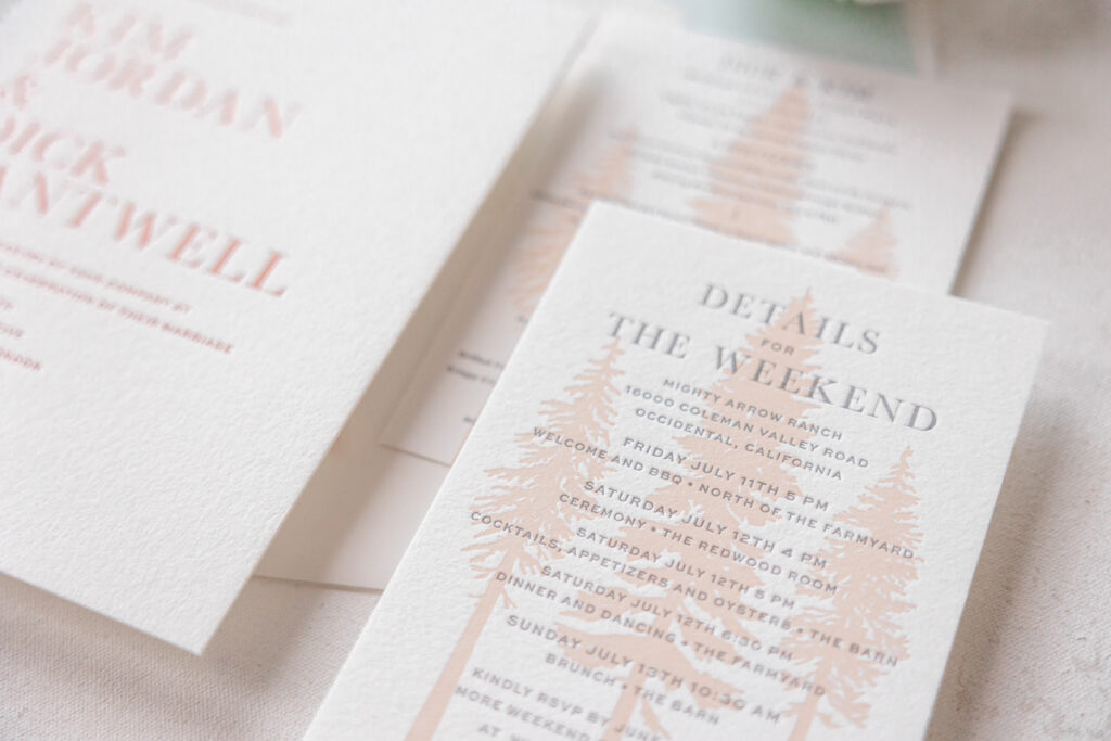
This wedding stationery suite blends timeless formal typography with delicate natural motifs, creating something that feels elevated, romantic, and quietly luxurious. An ombre fade gives these letterpress wedding invitations a modern edge. We helped the couple, Kim and Dick, customize our Bourne V.2 design for their Northern California wedding.
Invitation
letterpress inks: shell + mesa
fonts: manhattan regular + sweet sans regular + sweet sans medium
paper: bella cotton 2-ply white
size: f-8
envelope liner: custom bourne pattern in bellini and sea mist digital on white text
envelope: white cotton text
envelope addressing: mesa digital on the front and on the back
job: 75888
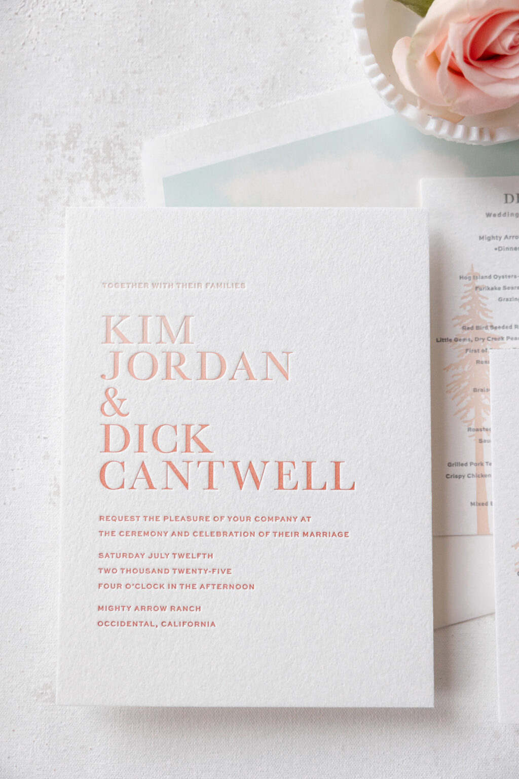
A mix of serif and sans-serif typography anchors the design. Generous spacing establishes a sophisticated presence, while the oversized names create a bold statement. There’s a beautiful contrast between the structure of the text and the softness of the color palette.
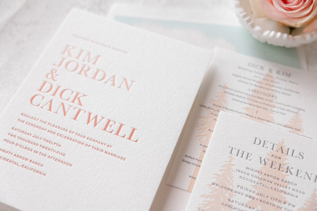
Our Bella Cotton paper is lush and pillowlike and holds a crisp letterpress impression, making it the perfect choice for this stationery set. All of the printing is done using an ombre fade technique with our shell and mesa letterpress inks. Shell ink appears at the top, with mesa ink at the bottom. During the printing process, the inks converge near the middle, creating a stunning and gradual transition. There is a slight variation to the fade as the cards are printed, ensuring each invitation is unique.
Details Card
letterpress inks: charcoal + bellini
fonts: manhattan bold + sweet sans medium
paper: bella cotton 1-ply white
size: a-6
job: 75888
Menu
letterpress inks: charcoal + bellini
fonts: manhattan bold + sweet sans medium
paper: bella cotton 1-ply white
size: a-6
job: 77545
The details card and menu feature an identical design, which we think was an excellent choice because the look is so lovely. The illustrated coastal redwood silhouettes introduce a subtle rustic element that ties the suite to the venue, the Mighty Arrow Ranch in Occidental, California. Because the artwork is tonal, it feels elegant, setting a more atmospheric vibe.
If you’re dreaming of a nature-inspired design or something fun and unexpected, like an ombre fade, then let’s talk. Contact us to design your perfect wedding invitations.
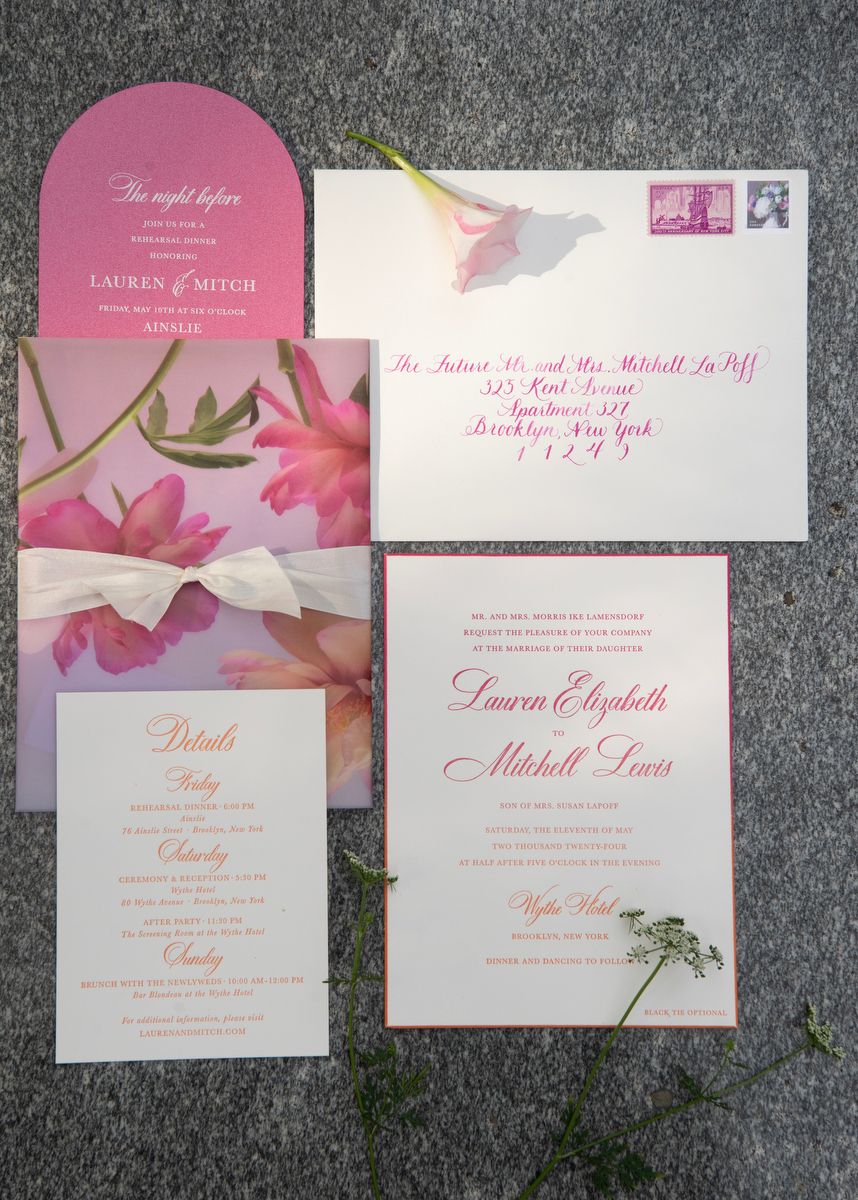
A dreamy color scheme and plenty of flowers set the perfect tone for Lauren and Mitchell’s wedding. This Brooklyn duo worked with Ashley Douglass Events, and the highly skilled and talented Ashley took care of all the details to create an intimate and unforgettable event. See all of the luxurious details, including the ombre invitations, in the feature on Carats & Cake.
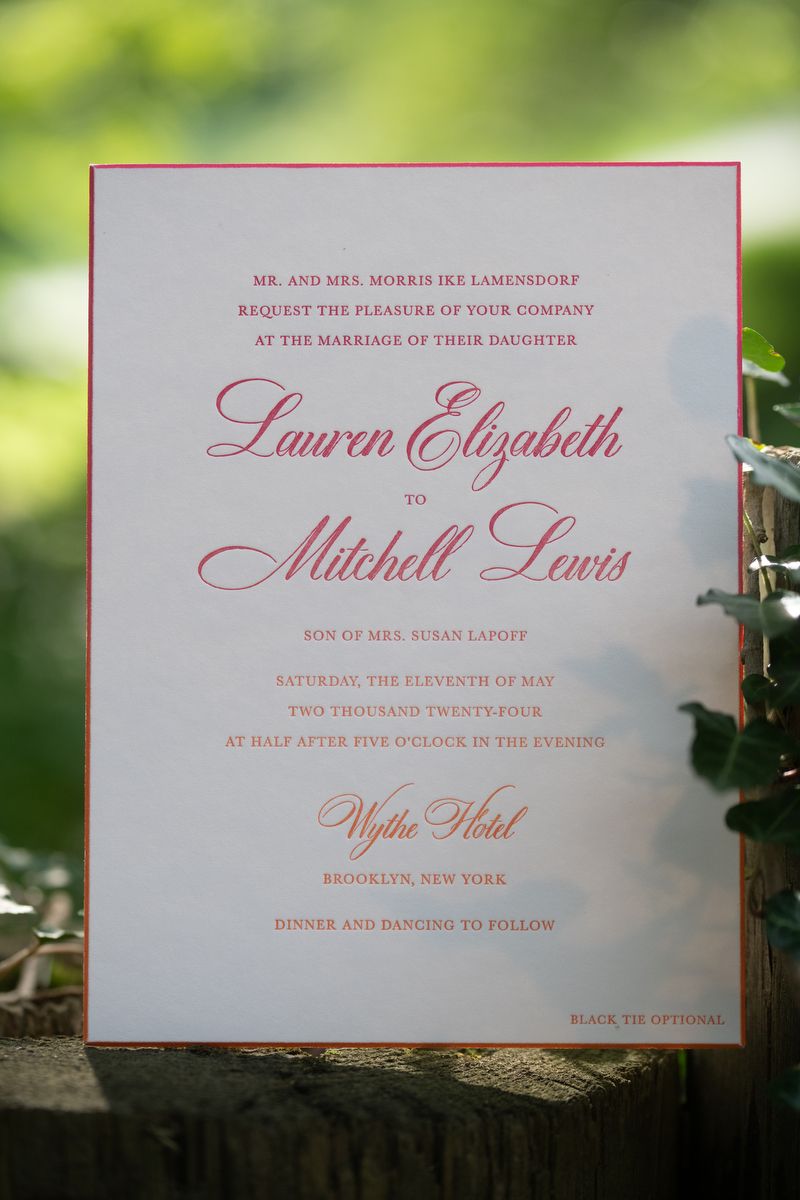
The first thing guests noticed about the invitations was the digitally printed vellum gatefold. The bold floral pattern stood out, providing guests a preview of the florals they would see at the ceremony and reception. The gatefold was secured with a decadent silk ribbon. Once opened, the gatefold revealed the classic and yet whimsical invitations. Ombre letterpress printing transitioned from bright pink to persimmon. The beveled edges were painted in coordinating colors that followed the same fade from one color to the other.
Invitation
Base design: custom
Letterpress: bright pink + persimmon
Paper: white smooth cotton 2-ply
Bevel: 45 degrees
Edge treatment: ombre edge paint in bright pink to persimmon
Card sizes: F-8
Liner: CMYK process (custom supplied pattern)
Envelope: white pointed flap
Digital addressing: bright pink
Customization: Job #69386
Gatefold Wrap
Base design: custom
Digital: CMYK process
Paper: 40# vellum
Size: F-8 vertical gatefold
Printing notes: Scored
Embellishments: mother of pearl silk ribbon
Customization: Job #69386
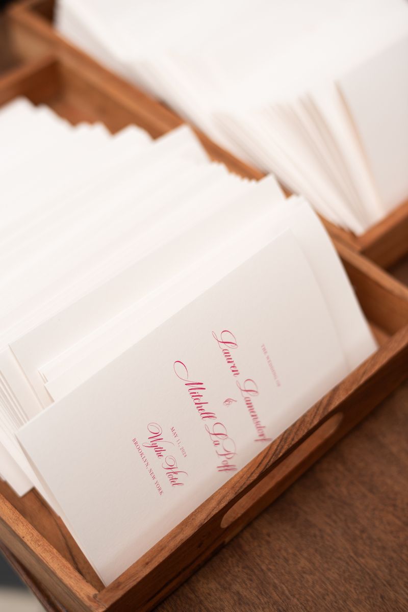
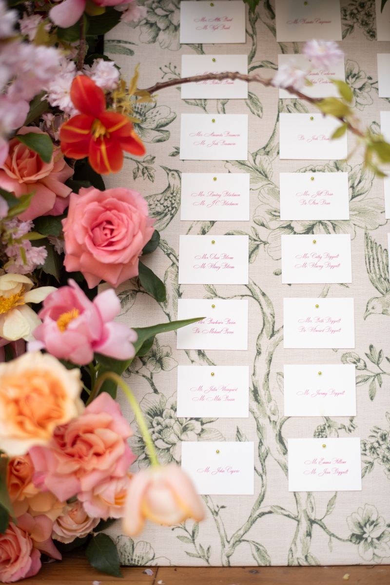
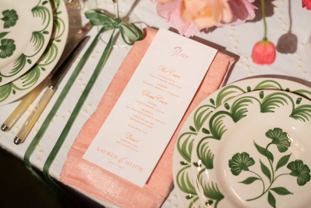
All of the day-of pieces, from the programs and escort cards to the personalized menus, are in the same bright yet refined colorway.
Program
Base design: custom
Digital: bright pink/bright pink
Paper: white smooth cotton 1-ply
Card sizes: 10.5 x 8.5 flat 5.25 x 8.5 folded
Printing notes: scored
Customization: Job #71256
Escort Cards
Base design: custom
Digital: bright pink/bright pink
Paper: white smooth cotton 1-ply
Card sizes: No. 17
Customization: Job #71256
Menu
Base design: custom
Letterpress: persimmon
Digital: bright pink
Paper: white smooth cotton 1-ply
Card sizes: No. 10
Customization: Job #71256
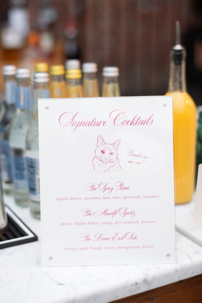
The charming bar sign displayed the couple’s signature cocktails and custom artwork for a personal touch.
Bar Sign
Base design: custom
Digital: bright pink + CMYK process
Paper: white smooth cotton 1-ply
Card sizes: 8 x 10
Customization: Job #71256
It was a joy to create these colorful ombre invitations, and it was exciting to see how all the printed pieces fit into Lauren and Mitchell’s special day!
We worked with our friends at Lee’s Paperie to create Sarah and Evan’s stunning suite. We created a fully custom design using fonts and colors the couple chose. The invitation is letterpressed in an ombre effect, and is edge painted to match. The events card is foil stamped in white, on chambray stock. An ombre envelope liner is the perfect finishing touch.
letterpress inks: french blue + deep blue ombre + chambray | foil stamping: white matte | fonts: gotham + ms claudy | paper: bella smooth cotton bright white 2-ply + 1-ply + chambray 1-ply | invite size: sq-7 | edge painting: french blue + deep blue ombre | liner: elegant ombre pattern in french blue + deep blue | envelope: bella cotton bright white | customization #70864