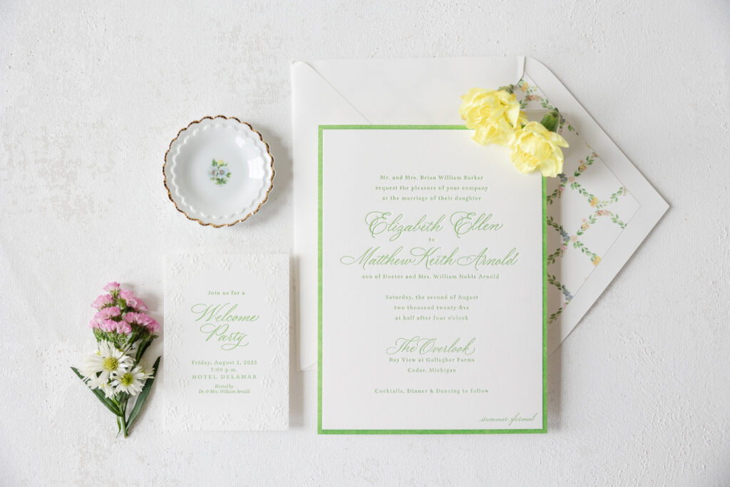
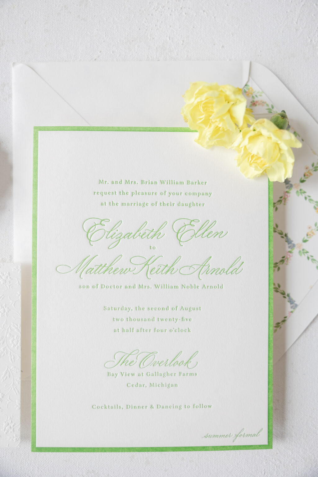
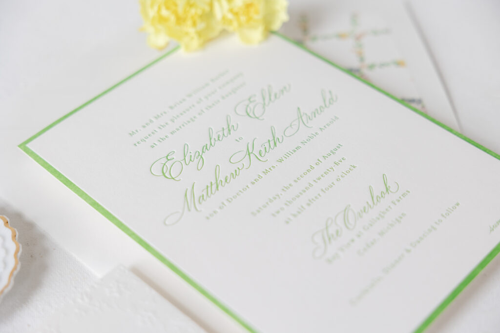
Elizabeth and Mathew’s letterpress wedding invitations are classic, refined, and gorgeous with plenty of romantic undertones. The look perfectly set the tone for their scenic summer wedding. The couple worked with our friend Kristyn of Oliver’s Twist to customize our Hadaway design.
Invitation
letterpress ink: garden
calligraphy: custom (supplied by client)
font: aria text
paper: bella smooth cotton 2-ply white
size: f-8
envelope liner: custom pattern in cmyk digital on white text
envelope: white cotton text pointed flap
envelope addressing: garden digital on the back
job: 76334
These invitations expertly balance classic formal elements, such as calligraphy and letterpress printing, with modern design and botanical charm. The flow of the calligraphy is stylish and airy, while the letterpress border framing the invitation adds a contemporary elegance. Our garden letterpress ink is fresh and perfect for a summertime affair.
Delicate florals adorn the liner in a symmetrical pattern, providing plenty of color and a traditional garden-inspired look.
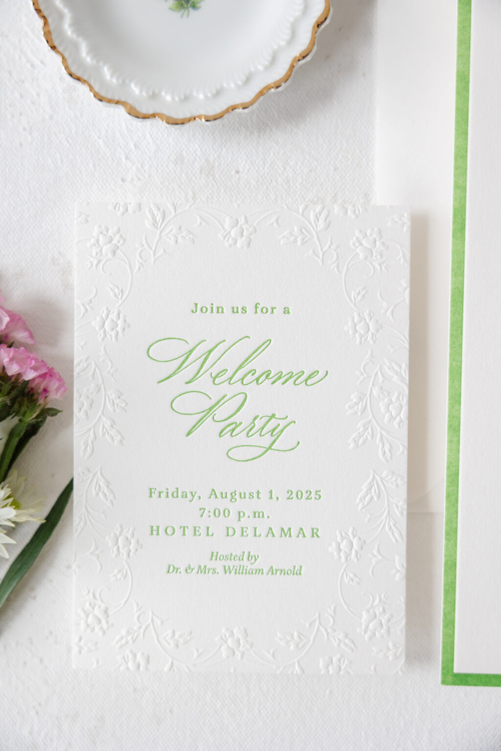
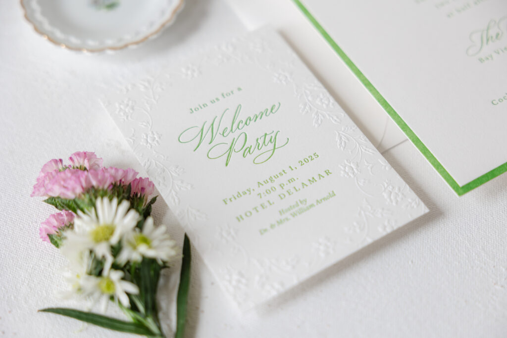
Welcome Party Card
letterpress ink: garden
emboss: blind
calligraphy: custom (supplied by client)
font: aria text
paper: bella smooth cotton 1-ply white
size: a-5
job: 76334
The welcome party card maintains the floral look but uses blind embossing. The floral border is more organic and less structured than the envelope liner, keeping the overall look fresh and unexpected. The raised detail contrasts with the depth of the letterpress printing, while the same ink color and graceful, agile flourishes of the calligraphy tie into the invitation design.
These letterpress wedding invitations have us dreaming of summertime weddings, floral arrangements, and calligraphy accents. Are you ready to design your perfect wedding stationery? Contact us or work with one of our dealers to get started!
We had the pleasure of chatting with Nika Smernoff at Calligraphette & Co. in Washington, DC. Nika is a calligrapher and designer with a decade of experience in the industry. Below, Nika explains how she got her start, what keeps her going, her favorite trends, and more!
Q: Tell us about yourself and how your studio came to be? What was your inspiration?
During my first semester of graduate school in 2015, studying the relationship between pandemics and national security of all things, I found calligraphy and quickly fell in love with spending meditative evenings practicing my letters. In 2016, I started a business doing envelope calligraphy to help pay my way through school. When I received my degree in 2018, I figured I could either wonder where Calligraphette & Co. could’ve gone or jump into working for myself full-time. I had fallen in love with the wedding industry and loved the thrill of being able to see someone else’s vision and help translate it into something beautiful and tactile.
Q: What are some of the most rewarding aspects of your job?
Weddings are just such a happy time in people’s lives. My clients are figuring out how to express their love for each other and their personality as a couple for a once-in-a-lifetime celebration. In particular, I get to make people realize they’re creative, help them make something that they didn’t realize was possible, and hopefully ease a little of the stress that other parts of wedding planning can create.
Q: What are your hopes for the future of your business?
My end goal is for my clients to have an invitation tucked away somewhere in a keepsake box, to find with their children one day, and be transported 25 years back in time to when they were engaged. Whether that means curating and personalizing a Bella Figura design or creating something from scratch, I want to create heirloom pieces for people to enjoy. Not everyone wants to take on the work it takes to create custom designs, even if they have the taste for it. If I can continue to help couples send out invitations that rise to the occasion of their wedding, I’ll always consider that a success.
Q: Do you have any current trends you’re loving?
I’m loving the trend of non-rectangular inserts! Whether it’s a circle or a custom die-cut, playing with shapes is such a fun way to bring life into an invitation suite. Velvet is a trend I’m excited to try, especially with letterpress and foil printing. Although this isn’t a new trend, I’m always a fan of putting pets on wax seals! It’s a great way to give a nod to an important family member without necessarily making them the focus of the invitation suite. Lastly, I’d say custom match boxes because they’re so unexpected and also so much fun to have after the wedding!
Q: What do you think your clients enjoy most about working with you to create their event stationery?
One theme that I’ve noticed in reviews is that I always go the extra mile and put myself fully into the design process with each client, making it easy for the client and bringing their vision to life. Almost all of my clients apologize early in the process for being picky and too detail-oriented, and I always tell them that the best clients are the ones who care about the small details. I’m always happy to refine font choices and make adjustments to colors in order to have a design reflect exactly what you see in your head, even if it’s hard to describe.
Clients usually say that I was their most responsive vendor, combining warmth and professionalism to make their decisions as easy as possible. I’m also notorious for becoming good friends with my local clients, so chances are, if you’re located in DC, we’ll be grabbing a glass of prosecco after your wedding to catch up!
Q: Anything else we should know or that you would like to share?
There can be a lot of focus on how to make your wedding about other people. Don’t get me wrong. Of course, you want your guests to have a wonderful time, for your friends and family to mingle and create memories, and for the day to run smoothly. Invitations are perhaps the one aspect of your wedding where you don’t really have to consider anyone else and do just what you want. This doesn’t have to mean spending months crafting something from scratch, but getting to play with paper and colors and discuss what designs you and your fiance like is such a joyful part of the planning process. A good stationer will make it feel like fun, with minimal to no homework for you to do, providing a glimmer of ease in an otherwise email and logistics-heavy process.
We worked with our friends at Arni Paperie, to create Elizabeth and Kevin’s beautiful summer wedding invitations. Our Leone and Turner designs provided inspiration. The layout and fonts were drawn from the Leone. The hand calligraphy style is Sofia by Nicole Black. The gorgeous summery blues of the Turner inspired the color palette, and custom seaside liner image.
letterpress ink: chambray | fonts: athelas regular + italic, adobe garamond pro | calligraphy style: sofia | paper: bella handmade cotton white + bella smooth cotton white 1-ply | invite size: f-8 | liner: supplied pattern in cmyk | envelope: bella chambray (now cloud) | customization #70967
We worked with Kristyn at Oliver’s Twist to create this stunning wedding stationery suite that includes save the dates, invitations, and day of pieces. The family are long time clients, back to when Kristyn did the brides high school graduation announcement! The wedding took place in the bride’s backyard in the spot where the treehouse was. The bride and groom wanted their reception to feel more like a five star restaurant, inspired from some of their favorites. Because of the location, they decided to name their reception “The Good Tree”. They wanted everything, including their stationery, to be classic and clean, formal and fun.
save the date details | foil stamping: gold matte | font: garamond | calligraphy style: engaged | paper: bella cotton white 2-ply | card size: a-7 | customization #69480
invitation details | letterpress ink: black + deboss | foil stamping: gold matte | fonts: garamond | calligraphy style: engaged | paper: bella cotton white 3-ply + 1-ply, bella black 1-ply + supplied sequoia 1-ply | invite size: f-8 | bevel: 45º | foil edging: gold matte | liner: supplied green text | envelope: bella cotton white | customization #71590
day of details | letterpress ink: black | foil stamping: gold matte | fonts: garamond | calligraphy style: engaged | paper: bella cotton white 1-ply | envelope: bella cotton white | customization #73229
Our friends at Berings worked with Annie and Trent to create their beautiful save the dates. The floral frame from our Willington sample creates a lush garden feel by bleeding off the card edges. The vibrant florals are complimented by garden letterpress and edge painting.
letterpress ink: garden | digital ink: cmyk | font: quincy cf light | calligraphy: ginny by virginia lucas hart | paper: bella smooth cotton white 2-ply | save the date size: a-7 | edge paint: garden | envelope: bella cotton white | customization #70161
Each letter within a calligraphed word is completely unique. Molly and Lawrence’s calligraphy letterpress wedding invitations are certainly no exception to that one-of-a-kind nature. The couple worked with our friends at Lee’s Specialty who helped their vision come to life. The future newlyweds decided on a deep purple as well as rich blue color palette. Our Blackberry ink used on the invitation matched that of the reply and brunch cards. Deep Blue used on the welcome dinner and other reply card completed the suite. Additionally, our Opaline marble pattern envelope liner tied this color palette together. As a final wow factor, a matching belly-band in the same marble pattern kept everything in one place.
Letterpress colors: Blackberry + Deep Blue| Hand Calligraphy: Victoria by Sarah Hanna | Design: New Calligraphy | Liner: Opaline in CMYK | Paper: 2 ply Bella Smooth Cotton White | Size: F8 | Customization: 43805 | Lee’s Specialty
Amy and Justin’s wedding was held at The Polo Club in Boca Raton; a venue surrounded by a plentiful amount of palm trees making these tropical wedding invitations a perfect fit for their big day. Using our Lani design as inspiration, a repeating palm pattern was printed around the outside of the invitation in blind deboss which made for a subtle yet memorable impact. Sarah Hanna’s Napa calligraphy style was used as an elegant accent to invitation shining beautifully in Tawny Matte foil. The insert cards were kept more simple in classic black letterpress with more calligraphy accents as a complimentary touch to the invitation. A custom foil envelope liner was added to keep guests wanting more the moment they opened their envelope, preparing them for a tropical affair to come.