Christina and Pierrick worked with Maddie Merriweather, Inc. to create these sweet foil save the dates for their June wedding. This save the date printed on our Bella Light Gray paper was the perfect glimpse into the couple’s elegant day to come at the Roaring Gap Club in North Carolina. Hand calligraphy elements with a hand-drawn cartouche enclosing the bride and groom to be’s names added personal touches to this save the date.


Foil color: White Matte | Fonts: Caslon, Submitted Calligraphy by Sarah Hanna | Design: Custom Customer Supplied | Paper: 2 ply Light Gray | Size: A6 | Customization: 42111 | Maddie Merriweather, Inc.
This modern rehearsal dinner invitation customization was inspired by our contemporary Newbury design. The Bella Gray paper from the original design was substituted with our Ivory paper to give the invitation more of a vintage vibe. The design itself was inspired by dark jewel tones represented in the Maple Shine foil and Prussian Blue letterpress accents. We imagined pairing this invitation with our elegant garden pattern also printed in the same color palette, all perfect for a moody candlelit affair.

Foil stamping: Maple Shine | Letterpress ink: Prussian blue | Blind Embossing | Fonts: Marguerite + Times | Paper: Ivory | Invite size: F-8 | Foil stamped liner: Elegant Garden in Maple shine + Prussian Blue | Original design by Kyle Laatsch | customization by Andrea Streeter | Photos: Ruffled Blog
Thanks to the help of our friends at Magnificent Milestones, Sarah and Stephen’s vision for timeless foil stamped wedding invitations came to life beautifully. The wedding was held at the University Club of Chicago, a classic venue which called for an equally classic invitation such as this reflecting an elegant affair to come. The couple chose a design reminiscent of Maeve and it was printed in Gold Matte foil with Bella Blue paper used as the backdrop. Their reply card was kept on the simpler side and printed in Navy letterpress to coordinate with the invitation. Guests will be pleasantly surprised to find the initials of the bride and groom intertwined as they open their envelope to reveal a gold leaf metallic envelope liner.


Foil: Gold Matte | Letterpress: Navy | Fonts: Imprint MT Shadow + AT Sackers Gothic | Design: Custom Created Design | Paper: 1 ply Bella Blue, 1 ply Bella Smooth White | Size: F8 | Customization: 39618 | Magnificent Milestones
From weddings to mitzvahs, we always love seeing different kinds of invitations made for a variety of special occasions come through our shop and bridal showers are no exception to that! The host of this particular day, Joan Bergen, worked with Fete Collection to create these romantic letterpress bridal shower invitations for the bride to be. They chose a color palette of Prussian Blue letterpress and Carolina letterpress with our Bella Blue envelopes to match creating an overall sense of monochromatic harmony. Our popular Sophia script font made sure the bride to be’s name stood out from everything else while hydrangeas printed in Carolina gave this sweet invitation an added touch of romance.


Letterpress ink colors: Carolina + Prussian Blue | Fonts: Sophia + Moravia | Design: Custom Library | Paper: 2 ply Bella Smooth White | Size: A6 | Customization: 42239 | Fete Collection

After a 29-year engagement filled with all the twists and turns life has to offer, Claudia and Daniel were finally married on the twenty-sixth of August surrounded by all of their loved ones. In 2012, Claudia was diagnosed with stage three cancer and from there endured a treatment plan that included chemotherapy, radiation, a double mastectomy and a full hysterectomy. In 2016, Claudia’s cancer metastasized to her bones which led to a partial hip replacement and she is currently on oral chemotherapy. Though Claudia and Daniel have experienced many ups and downs, the love that they share for each other has remained constant. We were lucky enough to play a small part in this couple’s incredibly moving story as we worked with Brilliant Event Planning and Wish Upon a Wedding to create their dream invitations and day of pieces.

Using our Everly design as inspiration, Claudia and Daniel picked a warm color palette of Cobblestone letterpress ink and paired it with Gold Matte foil. Botanical watercolor accents were added throughout each piece including the envelope liner to give everything a softer overall aesthetic. We’re excited to share a glimpse into the making of this couple’s invitations and day of pieces below. It takes a love like Claudia and Daniel’s to remind us of all the good in the world and to embrace it every single day.


Wish Granters: Wish Upon a Wedding | Wedding Photography: Sasithon Photography | Planning: Brilliant Event Planning | Venue/Catering: Mountain View Manor | Video: Pioneer Media | Floral: Winston Flowers | Baker: Elliegant Cakes | Gown: Amsale Aberra | Music: On the Move Events | Officiant: Tri-State Weddings
We worked with Invited to create these gold foil wedding invitations for Suzanne and Joseph’s botanical Dallas affair this past March. The wedding was held at the Dallas Arboretum which their chosen envelope liner mimicked beautifully. They chose to go with our Tristan pattern in Gold Matte foil with a digitally printed background in Pool behind it giving this suite a little extra punch of color. The invitation was inspired by our Whisper design but customized to fit the couple with a more modern script font decorated in gold foil surrounded by the rest of the wording in subtle Pool letterpress ink. It’s easy to see that everything tied together within this suite and we have no doubt Suzanne and Joseph’s special day came together just as elegantly too.
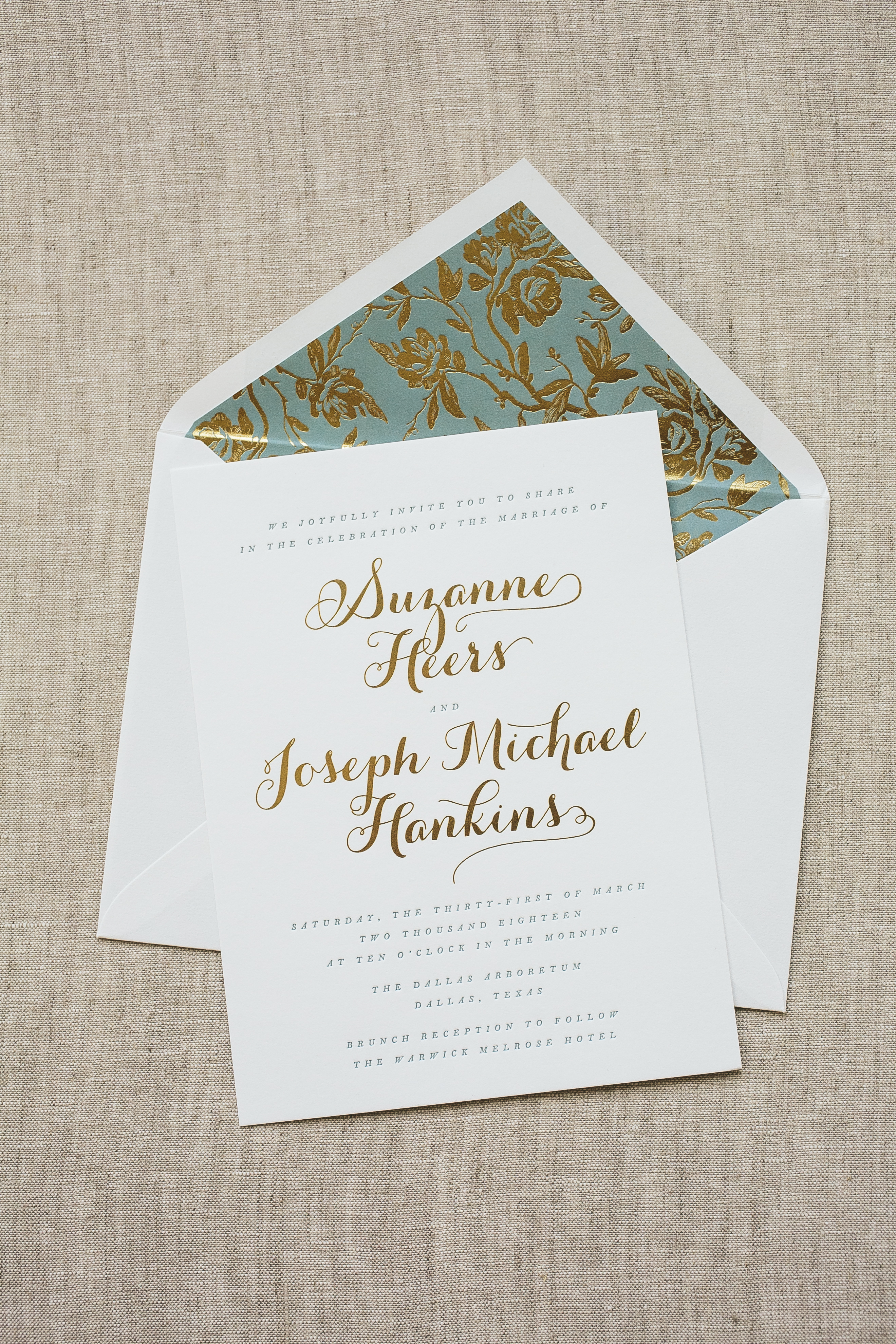


Foil color: Gold Matte | Letterpress ink color: Pool | Fonts: Keeva + Botony | Design: Whisper | Paper: 1 ply Bella Smooth White | Size: F8 | Customization: 42418 | Invited
Alexander and his family worked with our friends at Papery of Philadelphia to create these silver foil stamped Bar Mitzvah invitations. They customized our Irving design by using our rich Bella Gray paper and dressed it up with silver foil typography. This same palette was carried onto the party card while the reply card was kept clean with white paper and Charcoal letterpress ink. Our geometric Chic Combs pattern added an extra splash of fun to the suite but still tied everything together effortlessly.


Foil color: Silver Matte | Letterpress ink color: Charcoal | Fonts: Didot | Design: Irving | Paper: 2 ply Bella Gray, 1 ply Bella White | Size: SQ-7 | Customization: 40272 | Papery of Philadelphia
This destination wedding invitation is a fresh take on our contemporary Grant design. Similarly to Grant, the names of the bride and groom are big and bold, giving the attention right off the bat to the stars of this particular show. The design was inspired by the tropical Palm Springs venue of Colony 29 with its lush surroundings and earthy color palette. We imagined pairing this invitation with a pearl shine palm pattern for the envelope liner as a nod to the Floridian venue that inspired it all. This design perfectly combines a contemporary aesthetic with a tropical-inspired venue in a simplistic yet harmonious way.

We worked with our friends at Magnificent Milestones to create these southwestern inspired letterpress wedding invitations for Kelsey and Sam’s big day. This suite set the tone for their wedding held at the gorgeous Desert Botanical Garden in Arizona. Appropriately enough, the invitation was printed in Desert ink with a splash of Pool letterpress added to the mix. An Aztec inspired pattern placed along the bottom added an extra taste of southwestern flair to the design. The event card included sweet hand-drawn motifs to coordinate with each event beneath while the belly-band included yet another simple but eye-catching illustration. We can’t get enough of how seamlessly everything fits together with a taste of southwestern flair subtly added throughout.


Letterpress colors: Desert + Pool | Digital color: Espresso | Fonts: Dasha, Moravia + Chloe | Design: Custom Created | Paper: 1 ply Bella Cotton | Size: F-8 | Customization: 42061 | Magnificent Milestones
Start spreading the news, we recently spotted Alexandra and Matthew’s timeless wedding invitations on Carats & Cake and we’re thrilled to share a glimpse into their big day. The couple worked with our friends at Cardture who helped us to design and bring their vision to life. With a harmonious color palette of Olive letterpress and Copper Shine foil as the accent color, the couple’s vision of a simple yet luxurious invitation shined through. To enhance the level of sophistication, Copper Shine foil edging was added to their lavishly thick 3-ply invitation. The suite truly reflected the elegance and refinement of the inside of the New York Public Library with its warm tones and metallic accents. It’s easy to say that this classic invitation was the perfect fit for Alexandra and Matthew’s New York wedding. Carats & Cake has even more photos from their big day, but here are a few of our favorites – take a look!


Vendors: Photographer: The Day | Venue: New York Public Library | Catering: Creative Edge Parties | Makeup: Nam Vo Makeup | Hair: Sahag Workshop | Event planning: In Any Event
Our modern blind embossed wedding invitation Grant was inspired by a clean and contemporary wedding possibly set in an art museum or an edgy loft space in a city. This design features sharp, tailored lines and refined simplicity in all the details. With a sophisticated monochromatic palette of grays and neutrals, this design is a subtle statement-maker that leaves guests intrigued and wanting more. To finish it off, a marble envelope liner pattern added an extra touch of drama to a more simple overall aesthetic.


venue | guys + table setting | florals | wedding dress | bride + groom | cake
Amy and Justin’s wedding was held at The Polo Club in Boca Raton; a venue surrounded by a plentiful amount of palm trees making these tropical wedding invitations a perfect fit for their big day. Using our Lani design as inspiration, a repeating palm pattern was printed around the outside of the invitation in blind deboss which made for a subtle yet memorable impact. Sarah Hanna’s Napa calligraphy style was used as an elegant accent to invitation shining beautifully in Tawny Matte foil. The insert cards were kept more simple in classic black letterpress with more calligraphy accents as a complimentary touch to the invitation. A custom foil envelope liner was added to keep guests wanting more the moment they opened their envelope, preparing them for a tropical affair to come.


Foil stamping color: Tawny Matte | Letterpress colors: Black + Blind Deboss | Fonts: Napa calligraphy, Brandon Grotesque, and Veve | Design: Lani | Paper: 2 ply Bella Cotton | Size: F-8 | Customization: 41247 | Paper Parfait
