50 has never looked so good! We worked with Wynwood Letterpress to create these 50th birthday invitations in vine letterpress. A Blind Deboss woodgrain pattern added to the background of the invitation created rustic texture. The left-justified typography kept everything clean and bold in a modern block font. The suite contained a cohesive accommodations card as well as reply card in vine letterpress ink. The envelopes in jute brought a warm tone to the set with a woodgrain patterned envelope liner to match.
The Little Harbor Club in Michigan was the back-drop as well as the inspiration behind Liz and David’s September wedding. We created personalized letterpress wedding invitations for the couple using David’s venue illustration. The invitation printed in all Hunter letterpress ink paired with insert cards to match kept everything neutral and monochromatic. This tonal color palette allowed the illustration to do all the talking. The couple started their day taking a dip with the photographer in tow and ended with their nearest and dearest by their side! We’ll let Liz and David take it from here to share even more of the little details:
What was your favorite moment from your wedding day?
This is a very difficult question. There were more than one for sure, but when David and I woke up on our wedding day- we took my dad’s boat out and went for a swim. Our photographer came along and shot the whole thing and those photos are some of my favorite of the whole day.
How did you choose your invitation design and ink colors?
We knew we wanted to incorporate a drawing by David on the invitation. I wanted something that looked classic but modern- I actually had a hard time deciding on ink colors but in the end I went with my gut.. which is usually green. Our whole wedding was quite neutral. All the men were in black tuxes (except for David who wore midnight blue). And our flowers were all white and green. My shoes had red roses on them, that was the only pop of color!
What was the inspiration behind your wedding?
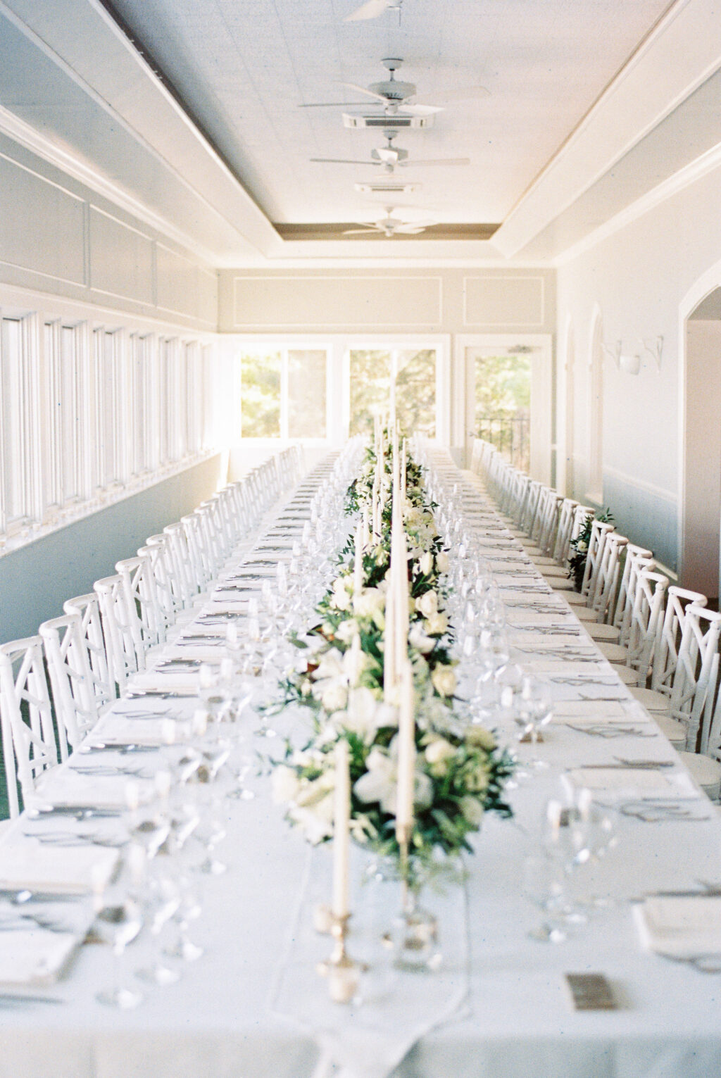
As David and I started to plan our wedding, we knew it was going to look a little different than the traditional schedule. What we envisioned was a timeless dinner party affair. We had 62 guests and a short and sweet outdoor ceremony followed by a multi-course served dinner with wine pairings that David and I chose. I was so very blessed to be surrounded by talented loved ones, David drew an illustration for our invitations and my sister turned that illustration into a ceramic tile for all our guests. September 2018 was also the month my parents celebrated their 30th wedding anniversary and they had their rehearsal dinner where our wedding was!
What was your favorite design element?
Probably our table! The whole setup was perfect – 31 people on each side. Taper candles, lots of glassware, custom tiles at each setting. Incredible food and wine, gorgeous florals. I could have sat there all night long.
What surprised you most about your wedding?
How wonderful the whole weekend truly was. I didn’t expect it to go poorly of course, but I think I was surprised at how magical it all felt! I couldn’t believe when Rachel, our wedding coordinator, told us it was time to make our exit. Also Michigan weather can be unpredictable especially in September, we were graced with the most beautiful sunny weekend!
Any advice to future couples planning their own wedding?
Everyone says the same thing, “enjoy it because it goes by so fast!” This is true. I would also say to revel in the magic of watching it unfold before your eyes.
Our friends at Fete Collection helped us to create these nautical inspired letterpress save the dates. A Pale Gray letterpress motif subtly positioned in the background added dimension to a clean layout. Typography printed in Navy letterpress gave a nautical nod to the Massachusetts location. A letterpress border to match added a simple touch to a sweet save the date. Finally, an anchor on the reverse of the envelope gave guests a glimpse as to what they would find inside.
The windy city was the back-drop to Jennifer and Michael’s wedding this past September. The couple worked with Magnificent Milestones who helped bring their Chicago skyline wedding invitations to life. Silver Matte foil and Shale letterpress ink kept the color palette cool and harmonious. The suite contained a corresponding reply card, details card, as well as a monogrammed thank you set to match. Finally, the pocketfold printed with a geometric pattern kept all the pieces together. The couple also took advantage of our day-of promotion and ordered matching programs, menus and place-cards.
It’s trunk show time! Join Bespoke Designs in Westport, Connecticut as they celebrate the wedding season on Saturday, January 26th from 11 AM-6PM. While at the event, guests will be get and up-close and personal peek into our 2019 collection. Don’t forget to take advantage of our exclusive trunk show special: buy 75 or more invitations and receive 25 complimentary. The creative team at Bespoke Designs is just waiting to bring your wedding stationery vision to life. They hope to see you there!
We participated in the Bridelux Atelier held at The InterContinental New York Barclay Hotel this past Sunday. While at the event, attendees had the opportunity to meet various wedding professionals within the industry. At our booth, we featured invitation samples from our 2019 collection as well as our new Brooklyn Utopia album. Our calligrapher Virginia Lucas Hart even personalized Bella Figura note-cards for attendees that stopped by. A lucky winner even went home with $500 towards their Bella Figura invitation order. A huge thanks to those who stopped by and for those who missed it, visit our stores or any of our dealer locations!
We worked with our friends at Ipanema Press to create these modern silver foil Bar Mitzvah invitations for Jake’s big day. Our No. 10 panel became the canvas for this typography based layout. The Bella Blue backdrop allowed the Silver Shine foil as well as Jake’s name to pop off the page. They kept the reply card clean in Navy letterpress ink with a reply envelope coordinating in Bella Blue. Lastly, the envelope liner captured the New York skyline in a sketchy style to keep the set playful while still sophisticated.
Foil color: Silver Shine | Fonts: Swiss | Design: Townsend | Paper: 3 ply Old Bella Blue | Size: No. 10 | Envelope liner: Bright Lights pattern in Prussian Blue on Silver Metallic | Customization: 41739 | Ipanema Press
Our Townsend design has sparked many customizations and we’re excited to share Hayley and Gregory’s version. Their silver foil wedding invitations with calligraphy created an elegant impression for the event to come. Sarah Hanna’s Honoured style shining brightly in Silver Matte foil adds a personalized accent to the set. The remainder of the text as well as the border printed in Charcoal letterpress keeps a cool color palette. The reply card, rehearsal dinner card, and a coordinating thank you card also contain the same border. Finally, to finish the suite, they added an envelope liner in our geometric pearse pattern. Thanks to the help of Papery and Cakery for bringing this suite together!
Foil color: Silver Matte | Letterpress color: Charcoal | Hand Calligraphy: Custom Honoured by Sarah Hanna | Fonts: Utrecht | Design: Townsend | Paper: 3 ply Bella Cotton White | Size: F8 | Envelope liner: Pearse in Charcoal | Customization: 42145 | Papery and Cakery
Our friends at Mulberry Market helped us to these Tawny Matte wedding invitations for Patricia and Christoper. Their June wedding held at St. Agnes Cathedral required an invitation with traditional elements to match. They decided to keep their script font in foil with the rest of the elements in our Prussian Blue letterpress ink. The reply card as well as the reception card followed suit in terms of color palette. To mimic the envelope liner, the details card used a vintage print backdrop with Prussian Blue letterpress ink overtop. Finally, a belly-band kept all the insert cards together with a monogram tag added with a final foil touch.
Andrea Streeter added a minimalist inspired wedding invitation to our line-up when she created the Wright design. A simple black and white color palette allowed for a more playful design layout. Crisp black letterpress and a Bella Cotton backdrop in White set the tone of the design. Non-traditional typography easily keeps the viewer’s eye moving around the page. While an organic line added right down the middle breaks everything into different parts. The overall design nods towards a mid-century aesthetic and keeps a retro vibe in mind. We can imagine this design used for a wedding filled with quirk and old souls.
We are always excited to see the Deveril customizations that come through our shop. These gold matte foil wedding invitations kept the understated feeling of the original design. The reply as well as details cards printed in Navy letterpress kept the color palette consistent with the Bella Blue backdrop of the invitation. Christa and Ian chose to add a touch of playfulness to their suite through the envelope liner. They did so by choosing our geometric Ardea pattern printed in Gold Matte foil. Finally, the couple worked with our flagship store in Manhattan who helped bring their invitation vision to life.
Foil color: Gold Matte | Letterpress color: Navy | Fonts: Impression + Danube | Design: Deveril | Paper: 2 ply Bella Blue (old) + 1 ply Bella Smooth White | Size: F8 | Envelope liner: Ardea pattern in Gold Matte | Customization: 43382 | Bella Figura NYC – Manhattan
We’re excited to introduce this nature inspired letterpress design called Pressed by Sierra Detrick. We’ll let Sierra take it from here to share more about her vision came to life. “I wanted to pair a naturalistic feel with something very traditional. I actually took a walk around my neighborhood and picked up greenery that I found interesting. A big thanks to all my friendly neighbors who let me hijack some of their plants! From there, I flattened each article, rolled over them with ink and pressed them onto paper. I did this many many many times. I’m in love with color, intricate pieces of art and anything derived from nature.”