Leah and Walter envisioned watercolor wedding invitations with botanical accents. The palms framed the wording printed in Pewter letterpress ink. Pewter works beautifully as a neutral within a more colorful palette. They opted for right justified names in Adora script for the bride as well as the groom. Moravia underneath kept the rest of the wording clean and agreeable. To keep within the green family, they used a small square details card in Bella Holly with White Matte foil wording. Lastly, an envelope liner kept the watercolor theme consistent. A big thanks to Union Street Papery for bringing these watercolor wedding invitations with botanical accents together!
Letterpress: Pewter | Foil: White Matte | Digital color: CMYK | Fonts: Adora & Moravia | Design: Custom Created | Paper: 1 ply Bella Smooth Cotton White + 1 ply Holly | Size: SQ-6 | Customization: 48887 | Union Street Papery
Write on Sarasota helped us bring these tawny foil save the dates with a vellum overlay to life. The couple married at the Marie Selby Botanical Gardens in Florida this past May. A venue surrounded by palm trees and Floridian flair. Their tawny foil save the dates matched the vibe of their venue with palms placed throughout. A small foil palm tree motif kept the save the date clean yet still appropriate. The vellum overlay added design interest giving a peek inside to the save the date. With the gold grommet at the top, this save the date became interactive for the guest receiving it. They opted for our Capri digital ink on the vellum overlay which added a pop of tropical color to the Tawny foil. Finally, the envelope liner also features a similar palm pattern in Capri as a nod to the vellum overlay.
Molly and Taylor worked with Sincerely Yours Diane to create this shale and umber letterpress invitation set. This warm color palette combination worked harmoniously with the jute envelopes. Each piece uses a touch of sprawling Melika script as well as the legible Moravia block. The invitation stole the show with the script taking up the upper half of the design. Molly and Taylor’s names stood out from the rest in Umber letterpress ink. Finally, cards featured touches of botanical elements mimicking the envelope liners.
The ring is on your finger, the date is set, what is the next step? Sending out save the dates. These type of announcements set the tone for the big day to come. It’s important that the aesthetic of the save the date reflects that of the wedding. Whether it be a beautiful photograph or simple yet enticing typography on the page, a save the date speaks volumes! We sat down with our consultants at our Bella Figura Manhattan store to get their expert opinion on all things save the date related:
Q: When should a couple send out their save the dates?
A: They should consider sending out their save the dates six to twelve months prior to their wedding. Twelve months for destination weddings and for the majority of guests traveling from out of town so that everyone gets a more than fair heads-up!
Q: When should a couple place their save the date order?
A: Think about placing a save the date order a month and a half before the desired mail date. Keep in mind — calligraphy, custom artwork, beveling, and engraving print methods add time to the turnaround that is important to factor in. It’s always better to order sooner rather than later to avoid any added stressors as well. We want this to be an enjoyable, seamless experience for everyone involved!
Q: What kind of save the dates typically come through the shop?
A: We are seeing a lot of typography based save the dates as well as hand-drawn venue motifs. We are seeing fewer save the dates featuring photos than we used to, but remember, it’s completely up to you and your desired aesthetic. Trends come and go!
Q: What should a couple keep in mind when they are dreaming up their vision for save the dates?
A: As mentioned, save the dates are the first impression your guests will see of your wedding. You want it to set the tone whether it be formal, elegant, fun, or casual. It is the prologue of a beautiful story that will be written.
Q: Any helpful hints/tricks you would like to share for couples creating save the dates?
A: When sending out save the dates, a helpful trick would be to make sure the website has room blocks listed, travel and registry information. In additional start getting guest addresses early as that seems to be the hardest part of the process!
Stay tuned for the continuation of this series as we will move onto the timeline of the invitation suite next!
Smudge Designs worked with Lisa and Benjamin to create these gray watercolor wedding invitations with gold matte foil. They married at the Globe and Mail Centre in Toronto this past August. A modern venue such as this requires an equally modern design aesthetic for their wedding invitations.
Inspired by our Wythe design, they opted for a cool color palette with a cloudlike watercolor background texture. A different watercolor pattern created a different tone for each card within the set as well. All of these cards kept the same color theme with moody gray tones throughout. This allows the invitation to stand out from the rest of the suite. A thick yet fun brushstroke font gives the gold matte foil a chance to shine brightly overtop due to the gray watercolor. Finally, an envelope liner mimicked the pattern from the Saturday Dinner as well as Monday Brunch cards. This easily ties everything together without being too overwhelming to the rest of the suite. Thanks again to Smudge Designs for helping us bring this set to life!
Stefanie and Michael worked with Bella Figura – Manhattan to create these gold save the date tri-folds. The photo in the middle panel sweetly highlighted the bride as well as groom to be who will marry in the big apple this summer. Inspired by our American Beauty design, they used a thin border that mimics the invitation design with a letterpress border. They opted for a single rule rather than the double as per the sample to keep the design a bit more simple as well as clean. Black ink acted as a neutral shade to the overall color palette. Touches of gold matte foil act as a classic accent to an otherwise neutral color theme. Finally, wedding details on the right panel allow the guests a sneak peek into the wedding to come.
Gold save the date tri-folds: Letterpress color: Black | Foil stamping color: Gold Matte | Digital printing: CMYK | Fonts: Aster + Baskerville | Design: American Beauty | Paper: 1 ply Bella Smooth Cotton | Size: A5-T | Customization: 40709 | Bella Figura NYC – Manhattan
Union Street Papery helped us bring these silver shine foil invitations with blind deboss accents to life. The typography in silver shine foil framed the blind debossed quarter. Bembo kept everything legible while a script font added a softer touch to this otherwise clean design. The Bella Black paper allowed the foil to pop and shine brightly. Whereas the Blind Deboss captured the intricacies within the quarter design. The envelope liner used a supplied pattern to add some color to these silver shine foil invitations. Finally, a vellum gatefold also uses the pattern from the envelope liner to tie the set together.
One of the loveliest stationers we work with became a bride herself this past December. We created these foil welcome booklets for Julie of Fete Collection’s Delaware affair. She opted for a Tawny Matte foil hexagon pattern as well as a calligraphy monogram. Charcoal letterpress used throughout maintained as the neutral color. Finally, we have no doubt Julie’s wedding was equally as lovely as she is!
Jane and Williams worked with our Manhattan store to create these deep blue letterpress wedding invitations. They opted for a free-flowing script font that highlighted their names across the invitation. A serif font beneath kept the details of the day legible due to its traditional nature. This let the names stand out as the main design element. Finally, a supplied envelope liner brought a punch of pink as well as cascading florals to this otherwise minimalistic invitation.
Letterpress colors: Deep Blue | Fonts: Melvin and Emily Script and Adobe Garamond | Design: Custom Created | Paper: 2 ply Bella Smooth Cotton | Size: F-8 | Customization: 47985 | Bella Figura – Manhattan
Pen and Paper helped us create these navy letterpress Bar Mitzvah invitations with platinum shine accents. They went ahead with a unique square shape to make the invitation stand out from the rest. The Platinum Shine foil popped due to the Navy letterpress ink surrounding Ethan’s name. A supplied blue envelope kept the color consistent from the invitation to the envelope. Finally, a vintage Philadelphia map added a graphic element to this more typography-based design.
Letterpress ink: Navy | Foil color: Platinum Shine | Fonts: Brandon + Gotham Ultra | Design: Custom Created | Paper: 2 ply Bella Cotton | Size: 7.25 x 7.25 | Liner: Vintage Philadelphia in Navy | Customization: 47513 | Pen and Paper
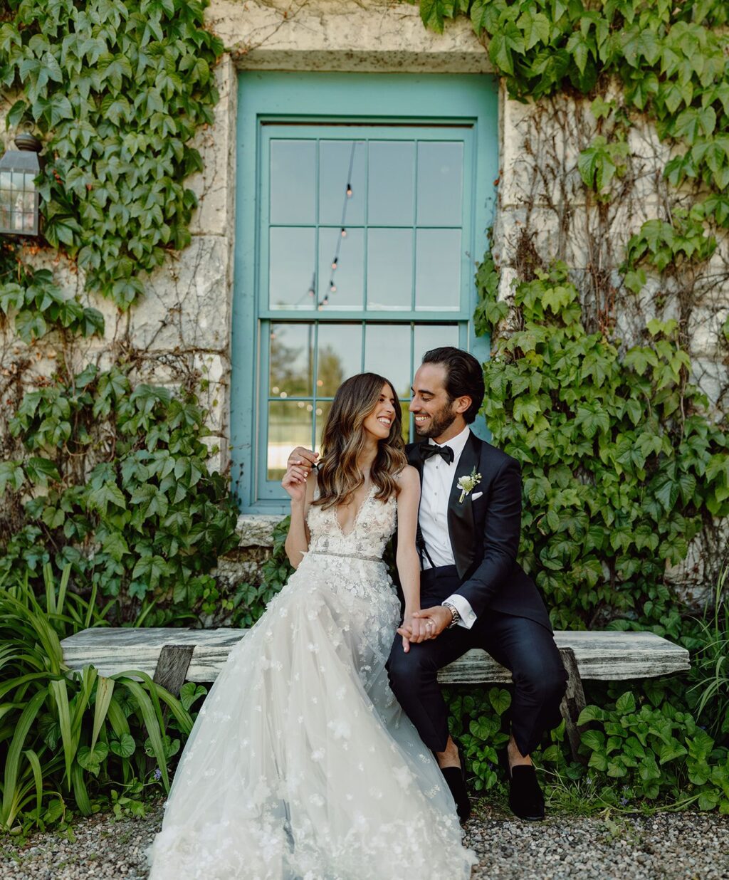
Dolyn and Zachary envisioned a wedding filled with love and celebration in a rustic chic setting. To set the tone for their day, the couple worked with our Brooklyn store to create their Alder inspired wedding invitations. Botanical elements throughout the suite nodded towards their Stonover Farm venue. They opted for a monochromatic color palette in Vine letterpress ink which kept all pieces consistent as well as clean. They freed their set of any script accents by using a serif font throughout instead. After the invitations are sealed and delivered, it’s time for the party to begin! Finally, we will let the couple take it from here to tell us more about their big day:
Q: HOW DID YOU CHOOSE YOUR INVITATION DESIGN & INK COLORS?
A: I knew that I wanted our wedding to have green and white florals early on. I’m not a huge fan of bright colors and I wanted to compliment the beauty of our Berkshires venue. At our first invitation meeting, I instantly fell in love with a design that was similar to our website, then we just made a few edits to fit our aesthetic. One of our favorite elements was our details card. It felt super unique and was such a fun way to include all the information for our events (welcome reception, wedding, and brunch) in one place. Our suite really spoke to our whole “rustic chic” aesthetic. It wasn’t too formal, but still had a simple elegance to it and felt like it really fit our venue.
Q: CAN YOU SHARE WITH US A BIT ABOUT YOUR WEDDING AND YOUR INSPIRATION FOR THE EVENT?
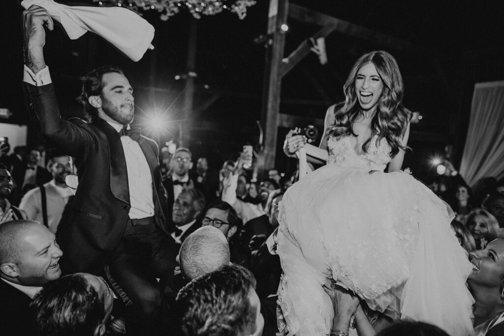
A: The most important thing to us is that our wedding is fun and filled with love. My husband and I went to college together and still have a tight-knit group of friends from school who all love to party together. So we set out to make a weekend-long celebration with that in mind. We had a welcome cocktail party with lobster rolls, tacos, sushi, and old-school ice cream cups. It was a casual vibe filled with tons of hilarious speeches and great mingling to kick off the weekend. On Saturday we didn’t want anything to feel too formal. We had energetic music as we walked down the aisle – everyone was cheering and having fun. Our band kept everyone on the dance floor – where we did the limbo, my husband crowd-surfed, and the barn floor shook. The aesthetic was “rustic chic” – which, to us, meant a combination of casual and elegant. Even though our main goal was to have fun, we still wanted it to feel like a wedding and have some of that traditional decor.
Q: WHAT ADVICE DO YOU HAVE FOR COUPLES CURRENTLY PLANNING A WEDDING?
A: Use Instagram as inspiration! I found almost all of my vendors (and even my venue) there…including Bella Figura. Give yourself plenty of time to search around and allow yourself to go down a rabbit hole. Maybe find a venue you like and figure out which florists, photographers, or planners created the content you love. Collect photos of weddings you love so that you can present them to your vendors and are able to clearly define the vibe you’re going for. If you start thinking about what’s important to you and what aesthetics you respond to early (even before you get engaged) – then you won’t feel rushed into making decisions.
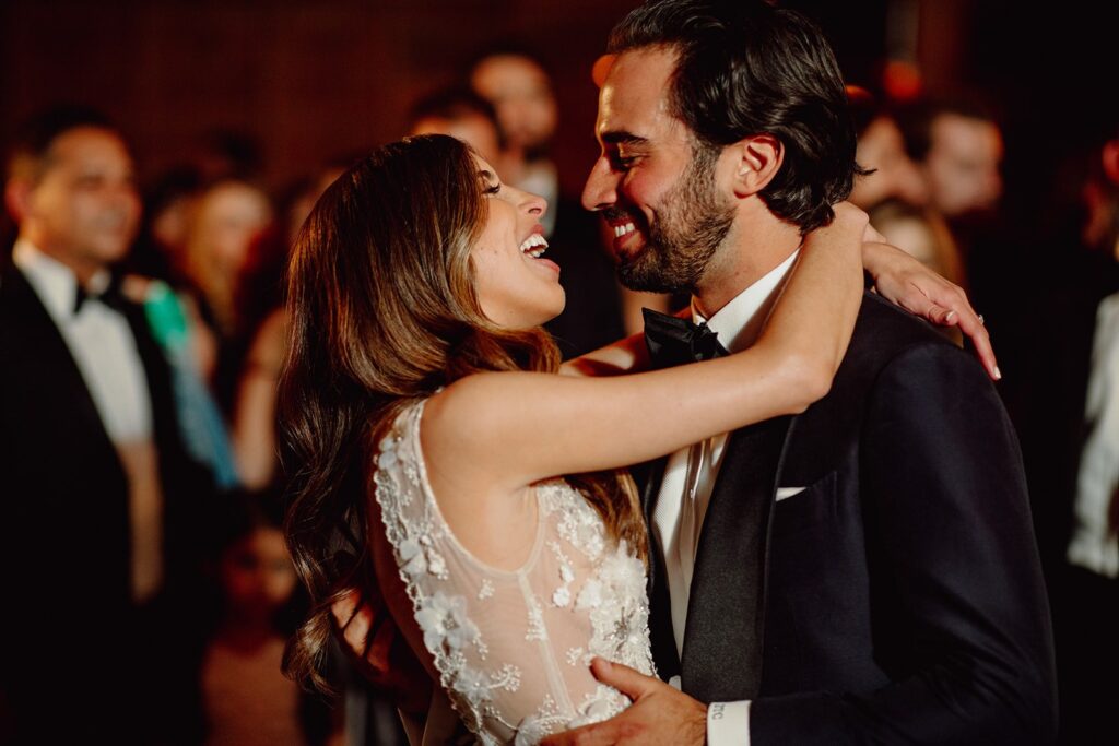
Q: WHAT WAS YOUR FAVORITE MOMENT?
A: We had two very clear favorite moments: our ceremony and our first dance. Our rabbi was a long-standing friend of my family who went to great lengths to personalize our ceremony. The nuptials included details of our love story, hand-picked blessings, and our own vows. It really felt like a celebration of our relationship. I was hesitant about writing my own vows because I hate public speaking, but couldn’t have been happier that we did. Our first dance song was You’re The One by Greta Van Fleet. We agonized for months to find the perfect song and then randomly stumbled upon You’re The One a few days before the deadline to finalize the music. It felt so right for us and was the perfect romantic way to kick off the party.
Q: WHAT SURPRISED YOU MOST ABOUT YOUR WEDDING?
A: I was most surprised by the fact that the little things that went wrong didn’t really matter in the moment. No matter how much you plan, something unexpected is bound to happen. But we included so many of our favorite things throughout our wedding weekend that it felt like a fool-proof way to be super happy throughout. It’s easy to get carried away with the planning process – but, in the moment, all I cared about was celebrating with my new husband and our friends and family.
We are so happy to spot Bella Figura customizations in the latest issue of Modern Luxury Weddings Chicago. This particular feature is all about trending envelope liner styles! And who better to go to than Smitten Boutique and Pulp and Ink for a little insight on all things wedding stationery. Erin Quinn from Smitten Boutique talks about how important an envelope liner can be when it comes to expressing a couple’s personality and style. While Colin Falco is all about the pop of a foil stamped envelope liner as shown in his skyline customization. We’re also happy to spot Elizabeth Grace as one of the professionals on this page! We can’t wait to see what envelope customizations might come through our shop next. Thanks again to Modern Luxury Weddings Chicago for the feature!