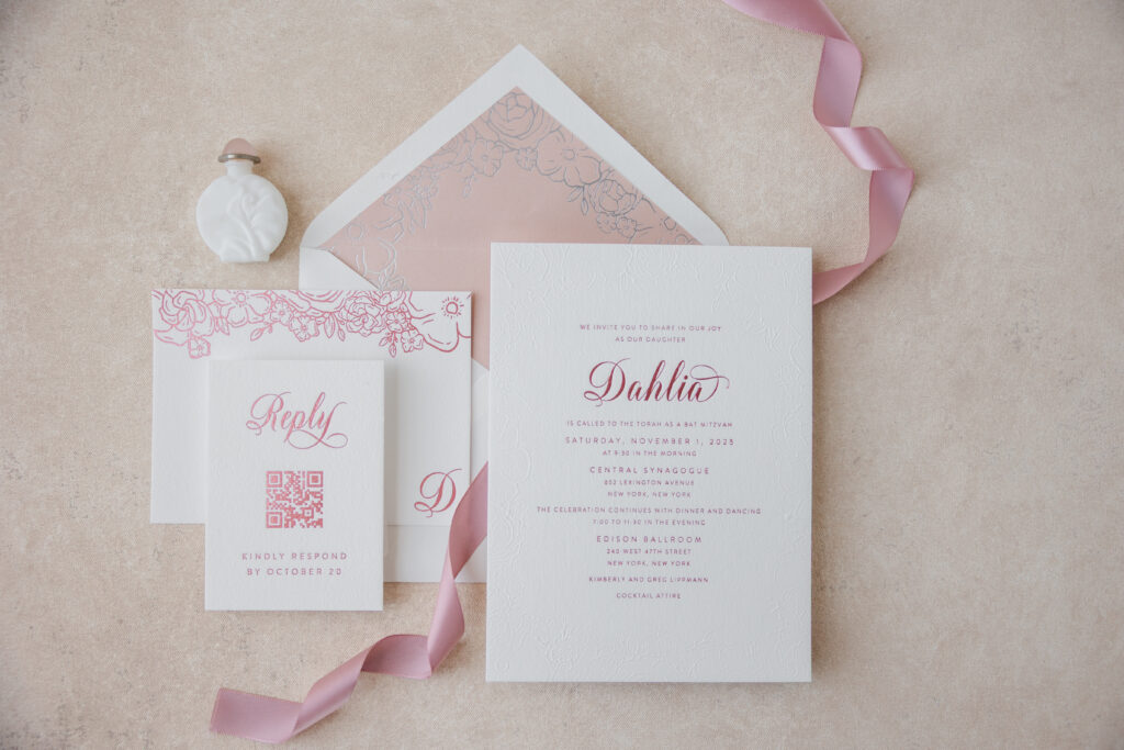
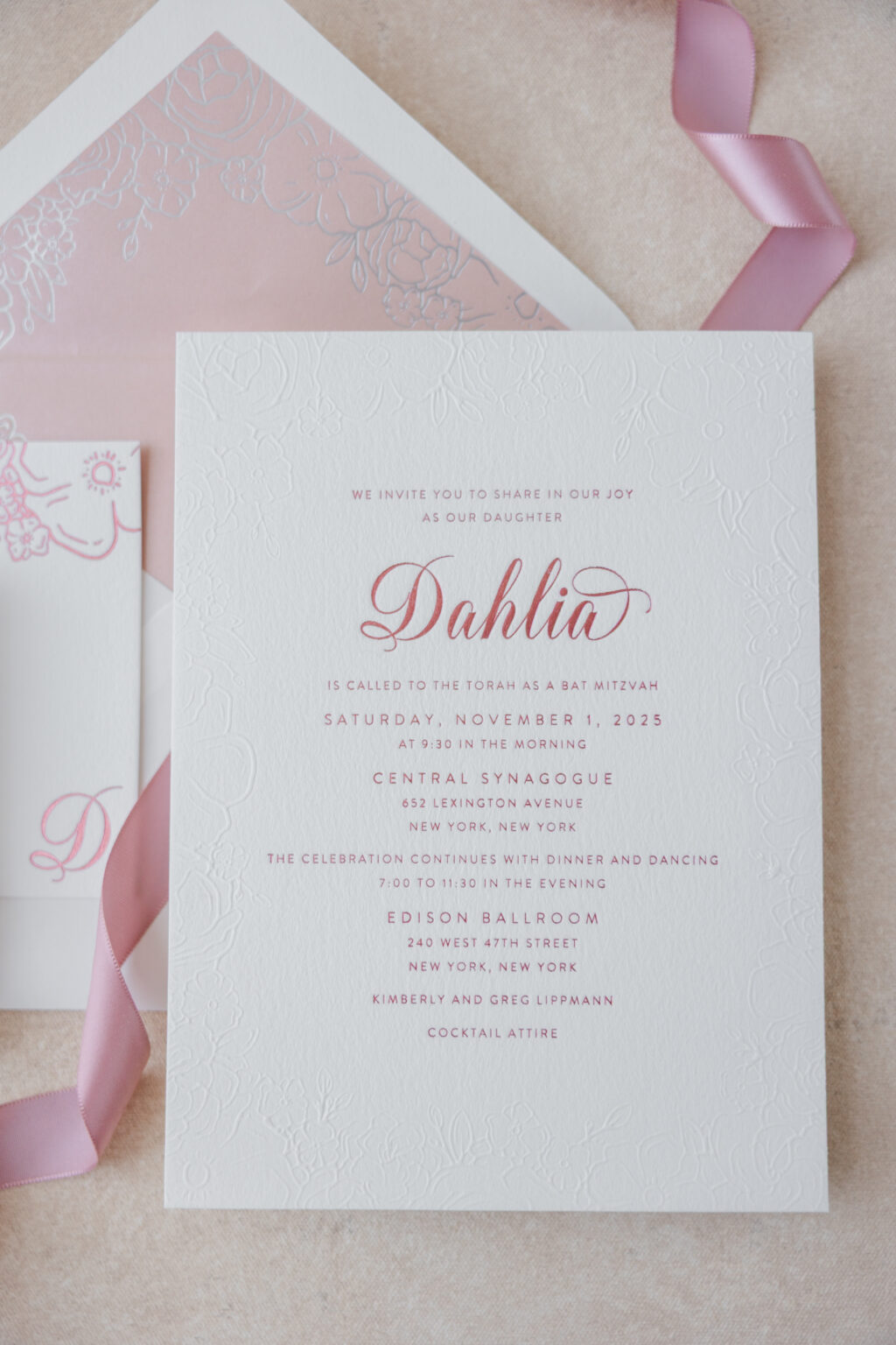
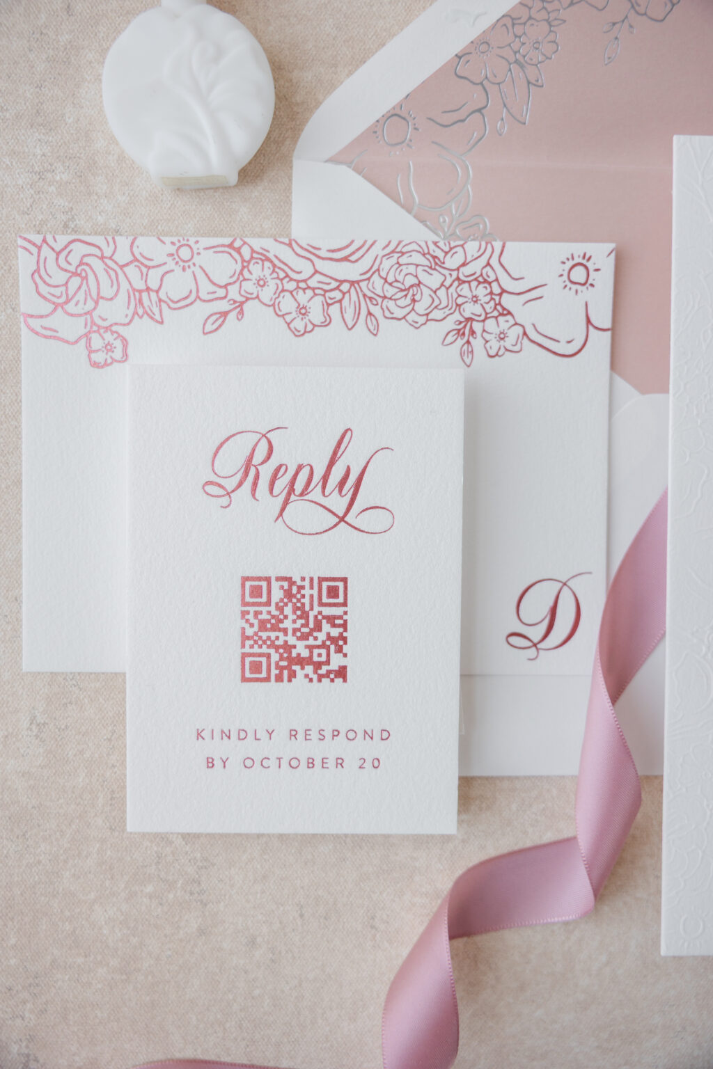
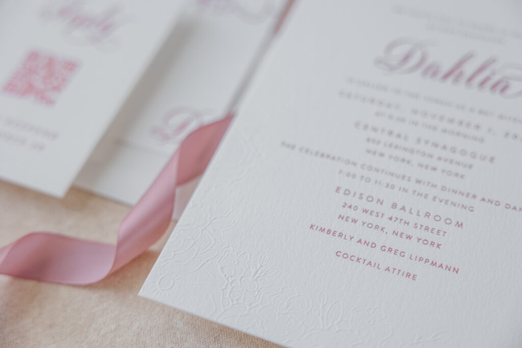
This invitation suite has a soft romantic aesthetic with subtle luxury details that feel traditional yet trendy. It combines delicate floral artwork, blind embossing, and elegant typography to create a look that is graceful, refined, and celebratory. Our dear friend Alexandra of Alexandra Partow Events worked with Dahlia to customize our Farrington design.
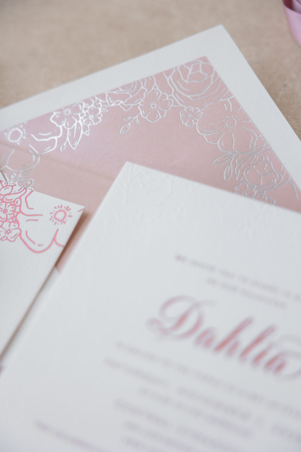
envelope liner: custom pattern in silver matte foil on metallic briar rose text
envelope: white cotton text pointed flap
envelope addressing: pewter digital on the front / pewter + tea rose digital on the back
job #: 77956
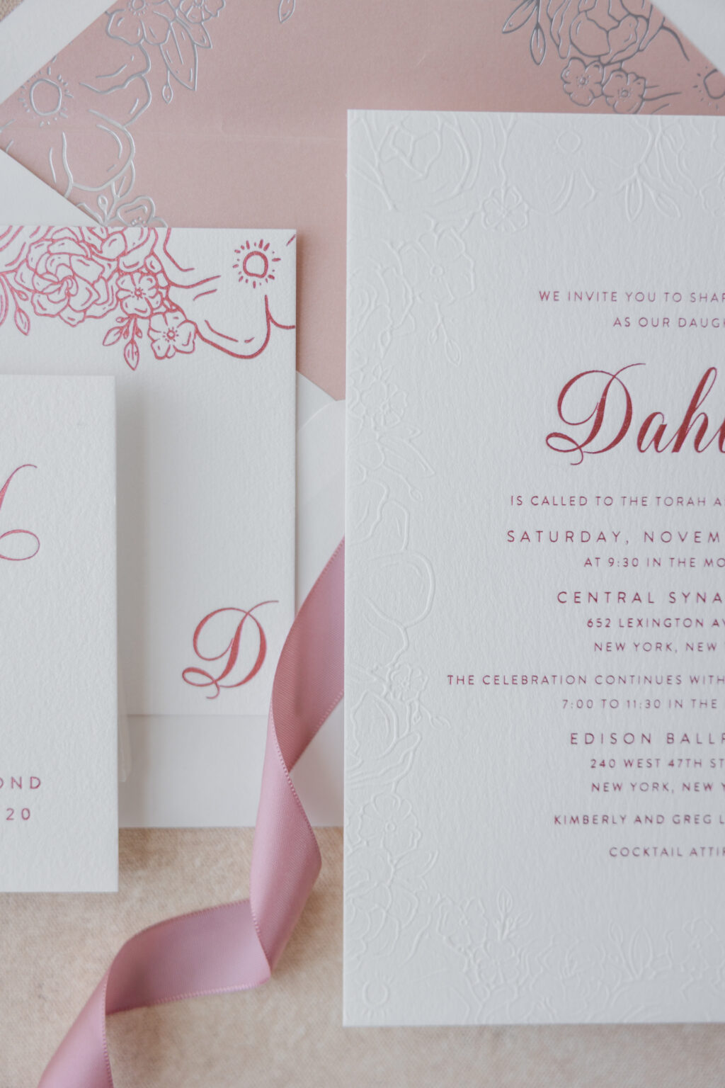
A script font with lavish flourishes ensures Dahlia’s name is the focal point of the invitation layout. A clean, classic serif font for the remaining text creates a balanced design that feels both elegant and approachable. Quartz matte foil stamping adds glamour, while an intricate blind-embossed floral pattern creates a richly textured border.
The same floral artwork appears as the envelope liner and as an accent on the thank you card. Using this pattern throughout the suite provides a cohesive feel while maintaining an airy sophistication.
envelope addressing: pewter + tea rose digital on the back
job #: 77956
Every detail is thoughtfully layered to evoke the beauty of fine stationery with a modern sensibility. Do you like the subtle look of a blind emboss border, or the concept of carrying a pattern throughout the design? Work with one of our dealers to create your perfect stationery.
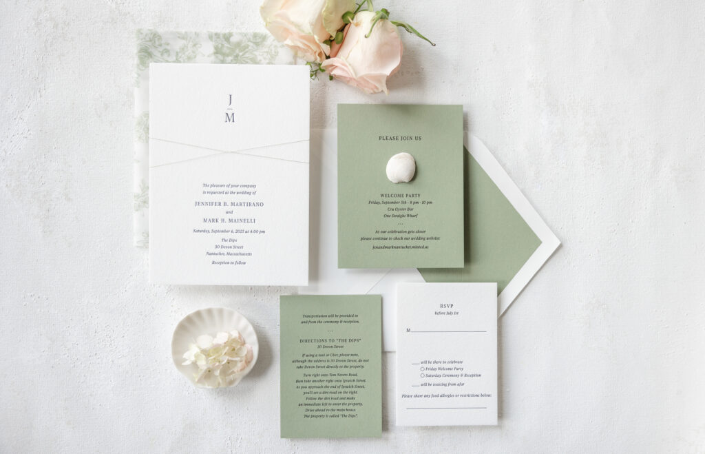
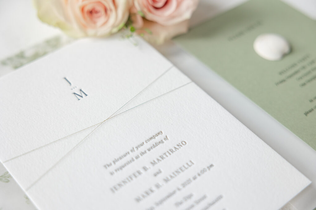
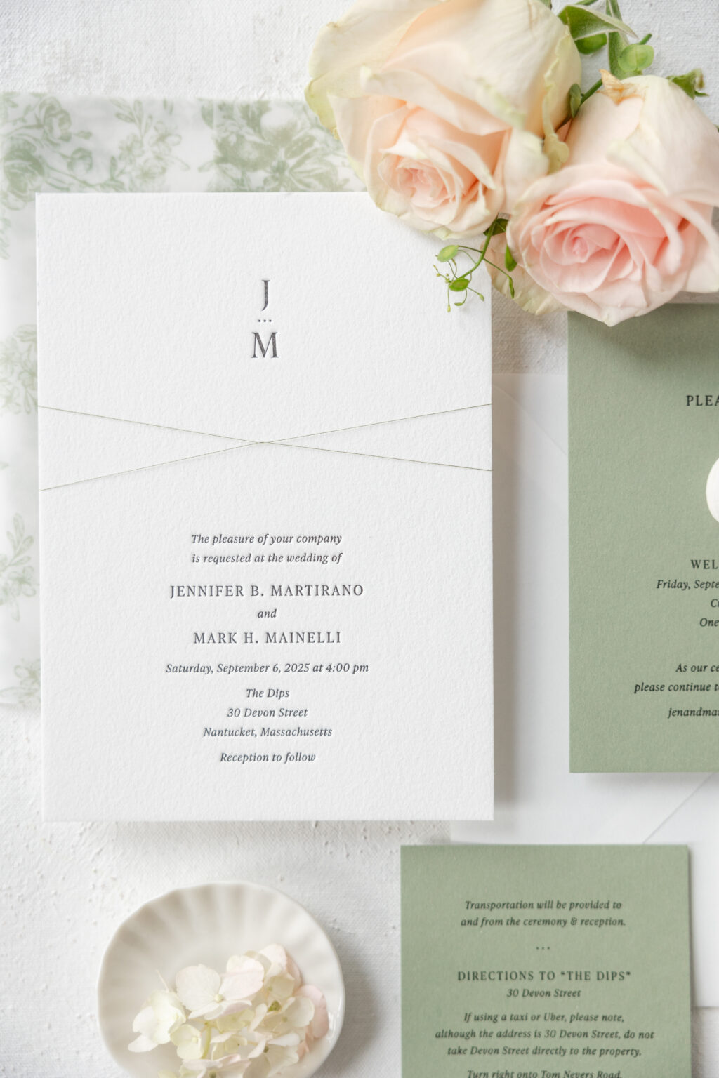
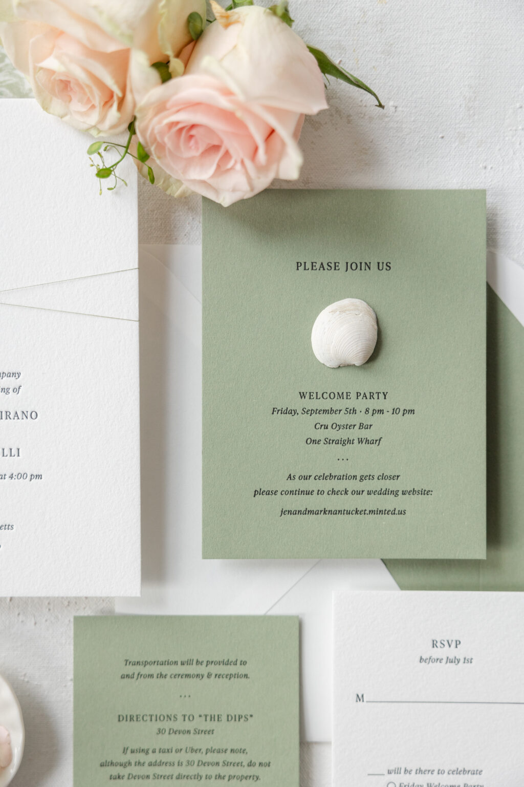
This invitation suite embodies a minimalist aesthetic that is refined and timeless while also incorporating elements of coastal luxury, perfect for this Nantucket wedding. The couple, Jennifer and Mark, worked with our dear friend Heidi of Parchment Fine Papers to create this lovely destination letterpress invitation suite complete with day-of pieces.
Invitation
letterpress ink: black
font: ivy presto display light/light italic
paper: bella cotton 2-ply white
card size: a-7
finishing: assemble with thread and gatefold
envelope liner: spruce text
envelope: white cotton text
envelope addressing: black digital on the front and the back
job #: 76201
Gategold
digital ink: spruce
paper: 40# vellum
card size: a-7
thread: metallic meadow
finishing: assemble with invitation and thread
job #: 76201
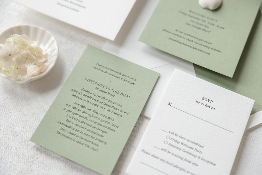
Details Card
letterpress ink: black
font: ivy presto display light/light italic
paper: spruce 1-ply
card size: a-5
job #: 76201
Black letterpress on our white cotton 2-ply paper is classic and traditional. Our cotton paper has a decadent pillowy texture yet still holds a crisp letterpress impression. This invitation design is a study in quiet elegance and proves that less is more. Minimal typography and generous blank space create an effortlessly sophisticated and modern look. The monogram featuring the couple’s initials stacked vertically is simple yet understated.
Events Card
letterpress ink: black
font: ivy presto display light/light italic
paper: spruce 1-ply
card size: a-2
job #: 76201
Reply Card
letterpress ink: black
font: ivy presto display light/light italic
paper: bella cotton 1-ply white
card size: a-5
envelope: white cotton text pointed flap
envelope addressing: black letterpress on the front
job #: 76201
The use of spruce paper for some of the auxiliary cards and the envelope liner adds subtle color while maintaining the minimalist and cohesive feel. A gatefold is always a lovely addition, but this particular design, featuring our elegant garden pattern digitally printed in spruce ink, is charming and romantic.
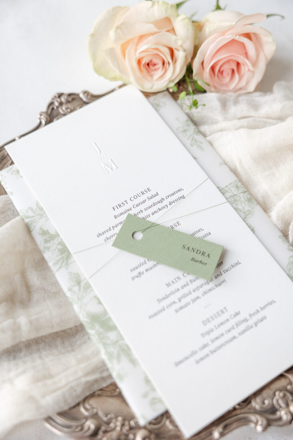
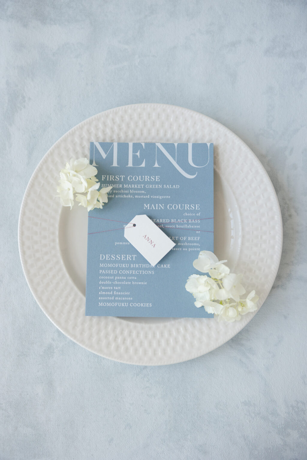
Menu
letterpress ink: black
emboss: blind
font: ivy presto display light/light italic
paper: bella smooth cotton 2-ply white
card size: 4” x 8.5”
job #: 78179
Tag
digital ink: black
font: ivy presto display light/light italic
paper: spruce 1-ply
card size: 1” x 2.5”
die-cut shape: cd-315
thread: metallic meadow
finishing: assemble with menu and thread
job #: 78179
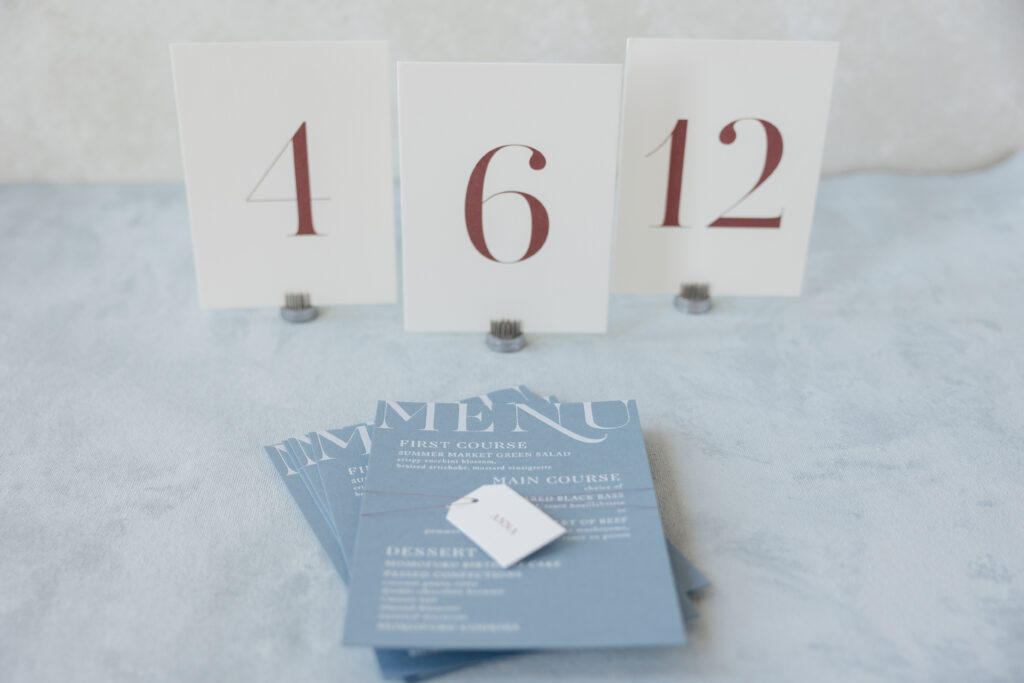
Our metallic meadow thread secures the gatefold and attaches the tag to the menu, adding texture while coordinating with the color palette. The tag bearing the name of each guest is a thoughtful addition.
Do you want something airy and romantic? Do you like a minimalist, coastal luxury aesthetic, or would you love to feature a floral gatefold? Work with one of our dealers to create your ideal letterpress wedding invitations.
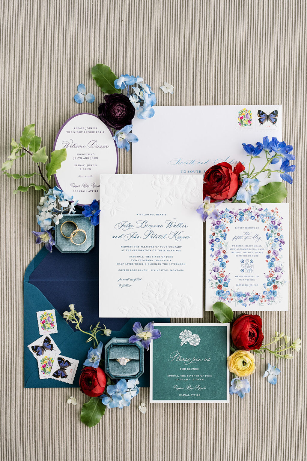
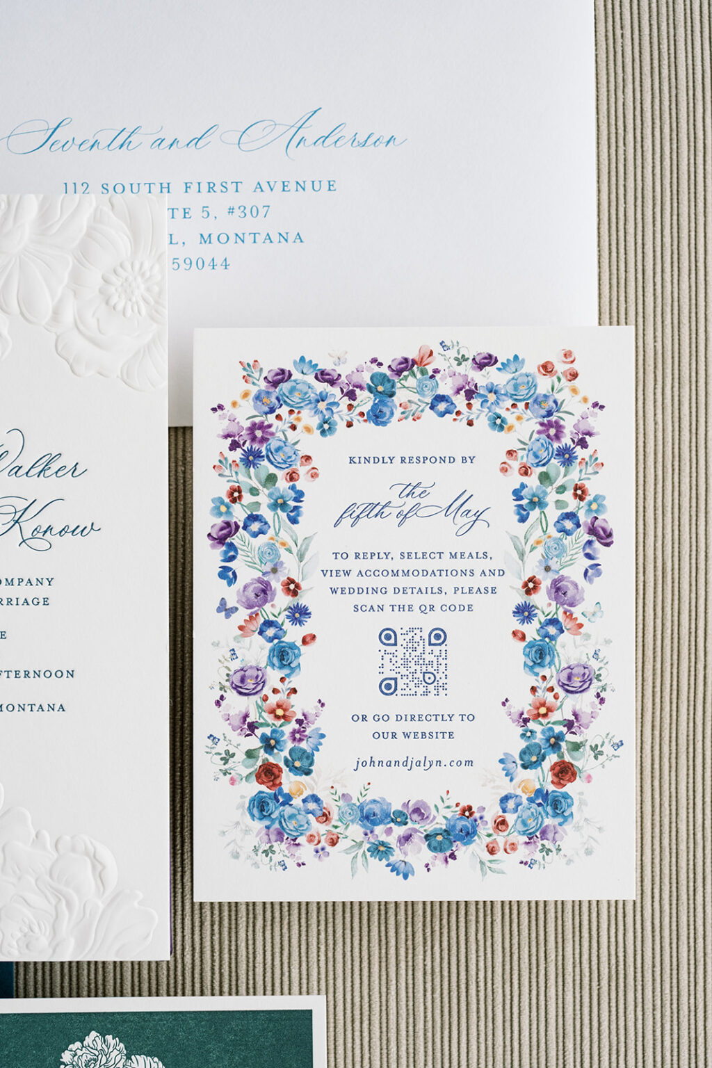
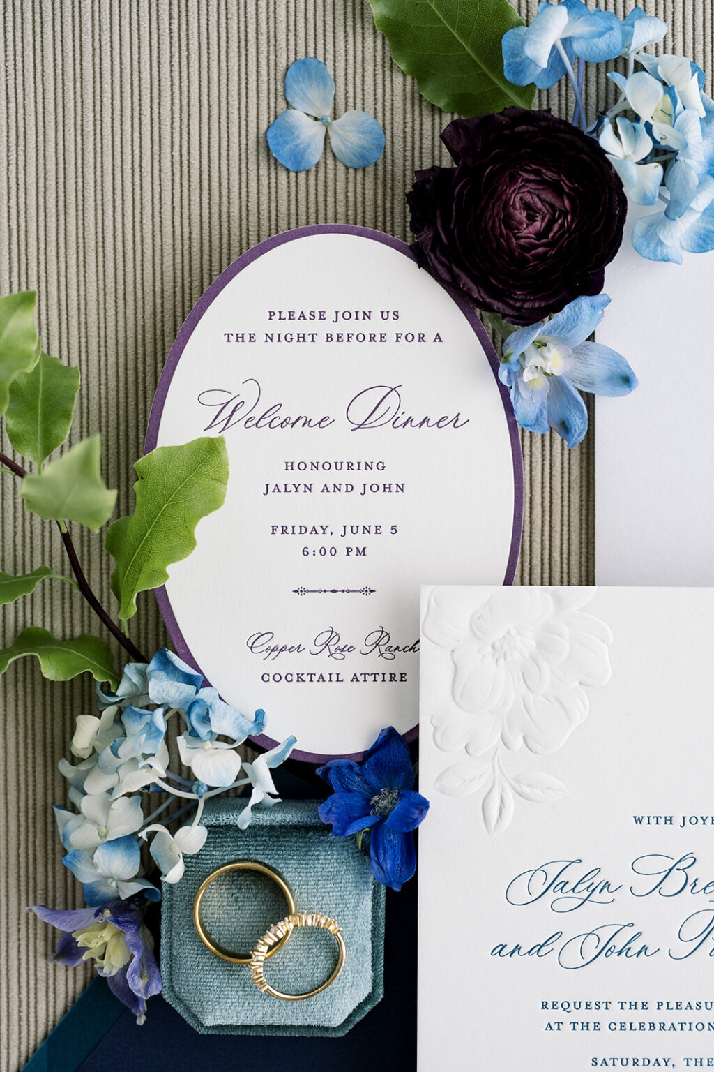
We had the absolute pleasure of working with our dear friend Janeil of Seventh and Anderson to help create Jalyn and John’s stunning wedding stationery. The entire suite feels timeless and colorful, blending classic typography with painterly florals, rich jewel tones, and lovely sculpted emboss details.
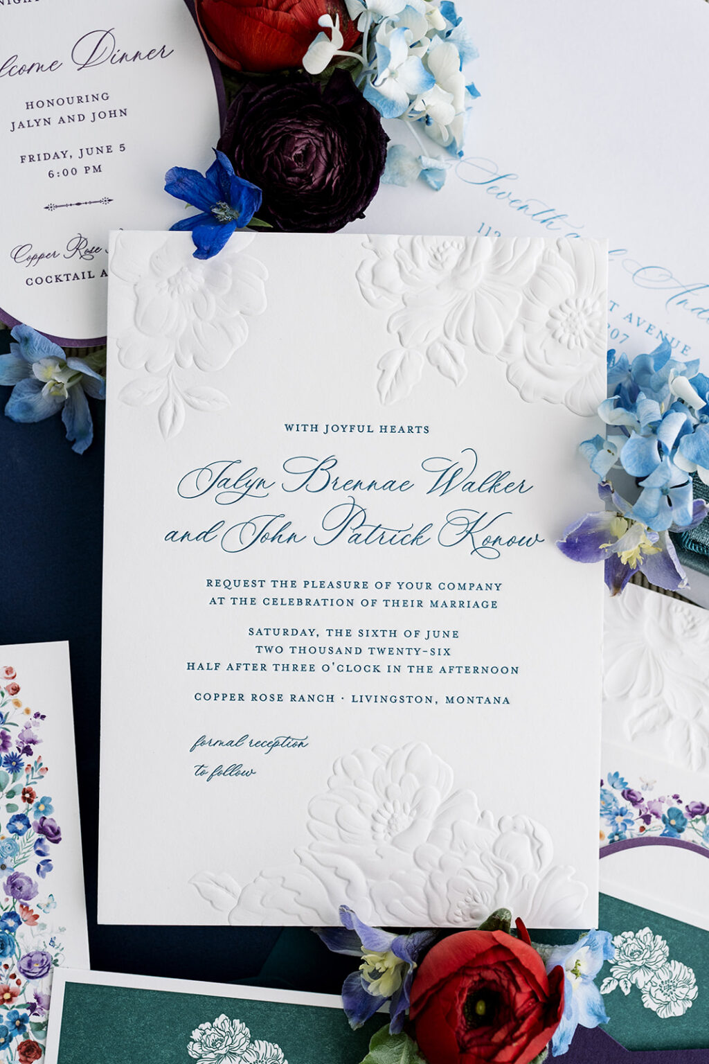
A traditional script font with thin, graceful flourishes paired with refined serif lettering sets a timeless tone for the invitation. Our amazon letterpress ink is bold yet maintains a formal sensibility. Our Bella smooth cotton 2-ply in white serves as the foundation for the invitation, providing a soft, satiny feel while holding a crisp letterpress impression. Delicate sculpted embossed floral motifs add depth and texture without overwhelming the design. Sculpted emboss is a technique that creates a raised impression and allows for different heights. In this instance, that means stunning detail, like the overlapping layers of petals and the veining of the foliage.
Invitation
letterpress ink: amazon
sculpted emboss: blind
paper: bella smooth cotton 2-ply white
card size: a-7
finishing: assemble with back pocket
job #: 81140
Back Pocket
paper: bella eggplant 1-ply
size: a-7 vertical back pocket
die-cut shape: ps-516
job #: 81140
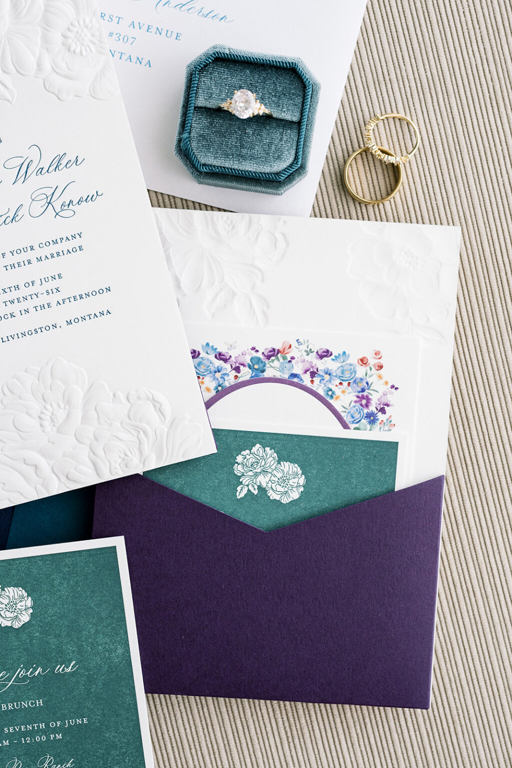
A pocket on the back of the invitation provides a clever spot to secure the additional cards in the suite, ensuring a neat, tidy presentation when guests open the envelope and remove the contents.
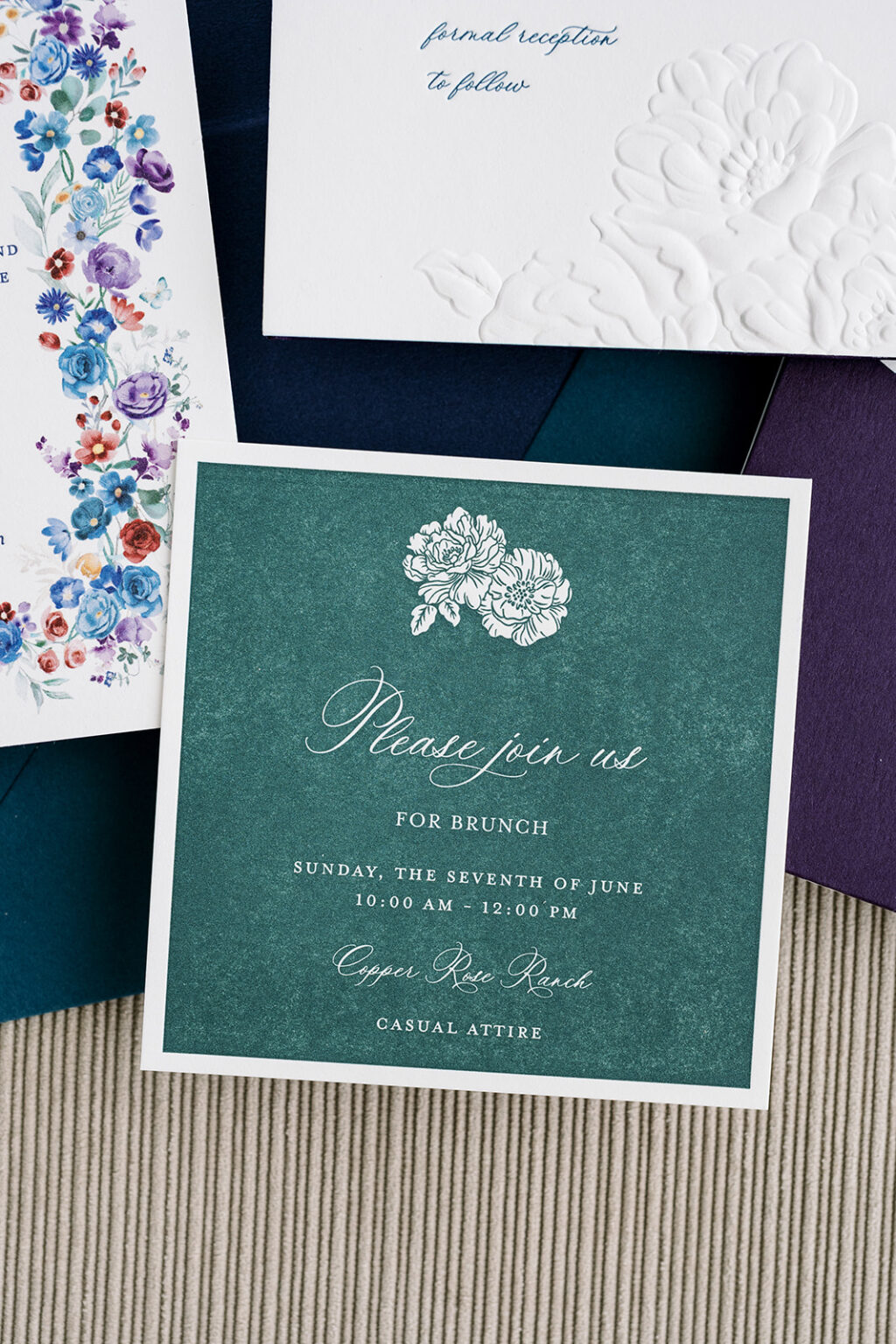
The reply card is darling. A painterly floral border evokes sweeping open meadows and introduces a fresh, joyful energy. The text still appears in letterpress but in a different shade of blue, to maintain a cohesive feel while standing out.
Reply Card
letterpress ink: royal blue
digital: cmyk
paper: bella smooth cotton 1-ply white
card size: a-2
job #: 81140
The rehearsal dinner invitation is more subdued, but still lovely. Plum letterpress printing stays true to the vibrant color palette. The oval die-cut shape mimics the floral border of the reply card.
Rehearsal Dinner Invitation
letterpress ink: plum
paper: bella smooth cotton 1-ply white
card size: a-5
die-cut shape: bf-112
job #: 81140
Last up is the brunch card, which is printed in reverse. The myrtle letterpress ink serves as the background, while the unprinted areas create the text and floral motifs. The printing showcases the gentle flourishes of the script font and the detail of the flower artwork. The satin-like texture of the paper shows through in the areas of high coverage, creating a suede-like appearance.
Brunch Card
letterpress ink: myrtle
paper: bella smooth cotton 1-ply white
card size: 4” x 4”
job #: 81140
Every element of this wedding stationery suite feels thoughtfully curated, balancing refined elegance with colorful garden romance. The vibe is both grand and intimate. It is always a pleasure to work with Seventh and Anderson, and we wish the best to Jalyn and John.
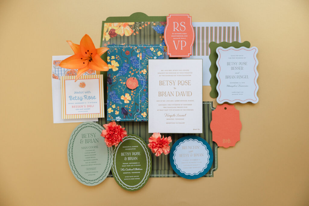
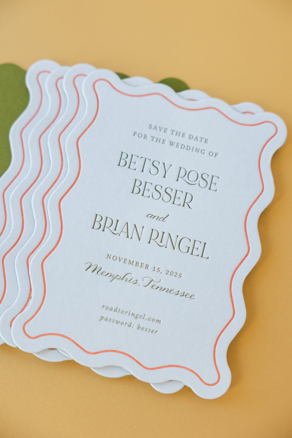
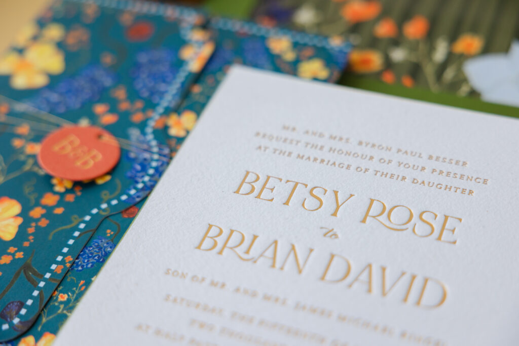
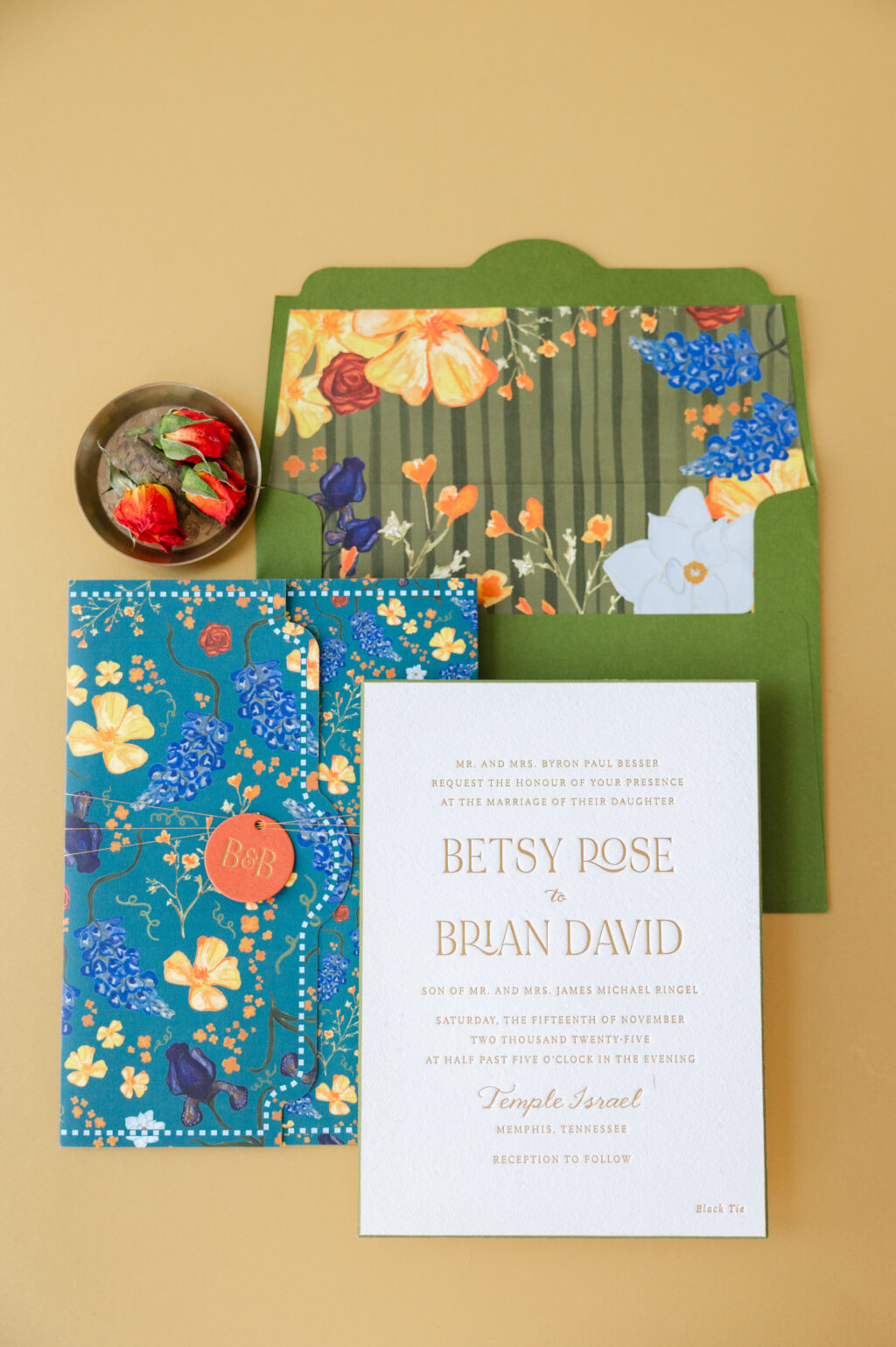
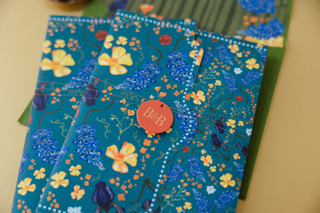
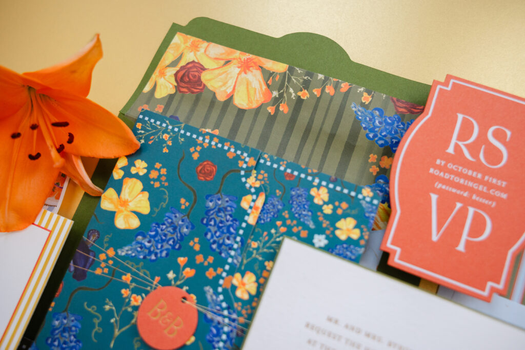
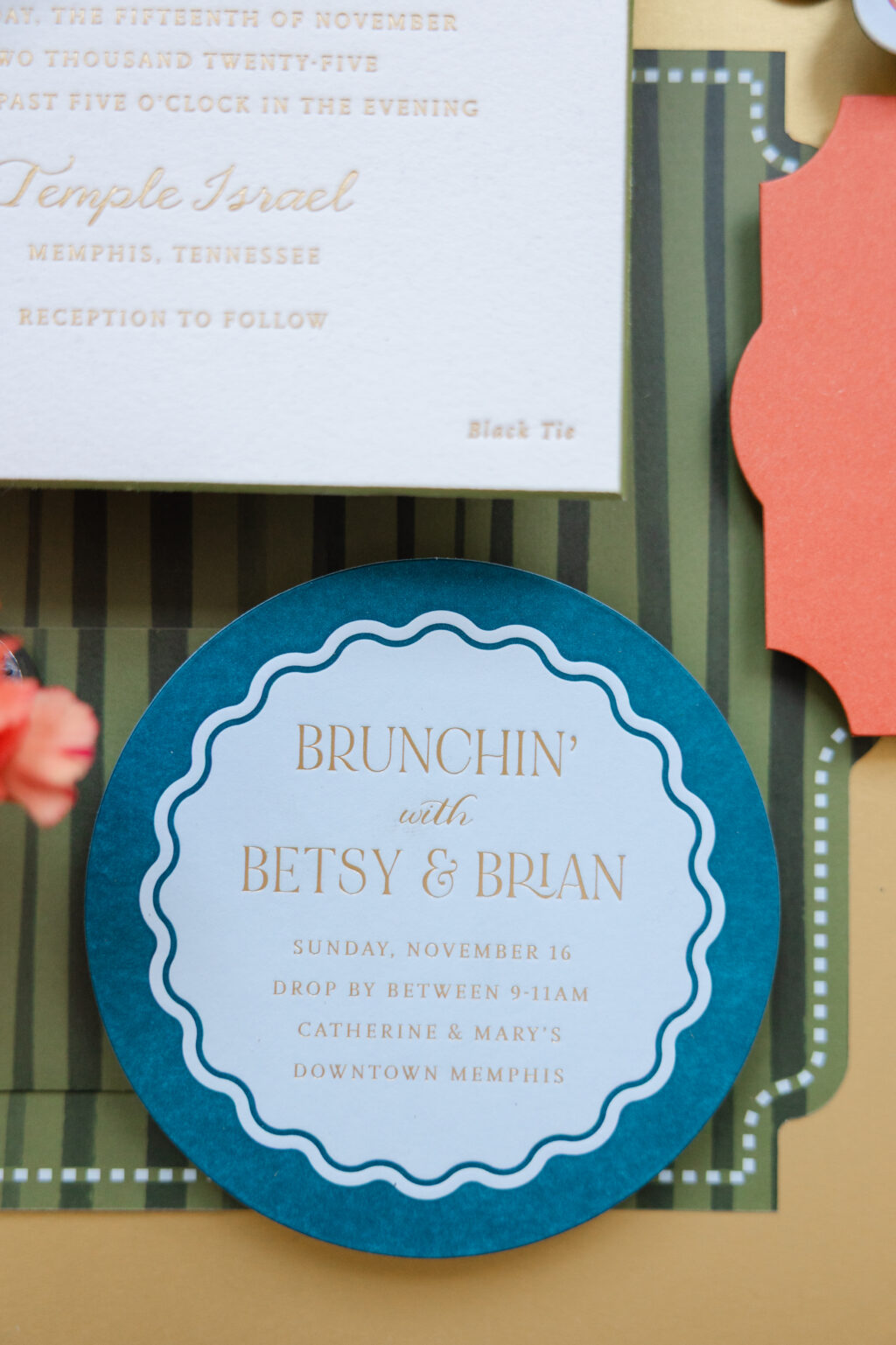
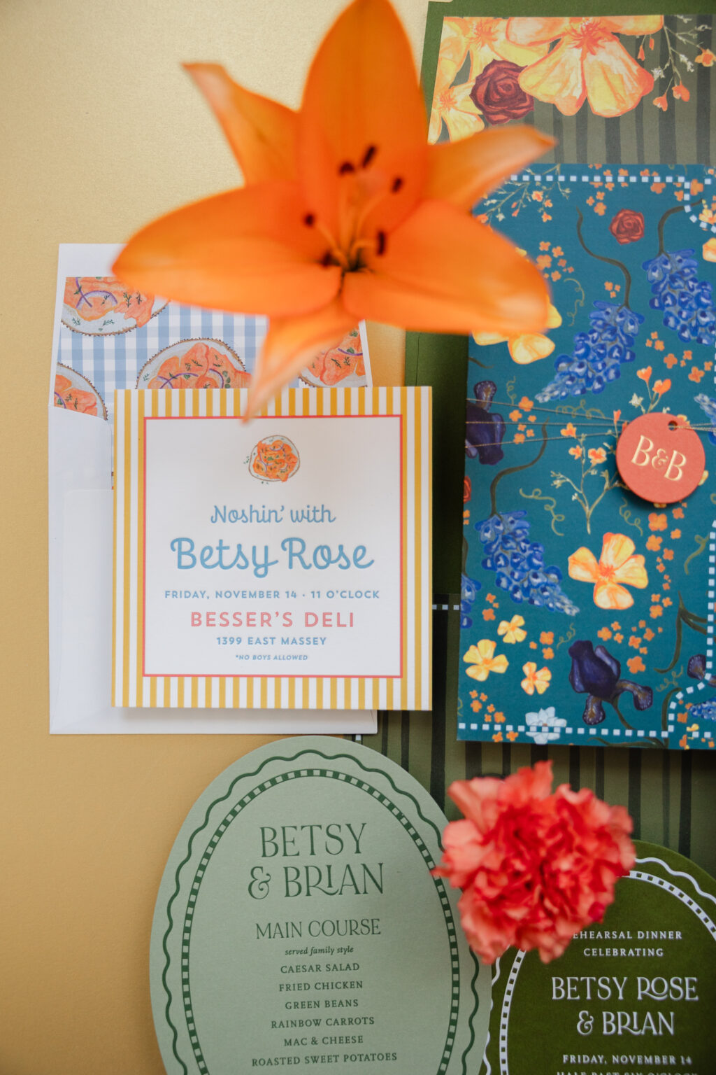
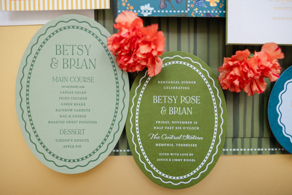
You’ll want to take a moment, or several, to enjoy Betsy and Brian’s Southern garden wedding invitations. Cheerful color, whimsical florals, elegant die-cut shapes, and sophisticated typography are just part of what this wedding stationery set has to offer. This lovely couple worked with our dear friend Lindsey of Mrs. Post Fine Stationery & Gifts to create this charming custom stationery.
envelope liner: custom pattern in hunter + mesa + 65% french blue digital on bella white text
envelope: bella sky text
envelope addressing: hunter digital on the front and the back
job #: 75807
The save the date was the first item guests saw, and it does not disappoint. The scalloped edge is emphasized by a letterpress border that follows the gentle curves. Sophisticated typography feels joyful, polished, and full of personality. The front of the card features our Bella sky 2-ply stock, which is duplexed to our moss 1-ply. This technique creates a lovely 3-ply card and introduces an unexpected pop of color that is delightful and imaginative.
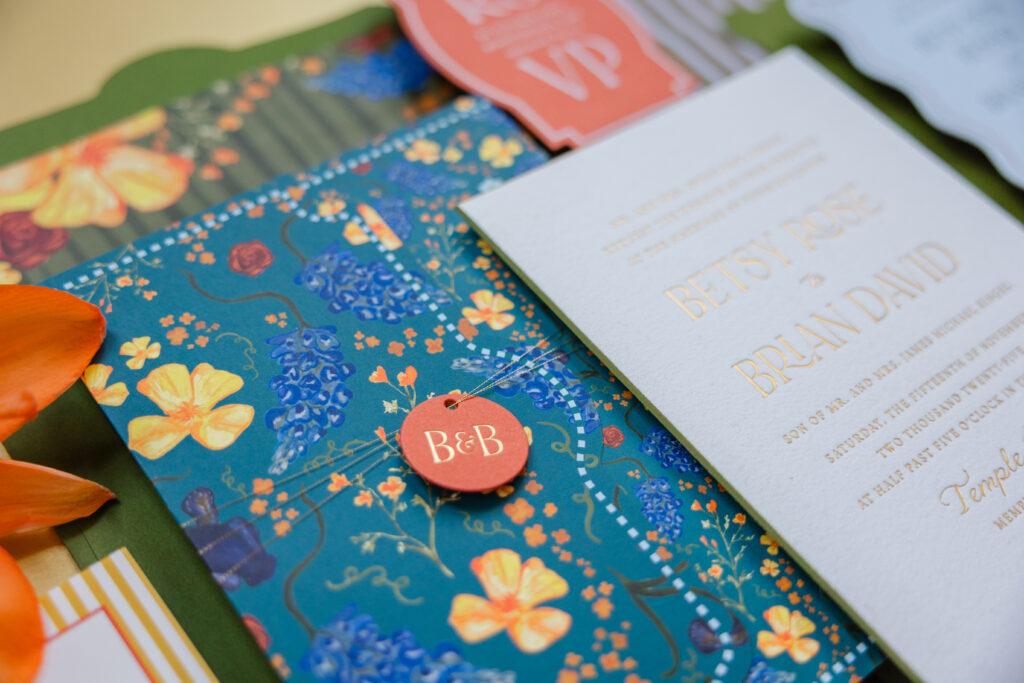
The invitation draws inspiration from the save the date, but ups the elegance factor. Bella cotton paper introduces a decadent texture, while gold matte foil stamping introduces glamour. Edge painting in hunter highlights the beveled edge.
Invitation
foil stamping: gold matte
fonts: noir et blanc + katie rose + scala
paper: bella white cotton 2-ply
card size: f-8
bevel: 45 degrees
edge paint: hunter
envelope liner: custom pattern in cmyk + hunter digital on bella white text
envelope: custom converted moss text
envelope die: e-431
envelope addressing: gold matte foil stamping on the back
job #: 77619
Folder
digital ink: cmyk (front) / cmyk (back)
paper: bella cover white
size: 14.67” x 8.28” flat, 6.17” x 8.28” folded
die-cut shape: ps-612
finishing: assemble with pocket
job #: 77619
Pocket
digital ink: cmyk
paper: bella cover white
size: 7” x 4” flat, 5.5” x 3.25” assembled
die-cut shape: ps-533
finishing: assemble with folder
job #: 77619
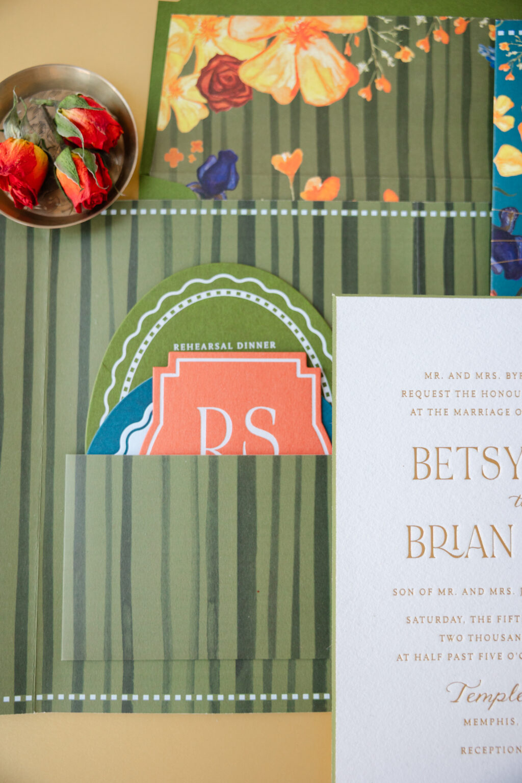
Perhaps the standout feature of the entire suite is the folder. Garden-inspired floral artwork adorns the exterior, which is secured with metallic thread and a tag bearing the couple’s initials. A custom strip pattern on the interior is sophisticated and formal. A pocket adhered to the folder’s interior creates a space to stash the additional cards, ensuring a polished presentation when guests open the folder.
The envelope liner features the same strip pattern from the folder’s interior, with the addition of some of the florals from the exterior. This establishes a cohesive feel, while still ensuring every single item in this suite is unique.
Reply Card
foil stamping: white matte
fonts: noir et blanc + katie rose + scala
paper: bella messa 2-ply
card size: 3.38” x 7.75”
die-cut shape: cd-763
job #: 77619
Brunch Card
letterpress ink: amazon
foil stamping: gold matte
fonts: noir et blanc + katie rose + scala
paper: bella sky 2-ply
card size: 4.75”
die-cut shape: bp-6
job #: 77619
Bridal Luncheon Card
foil stamping: white matte
fonts: noir et blanc + katie rose + scala + finaly + trend sans
paper: bella moss 2-ply
card size: 6.19” x 4.56”
die-cut shape: bp-127
envelope liner: custom pattern in cmyk + french blue digital on bella white text
envelope: white cotton text
envelope addressing: wedgewood digital on the back
job #: 77619
Tag
foil stamping: gold matte
fonts: noir et blanc
paper: bella messa 2-ply
size: 1.3” x 1.3”
die-cut shape: cd-104
thread: metallic gold
finishing: assemble with thread around folder
job #: 77619
Escort Tag
foil stamping: gold matte
fonts: noir et blanc
paper: bella messa 2-ply
size: 3.4658” x 4.8146”
die-cut shape: cd-764
job #: 77619
The remaining cards in the suite maintain the same vibrant mix of Southern charm and whimsical elegance. This wedding invitation suite effortlessly combines colorful botanical patterns with preppy stripes, scalloped die-cut shapes, and vintage-inspired typography. The bold color palette is fresh yet nostalgic, while layered textures and die- cut cards add dimension and personality. The result is a playful look that feels refined.
Rehearsal Dinner Menu
letterpress ink: vine
fonts: noir et blanc + katie rose + scala
paper: bella spruce 1-ply
card size: 5” x 7”
die-cut shape: bp-125
job #: 78963
Rehearsal Dinner Invitation
letterpress ink: wedgewood
digital inks: goldenrod + chili + cmyk
fonts: noir et blanc + katie rose + scala
paper: bella smooth cotton white 2-ply
card size: sq-5
job #: 77619
Do you dream of garden wedding invitations with bold typography, adorable patterns, or a whimsical yet efficient folder to hold everything in place? Work with one of our dealers to create your perfect wedding stationery.
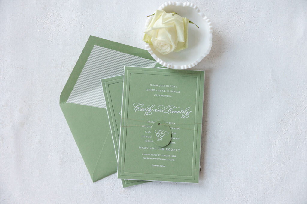
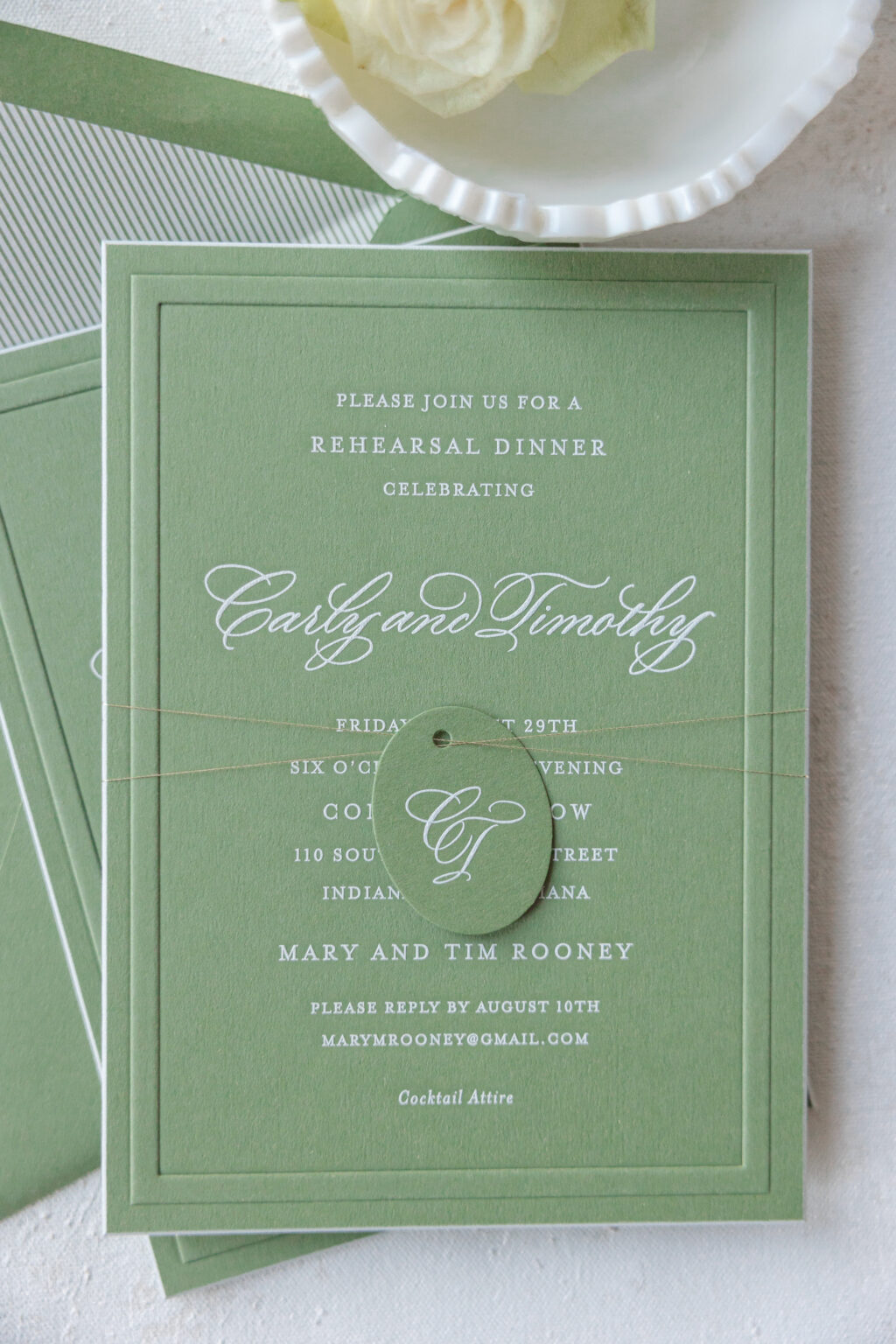
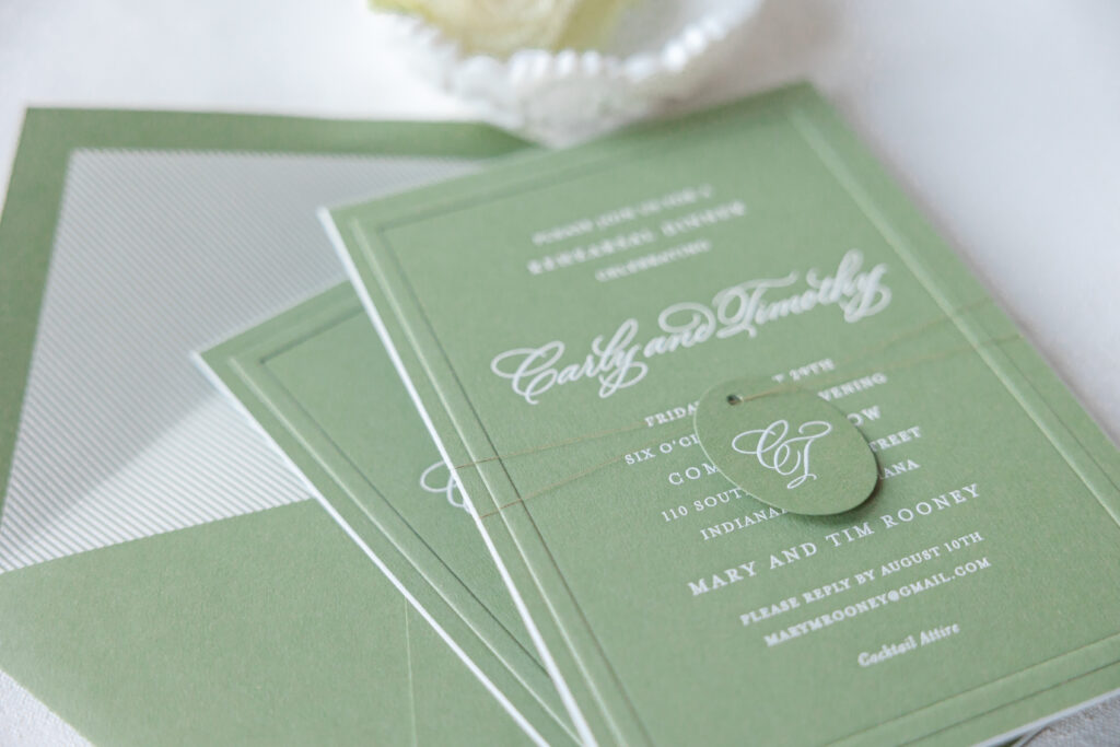
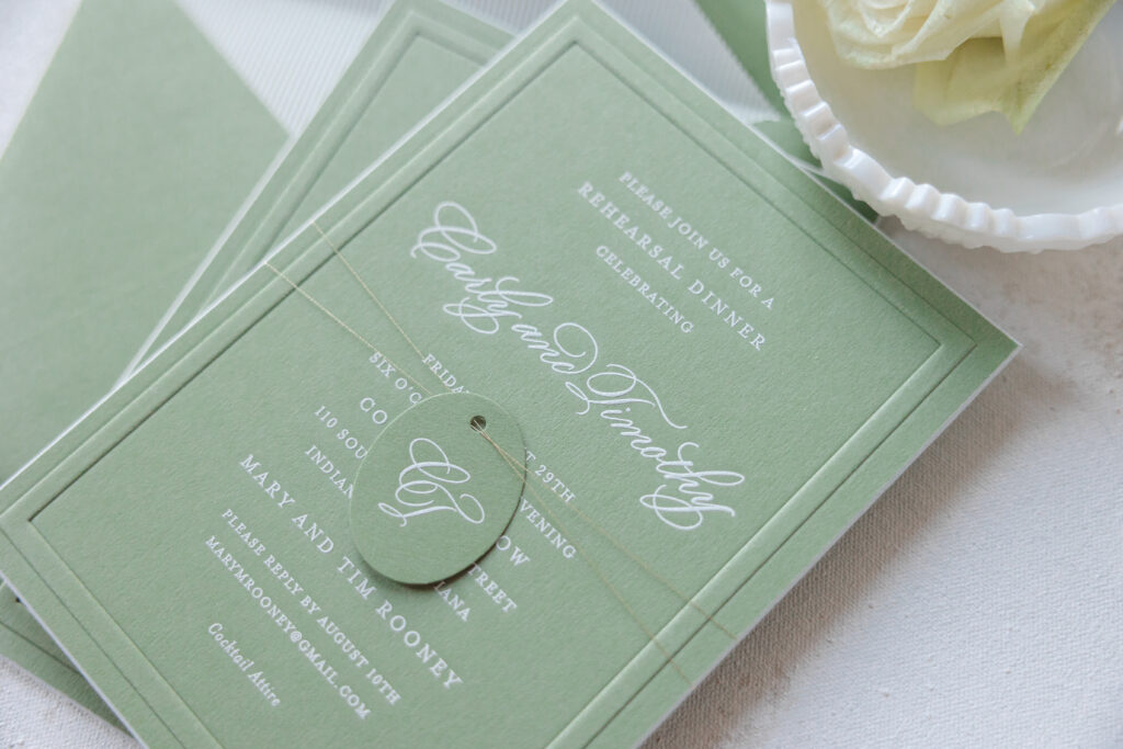
These invitations feel refined yet understated, combining soft color, classic typography, and luxurious details for an effortlessly sophisticated look. The couple, Carlyn and Timothy, worked with our dear friend Kristyn of Oliver’s Twist to create this elegant engraved rehearsal dinner invitation.
Rehearsal Dinner Invitation
engraving: white
emboss: blind
font: garamond
calligraphy: supplied
paper: bella spruce 2-ply
card size: a-7
bevel: 45 degrees
edge paint: white
thread: metallic tawny
finishing: assemble with thread and tag
envelope liner: dune pattern in spruce digital on white text
envelope: spruce text
envelope addressing: holly engraving on the back
job #: 76842
Tag
engraving: white
calligraphy: supplied
paper: bella spruce 1-ply
size: 1.3” x 1.675”
die-cut shape: cd-382
finishing: assemble with thread and invitation
job #: 76842
The graceful calligraphy creates a romantic focal point, while the classic serif font provides balance and structure. Our spruce paper is a lovely muted green which pairs perfectly with white engraving. Engraving is a traditional form of printing that creates a raised impression, and it’s excellent for creating the crisp lines of the serif font and the thin swooping flourishes of the hand calligraphy.
This card also features a blind emboss border. Embossing creates a raised impression, which in this case mirrors the raised engraving. The thick border beautifully frames the text while adding dimension and enhancing the tactile quality of the 2-ply paper. The edges of the invitation were beveled and then painted in white to match the engraving and add an extra flair.
An oval tag bearing the couple’s calligraphed initials is a darling addition. The tag features our spruce paper with white engraving to maintain a cohesive feel with the card. The tag is secured to the invitation with metallic twany thread for a subtle shimmer. The striped envelope liner completes the tailored, polished look.
Every element feels intentional and refined, favoring the simplicity of the design and craftsmanship. The overall aesthetic is modern yet timeless. Are you envisioning a rehearsal dinner invitation with the classic good looks of engraving or the charming addition of a monogram tag? Work with one of our dealers to design the wedding stationery of your dreams.
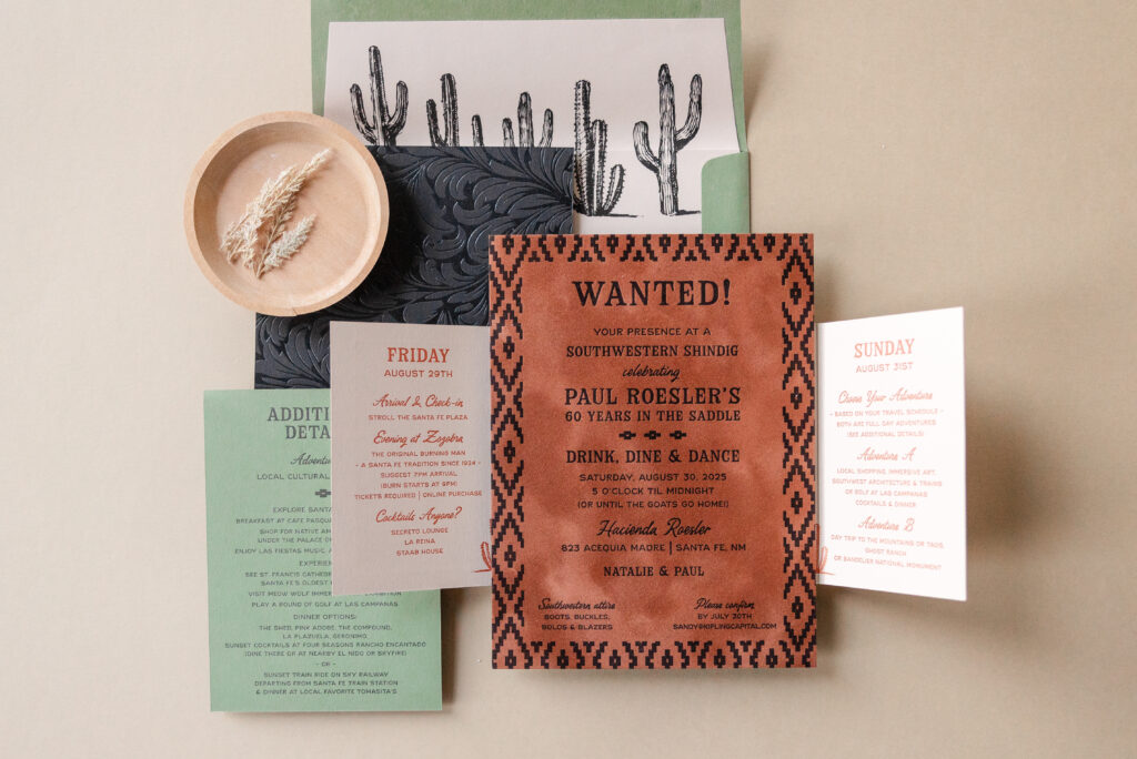
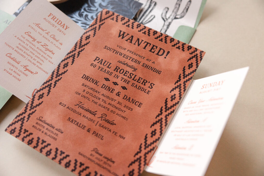
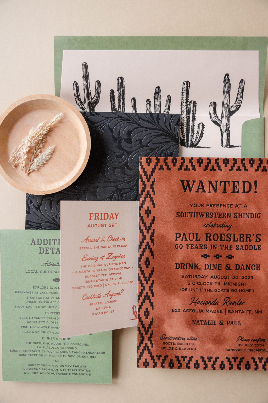
Our dear friend Stacey of Union Street Papery always sends us beautiful, stunning designs. To back up this statement, we’d like you to take a look at this Southwestern birthday invitation set. It’s rustic yet refined. There’s loads of texture and patterns, and a warm color palette that draws you in. The design draws inspiration from the desert landscape and culture of the destination, Santa Fe. Everything about this invitation suite feels authentic and sophisticated.
envelope liner: supplied pattern in black digital on bella almond text
envelope: bella spruce text
envelope addressing: black digital on the front and the back
job #: 77367
Gatefold
letterpress ink: toffee (front) / messa (back)
paper: bella almond 1-ply
size: 5” x 12.51” flat, 5” x 6.24” folded
envelope liner: supplied pattern in black digital on bella almond text
envelope: bella spruce text
envelope addressing: black digital on the front and the back
job #: 77367
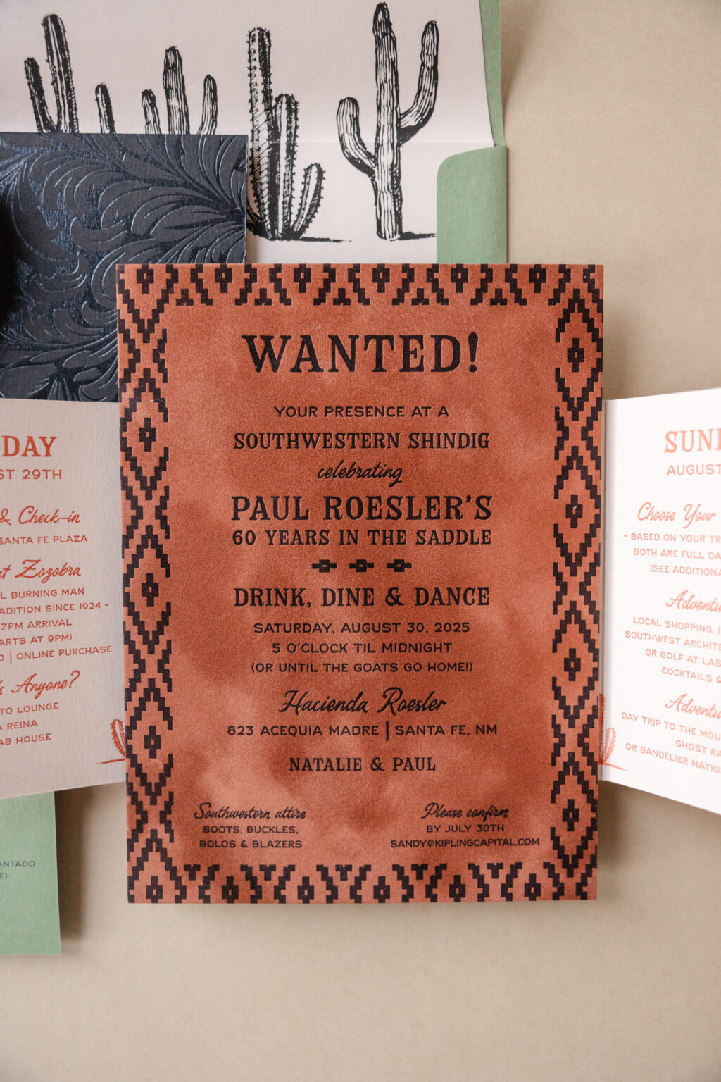
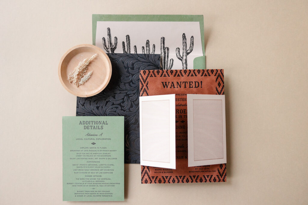
The cheeky invitation design draws inspiration from an Old West wanted poster. The mix of vintage Western-inspired fonts with delicate script lettering creates the perfect balance between rugged and refined. The geometric border, inspired by Native American beadwork, further establishes the tone and gives the invitation a bold, handcrafted feel.
Our mocha velvet adds warmth and texture, while the back of the invite features clear shine foil-stamping on our ultra black stock, mimicking the look of elaborate leathercrafting. Darling illustrated cacti on the envelope liner reinforce the Santa Fe setting while adding an artistic, minimalist touch.
Details Card
letterpress ink: black (front) / black (back)
paper: bella spruce 1-ply
card size: 4.5” x 6.25”
job #: 77367
The gatefold is really thoughtfully designed. From the outside, it offers up a fun Old West vibe that completely matches the theme. The exterior printing resembles saloon doors that open to reveal the invitation. The gatefold’s interior provides a full itinerary for the weekend, neatly organized and leading guests through scheduled events and possible side excursions so they can make the most of their time during what was certainly a fun weekend.
This Southwestern birthday invitation expertly demonstrates how to integrate rich textures, balanced layouts, and cohesive color choices into a design. It captures the spirit of the American Southwest with a modern sensibility and is equal parts rustic, artistic, and elegant. Do you love the look of letterpress on velvet, or do you want a gatefold that is equal parts cohesive accessory and functional stationery? Work with one of our dealers to create the perfect stationery for your milestone events.
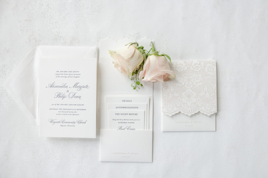
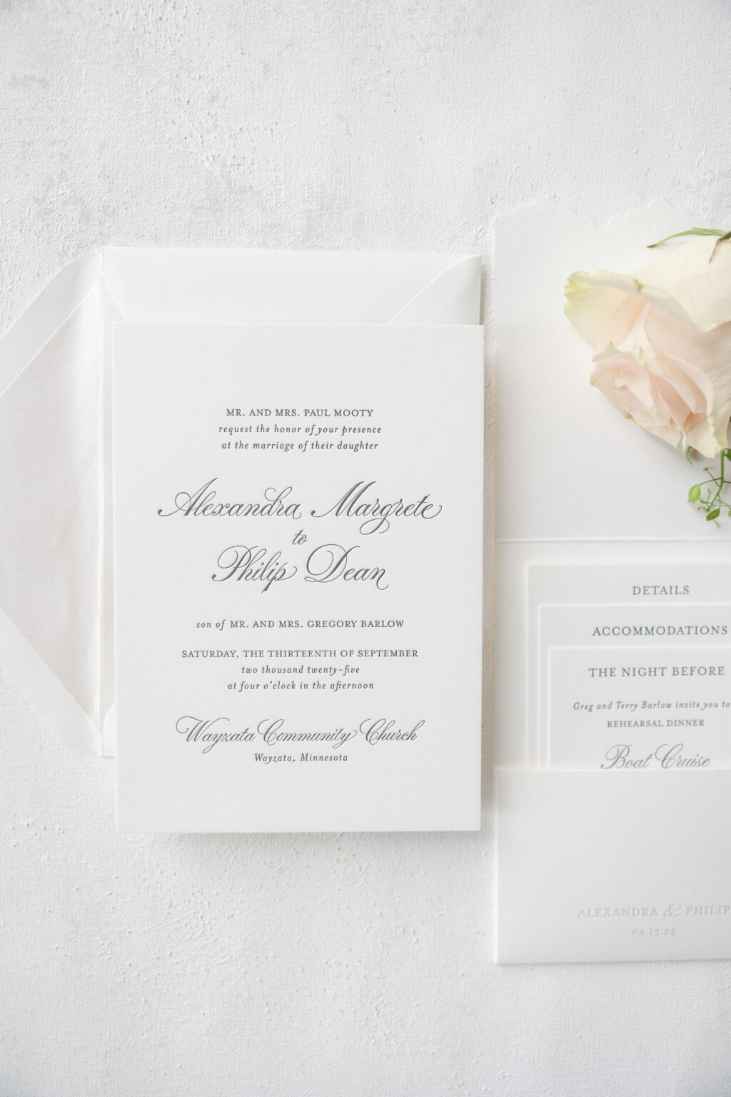
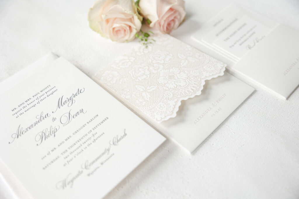
This sophisticated letterpress wedding invitation is lovely and timeless, but the exquisite lace-inspired pocketfold took our breath away. This design came to us from our dear friend Jill of Jill Elaine Designs. The couple, Alexandra and Philip, designed their very own custom wedding stationery, and we are so happy they did.
Invitation
letterpress ink: black
paper: bella smooth cotton 2-ply white
card size: a-7
envelope liner: metallic oyster
envelope: white cotton text
envelope addressing: black digital on the front and the back
job #: 77480
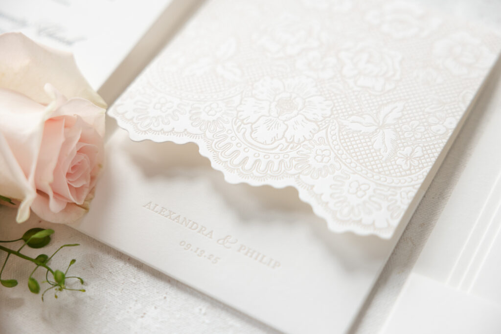
Pocketfold
letterpress ink: khaki
paper: bella smooth cotton 1-ply white
size: 6.31” x 14.44” flat; 4.81” x 6.44” closed (ps-475)
finishing: score and assemble
job #: 77480
The invitation is beautifully classic. An understated, flowing script font paired with an elegant serif is timeless. Black letterpress keeps with the enduring and elegant vibe. Our Bella smooth cotton 2-ply paper holds a deep letterpress impression, showcasing the gentle loops and fine lines of the typography.
Details Card
letterpress ink: black
paper: bella smooth cotton 1-ply white
card size: 4” x 6”
job #: 77480
Accommodations Card
letterpress ink: black
paper: bella smooth cotton 1-ply white
card size: 3.63” x 5.25”
job #: 77480
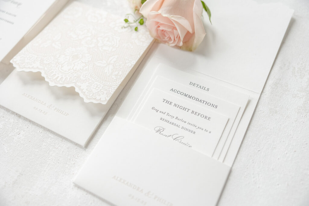
The Night Before Card
letterpress ink: black
paper: bella smooth cotton 1-ply white
card size: 3.25” x 4.63”
job #: 77480
The coordinating cards are neatly tucked into a stunning pocketfold for a polished presentation. Each card is sized so the heading, details, accommodations, and the night before are perfectly displayed. The pocketfold’s cover is gorgeous and reminiscent of vintage heirloom lace or embroidered wedding veils. Khaki letterpress ink on our white Bella smooth cotton stock introduces subtle tonal details that create depth. Its scalloped edges and floral motifs create a delicate pattern, adding romance and dimension without overwhelming the clean, minimalist composition.
Do you want a lace-inspired pocketfold or wedding stationery that is formal yet effortlessly romantic? Work with one of our dealers, and we can help you create something beautiful that fits your style and vision.
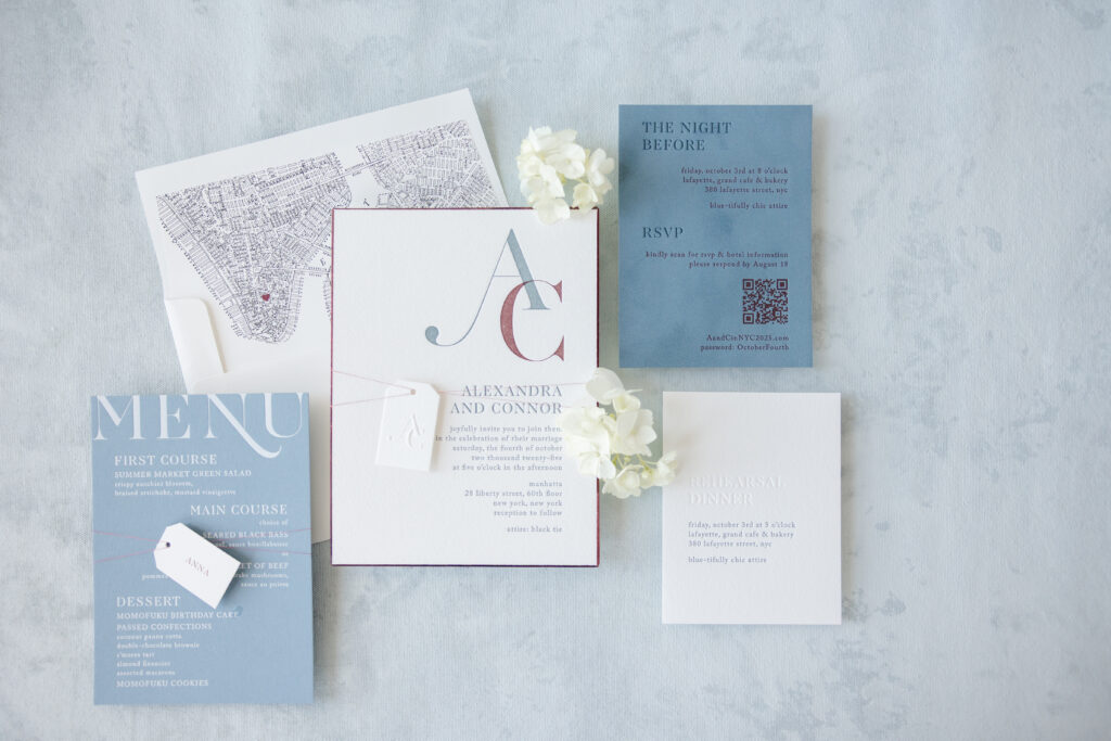
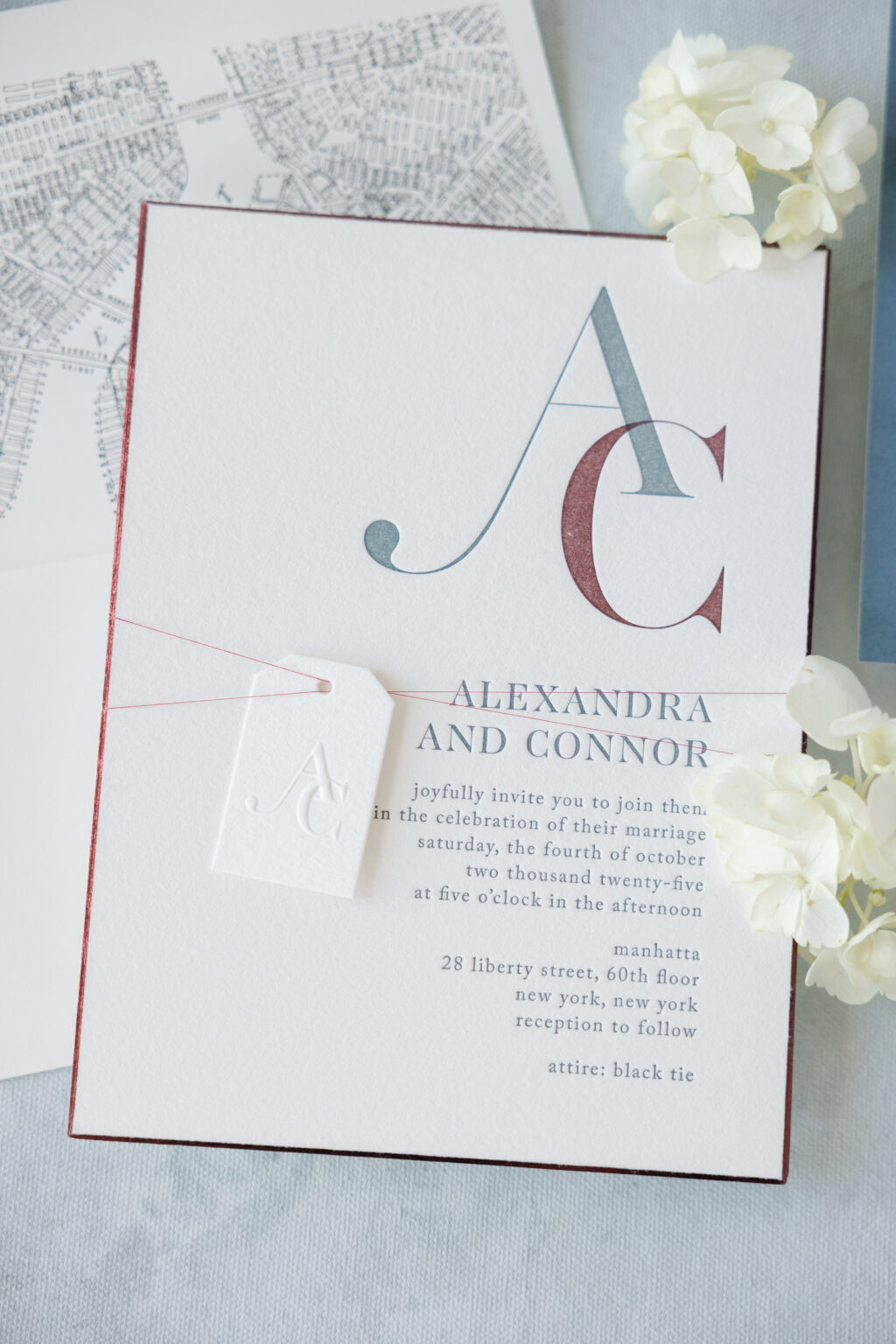
Contemporary typography, understated luxury, and meaningful personal details give Alexandra and Conner’s letterpress invitations a sophisticated feel while remaining timeless. This couple customized our Province design, making it their own. Our dear friend Alyssa of Erganic Design helped the couple create their perfect letterpress invitations, brimming with lovely details.
Invitation
letterpress inks: deep blue + currant
fonts: caslon + aw conquerer didot
paper: bella cotton 2-ply white
card size: f-8
bevel: 45 degrees
foil edge: burgundy shine
finishing: assemble with mounting card and belly band
envelope liner: custom pattern in black + currant digital on white text
envelope: white cotton text
envelope addressing: deep blue digital on the front and the back
job #: 77424
Invitation Tag
emboss: blind
paper: bella velvet french blue (front) / bella cotton 1-ply white (back)
card size: 1.25” x 2”
die-cut shape: cd-2
metallic thread: cranberry
finishing: assemble with the invitation and thread
job #: 77424
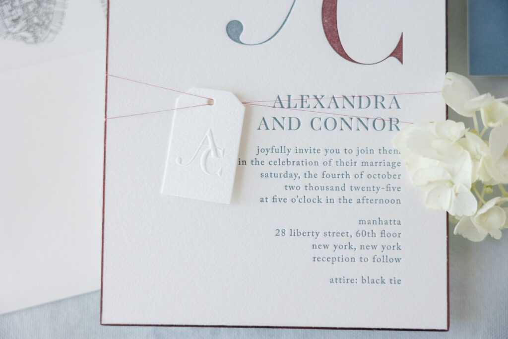
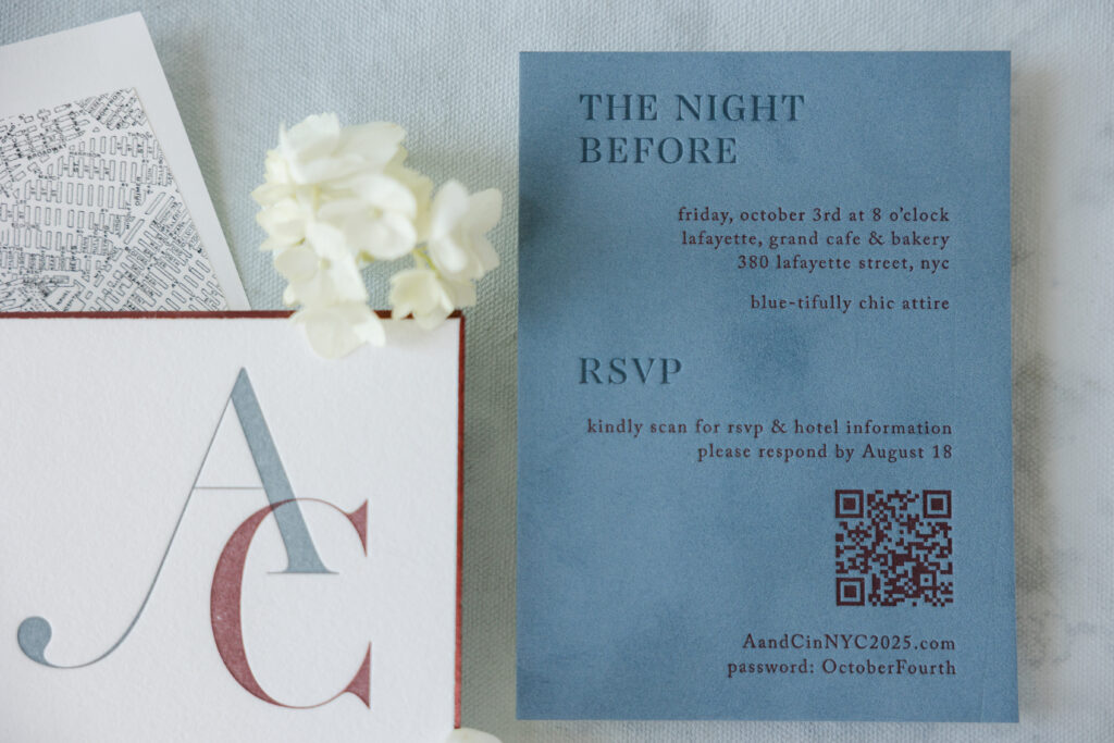
The layout embraces generous white space, allowing each design element to be admired and enjoyed. The beauty of this design comes from the restraint and subtle contrast. A mix of oversized, artistic initials creating a distinctive monogram and delicate serif fonts is a refined design feature.
Burgundy shine foil showcases the bevel edge while adding some glimmer. A tag bearing the invitation’s monogram, this time blind-embossed, is secured to the invitation with metallic cranberry thread. The shimmer of the metallic thread beautifully coordinates with the foil edging.
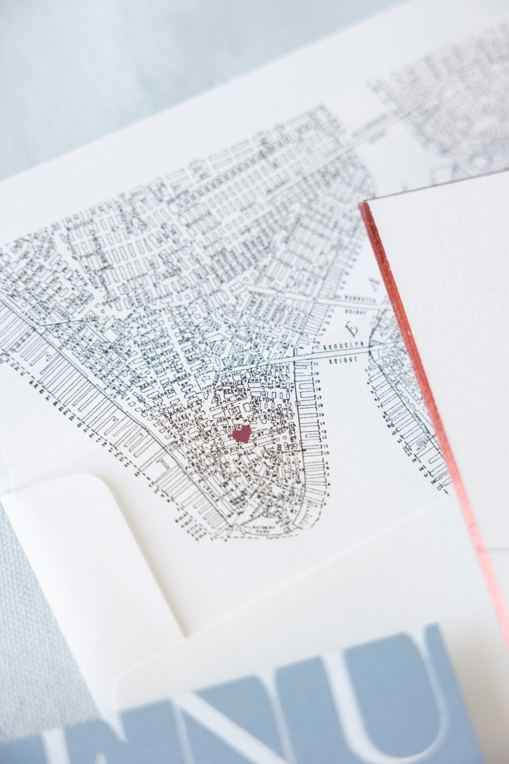
The vintage-style map envelope liner is a darling addition. A heart motif marks the location of the wedding and reception venue for a charming personal detail.
Rehearsal Dinner Invitation
letterpress ink: deep blue
deboss: blind
fonts: caslon + aw conquerer didot
paper: bella cotton 1-ply white
card size: a-2
job #: 77424
Details Card
letterpress inks: deep blue + currant
fonts: caslon + aw conquerer didot
paper: bella velvet french blue (front) / bella cotton 1-ply white (back)
card size: a-6
job #: 77424
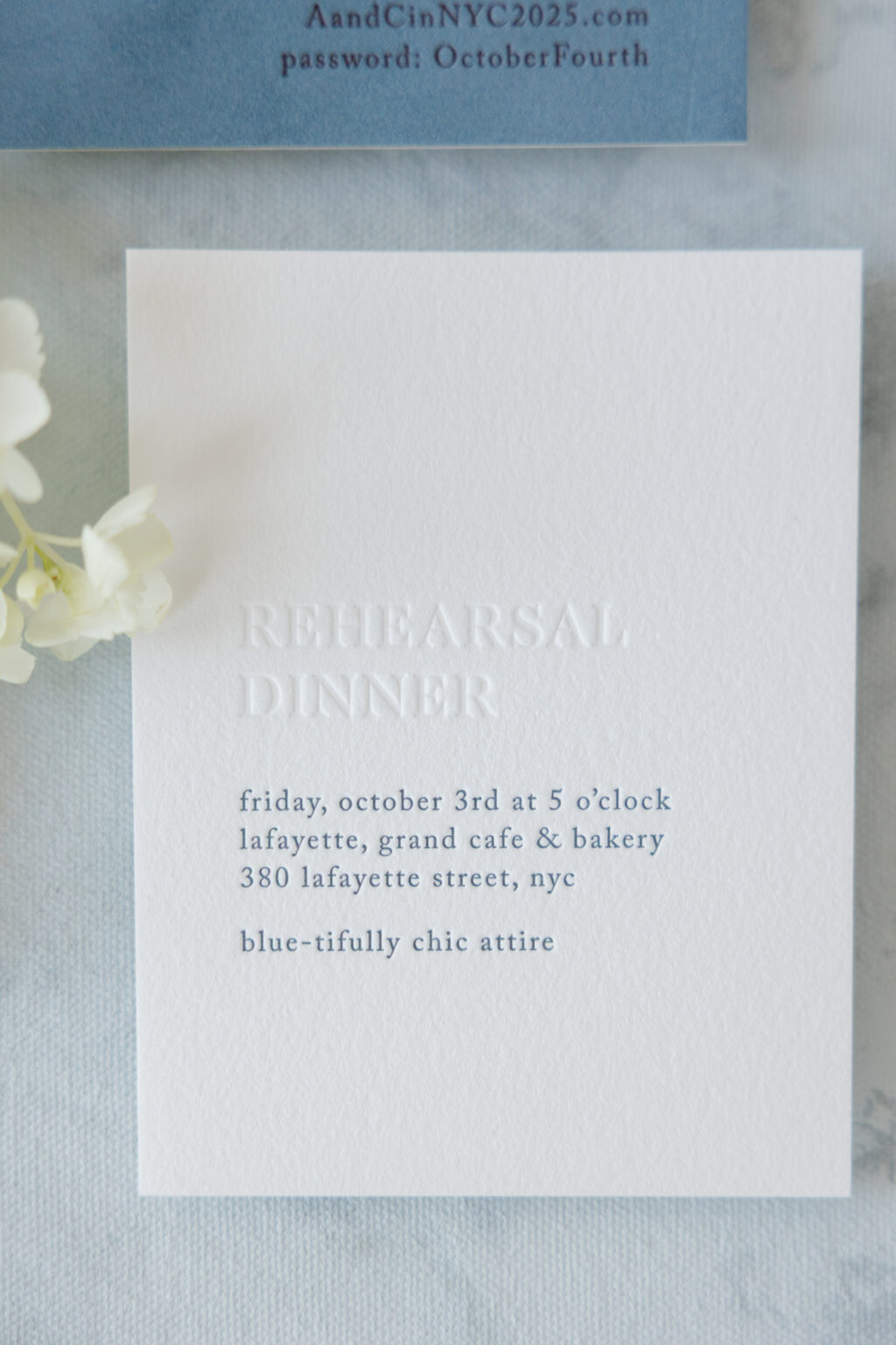
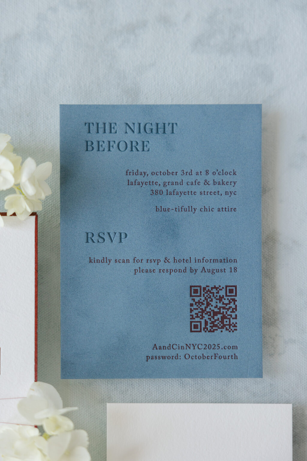
The auxiliary cards in this wedding stationery suite are just as stunning as the invite. The details card features letterpress printing on our velvet stock. Velvet adds a lovely texture and holds a crisp letterpress impression. The use of our deep blue letterpress ink on our French blue velvet creates a stunning tonal look.
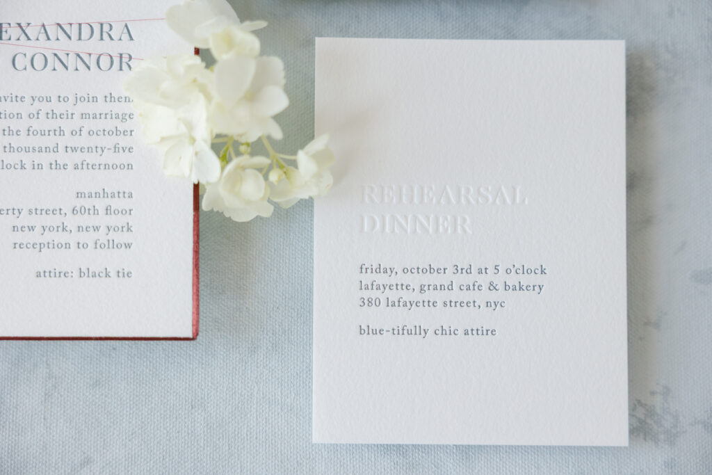
The rehearsal dinner invitation is a masterclass in minimalism. Blind debossing on our Bella cotton 1-ply paper mimics the look of tonal printing while showcasing the depth of the debossing and the stock’s soft texture. Utilizing letterpress printing in our deep blue ink for the remaining text maintains consistency across the rest of the suite.
Menu
foil stamping: white matte
fonts: caslon + aw conquerer didot
paper: bella storm 2-ply
card size: a-7
job #: 79002
Menu Tag
digital ink: currant
paper: bella smooth cotton 1-ply
card size: 1.25” x 2”
die-cut shape: cd-2
metallic thread: cranberry
finishing: assemble with the menu and thread
job #: 79002
Table Card
digital ink: currant
paper: bella smooth cotton 2-ply
card size: a-6
job #: 79002
The menu switches things up while staying true to the design vibe, featuring white matte foil stamping on our storm color paper. A tag bearing the guest’s name is secured to each menu with the same metallic cranberry thread as the invitation.
The look is timeless yet contemporary, and it was such an honor to work on these letterpress invitations. Do you envision a bold monogram, a sleek foil edge, or a tag that serves as an escort card? Work with one of our dealers to design your dream invitations, and we can bring your vision to life.
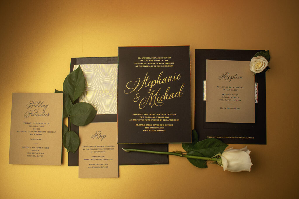
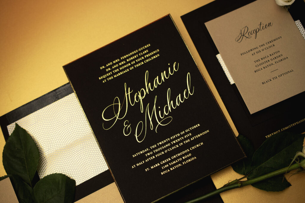
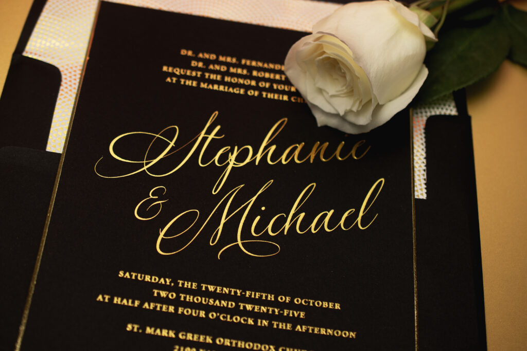
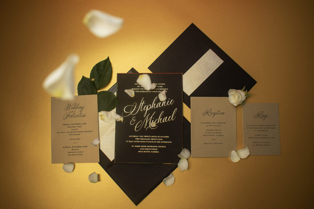
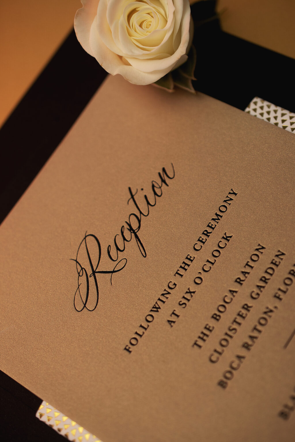
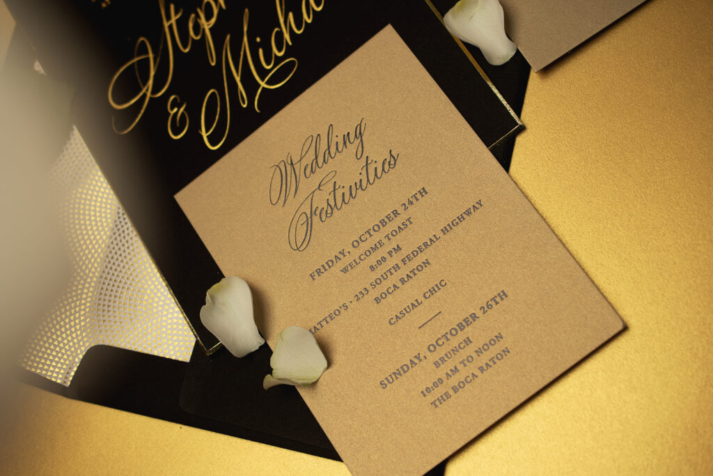
A swooping script font, gold shine foil, and decadently thick, 3-ply paper have us taking a moment to admire Stephanie and Michael’s sophisticated foil stamped invitations. The design blends traditional wedding formality with contemporary minimalism, creating a refined presentation that feels both dramatic and enduring. This couple worked with our dear friend Diane from Sincerely Yours Diane to craft their stunning wedding stationery.
finishing: assemble with mounting card and belly band
envelope liner: iridian pattern in gold shine foil on white text
envelope: ultra black text
envelope addressing: white digital on the front and the back
job #: 77604
Mounting Card
paper: bella ultra black 1-ply
card size: 4.62” x 6.3”
finishing: assemble with invitation and belly band
job #: 77604
Belly Band
foil stamping: gold shine
paper: bella smooth cotton 1-ply white
size: 10.09” x 1.75” flat / 4.68” x 1.75” folded
finishing: assemble with the invitation and mounting card
job #: 77604
The invitation design is anchored by our Bella ultra black stock in 3-ply, elevated with warm gold shine foil that adds depth. A lavish script font for the couple’s names serves as a focal point while a classic serif font provides structure for the remaining text.
The edges are cut at a 45-degree bevel before being gilded with gold shine foil for an extravagant detail that further highlights the thick 3-ply paper.
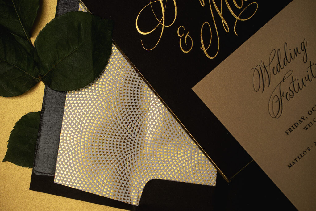
A mounting card adhered to the back of the invitation secures a belly band, creating a spot to neatly hold the auxiliary cards. A lovely Art Deco-inspired pattern in gold shine foil adorns the belly band and coordinates with the envelope liner. Foil stamping at the bottom of the invitation directs guests to the couple’s wedding website.
Reply Card
foil stamping: black shine
fonts: adobe garamond pro bold + silenter
paper: metallic gold leaf (supplied)
card size: a-5
job #: 77604
Reception Card
foil stamping: black shine
fonts: adobe garamond pro bold + silenter
paper: metallic gold leaf (supplied)
card size: a-2
job #: 77604
Events Card
foil stamping: black shine
fonts: adobe garamond pro bold + silenter
paper: metallic gold leaf (supplied)
card size: a-6
job #: 77604
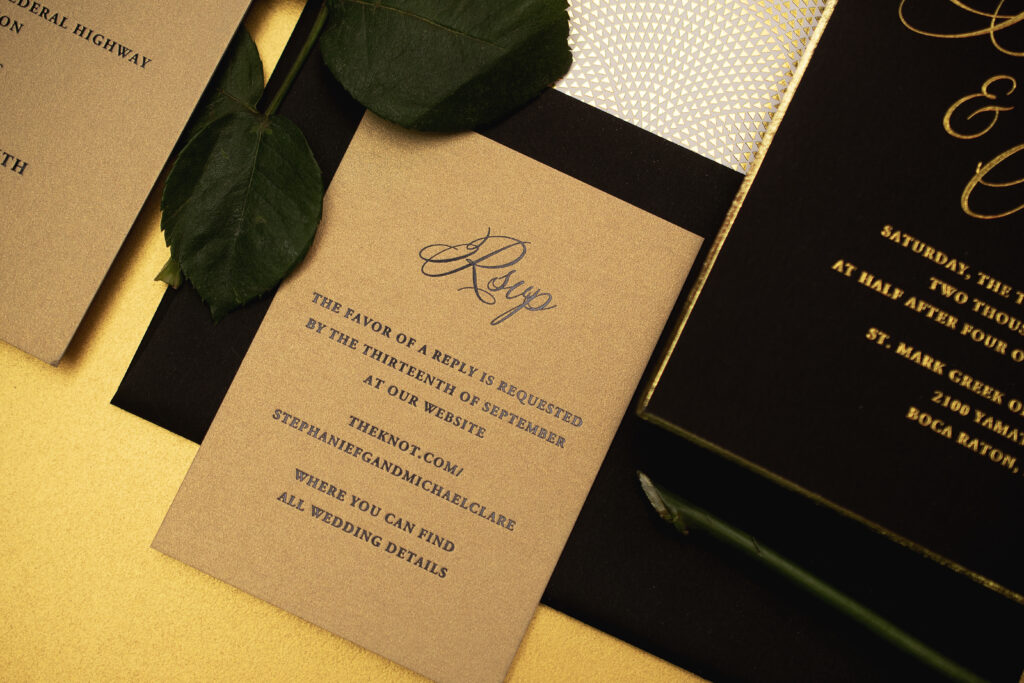
The insert cards reverse the invitation design and feature a glamorous black shine foil on metallic gold leaf stock (customer supplied). Swapping the colors in this way maintains a cohesive feel while allowing the invitation to take center stage. The contrast between the black invitation and the soft neutral insert cards creates a striking visual balance that feels upscale without being overly ornate.
Are you as in love with these sophisticated foil stamped invitations as we are? Do you want your invitations to have an effortless glamour and plenty of shine? Would a belly band adhered to the back of the invitation give you the streamlined presentation you’re after? Work with one of our dealers to create your dream invitations.
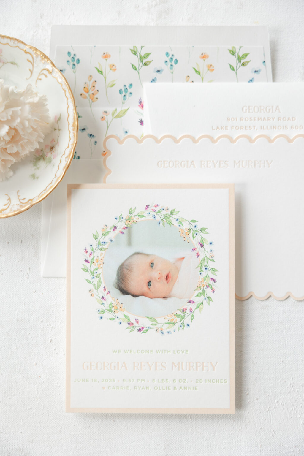
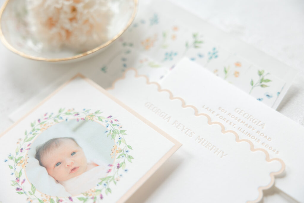
This announcement, brought to us by our dear friend Erin of Smitten Boutique, celebrates a delightful milestone with soft florals, a cheerful color palette, and an adorable photo of the little one. The look was inspired by our Whitney design but beautifully customized into a charming keepsake. While this design is retired, it is still available to customize; we simply no longer maintain samples. This letterpress birth announcement is extra special because we’ve also had the pleasure of printing the announcements for baby Georgia’s older siblings.
Announcement
letterpress inks: clover + bellini
digital ink: cmyk
fonts: gotham + naive
paper: bella smooth cotton 2-ply white
card size: a-6
die-cut shape: bf-95
envelope liner: custom supplied cmyk digital on white text
envelope: white cotton text
envelope addressing: clover digital on the front/clover letterpress on the back
job #: 77879
Flat Thank You Card
letterpress ink: bellini
fonts: naive inline
paper: bella smooth cotton 1-ply white
card size: a-6
envelope liner: custom supplied cmyk digital on white text
envelope: white cotton text
envelope addressing: bellini letterpress on the back
job #: 77879
Soft watercolor florals arranged in a wreath to frame the photo are graceful and add a vibrant burst of color while creating a delicate, airy styling. A letterpress border that follows the edge of the card adds more color and showcases the smooth texture of the 2-ply stock.
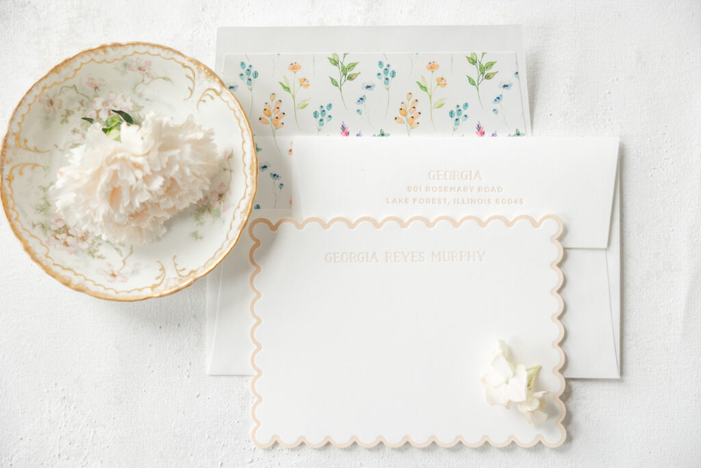
Delicate typography features generous spacing for a clean, unencumbered presentation. Georgia’s stationery-savvy mom took things a step further by also including a flat thank-you card in this suite. The child’s name appears in different versions of the same font on the announcement and the social note card. This creates a cohesive feel while still giving each card its own look. The announcement features the naive font, while the note card features naive inline, which adds some dimension and whimsy to the more subdued design.
The scalloped edge of the thank-you card introduces gentle dimension, echoing vintage stationery traditions with a fresh, modern simplicity. The edges feature a letterpress border again in our bellini ink, mimicking the look of the announcement.
A coordinating envelope liner uses the sample florals from the birth announcement’s wreath, but rearranged into a vertical pattern. Both cards have the same lovely liner. Everything about these cards is intentional and understated for a look that is elegant, fun, and timeless.
Congratulations to the entire Murphy family! Do you want a darling letterpress birth announcement with botanical accents? Or a charming die-cut thank you card? Work with one of our dealers to create the perfect stationery for whatever life events you are celebrating.
Our latest collection is now available, and we’re so happy for you to see it. These designs are reimagined versions of some of our favorites, featuring different print methods and materials to create beautiful designs. Since we recently added laser die-cutting to our lineup, we wanted to showcase some of the creative ways to feature this capability.
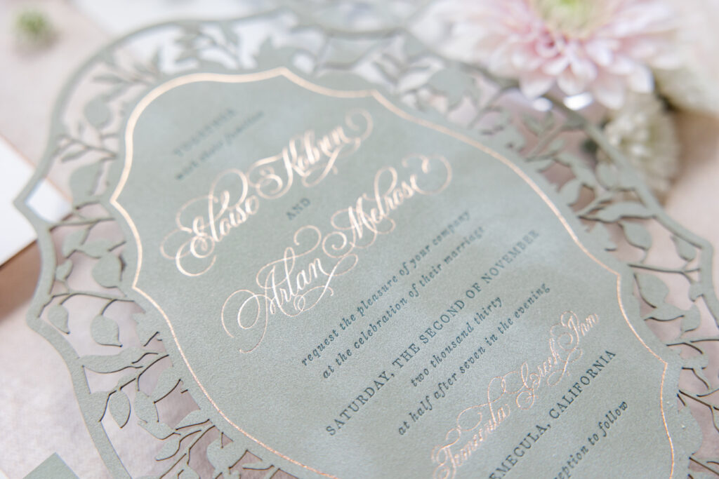
Laser Die-Cut Velvet
Our Melrose V.2 can best be described as botanical elegance. It feels refined, organic, and timeless. Our asparagus velvet stock adds soft texture while holding a crisp impression for both letterpress printing and foil stamping. Cyprus letterpress ink gives the design a tonal look, while bronze-shine foil adds warmth. The elaborate laser-die-cut border is artistic and sophisticated, adding depth to the design. This wedding stationery suite is romantic, graceful, and perfect for a garden or estate wedding.
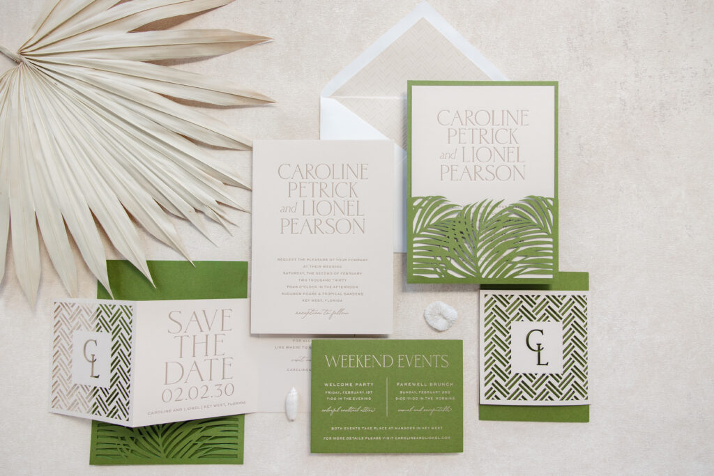
Modern Tropical Elegance
Pura Vida V.2 blends clean contemporary design with lush botanical inspiration and intricate laser-cut patterns. This design feels fresh, refined, and destination-inspired while maintaining a high level of sophistication. The invitation has a tone-on-tone vibe with toast letterpress ink on our almond paper. The laser-die-cut pocket panel elevates the design while neatly securing all the cards in the suite. Bold palm fronds, geometric patterns, and a crisp color palette create an invitation that feels vibrant yet understated, balancing natural beauty with minimalist elegance.
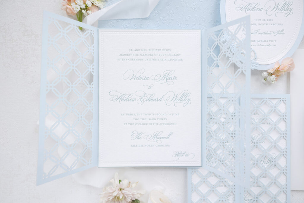
Lattice-Inspired Gatefold
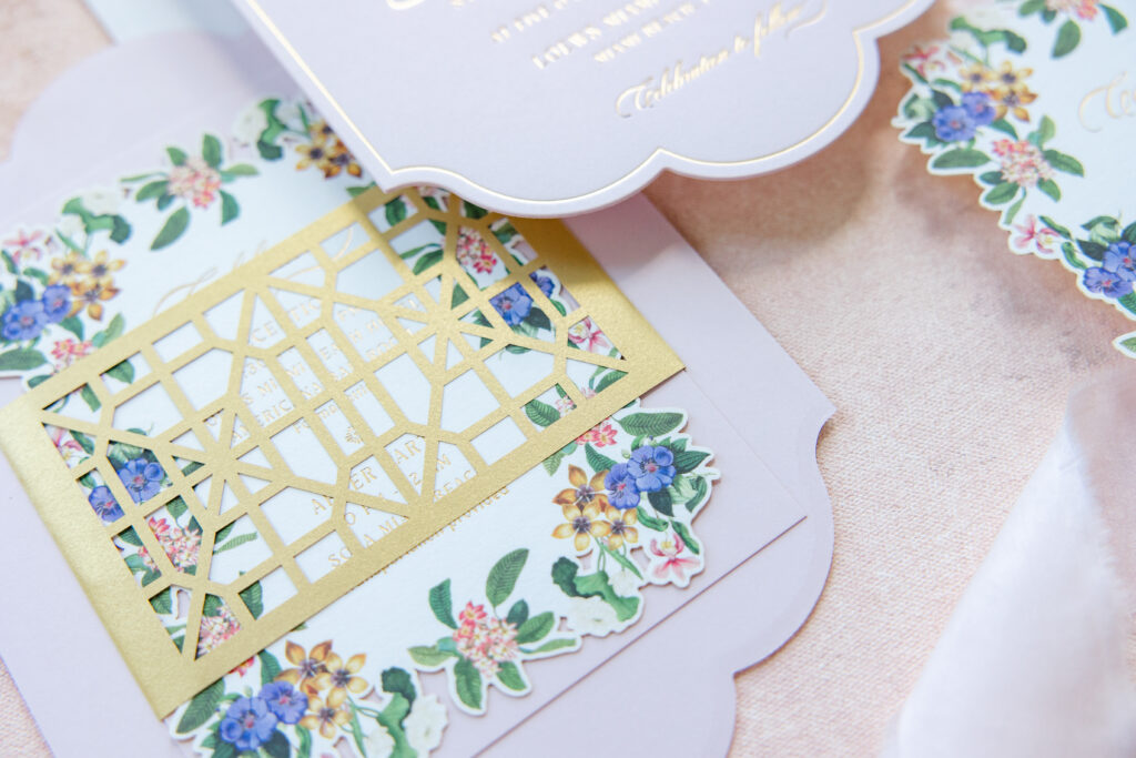
The intricate laser-die-cut lattice panels of Imari V.2 open to reveal a classic invitation, perfect for a formal wedding at a grand estate or historic ballroom. Refined typography, including a dramatic script font and a blind emboss border, elevates the look. The equally stunning liner is a twist on a Toile de Jouy pattern and features blind embossing on our sky paper.
Rustic Formal Chic
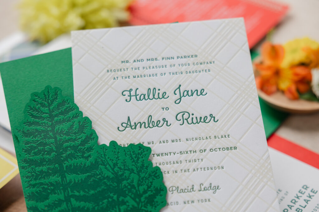
Scout V.2 delivers so many charming and unexpected details that work together to create an invitation design that is formal yet outdoorsy and inspired by lazy summer days at camp. Bold color paper and charming laser-cut details set the scene. Not one but two plaid patterns, including one letterpress-printed on the invitation, keep the look grounded and rustic, while a darling pocket panel with laser-die-cut trees ensures this design is perfect for a wedding held at a lodge.
Art Deco Glamour
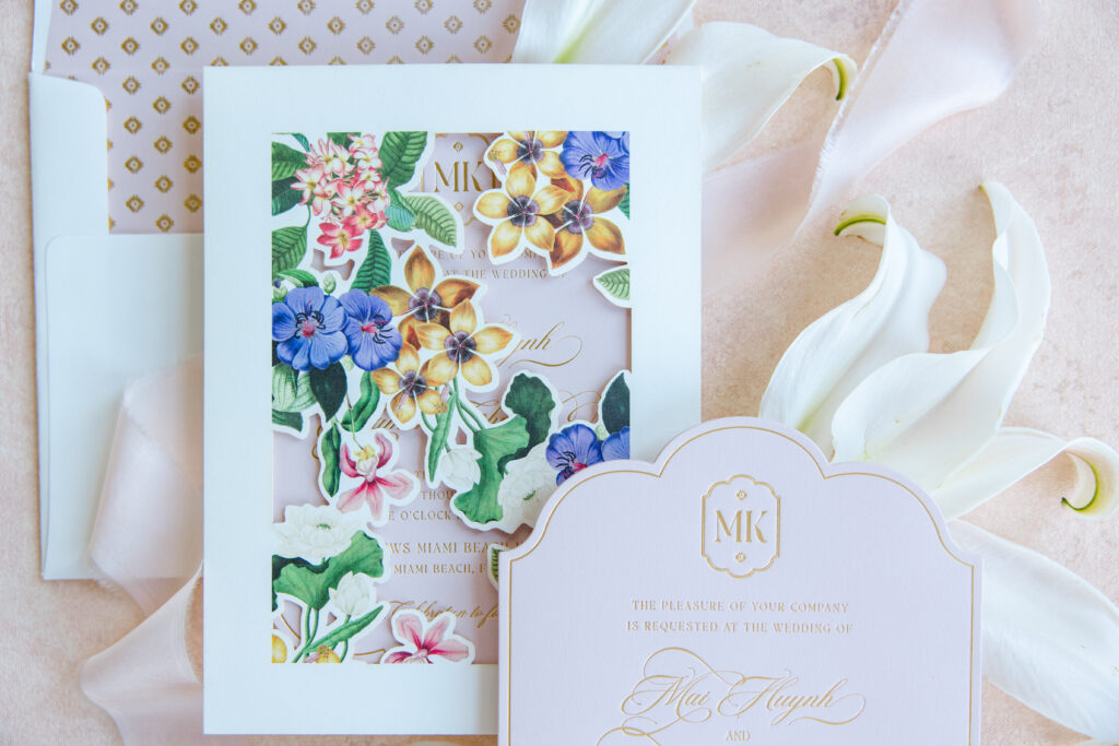
An extravagant die-cut invitation with decadent gold matte foil stamping ensures that once you lay eyes on Mai V.2, you’ll think about it for a long time. A flowing script font for the couple’s names lends the design an air of opulence, while a stately monogram within a cartouche that mirrors the invitation’s shape is a perfect personalized touch.
The invitation also features a laser die-cut belly band adhered to the back, creating the perfect spot to secure additional cards in the suite. The entire bundle then slides into a stunning sleeve adorned with flowing florals. The front panel of the sleeve is also laser-die-cut, creating open spaces between the blooms and allowing the invite to peek through. The entire presentation is swoon-worthy.
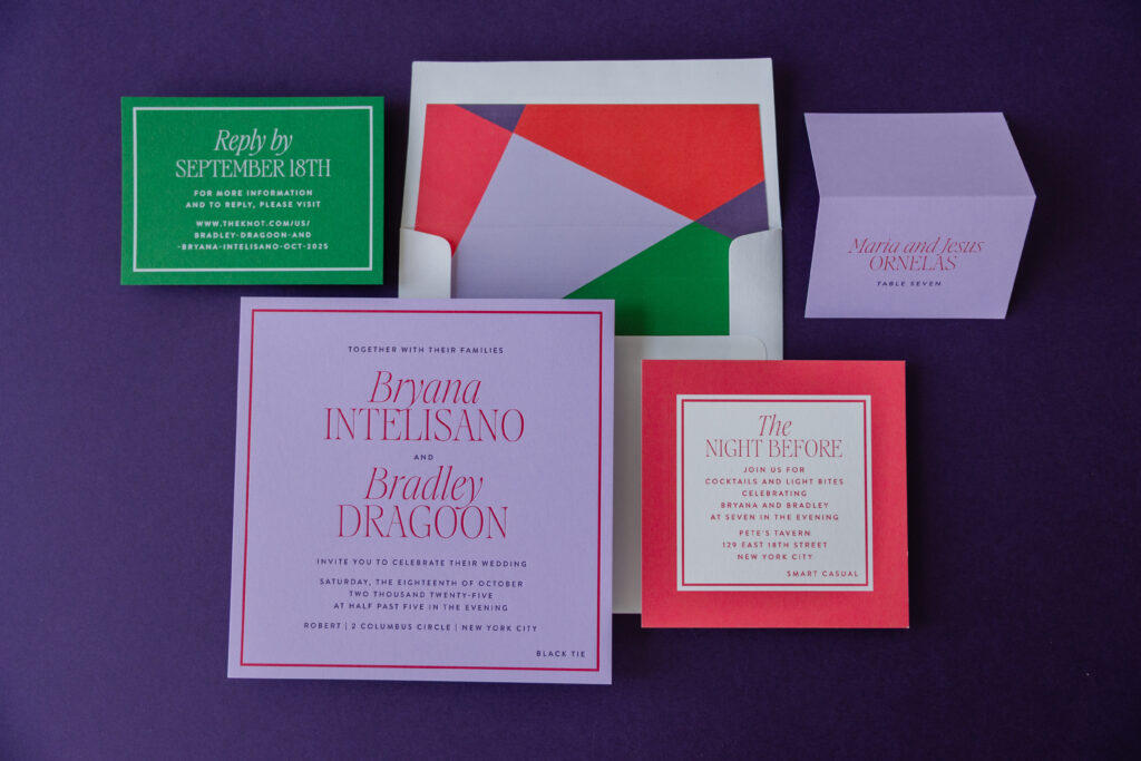
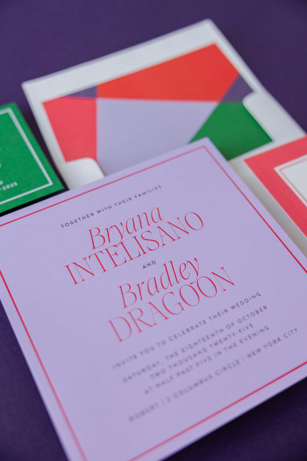
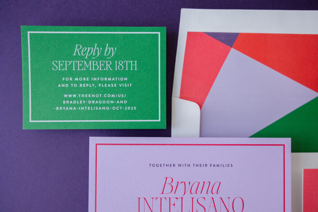
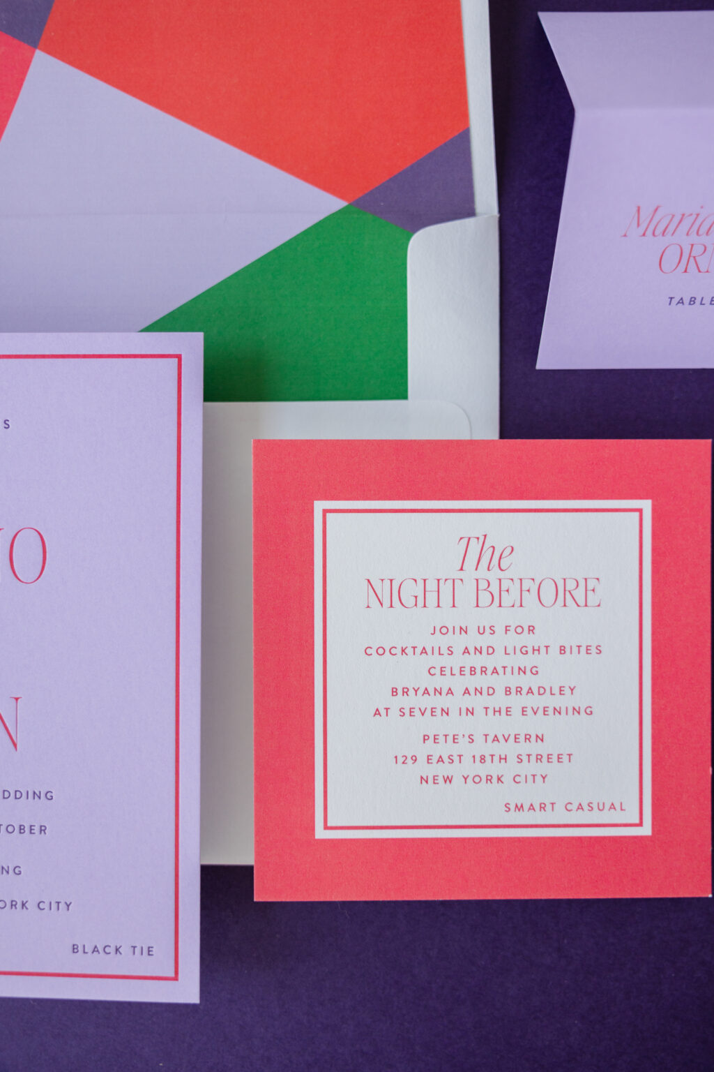
Bold geometric design and sophisticated typography ensure that Bryana and Bradley’s modern color blocking wedding invites stand out for all of the right reasons. This suite embraces a clean, vibrant aesthetic that is perfect for a celebration held in the restaurant above the Museum of Arts and Design. We are so happy this couple worked with our dear friend Tracey of Written and Wrapped to bring their contemporary invitation suite to life.
Invitation
letterpress inks: plum + flamingo
fonts: aida + brandon
paper: bella amethyst 2-ply
card size: sq-7
envelope liner: charletto pattern in plum + amethyst + flamingo + chili + leaf digital on white text
envelope: white cotton text
envelope addressing: plum digital on the front and the back
job #: 77344
Reply Card
digital ink: white
fonts: aida + brandon
paper: bella leaf 1-ply
card size: a-5
job #: 77344
The invitation features a striking, high-contrast palette of our plum and flamingo letterpress ink on our amethyst paper. The color combination is playful and elevates the look. Rather than relying on florals or ornamental details, the design uses geometric shapes, crisp borders, and bold color blocking to create visual interest. This modern design is juxtaposed with the traditional technique of letterpress printing. Our 2-ply color paper holds a deep, crisp impression, introducing a tactile element to the design.
A contemporary serif font with dramatic strokes gives the names a fashionable prominence, while clean sans-serif text provides balance and readability. The restrained use of typography allows the vivid colors to remain the focal point.
Rehearsal Dinner Invitation
digital ink: flamingo
fonts: aida + brandon
paper: bella smooth cotton 1-ply white
card size: sq-5
job #: 77344
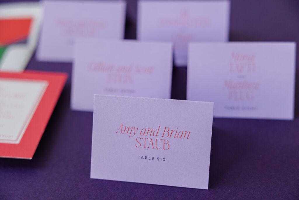
Folded Escort Card
digital inks: chili + plum
fonts: aida + brandon
paper: bella amethyst 1-ply
card size: no. 17 folded
job #: 79030
It’s impossible to miss the geometric envelope liner, which introduces abstract shapes in coordinating colors, creating a surprise element when the envelope is opened. The matching design for the reply card and rehearsal dinner invitation continues the cohesive visual identity with framed layouts, saturated backgrounds, and disciplined spacing.
Every piece feels carefully curated, embracing simplicity while making a confident visual statement. Do you love the look of clean borders and structured layouts? Do you want an abstract geometric envelope liner or bold color-blocking? Whatever you want for your wedding invites, our dealers can help you make it happen.