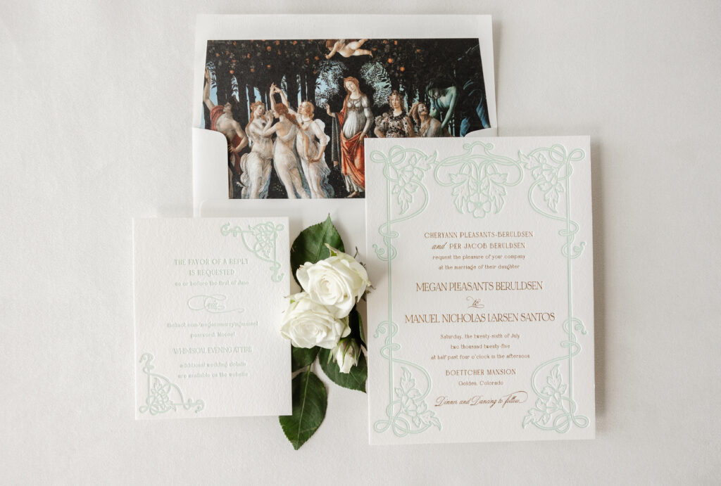
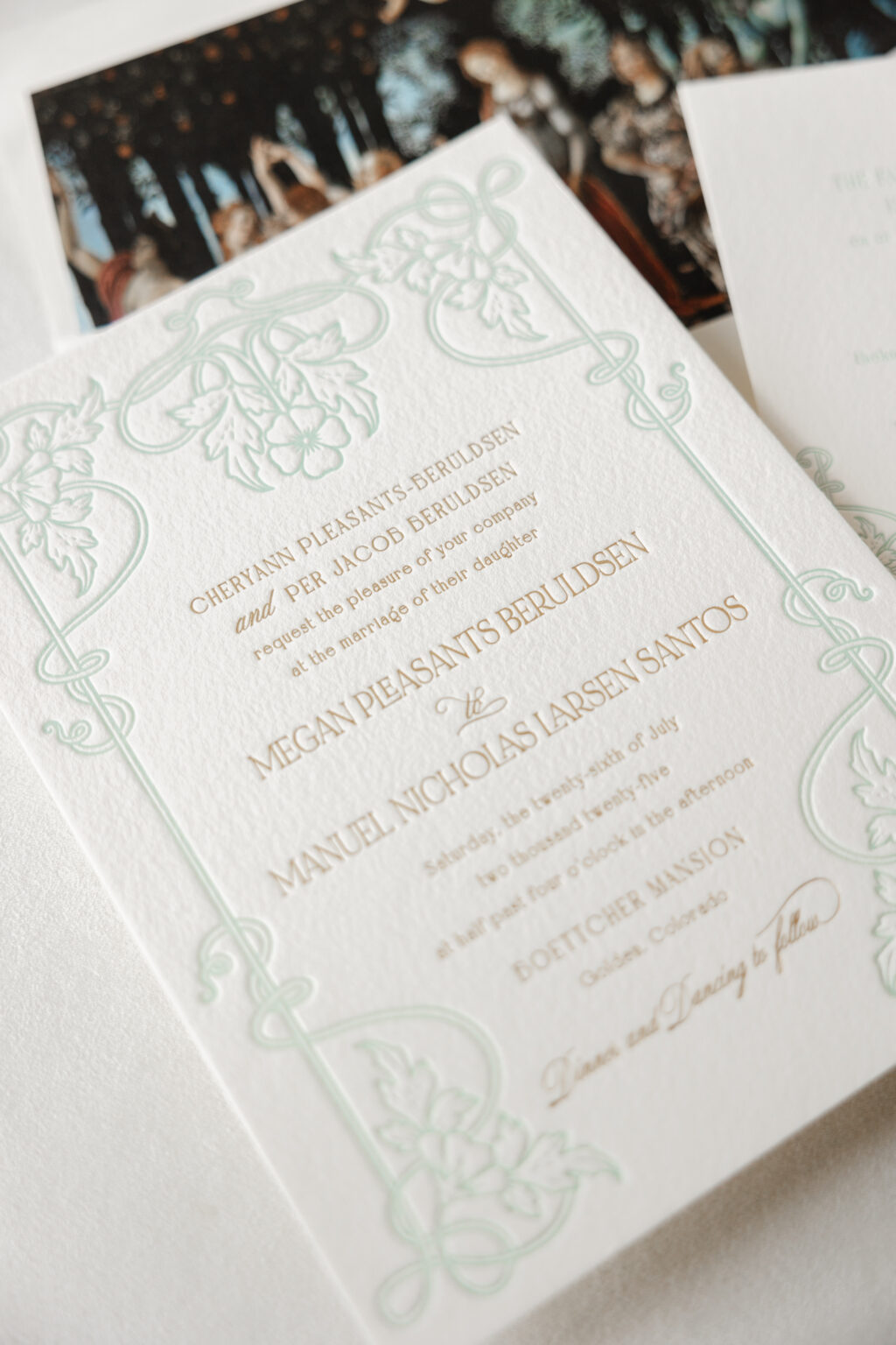
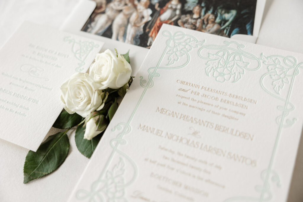
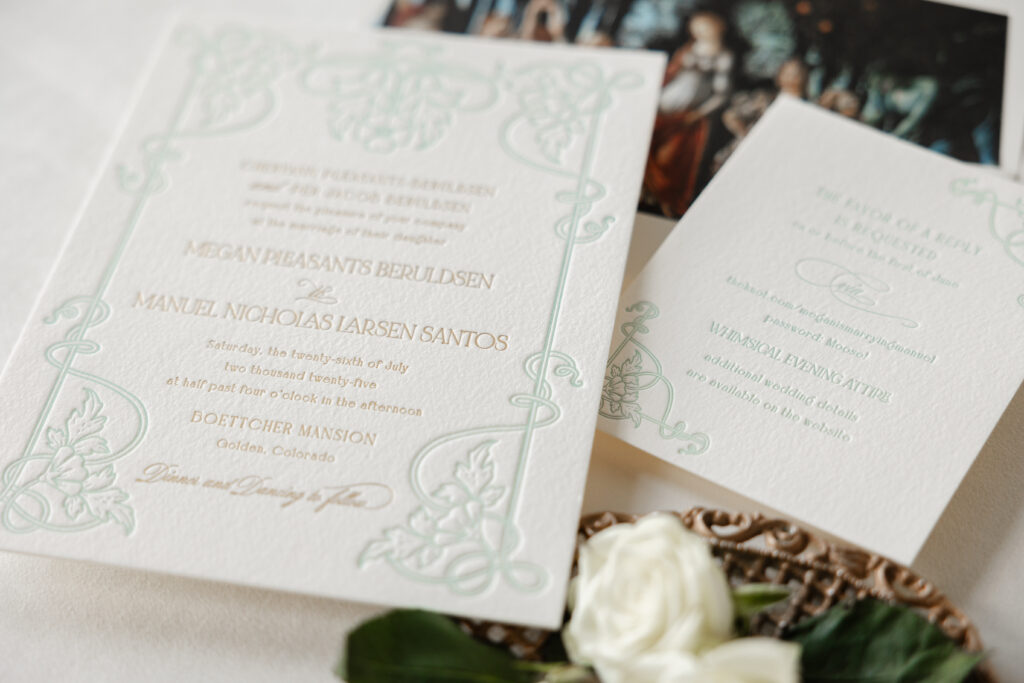
Megan and Manuel worked with our dear friend Hollis of Bering’s to create their stunning letterpress and foil-stamped wedding invitations. They chose to customize our Matilde design for their Colorado nuptials. The final design features unique details that speak to the couple and set the tone for their special day.
envelope liner: customer-supplied pattern in cmyk digital on ivory text
envelope: ivory cotton text
envelope addressing: antique gold digital on the front and the back
job: 76290
Reply Card
letterpress ink: sea mint
fonts: bigilla bold, mozart script regular, noir et blanc regular
papers: bella cotton ivory 1-ply
card size: a-2
job: 76290
The intricate frame on the invitation appears in our sea mist letterpress ink. The light color allows the text, which appears in gold matte foil stamping, to stand out. The three fonts work together perfectly to introduce a fanciful, playful vibe while still maintaining a formal feel. The floral and foliage artwork beautifully coordinates with the garden elements of the artwork featured as the envelope liner.
The envelope liner features La Primavera, an artwork by Italian Renaissance artist Sandro Botticelli. The painting, believed to have been completed between 1477 and 1482, is located in a gallery in Florence and depicts a group of mythological figures in a lush garden setting. The painting is often interpreted as being a celebration of love.
The frame from the invitation was reimagined for the reply card. Breaking apart the artwork and using components of it in two corners maintains the consistency and formality without being identical. The reply card features the same fonts used in tandem to create an eccentric feel, perfectly suited for this whimsical affair.
Megan and Manuel’s letterpress and foil wedding invitations are lovely and personal, and it was a pleasure to help bring this couple’s vision to life. Whether you want to create an aesthetic with typography, use artwork for the envelope liner, or add personal details to celebrate you and your partner, we can help make it happen. Contact us to learn more or work with one of our talented dealers to create your dream wedding invitations.
Our wedding release is easily one of the things I look forward to most each year. It’s a time to explore new styles from trendy to timeless, spotlight new offerings from our library, and push the boundaries of what we can do.
The open-endedness can truthfully be a bit daunting for me. Sometimes, a concept comes together quickly; other times, it takes a while to come to fruition. Regardless, the start of the process for me is always the same — a trusty Pinterest board. I start by pinning anything that catches my eye: patterns, color palettes, artwork, photos, anything. From there, I sort through everything, grouping what feels cohesive, allowing me to see the things I’m drawn to and start to conceptualize my new designs for the wedding release.
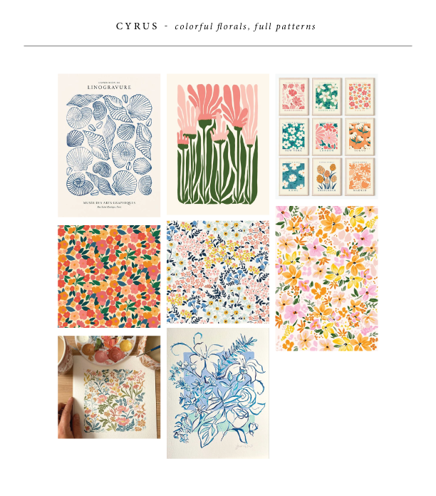
Cyrus
Cyrus was born from dense florals, fun colors (I had to use our new Verdigris, Lilac, and Rouge inks here!), and modern typography. Creating these florals that fit together like puzzle pieces was quite the challenge, but it brings almost an art print feel to the set.
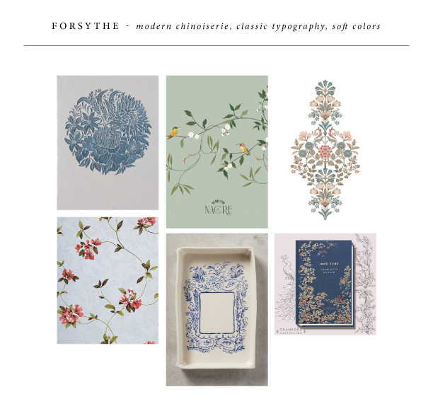
Forsythe
Forsythe was one of those ones that came together quickly — my inspiration led me to an updated, modern chinoiserie feel. A delicate, hand-drawn floral branch is utilized throughout the set. The soft blue inks beautifully contrast with the pale ribbon and velvet accents. Our belly band assembly set up on the back of the invitation has been a hit. The custom die-cut tag felt like the perfect way to elevate that.
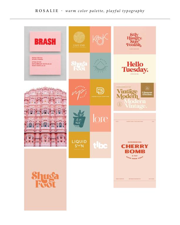
Rosalie
Rosalie came from a color palette that seemed to catch my eye — soft pink and bright red. This was the perfect place to show off our new Ballet paper and Chili ink, with tonal accents in Bellini. I knew whatever direction this took, it had to be fun and playful. A vintage Palm Springs vibe felt right, with cheery illustrations and whimsical typography.
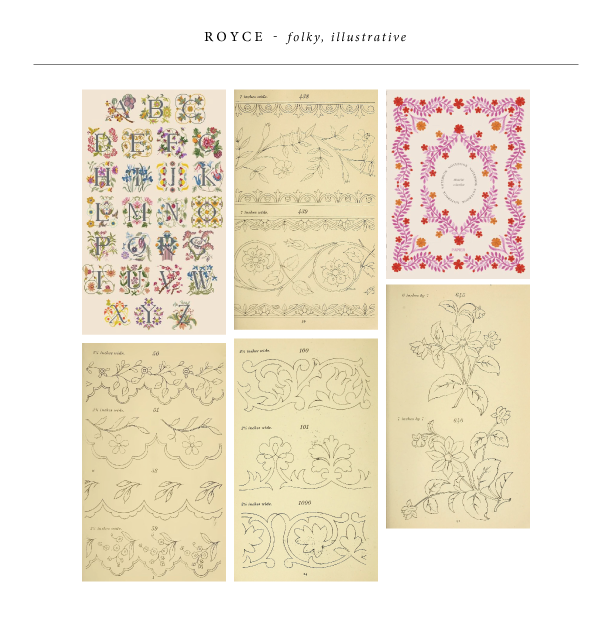
Royce
Royce was the last design to come together, but it may just be my personal favorite. This set came alive from vintage embroidery transfers that I stumbled upon. I started with the flower digital illustrations you see on the folder, invite, and save the date. Then, I created the additional borders for the other pieces. It feels a little chaotic, but at the same time, cohesive. My favorite part about this is easily the folder — I think it perfectly showcases the entire set without one piece overpowering the other.
Our friends at Phantastic Papers assisted Lauren and Anthony to create their crisp, modern, typography- driven invites. Khaki letterpress brings the varied fonts to life for a modern invitation suite.
We L.O.V.E. these spectacular letterpress wedding invitations that our pals at Gus & Ruby Letterpress in Portsmouth, New Hampshire submitted to us to print. As a play on our Anthology design (by Lindsy Aragona) a custom LOVE design was submitted and is repeated throughout this set letting us know what the couple is really all about! Letterpress printed in amethyst and chartreuse inks on our 1-ply ivory paper the invitation makes a statement in our no. 10 size! The mixture of contemporary typography mixed with letterpress is the perfect marriage for these modern invitations.
inks: amethyst + chartreuse | fonts: impression + sans capital | paper: 1-ply ivory | invite size: no. 10 |
Hey letterpress fans – Happy Birthday indeed! Nothing celebrates another year passing better than a party invite like this customization, courtesy of the lovely ladies at Social Graces in Nashville. When planning her mother’s 70th birthday party, Gretchen wanted an invitation reminiscent of retro Broadway movie tickets. Social Graces altered Jessica Tierney’sPopular Country design to take maximum advantage of the beautiful Norah script by combining it with the Bennington and Popular fonts.
Espresso was the perfect ink to pull off the “old-timey” feel, and the corner rounding embellishment solidified the desired effect of bringing us back to simpler, carefree days of youth.
Madelyn, we hope your 70th year is as beautiful as this invitation!
This design won an honorable mention in our Bella Figura design competition for the first half of 2011. This twice-a-year competition recognizes outstanding and inspired design submitted by our beloved dealers.
Today’s favorite is shared by Bella Figura designer Jessica Tierney…
One of my favorite unique wedding ideas is the use of typography! Not only beautiful typography on your stationery, but also oversized, interesting type used as decorative elements throughout the celebration. I love weddings where couples incorporate large, graphic typography – especially cute sayings or phrases that have a personal meaning to the couple. It’s a wonderful, personal touch that not only looks visually stunning but is also a reflection of the bride and groom’s personalities sure to make a lasting impression on your guests!