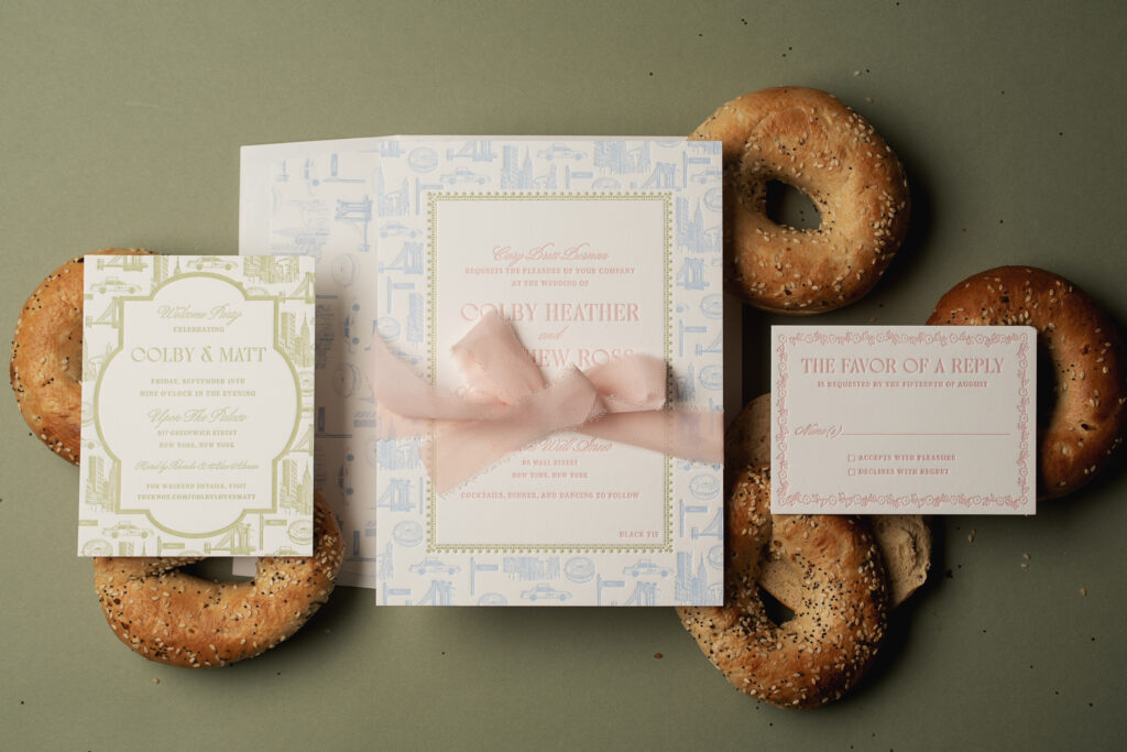
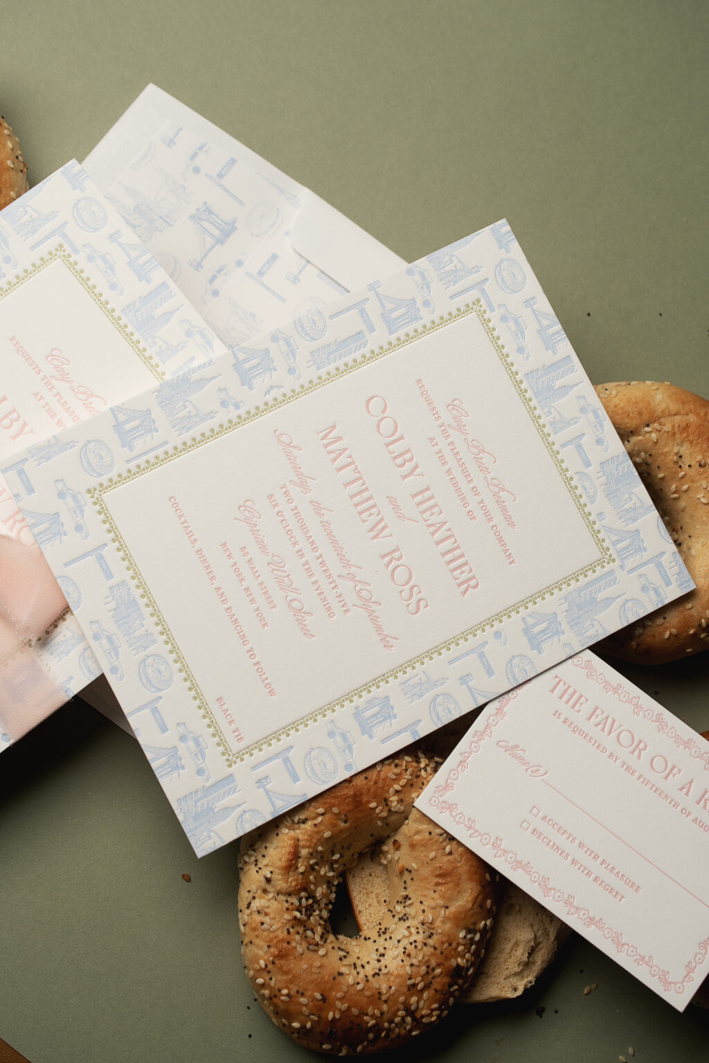
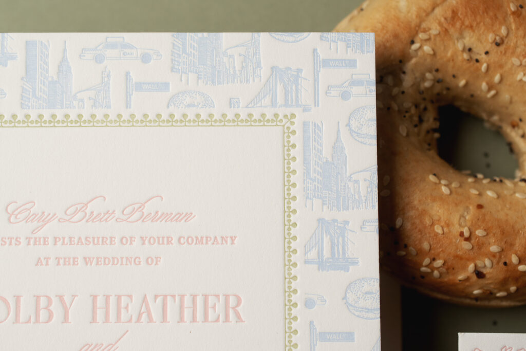
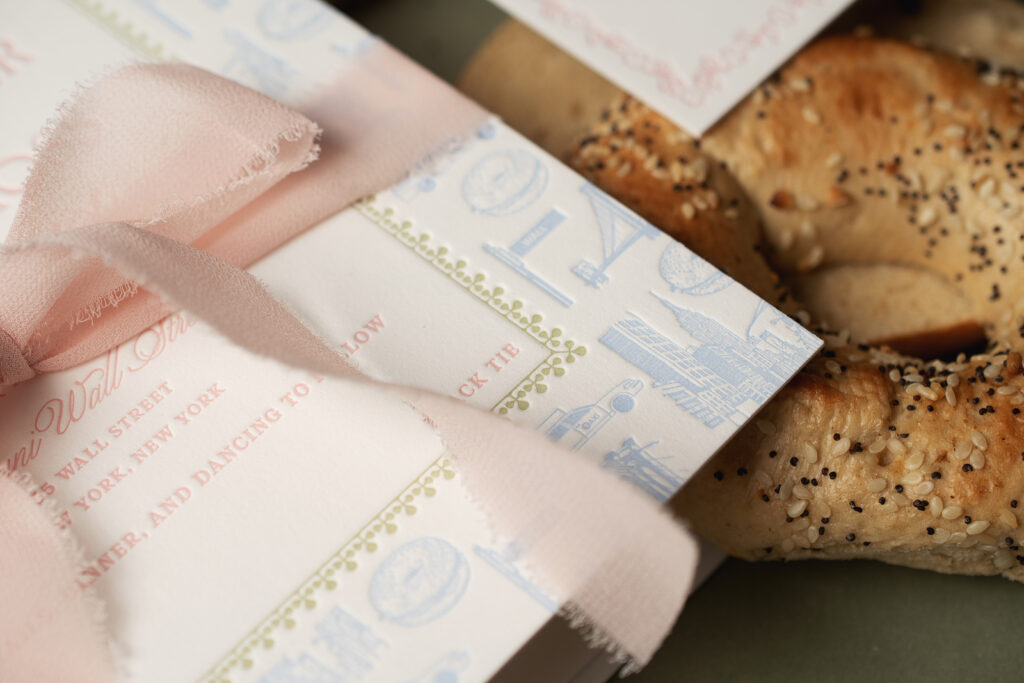
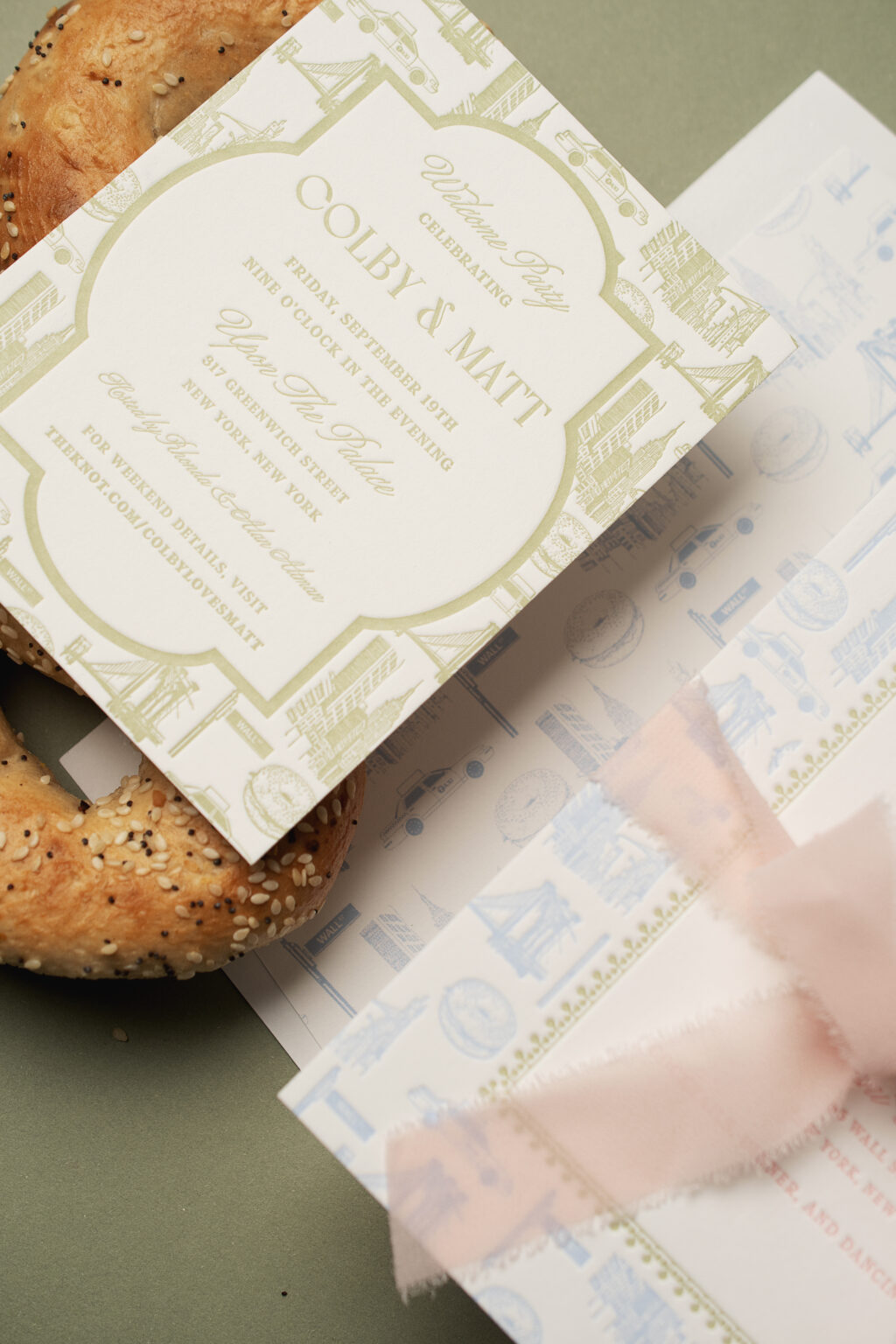
We created a custom pattern just for these NYC-inspired letterpress wedding invitations. The pattern appears on two of the cards in the suite and makes a charming envelope liner. The couple, Colby and Matt, worked with our Bella Figura NYC store, and we are so happy they did.
Invitation
letterpress ink: french blue + cherry blossom + acadia
fonts: wordless script + 1769 display + argent cf
papers: bella smooth cotton white 2-ply
card size: f-8
ribbon: chiffon pink blush (customer supplied)
envelope liner: custom pattern in french blue digital
envelope: white text
envelope addressing: carolina digital on the front and the back
job: 77040
The three-color letterpress invitation is printed on our 2-ply Bella smooth cotton stock, so it holds a deep impression. The couple had the idea for the custom pattern, and we brought their vision to life. Individual motifs representing iconic images from NYC were placed together, creating the pattern. A border appears in acadia letterpress ink, between the pattern in French blue and the text in cherry blossom ink. This border is reminiscent of the Greek Revival architecture of the venue, the Cipriani Wall Street.
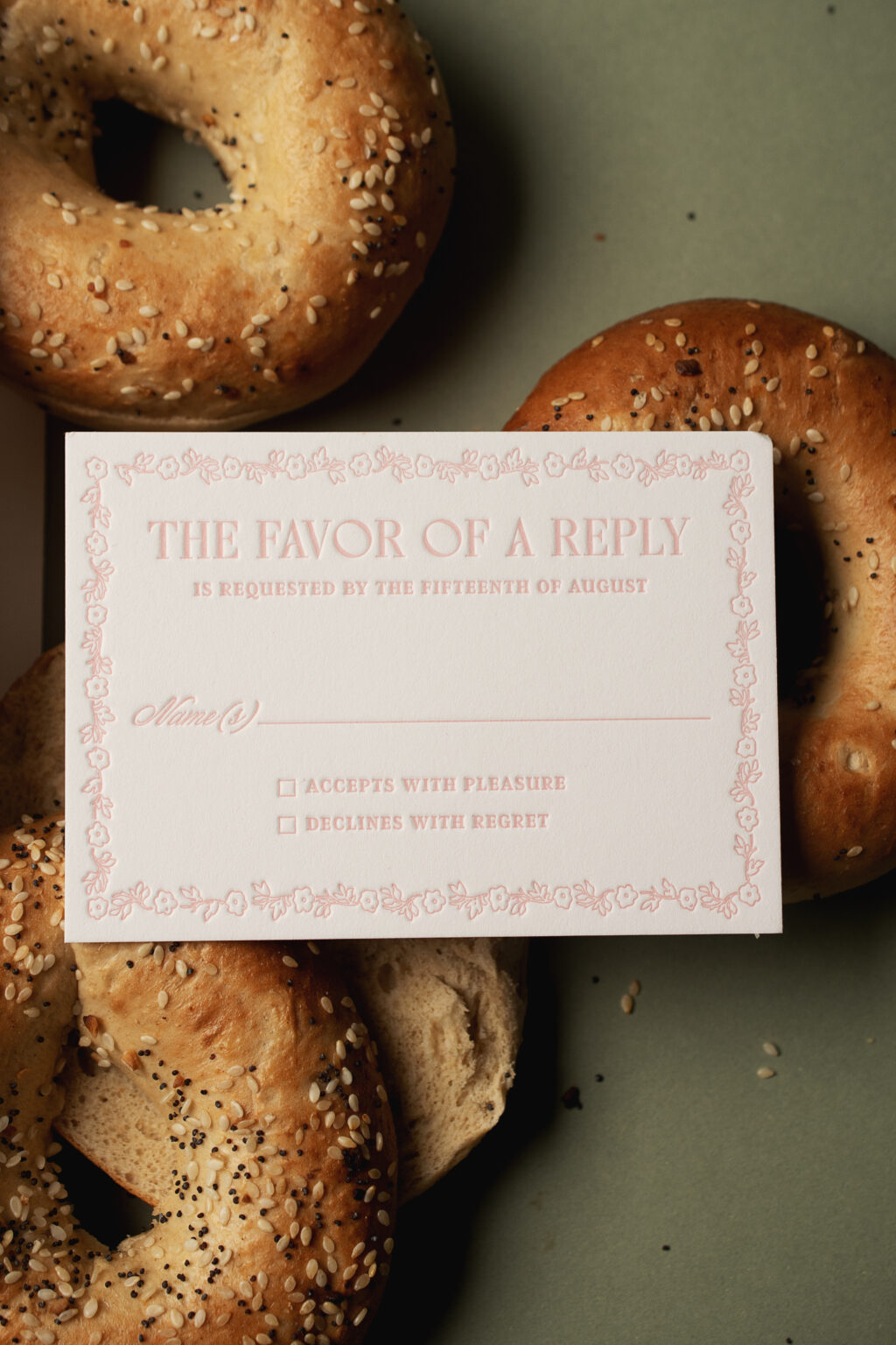
The reply card is letterpress printed in cherry blossom ink and features a delicate floral border. The ink color coordinates with the ribbon tied around the invitation.
Reply Card
letterpress ink: cherry blossom
fonts: wordless script + 1769 display + argent cf
papers: bella smooth cotton white 2-ply
card size: a-5
envelope: white text
envelope addressing: acadia digital on the front
job: 77040
The welcome party card closely mimics the design of the invitation. The same NYC-inspired custom pattern appears, but a thick, solid line border separates the pattern from the text.
Welcome Party Card
letterpress ink: acadia
fonts: wordless script + 1769 display + argent cf
papers: bella smooth cotton white 2-ply
card size: a-2
job: 77040
These custom NYC-inspired letterpress wedding invitations are both playful and formal, and one-of-a-kind. It was a pleasure to work with Colby and Matt, and we’re so happy to have turned their idea into a reality. Are you thinking about a custom pattern for your wedding invitations? Reach out, and we’ll be happy to help.
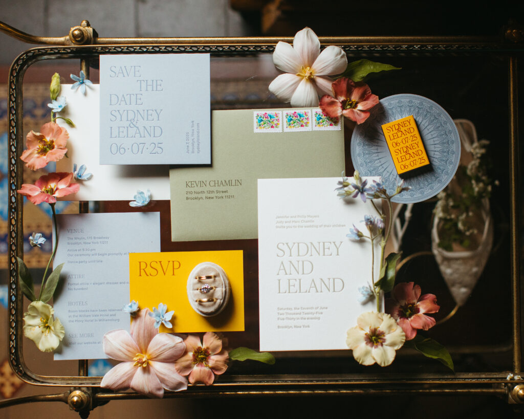
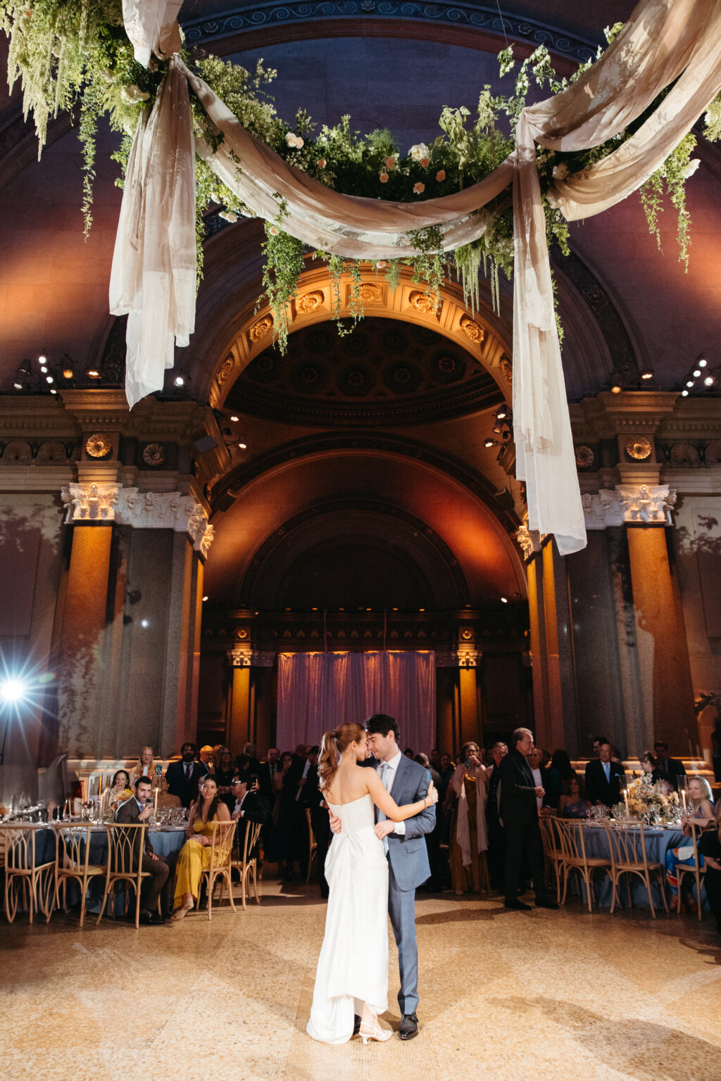
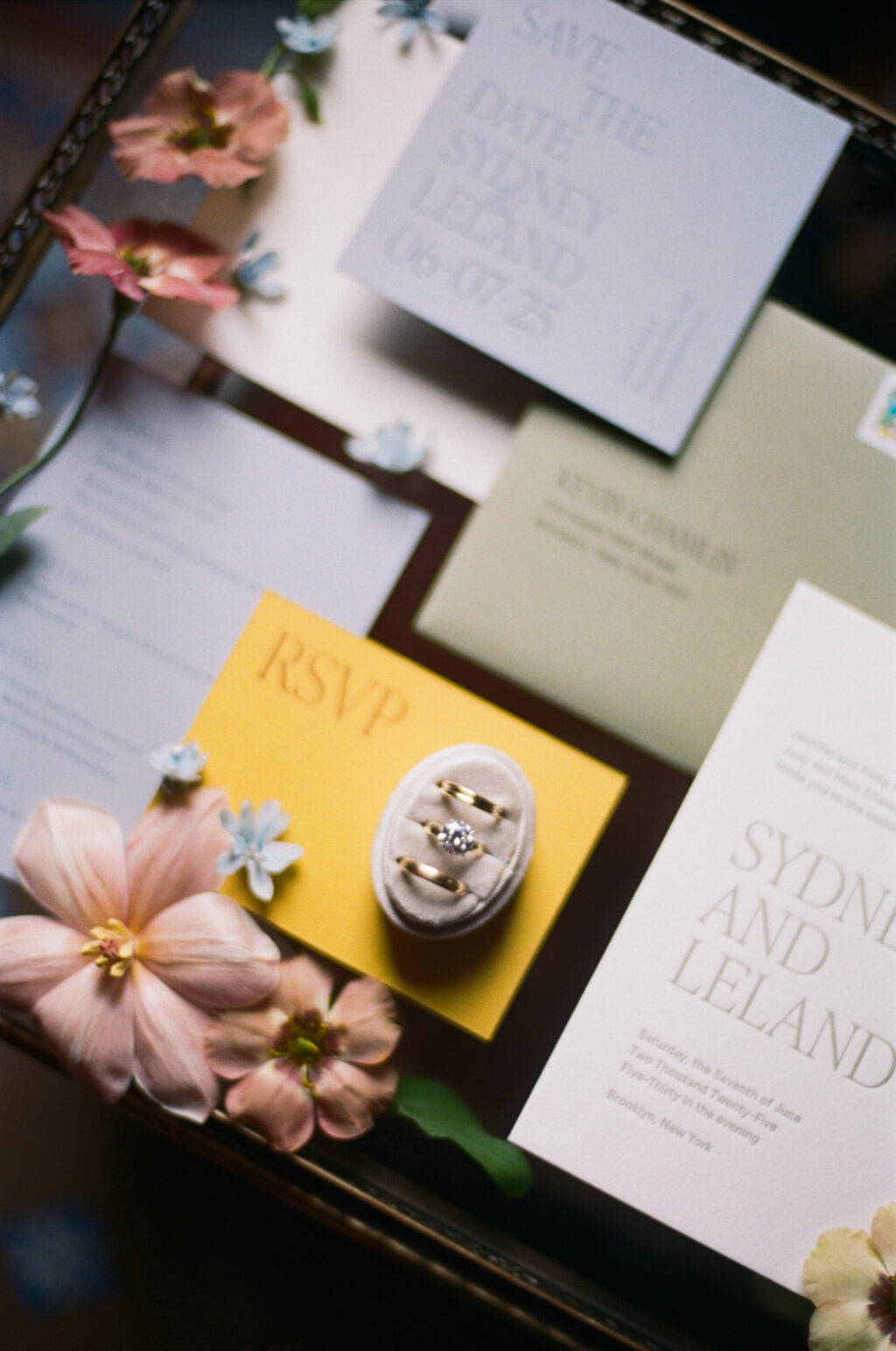
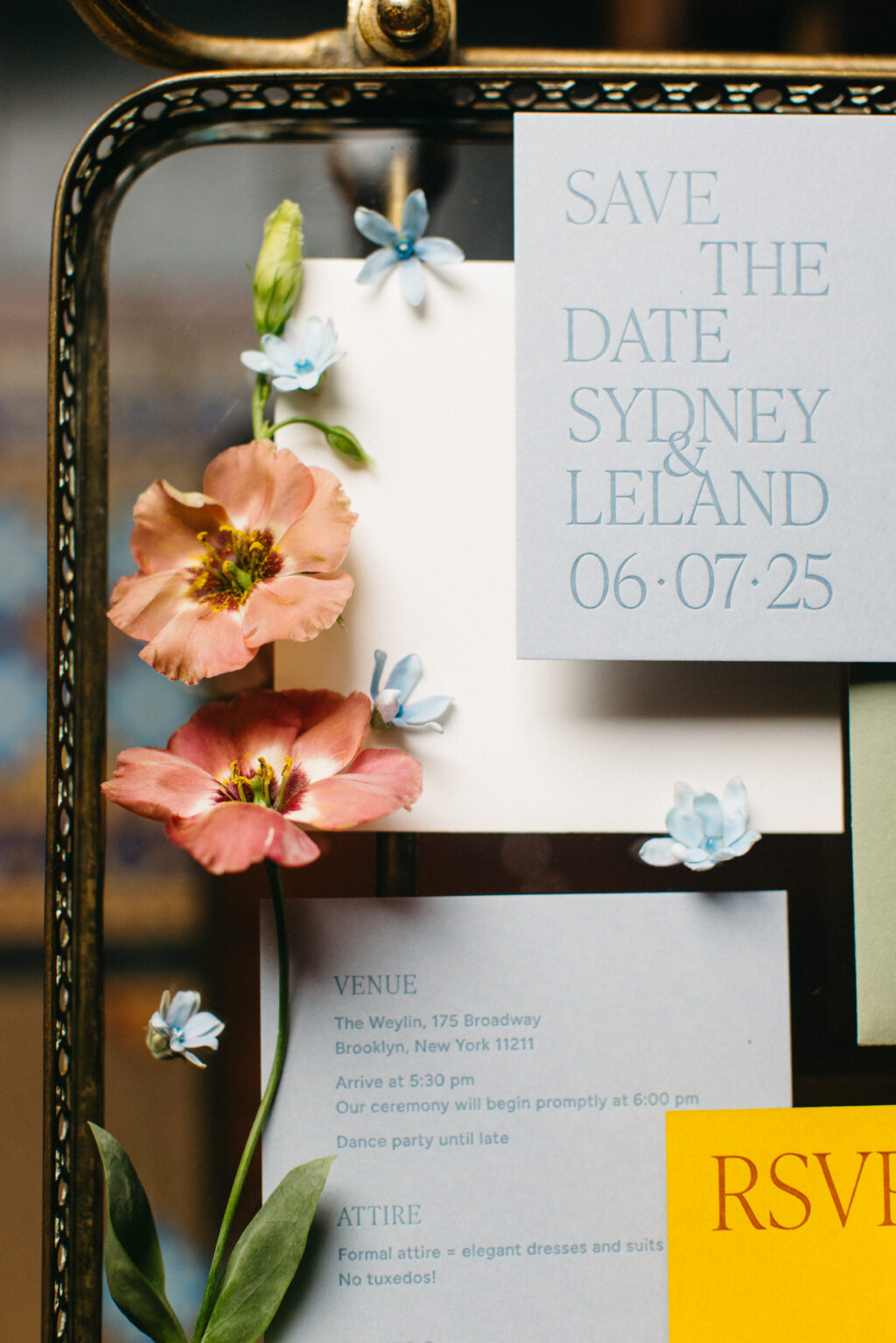
We were delighted to work with Sydney and Leland on their letterpress wedding invitation and day-of pieces, having had the pleasure of helping this couple create their stunning save the date. The minimalist design had an understated elegance that perfectly set the tone for their stunning nuptials held at a quintessential NYC venue.
The invitation is printed on our 2-ply cotton paper, which has a soft texture and holds a deep letterpress impression. The spruce letterpress ink perfectly coordinates with the spruce edge painting on the invitation and the envelope.
Invitation
letterpress ink: spruce
fonts: figtree regular, ivy presto display thin AT
paper: bella cotton white 2-ply
card size: a-7
edge paint: spruce
liner: brooklyn 3 pattern in deep blue digital on white text
envelope: spruce text
envelope addressing: cypress digital on the front and back
job #73480
Reply Card
letterpress ink: nutmeg (front) / nutmeg (back)
fonts: figtree regular, ivy presto display thin AT
fonts: figtree regular, ivy presto display thin AT
paper: cloud 1-ply
card size: a-6
job #73480
The invitation beautifully coordinates with the streamlined design of the couple’s save the date, featuring the same fonts and aesthetic. We previously highlighted the save the date, which includes artwork based on the venue, The Weylin.
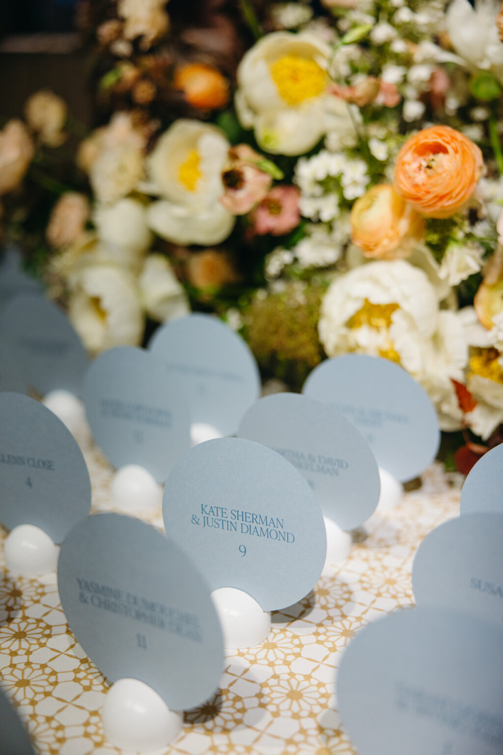
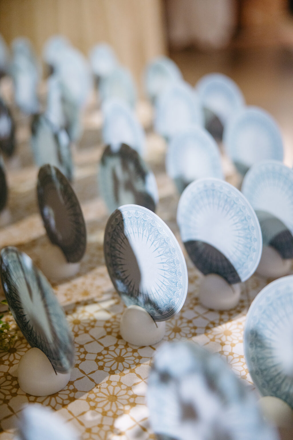
Flat Escort Card
digital ink: chambray (front) / chambray (back)
fonts: figtree regular, ivy presto display thin AT
paper: cloud 1-ply
card size: 4.75″
diecut shape: circle (BP-6)
job #77010
The detailed artwork from the save the date made another appearance on the back of the circular die-cut escort card. This was a charming detail guests could enjoy while at the iconic venue. With the exception of the domed fresco-inspired artwork, the entire suite is typography-focused. Featuring the geometric artwork on the escort cards only highlights this feature, making it more special and eye-catching.
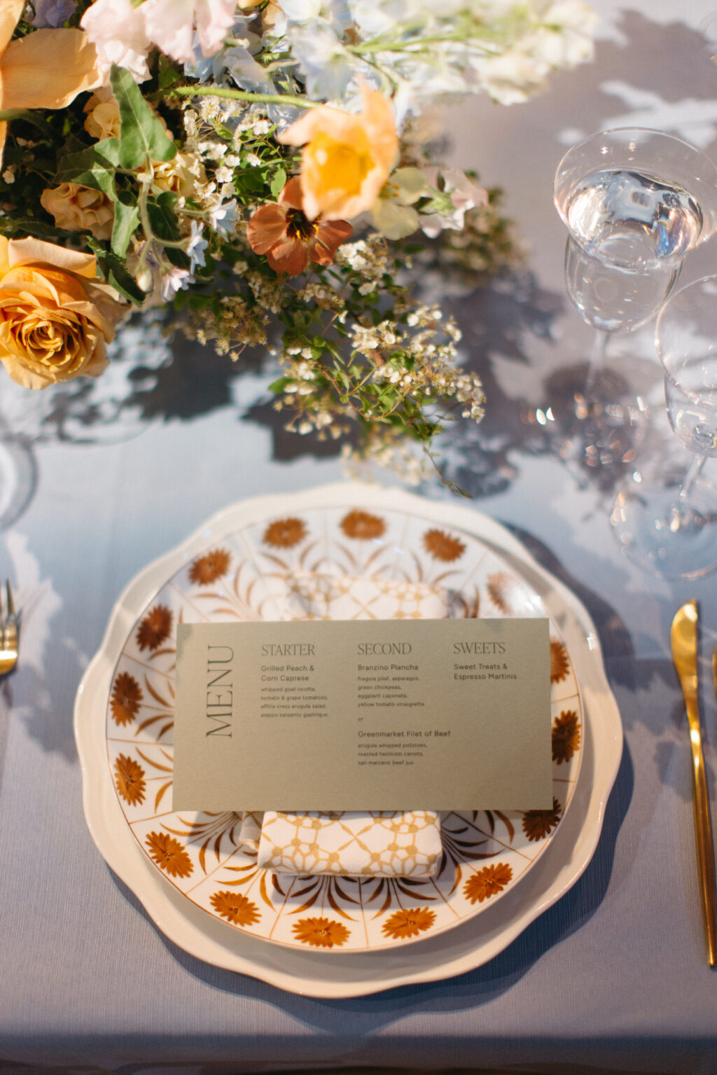
Menu
digital ink: chambray (front) / chambray (back)
fonts: figtree regular, ivy presto display thin AT
paper: spruce 1-ply
card size: 4 x 8
job #77010
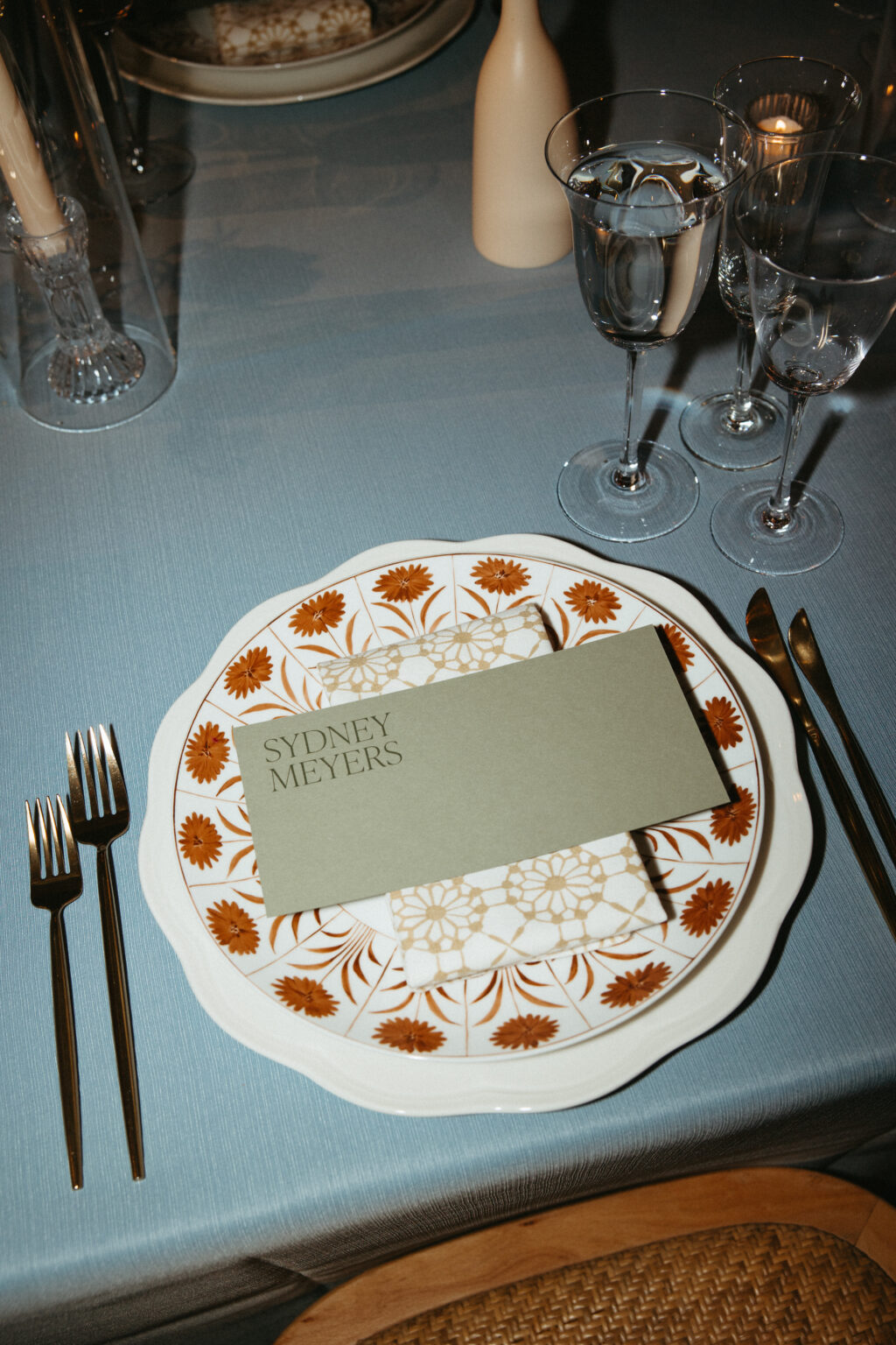
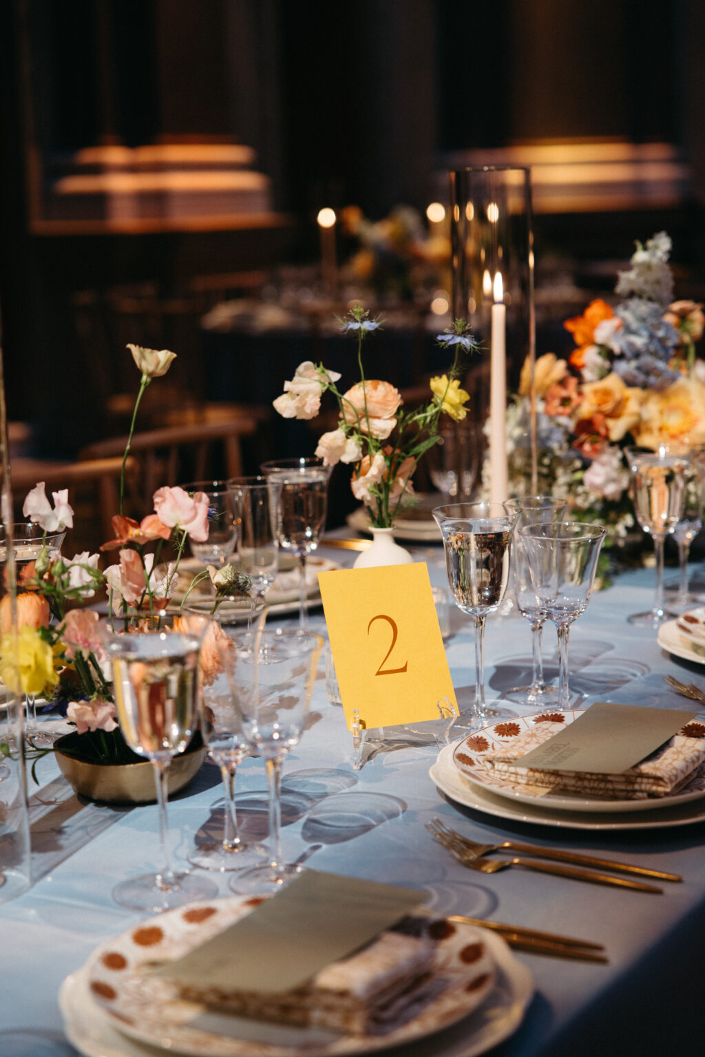
The remaining cards are printed on Bella color papers and feature a coordinating ink for a trendy yet elegant tone-on-tone look. The monochromatic look and bold colors of the day-of pieces were the perfect complement to the floral arrangements and table settings.
Table Card
digital ink: nutmeg (front) / nutmeg (back)
fonts: ivy presto display thin AT
paper: maize 1-ply
card size: a-6
job #77010
Bar Sign A
digital ink: chambray
fonts: figtree regular, ivy presto display thin AT
paper: cloud 1-ply
card size: f-8
job #77010
Bar Sign B
digital ink: nutmeg
fonts: figtree regular, ivy presto display thin AT
paper: maize 1-ply
card size: f-8
job #77010
Best wishes to Sydney and Leland! It was a joy to work with this couple and to help create their stunning letterpress wedding invitations. Are you inspired by the architecture of your venue or interested in a tone-on-tone look for your letterpress wedding invitation, save the date, or day-of pieces? Contact us with questions or work with one of our dealers to see samples in person and receive expert tips and guidance.
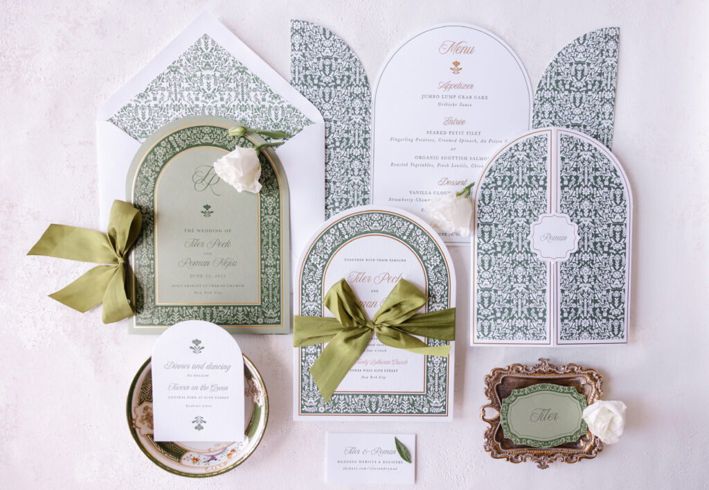
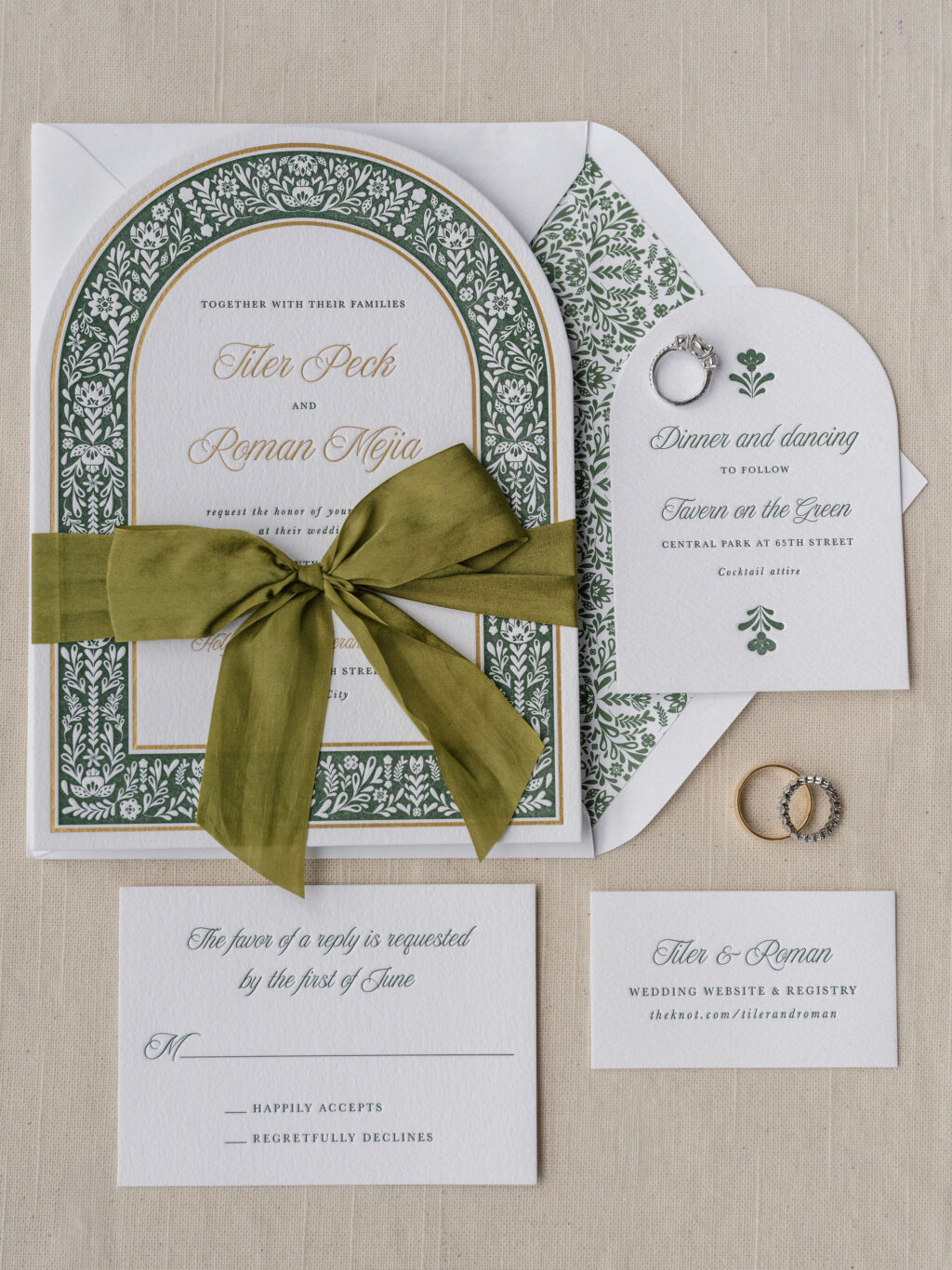
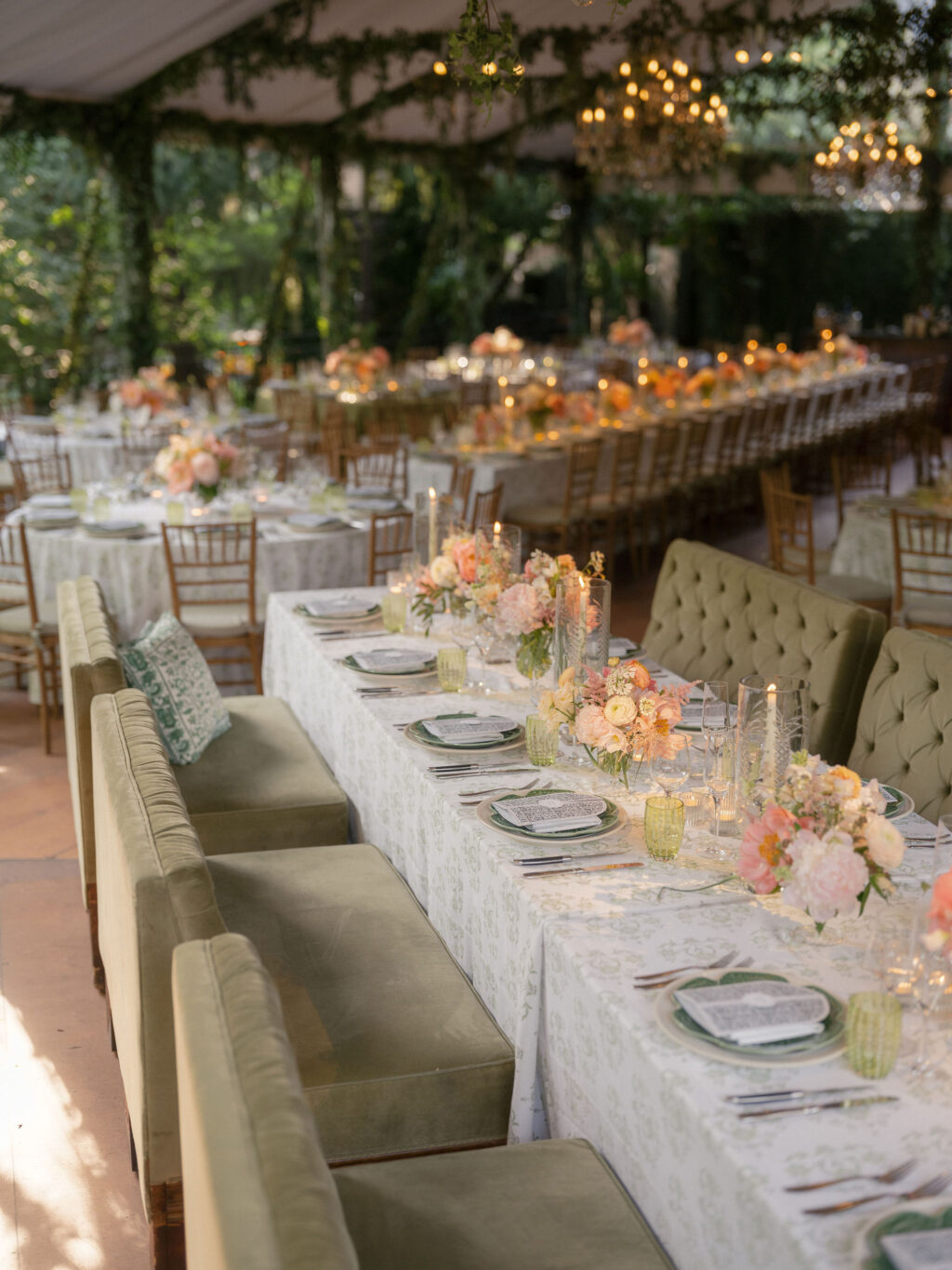
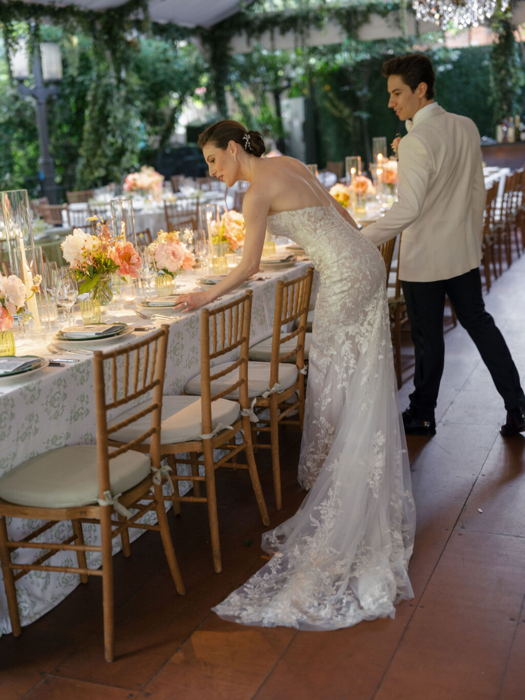
Everything about this NYC wedding is gorgeous and swoon-worthy. The bride and groom, Tiler and Roman, are both principal dancers with the NYC Ballet, and they have a beautiful love story. This couple worked with our dear friend, Claudia of the Wedding Library, to create their charming and exquisite garden-inspired NYC wedding invitation suite. Get the details about their invitation, cards, menu, and more!
Photo: Sasithon Photography
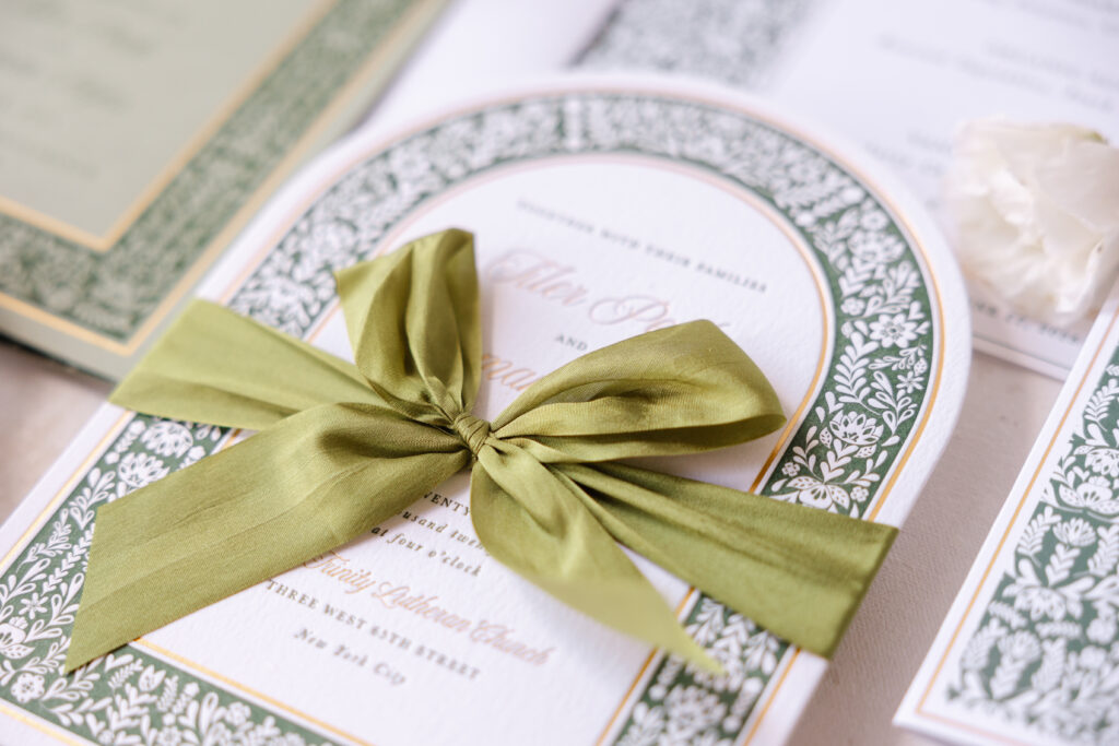
Invitation
letterpress ink: vine
foil stamping: gold matte
font: new icon script, baskerville
paper: bella cotton bright white 2-ply
size: f-8
diecut style: bf-89
liner: fairefolk pattern in vine digital on bright white text
silk ribbon: moss
envelope: bright white pointed flap
digital addressing ink: vine digital (front) / vine letterpress (back)
job #75422
Reply Card
letterpress ink: vine
font: new icon script, baskerville
paper: bella cotton bright white 1-ply
size: a-5
envelope: bright white pointed flap
job #75422
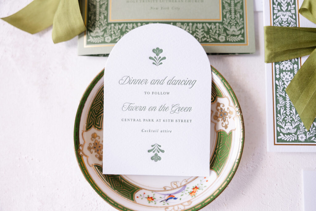
Tiler and Roman chose our Fairefolk design for their big day. This design perfectly coordinated with their reception venue and quintessential NYC eatery, Tavern on the Green. The bold sans-serif font of the original was replaced with a refined script font, giving the invitation a more classic feel. The bride and groom’s names, ceremony location, and part of the border are featured in gold matte foil, further elevating the look. Our bright white 2-ply paper provides a lovely contrast to the vine letterpress ink and holds a deep impression. A silk ribbon tied in a bow adds a decadent finishing touch.
From the bride, “Claudia designs the stationery for her clients, and that made the process so easy for us. She presented me with the design we used, worked on the wording, timing, etiquette, mailing, and all the little details. Bella Figura is one of her print partners, and they did all the graphic elements as well as all the printing. You really notice the beautiful quality of the letterpress printing, the hand-dyed silk ribbons, and all the custom work in everything from our invitations to our menu cards. The deadlines and details are really stressful, and Claudia just made it easy. We love the way the elements all tie together and are perfect for our summer wedding in Central Park!”
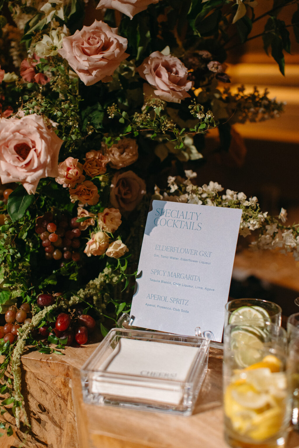
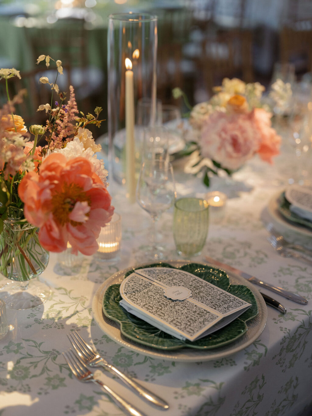
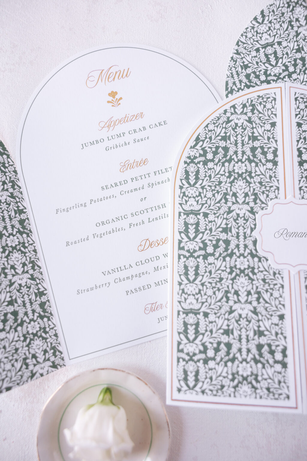
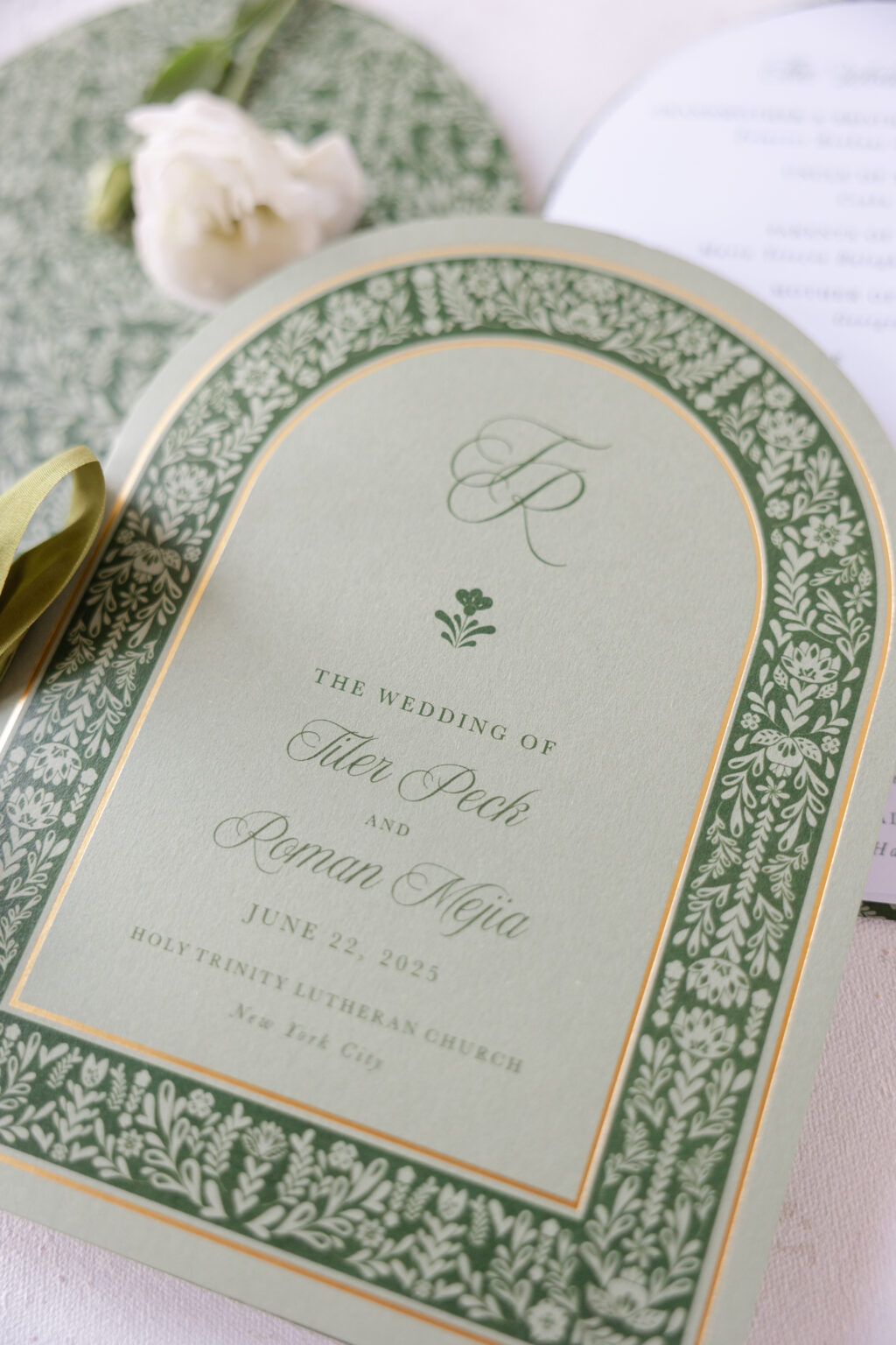
The arch design of the invitation is repeated throughout the suite on the reception card, as well as on the menu and program. While the folkart-inspired pattern found on the invitation border and the envelope liner appears more fully on the front of the gatefold menu and the interior of the program cover. The program stays true to the theme, but mixes things up slightly by featuring digital printing in vine on spruce 1-ply. The overall look is chic and perfect for the garden-themed reception.
Photo: Sasithon Photography
Photo: Sasithon Photography
Photo: Sasithon Photography
Menu
letterpress ink: vine (interior)
foil stamping: gold matte (interior & exterior)
digital ink: vine (exterior)
font: new icon script, baskerville
paper: bella smooth cotton bright white 1-ply
size: 12.38 x 8.31 (open); 6.19 x 8.31 (closed)
diecut style: bf-133
job #77430
Place Card Tag
foil stamping: gold matte
digital ink: vine
font: new icon script, baskerville
paper: bella smooth cotton bright white 1-ply
size: 2 x 2
diecut style: cd-137
job #77690
Program
foil stamping: gold matte (front exterior cover)
digital ink: vine (front exterior & interior cover/insert pages)
font: new icon script, baskerville
paper: spruce 1-ply (cover) / bright white text (insert pages)
cover size: 12.38 x 8.31 (open); 6.19 x 8.31 (closed)
See more photos and get all of the dreamy details in the bride and groom’s feature in Vogue. Congratulations and best wishes to Tiler and Roman, and thank you to Claudia of the Wedding Library for bringing this beautiful garden-inspired NYC wedding invitation suite to us!