Recently we’ve had the pleasure of printing a whole bunch of really great letterpress ceremony programs. In different shapes and sizes and featuring a whole array of different designs, each one is personalized with the colors, fonts and designs perfect for each individual couple and their event.

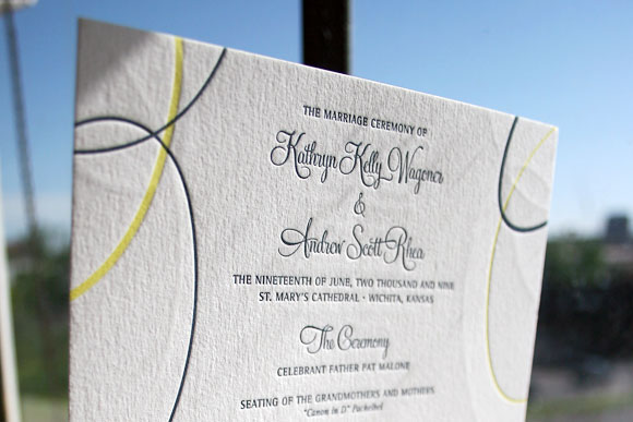
These double-sided programs are in our Suyra design, printed in deep blue and butter yellow inks. They were a full F8 size, the same as our larger-sized invitations, to allow the couple to really maximize the amount of information they could include. In this case, the back of the program featured details on the members of their wedding party.

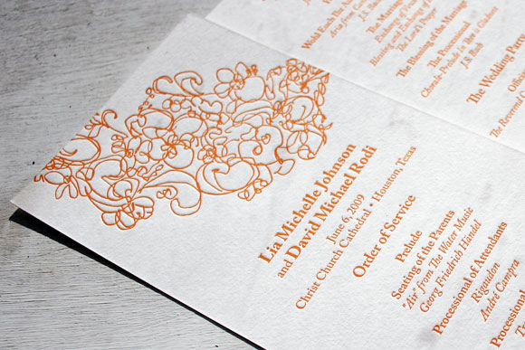
Decidedly modern in our Flourish design printed in persimmon, these 1-color double-sided ceremony programs are a true reflection of the event this couple was planning. They are fun and whimsical while still perfectly appropriate for their traditional church ceremony.


Perfect for a more formal event, these letterpress programs in our Plume design feature deep blue and antique gold inks and the undeniable flair of hand calligraphy accents. Like the Flourish letterpress programs above, these were double-sided letterpress on our tea length size. We love the elegance a lovely letterpress ceremony program can add to a wedding and look forward to printing many many more.
Custom letterpress coasters are among our favorite things to print. There is truly no better way to add a special, unexpected and unique touch to your wedding, anniversary party or fiesta than with gorgeous letterpress coasters. We love when couples incorporate a special monogram or recipes for signature cocktails, but they’re equally as fun when printed with motifs to match their letterpress wedding invitations. If you’re looking for that perfect way to infuse your event with personal flair, letterpress coasters are a must have.

Printed in one color letterpress in our dusty pink ink, these coasters perfectly coordinate with the couple’s Pavilion letterpress wedding invitations for their glamorous nuptials in Indonesia. They are both chic and oh so pretty.

These two-sided letterpress coasters are printed in fuchsia ink and feature the same design as the couple’s Birds letterpress wedding invitations. Along with a recipe for the signature cocktail served at their wedding, the back of the coaster also features the custom pattern used for their envelope liners – a perfectly coordinated and really fun way to personalize their event.

These letterpress coasters feature a custom hand calligraphy monogram, making them truly one of a kind. Printed in cardinal ink, they could be equally as special for an anniversary party or graduation celebration as for a wedding.

Circolo 1 is one of our favorite designs, but we especially love it when printed as a great letterpress coaster. Printed here in antique gold ink, this coaster is nothing short of modern and hip, again featuring a recipe for the couple’s signature cocktail. When we print great coasters like this, we know our couples’ guests are in for a real treat!
You can see more custom letterpress coasters here.
Last year we had the opportunity to print beautiful letterpress wedding invitations for the fall wedding of Ashley and Christian. Today we are thrilled that their wedding is featured on Style Me Pretty! Married at Houston’s First Presbyterian Church with the reception following at The Junior League of Houston, Ashley and Christian created an incredibly elegant affair that was the perfect blend of old world charm and modern sophistication.

Ashley and Christian chose our timeless Classic Calligraphy design for their letterpress invitations, printed in espresso and featuring a custom blind deboss monogram. Printed on our ivory cotton paper, the final look is nothing short of perfectly refined and elegant. For much more of Ashley and Christian’s wedding, as photographed by their amazing photographer Tanja Lippert, make sure to visit Style Me Pretty.

Congratulations Ashley and Christian and thank you for allowing us to share your beautiful wedding with Style Me Pretty readers!
{Photos by Tanja Lippert}
Concluding our letterpress calligraphy love fest (for now!) — here are some really sweet escort cards that feature letterpress printed calligraphy. What a great keepsake this would make for your guests…these escort cards are from our Classic Calligraphy letterpress design. In addition to offering letterpress printed calligraphy, we do offer calligraphy services (for envelopes, place cards, etc.) through our favorite calligrapher ever Debi Zeinert.

This letterpress wedding invitation is printed in a custom dark blue ink and features lots and lots of gorgeous, hand-drawn calligraphy by our master calligrapher Debi Zeinert.


Even the M line on the reply card highlights the calligraphy….lovely! Shows how even a single calligraphy letter can totally make a card shine.

Letterpress accents on the classy letterpress coasters too….

Here’s our New Calligraphy design as a save the date – in moss ink, with moss edge painting, on our ultra-thick 2-ply cotton paper (the 2-ply paper really lets the edge painting stand out). The mix of the modern & the historical in this letterpress calligraphy design is so cool, and the moss ink color is full of personality too.


Continuing our letterpress calligraphy love fest…here are a few more calligraphy treats.
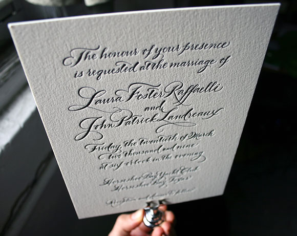
Black ink seems so right for calligraphy invitations – it’s the original letterpress ink from hundreds of years ago, and black has stayed in fashion ever since. This is the Classic Calligraphy design using the Spencerian calligraphy style, letterpress printed on our 2-ply cotton paper. Totally timeless. And notice how special each of the first letters of the bride’s and groom’s names are – I love how the “L” of the bride is intertwined already with the “P” of the groom.
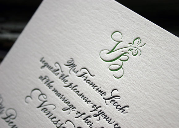
We often do calligraphy invitations in one color — but wow, when you add a second color–and add that to a custom monogram in fact — what an effect! The butterfly monogram is sweet and sophisticated and uses the bride & groom’s first letters of their first names. More black ink — how can you go wrong there? — but the garden green ink ads a bit of fun. This is another variation on the Classic Calligraphy design, Spencerian style.
Stay tuned for a very cool calligraphy save the date — in green!

Incorporating calligraphy into your letterpress wedding invitations strikes us as one of the season’s best wedding trends. Actually, calligraphy has been a popular design element for, oh, several hundred (or thousand?) years, but we’ve been seeing calligraphy a whole lot in our favorite wedding invitations this year. Though script fonts are great, nothing – absolutely nothing! – compares with hand lettered calligraphy, where every single letter is a totally unique work of art. Bella Figura’s calligrapher is the amazingly talented Debi Zeinert, who has been making our letterpress brides so happy for years now.

So for the next few posts, we’ll focus on some really gorgeous calligraphy invitations. Let’s start with this Nonpareil invitation – it’s honestly one of the prettiest things we have ever seen! And what an inspired customization too (check out the Nonpareil original invitation here). It’s true, we’re letter junkies over here, but check out the calligraphy accents: look at that A! The M! Just lovely. Clients can choose from about 10 different styles of calligraphy, but this style (the Clermont style) feels perfect: modern, elegant, with a little bit of cool. Also note that both the reply information AND reception information is on the invitation itself – it’s eco (less paper!) and keeps cost down too (no reply card/envelope/reception card to worry about!). Colors are black & fuchsia – so perfect!

We think it’s smart to do the thank you note and coaster in 1 color, to keep costs down. If you’re trying to save money, keep the 2 color design for the invitation, and do the rest of the pieces in 1 color.

Learn more about letterpress calligraphy designs at Bella Figura, or about having your envelopes addressed by our calligrapher as well.