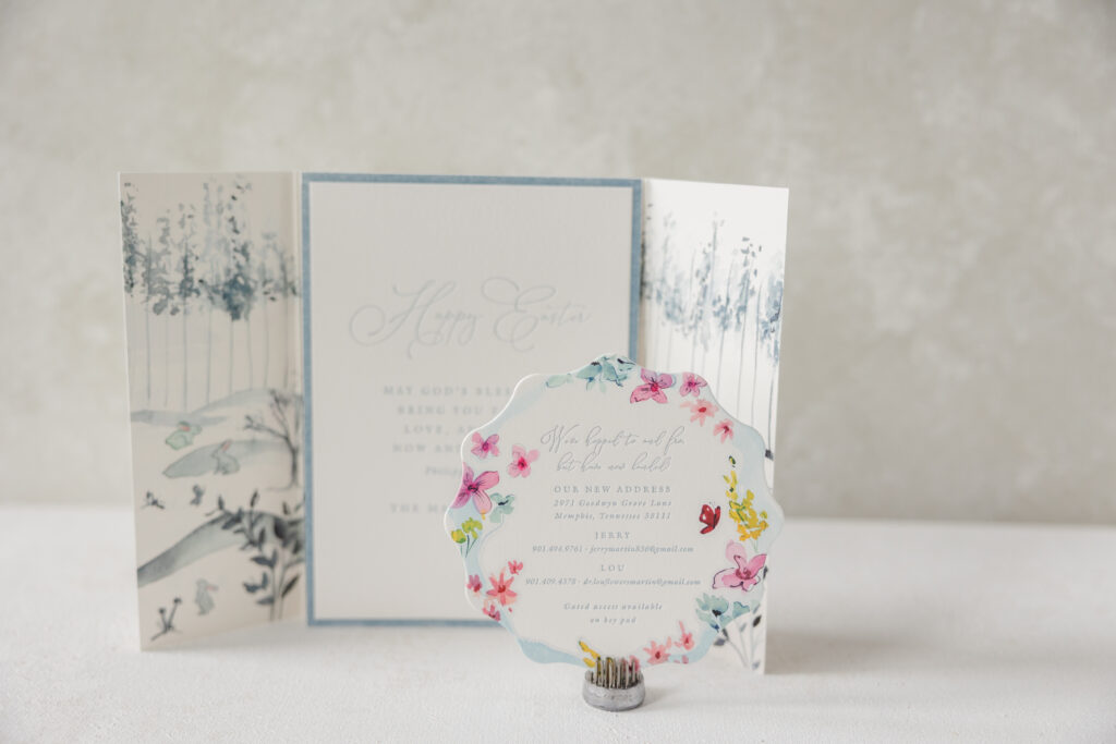
A new home is an exciting time, and the Martin family wanted to share the good news with their friends and family. Given the timing, they also chose to include another card conveying Easter well wishes. The family worked with our dear friend Lindsey from Mrs. Post Fine Stationery & Gifts to create a whimsical new home announcement, a thoughtful Easter card, and a lovely gatefold with custom artwork. The overall feel is soft and sentimental.
Details Card
letterpress ink: chambray
digital ink: cmyk
fonts: itc galliard pro roman/italic + sophia script regular
paper: bella smooth cotton 2-ply white
Size: sq-5
die cut shape: cd-654
envelope printing: cmyk + chambray digital on the front, interior, and back flap
custom converted envelope: white text
envelope die: e-400
job: 75675
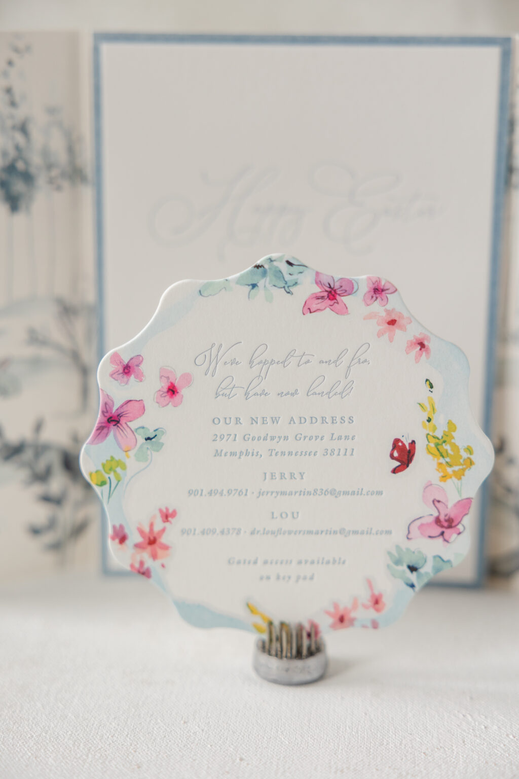
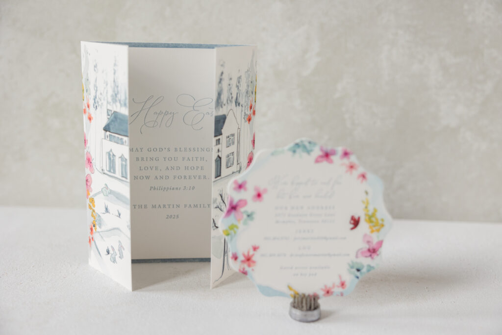
The details card shares the couple’s new address and contact information. Floral watercolor artwork hugs the gentle scallop edge. The extravagant script font beautifully coordinates with the floral border. The design is fun and fanciful.
Announcement Card
letterpress ink: chambray
fonts: itc galliard pro roman/italic + sophia script regular
paper: bella cotton 2-ply white
Size: a-7
job: 75675
Gatefold
digital ink: cmyk (front) / cmyk (back)
paper: bella smooth cotton 1-ply white
Size: 10.67” x 7.19” flat, 5.32” x 7.19” folded
job: 75675
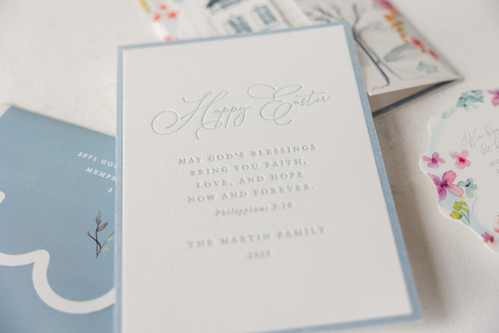
The announcement card features a more traditional design and shares an Easter sentiment. The airy script font makes a statement while the remaining text appears in a refined yet understated serif font that anchors the typography. The crisp letterpress border frames the text while outlining the edges of the card.
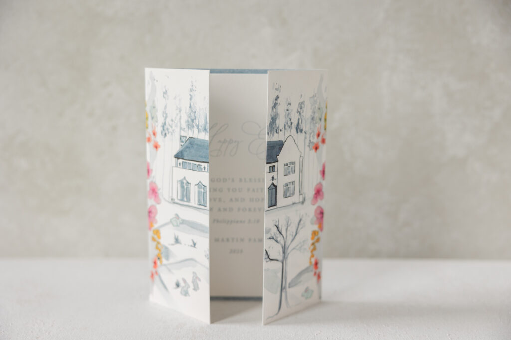
The gatefold is an absolutely charming piece that secures the cards in the envelope while also showcasing the couple’s home. An illustration of the home appears on the interior and is visible when the cards are removed. Artwork featuring the home is also printed on the exterior of the gatefold and aligned in such a way to showcase the structure when the gatefold is closed. The same floral artwork from the details card delicately cascades along the exterior fold line, framing the home when recipients remove the gatefold from the envelope.
All of these pieces have a storybook feel with charming watercolor artwork and personal touches. It was a complete joy to work on this job. Are you interested in custom stationery to commemorate a milestone and spread your good news? Do you love the concept of a gatefold that reveals a custom illustration when the panels are closed? Whatever your stationery needs, our dealers can assist you through the process to create the perfect pieces.
We had the absolute pleasure of working with Shannon and Cesar through our NYC studio to create their beautiful invitation and program. We’ll let Shannon take it from here to share more about their wedding details!
CAN YOU SHARE WITH US A BIT ABOUT YOUR WEDDING AND YOUR INSPIRATION FOR THE EVENT? Our wedding took place this past August in San Francisco, CA. My husband is from the Bay Area, whereas I’m from NYC. Family is most important to us, so when planning the wedding, we really focused on inclusivity and comfort of guests, while executing a classic, elegant affair. Our ceremony took place in a Catholic church, and the cocktails & reception was at the historic Westin St. Francis Hotel in downtown San Francisco. Our biggest inspiration wasn’t a person or place, rather a sentiment: love. We wanted everyone–many who traveled far–to experience a warm and sentimental environment, while having fun!
WHAT ADVICE DO YOU HAVE FOR COUPLES CURRENTLY PLANNING A WEDDING? Ask your most valued people (family, friends, godparents, etc.) what’s important to them. You may not be able to promise them everything, but at least there was communication. You don’t want people to be upset or disappointed the day before or day of wedding when they find out that xyz did/didn’t happen. At least you can say, “well it was discussed and we determined what’s best for us.” It saves any headaches or hurt feelings, and it allows people to feel heard.
HOW DID YOU CHOOSE YOUR INVITATION DESIGN & INK COLORS? We needed a bilingual invitation, so we saw a trifold design that Mariana showed us–it was perfect. She gave us the idea of having our church drawn on the front, which mirrored church doors openings. EVERYONE complimented it and said how unique and elegant it was, even if they didn’t speak Spanish. The color was a warm white, and we had a gold ink for the church design and denim ink for the inside print. Since our wedding was in late summer, we stayed away from deep fall hues and spring pastels. We also wanted something eye catching without being flashy, to exude an air of elegance so that guests can understand the wedding was a formal event.
WHAT SURPRISED YOU MOST ABOUT YOUR WEDDING? How fast the day goes! Everyone says how quickly things move, and it’s so true! Just enjoy it.
WHAT WAS YOUR FAVORITE MOMENT? Walking up the aisle with my father, and seeing my husband at the altar waiting for me. It was a magical and once in a lifetime moment.
FAVORITE DESIGN ELEMENT OF YOUR BIG DAY? We LOVED our flowers. They made a difference in the church and the reception room. They brought so much life and color, and everyone complimented them. We also rented some lounge furniture for our cocktail area, which allowed people to relax and chat.
WHAT’S NEXT FOR THE NEWLYWEDS? We’re enjoying our new chapter and we shall see what comes next 🙂