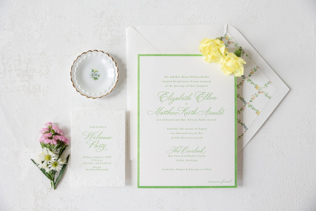
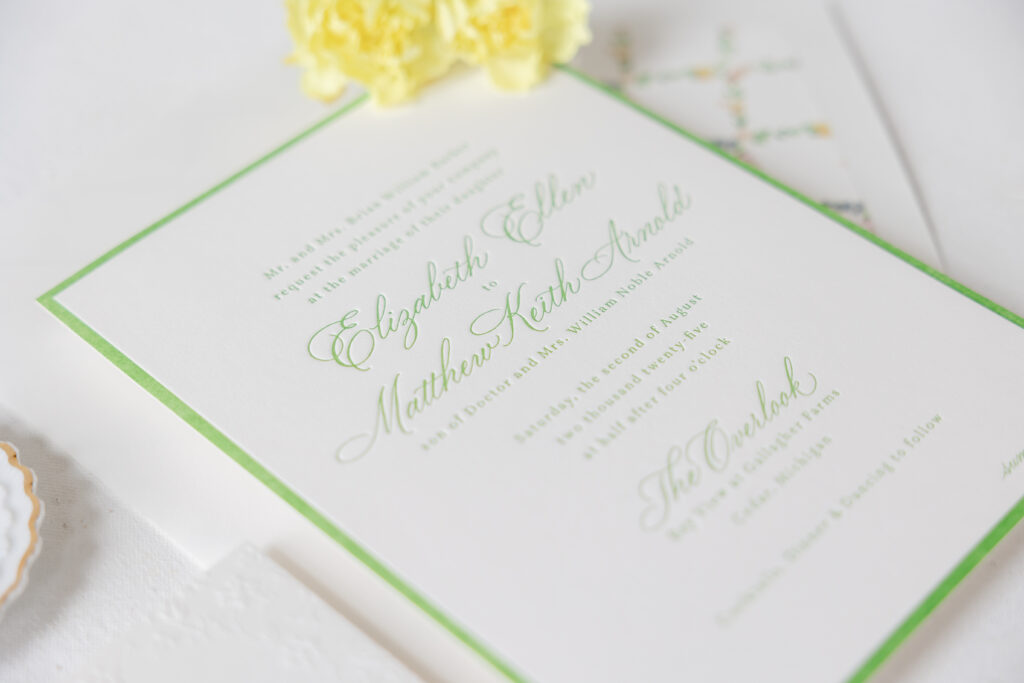
Elizabeth and Mathew’s letterpress wedding invitations are classic, refined, and gorgeous with plenty of romantic undertones. The look perfectly set the tone for their scenic summer wedding. The couple worked with our friend Kristyn of Oliver’s Twist to customize our Hadaway design.
Invitation
letterpress ink: garden
calligraphy: custom (supplied by client)
font: aria text
paper: bella smooth cotton 2-ply white
size: f-8
envelope liner: custom pattern in cmyk digital on white text
envelope: white cotton text pointed flap
envelope addressing: garden digital on the back
job: 76334
These invitations expertly balance classic formal elements, such as calligraphy and letterpress printing, with modern design and botanical charm. The flow of the calligraphy is stylish and airy, while the letterpress border framing the invitation adds a contemporary elegance. Our garden letterpress ink is fresh and perfect for a summertime affair.
Delicate florals adorn the liner in a symmetrical pattern, providing plenty of color and a traditional garden-inspired look.
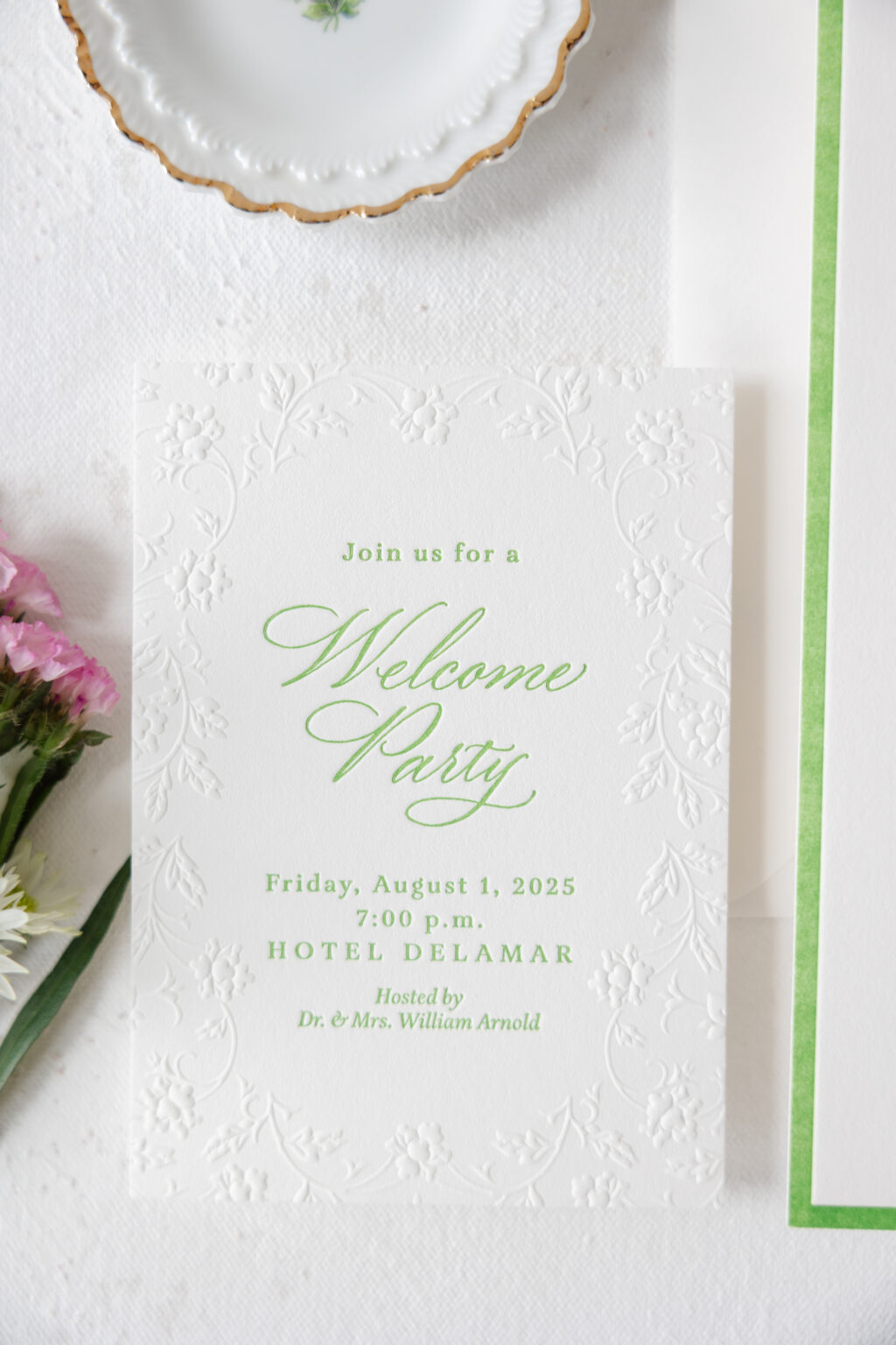
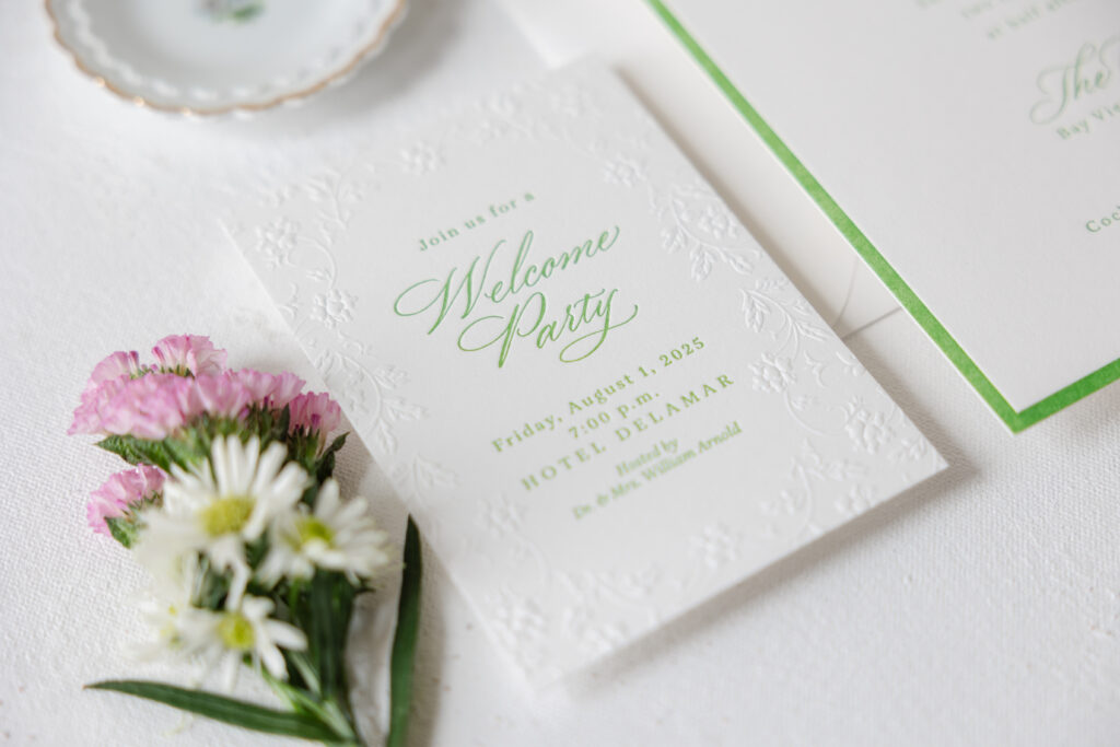
Welcome Party Card
letterpress ink: garden
emboss: blind
calligraphy: custom (supplied by client)
font: aria text
paper: bella smooth cotton 1-ply white
size: a-5
job: 76334
The welcome party card maintains the floral look but uses blind embossing. The floral border is more organic and less structured than the envelope liner, keeping the overall look fresh and unexpected. The raised detail contrasts with the depth of the letterpress printing, while the same ink color and graceful, agile flourishes of the calligraphy tie into the invitation design.
These letterpress wedding invitations have us dreaming of summertime weddings, floral arrangements, and calligraphy accents. Are you ready to design your perfect wedding stationery? Contact us or work with one of our dealers to get started!
Bailey and Noah chose to customize our Underwood V.2 design for their wedding. The couple made some simple but significant changes to elevate the design and make it their own. They worked with our dear friend Johnna of Big City Bride to create these lovely tone-on-tone wedding invitations.
The structured typography and clean layout keep everything polished and intentional. The bold serif font for the names and the delicate sans serif font for the text introduce a modern feel. A muted, earthy color palette feels organic and grounded, and is perfect for a fall wedding. The use of tone-on-tone printing is elegant yet trendy. Subtle debossed florals create texture. Blind debossing presses into the paper without ink and, in this instance, adds charm to the look without feeling busy.
Invitation
letterpress ink: olive
deboss: blind
font: austin + sweet sans
paper: bella spruce 2-ply
size: f-8
envelope liner: underwood pattern in black digital on ballet text
envelope: ballet text
envelope addressing: black digital on the front and the back
job: 75411
Reply Card
letterpress ink: rosebud
font: austin + sweet sans
paper: bella rose 1-ply
size: a-5
job: 75411
The same floral artwork also appears on the envelope liner, digitally printed in black on our ballet text. The use of black ink on the light, delicate pink paper is striking, making the florals the highlight of the liner, while they play a supporting role on the invitation.
Details Card
letterpress ink: bordeaux
font: austin + sweet sans
paper: bella mauve 1-ply
size: a-7
job: 75411
Rehearsal Dinner Invitation
letterpress ink: espresso
font: austin + sweet sans
paper: bella moss 1-ply
size: sq-5
job: 75411
For the reply card, the debossed floral artwork from the invitation is rearranged into a bouquet and letterpress printed in our rosebud ink. This creates consistency across the pieces while still keeping things fresh and unique.
The delicate florals and tonal printing soften the modern look, creating a dreamy, elegant wedding suite. It was a pleasure to create these lovely wedding invitations for Bailey and Noah, and it’s always a pleasure to work with Big City Bride. Work with one of our dealers to create the tone-on-tone wedding invitations of your dreams!
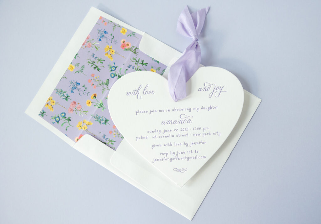
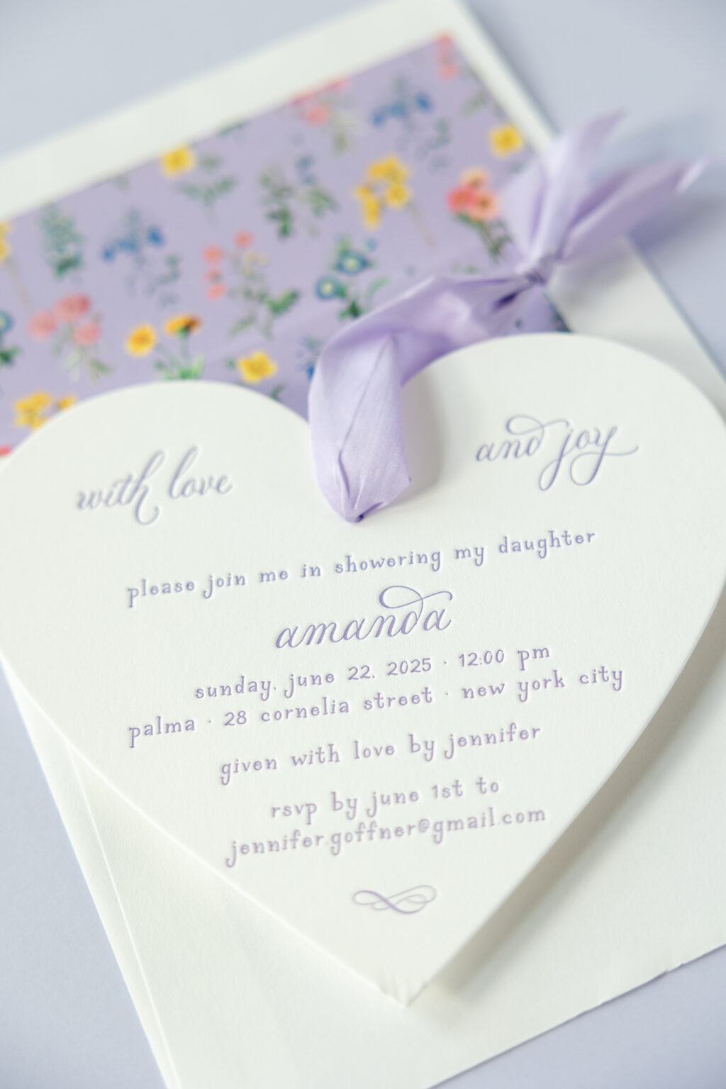
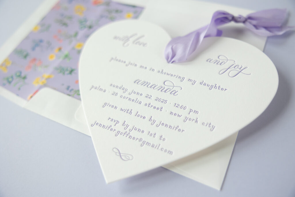
These shower invitations are absolutely delightful. A sweet die-cut shape, a silk ribbon, and a charming floral envelope liner make for a mesmerizing combination. The hostess worked with Debbie of AGI Events to customize our Lilibet design. The inspiration design started as a Valentine’s Day card, but effortlessly transformed into a shower invitation.
Invitation
letterpress ink: amethyst
fonts: petunia serif + petunia script
paper: bella smooth cotton 1-ply white
size: 6.75” x 5.9”
die cut shape: cd-132
silk ribbon: dark lavender
finishing: assemble with ribbon
envelope liner: hadaway pattern in amethyst + cmyk digital on white text
envelope: white cotton text
envelope addressing: amethyst digital on the front and the back
job: 76077
The heart-shaped invitation instantly sets a sentimental, love-centered tone. It’s sweet and pairs beautifully with the graceful script font and delicate serif font. Amethyst ink coordinates with the silk ribbon, giving everything a cohesive, dreamy look.
The floral envelope liner creates a meadow of tiny blooms against a lavender backdrop. It feels vintage-inspired, like pressed wildflowers from an old garden journal, but the clean layout and crisp white envelope keep it modern and polished.
Whimsical garden romance meets classic elegance, making this design perfect for a bridal shower or any celebration, really. Are you daydreaming about the perfect shower invitation? Locate one of our dealers to bring your stationery dreams to life!
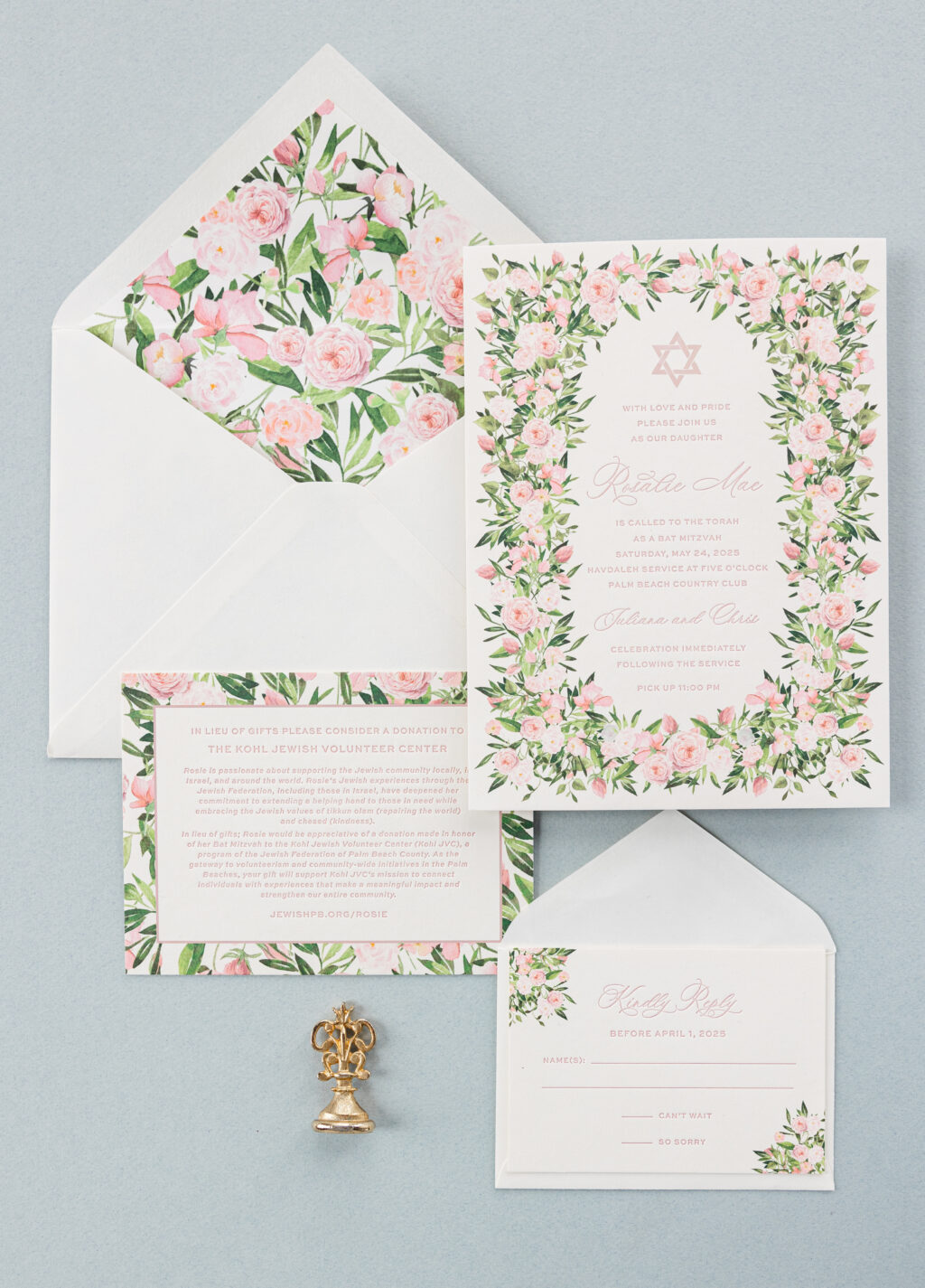
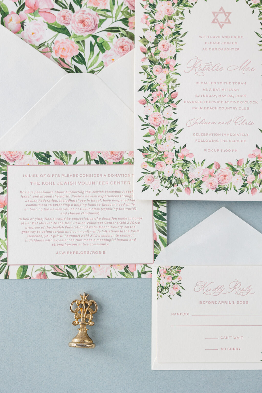
This custom-created floral Bat Mitzvah invitation set came to us from our dear friend Liz at Stationer on Sunrise. Decadent 3-ply smooth cotton paper elevates this invitation and features a deep impression from the letterpress printing. The invitation text is letterpress printed while the Star of David is digitally printed in the same color, Old Rose, to coordinate perfectly. The large-scale rose border nicely complements the F-8 card and still provides ample space for the text. The same floral artwork adorns the liner.
Invitation
Letterpress ink: old rose
Digital: cmyk + old rose
Fonts used: Ms Claudy + Sweet Sans
Paper: Bella smooth cotton ivory 3-ply
Size: f-8
Liner: custom pattern in cmyk
Envelope: Bella cotton ivory pointed flap
digital addressing: old rose + cmyk on back flap
Job #74214
The donation card has a more stately appearance. The rose artwork is scaled up to match the liner, yet still coordinates with the other pieces while maintaining its own distinct identity. A thin line border separates the rose artwork from the text. The reply card features two floral motifs in opposite corners, keeping the rose theme while introducing a unique look.
Donation Card
Letterpress ink: old rose
Digital: cmyk + old rose
Fonts used: Ms Claudy + Sweet Sans
Paper: Bella smooth cotton ivory 2-ply
Size: a-6
Job #74214
Reply Card
Letterpress ink: old rose
Digital: cmyk
Fonts used: Ms Claudy + Sweet Sans
Paper: Bella smooth cotton ivory 1-ply
Size: a-5
Envelope: Bella cotton ivory pointed flap
addressing: old rose letterpress on front
Job #74214
Are you looking for the perfect Bar or Bat Mitzvah invitation? Or do you have a vision for your own floral Bat Mitzvah invitation or something completely unique? Contact us to get started, or find a dealer near you to see samples and swatches in person and start designing your invitation!
We worked with Sue Corral Ink to create these neutral letterpress wedding invitations with floral accents for Amanda and James. They opted for a Desert letterpress ink color which they carried through to the reply set as well. The neutral palette allowed for a pop of color on the invitation as well as the envelope liner. They dressed up the monogram with florals around the perimeter of the cartouche. Lastly, the same floral theme carried onto the envelope liner kept everything consistent and harmonious.