Marisol and Terence’s foil-stamped wedding invitations have an old-world charm and plenty of refined details, plus some unexpected design elements that keep things light, fun, and glamorous. This couple worked with our dear friend Carolyn from Quintessence Fine Papers and Gifts to create these invitations.
Invitation
foil stamping: champagne matte
fonts: madison pro + mrs. eaves
paper: bella cotton 2-ply white
size: f-8
envelope liner: supplied pattern in white digital on walnut text
envelope: white cotton text
envelope printing: espresso digital on the front and the back
job: 77213
Reply Card
letterpress ink: espresso
fonts: madison pro + mrs. eaves + adobe garamond italic
paper: bella cotton 1-ply white
size: a-5
envelope: white cotton text
envelope printing: espresso digital on the front
job: 77213
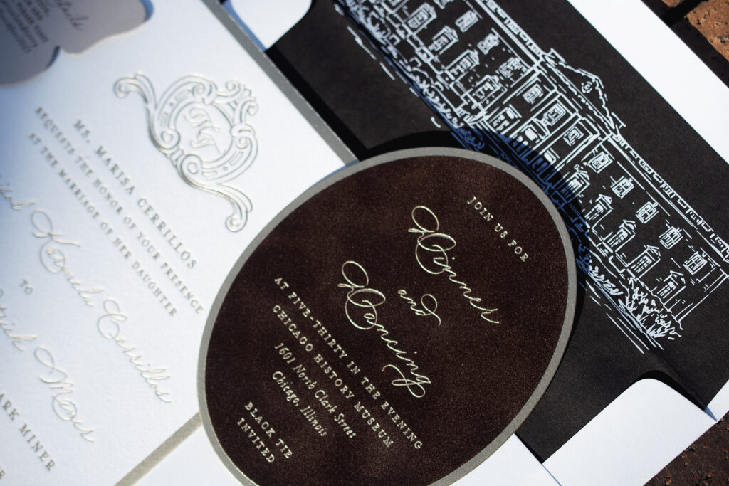
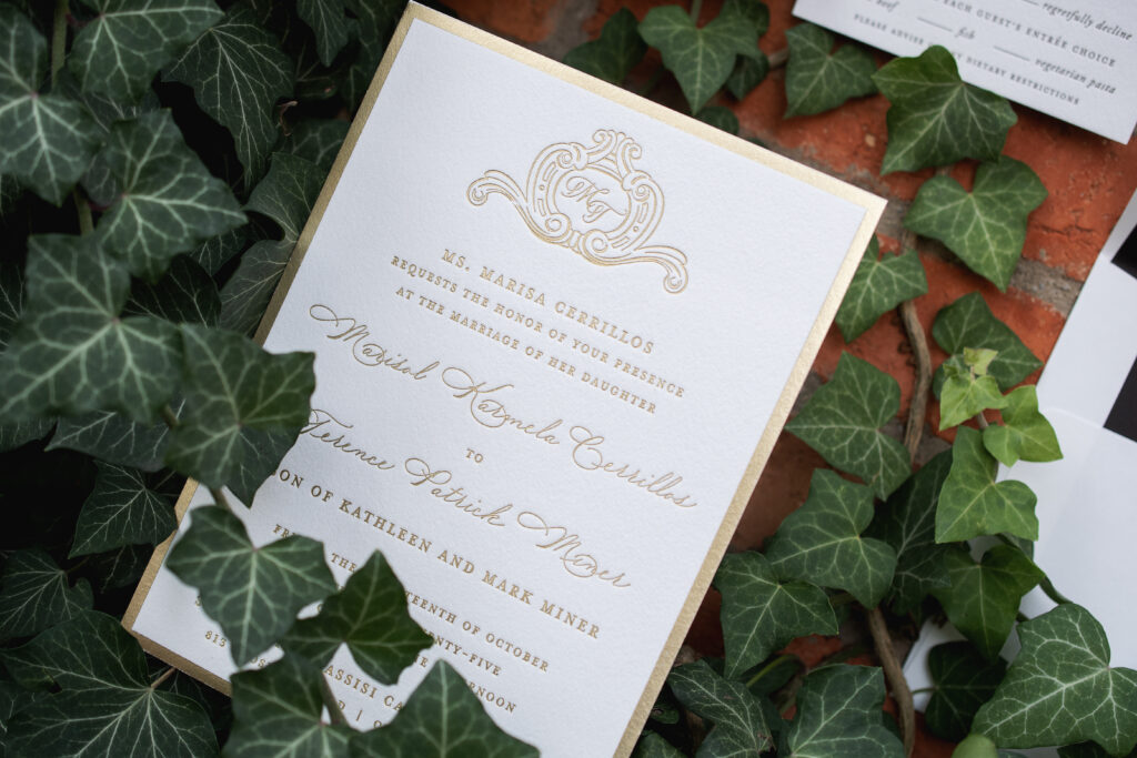
At its core, this custom wedding invitation design leans into classic formality. The couple’s initials appear in a custom, ornate crest at the top, immediately setting the tone. A traditional layout, coupled with a flowing script font and a classic serif font, creates a balanced, structured feel. Champagne matte foil stamping is elegant, while the broad, foil-stamped border adds a decadent touch.
The envelope liner features a custom illustration of the Chicago History Museum, the location of the reception. This is a lovely personal element that is completely unique to this design. The envelope liner features bold white digital printing on walnut text, adding a contemporary feel to the invitation suite.
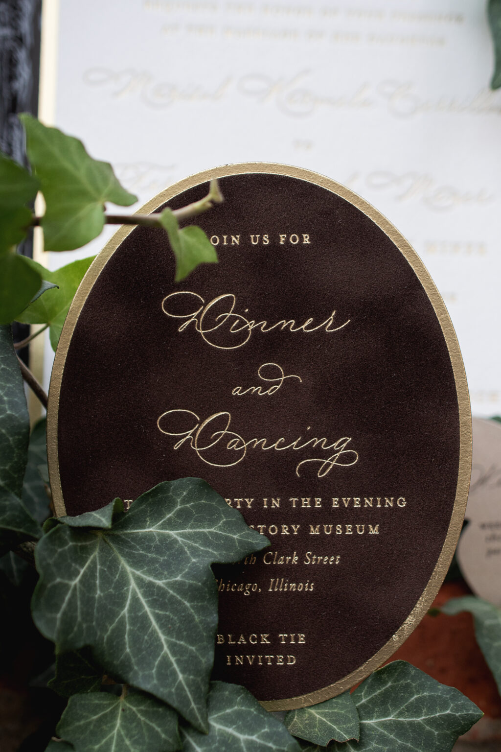
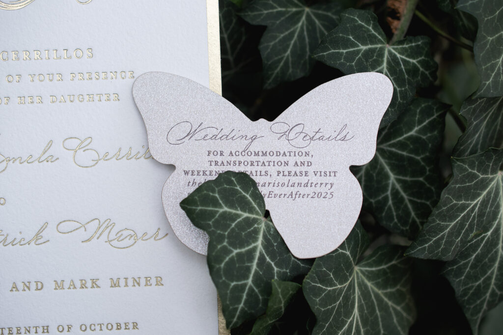
The reception card is a stunner, featuring foil stamping on our cocoa velvet. The velvet is adhered to our metallic sand 1-ply, giving the card structure and a hint of glimmer. An oval die-cut shape further distinguishes this card, while the broad foil-stamped border aligns with the invitation design.
The whimsical details card also features our metallic sand stock, but this time it’s die cut into the shape of a butterfly. This is a charming card that succinctly conveys important info while introducing a fun, unexpected design element.
Do you want classic wedding invitations? Or do you want to feature velvet or add whimsy with a fun die-cut shape? Would a custom envelope liner featuring the reception location be the perfect addition? Whatever you’re thinking, we can help make it happen. Contact us or work with one of our dealers to create the perfect wedding stationery for your big day.
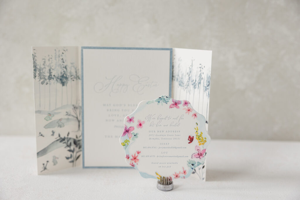
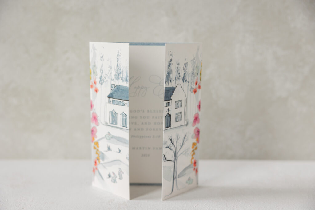
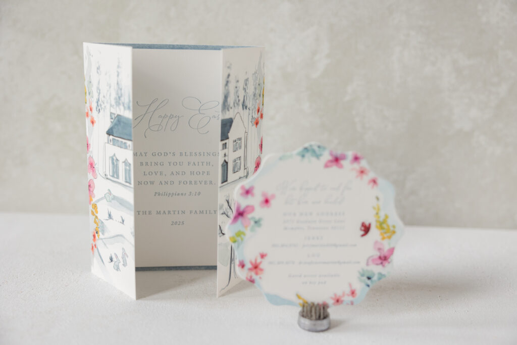
A new home is an exciting time, and the Martin family wanted to share the good news with their friends and family. Given the timing, they also chose to include another card conveying Easter well wishes. The family worked with our dear friend Lindsey from Mrs. Post Fine Stationery & Gifts to create a whimsical new home announcement, a thoughtful Easter card, and a lovely gatefold with custom artwork. The overall feel is soft and sentimental.
Details Card
letterpress ink: chambray
digital ink: cmyk
fonts: itc galliard pro roman/italic + sophia script regular
paper: bella smooth cotton 2-ply white
Size: sq-5
die cut shape: cd-654
envelope printing: cmyk + chambray digital on the front, interior, and back flap
custom converted envelope: white text
envelope die: e-400
job: 75675
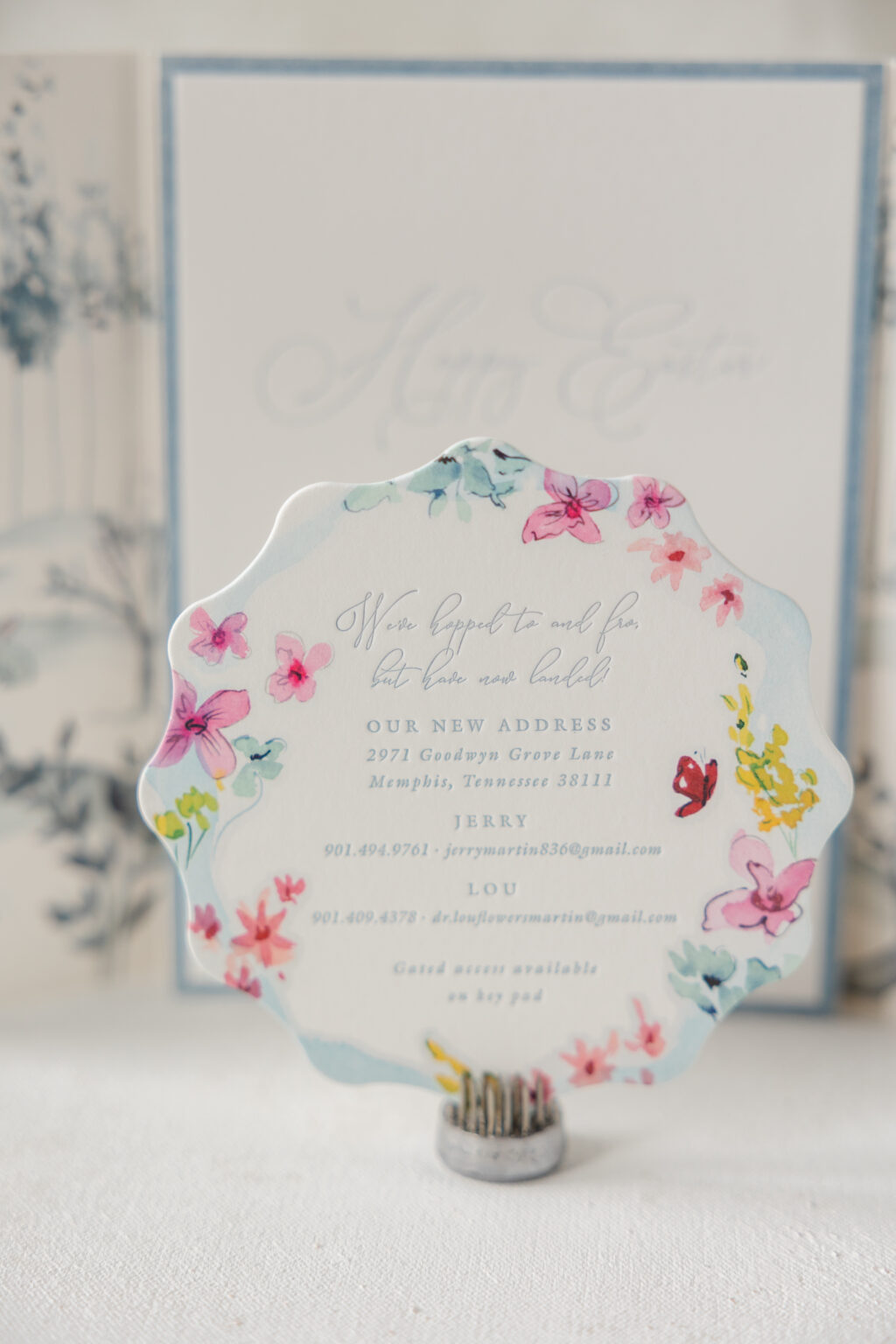
The details card shares the couple’s new address and contact information. Floral watercolor artwork hugs the gentle scallop edge. The extravagant script font beautifully coordinates with the floral border. The design is fun and fanciful.
Announcement Card
letterpress ink: chambray
fonts: itc galliard pro roman/italic + sophia script regular
paper: bella cotton 2-ply white
Size: a-7
job: 75675
Gatefold
digital ink: cmyk (front) / cmyk (back)
paper: bella smooth cotton 1-ply white
Size: 10.67” x 7.19” flat, 5.32” x 7.19” folded
job: 75675
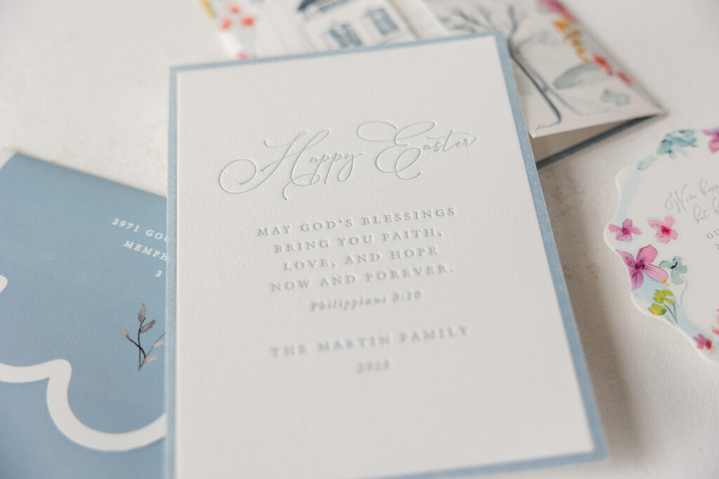
The announcement card features a more traditional design and shares an Easter sentiment. The airy script font makes a statement while the remaining text appears in a refined yet understated serif font that anchors the typography. The crisp letterpress border frames the text while outlining the edges of the card.
The gatefold is an absolutely charming piece that secures the cards in the envelope while also showcasing the couple’s home. An illustration of the home appears on the interior and is visible when the cards are removed. Artwork featuring the home is also printed on the exterior of the gatefold and aligned in such a way to showcase the structure when the gatefold is closed. The same floral artwork from the details card delicately cascades along the exterior fold line, framing the home when recipients remove the gatefold from the envelope.
All of these pieces have a storybook feel with charming watercolor artwork and personal touches. It was a complete joy to work on this job. Are you interested in custom stationery to commemorate a milestone and spread your good news? Do you love the concept of a gatefold that reveals a custom illustration when the panels are closed? Whatever your stationery needs, our dealers can assist you through the process to create the perfect pieces.
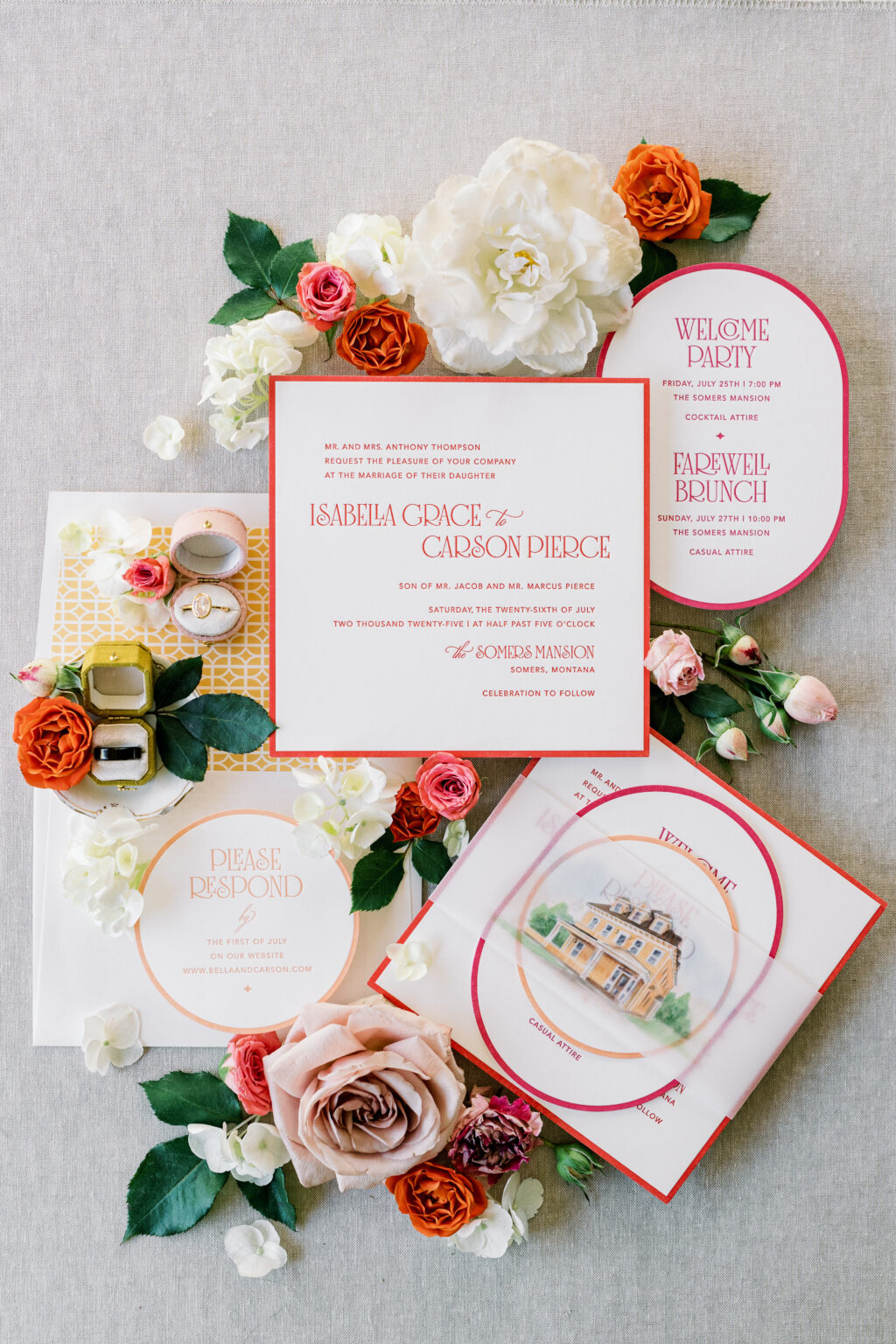
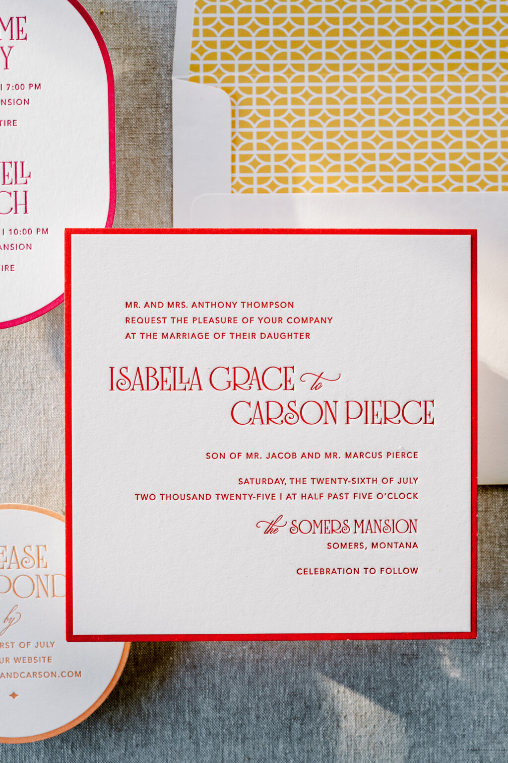
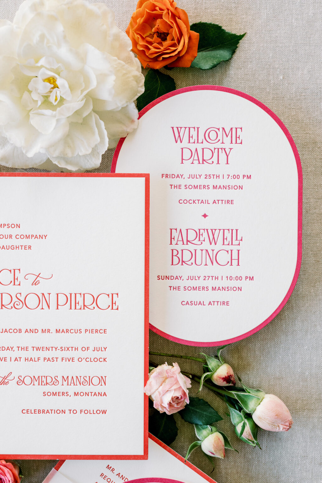
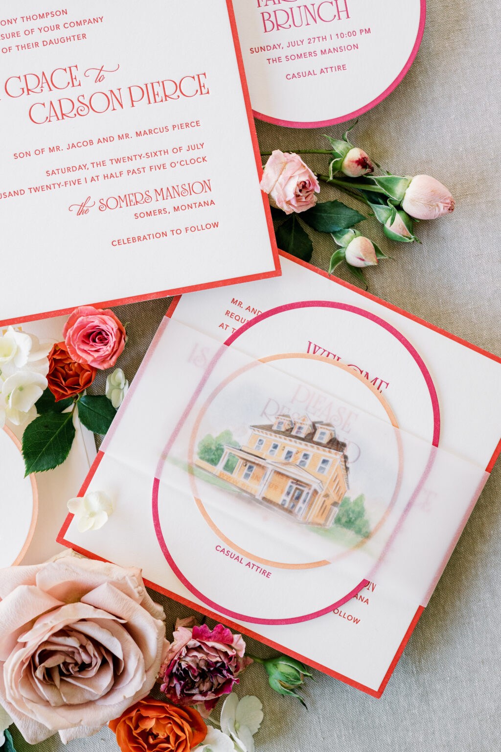
We have another one-of-a-kind design to share with you, courtesy of our friend Janeil of Seventh and Anderson. Not too long ago, we partnered with Janeil to create two wedding stationery suites for a styled shoot. We already highlighted the garden party-inspired design, and we cannot wait to share the second design, which features layered die-cut shapes, a vibrant color palette, and a watercolor illustration of the venue.
Invitation
letterpress ink: chili
fonts: avenir + solingen + ecatherina
papers: bella smooth cotton 2-ply white
card size: sq-7
envelope liner: lexsa pattern digitally in cmyk on white text
envelope: white text
job: 77887
This design is bold and modern, yet it still has an underlying romantic feel. The layout is traditional, but the whimsical font is contemporary and fun, while still maintaining a formal sense.
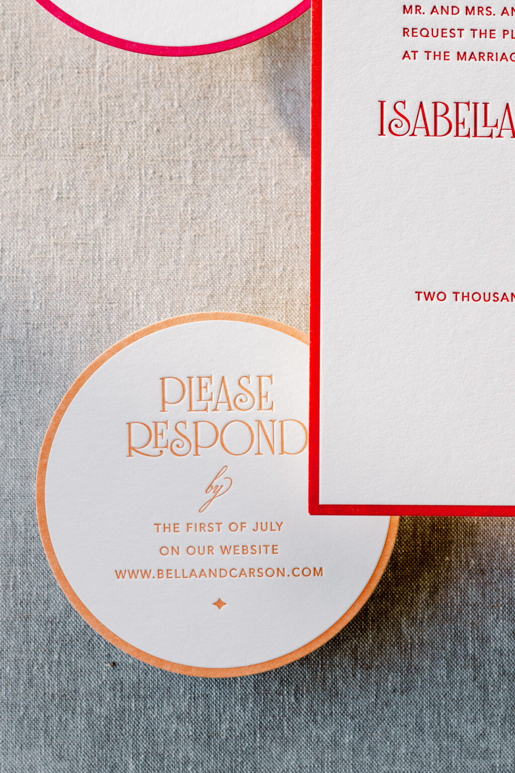
Reply Card
letterpress ink: persimmon
fonts: avenir + solingen + ecatherina
papers: bella smooth cotton 1-ply white
card size: 4-inch circle
die cut shape: sm-33
job: 77887
Each card in the suite is a different size and shape. The thick letterpress border on each card creates a cohesive element while highlighting the different shapes. Each card also features a different complementary color, further creating a sense of consistency while introducing vibrant energy and a cheerful, approachable vibe.
Details Card
letterpress ink: punch
fonts: avenir + solingen + ecatherina
papers: bella smooth cotton 1-ply white
card size: a-6
die cut shape: bf-113
job: 77887
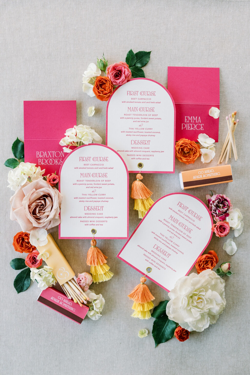
The cards neatly stack and are secured together with a vellum belly band. A watercolor illustration of the venue is digitally printed on the belly band, adding a fun, personal touch.
Menu
letterpress ink: punch
fonts: avenir + solingen + ecatherina
papers: bella smooth cotton 1-ply white
card size: a-6
die cut shape: cd-179
finishing: 0.25” hole drill and gold grommet
job: 77887
Folded Place Card
digital ink: white
fonts: avenir + solingen + ecatherina
papers: punch 1-ply
card size: no. 17 folded
job: 77887
Belly Band
digital: cmyk
papers: 40# vellum
card size: sq-7 (2.75” x 14.25” open, 2.75” x 6.74” closed)
job: 77887
This suite is cheerful, bold, and romantic. The design is perfect for a summer wedding at an estate or mansion. The look blends tradition with personality. It feels festive and welcoming, elegant but not overly formal, and very much made to celebrate.
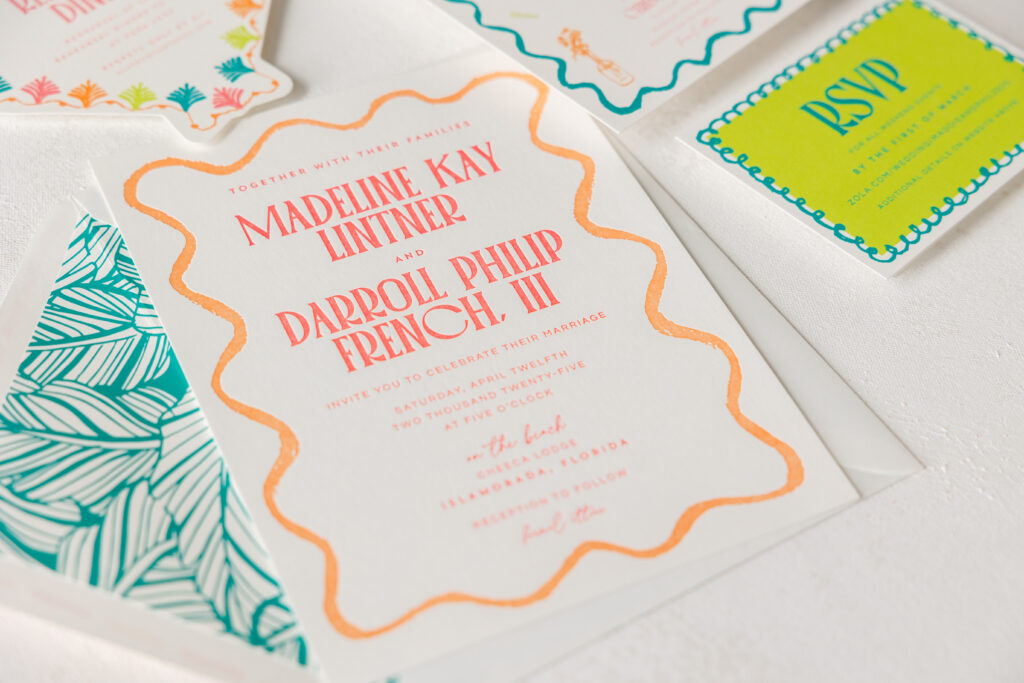
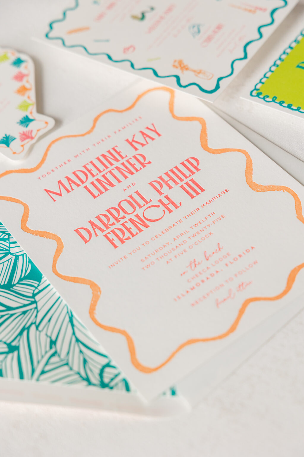
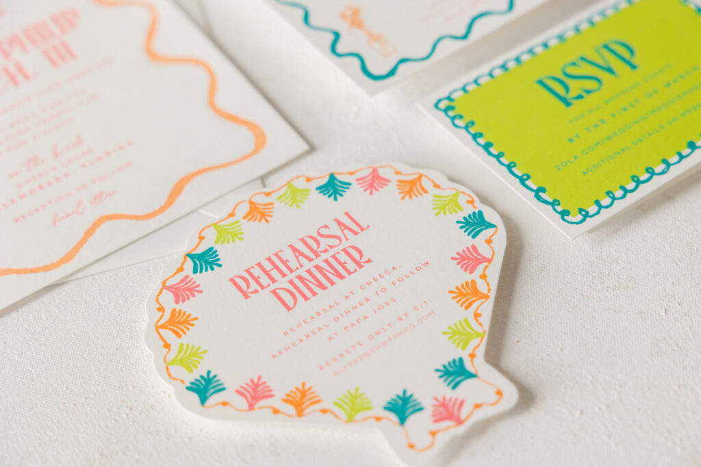
The bold, vibrant colors and fun, tropical look of our Gigi design were an excellent starting point for Madeline and Darroll’s wedding invitations. The festivities were held in the Florida Keys, so the bright colorway coupled with beachy motifs and a clamshell die-cut card set the perfect tone. Our dear friend Kristyn of Oliver’s Twist brought us this lovely tropical letterpress invitation suite.
Invitation
letterpress inks: watermelon + persimmon
font: palmore + questrial + la luxes script
paper: bella smooth cotton white 1-ply
card size: f-8
liner: l’anana pattern in aquamarine digital on white text
envelope: white cotton text pointed flap
envelope addressing: watermelon + persimmon digital on the front and back
job #73386
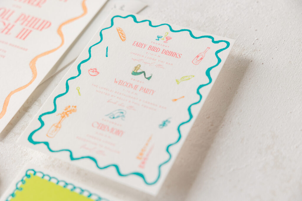
This two-color letterpress invitation features an organic border in persimmon ink that almost looks hand-drawn. Madeline and Darroll chose our l’anana pattern for the envelope liner, which beautifully coordinates with the tropical locale of the ceremony. The same border from the invitation is repeated in digitally printed aquamarine on the whimsical details card. The details card also features a variety of motifs for a fun, personalized, and playful look. The die-cut rehearsal dinner invitation is adorable and perfectly fits the tropical theme.
digital inks: lime-aid + aquamarine + watermelon + persimmon
font: palmore + questrial + la luxes script
paper: bella smooth cotton white 1-ply
die cut shape: cd-341
card size: 5 x 5
job #73386
Reply Card
digital inks: lime-aid + aquamarine
font: palmore + questrial + la luxes script
paper: bella smooth cotton white 1-ply
card size: a-5
job #73386
It was a joy to work on Madeline and Darroll’s tropical letterpress invitation suite, and we always look forward to working with Oliver’s Twist. The right invitations set the tone and get your guests excited for your big day. Find one of our dealers so you can see samples and swatches and get expert guidance to create your perfect invitation!
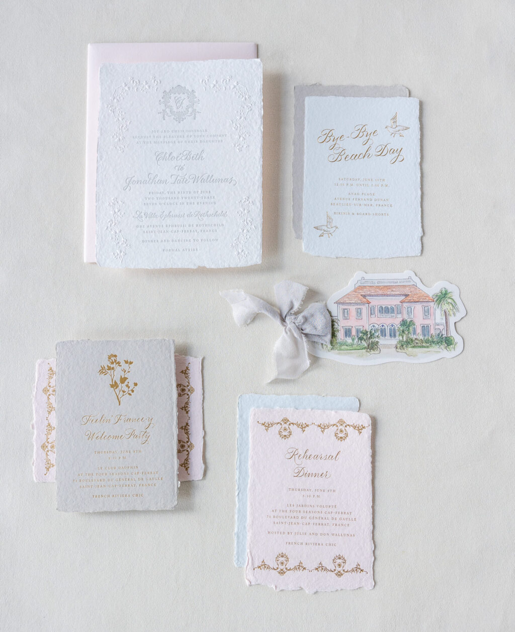
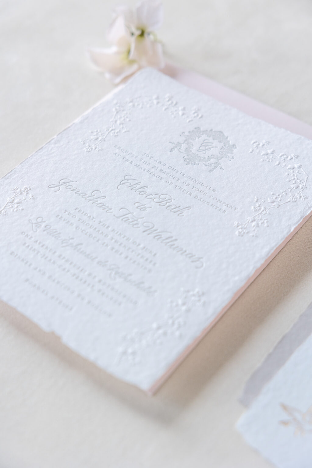
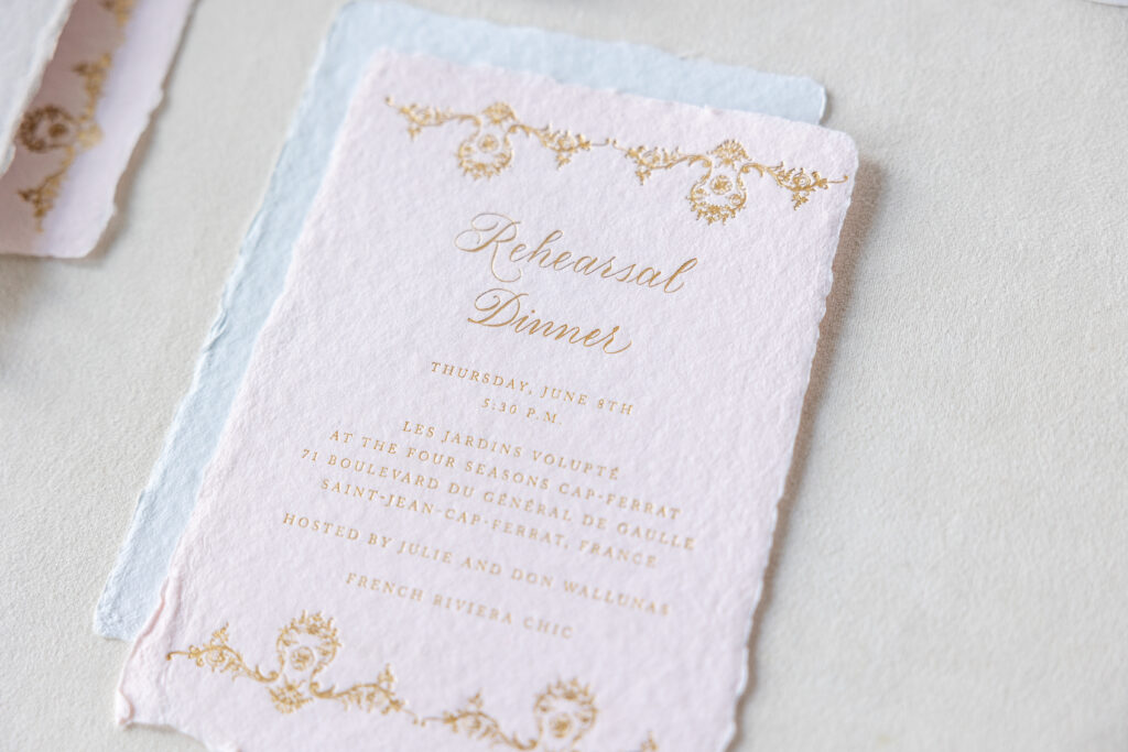
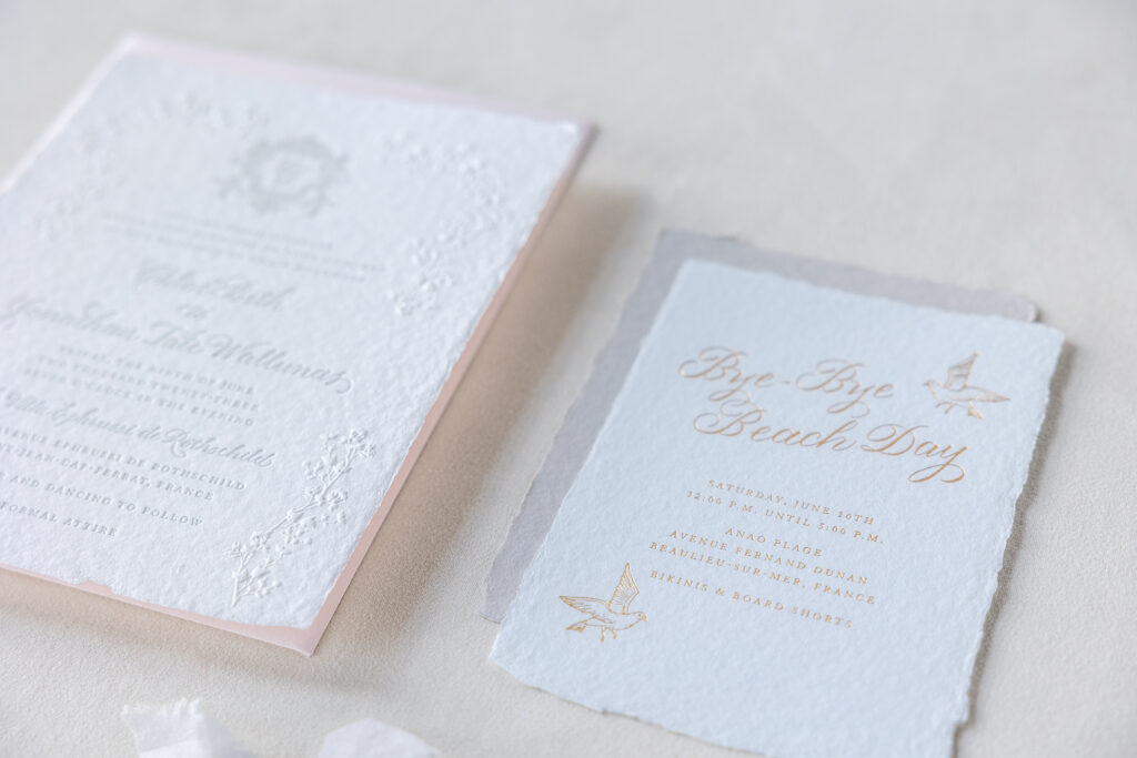
Everything about Chloe and Jonathan’s wedding invitation suite is dreamy. From the handmade paper (including matching envelopes!), a custom crest, and the darling die-cut reply card, there is much to see and swoon over! We were excited when our dear friend, Signed & Sealed by Steph, brought us these custom-created deckle edge invitations.
The invitation features letterpress printing in cool gray for the text and the regal crest that encircles the bride and groom’s initials. The handmade paper has a natural deckle edge, introducing subtle texture, while the blind emboss floral accents create an organic border and add even more texture. A tall belly band (not pictured) features a full flood of a custom blue hue and a full-color digitally printed bouquet coordinating with the invitation’s floral border.
Invitation
letterpress: cool gray
emboss: blind
digital: cmyk + custom blue (belly band)
fonts: submitted hand calligraphy + adobe caslon pro
paper: bella handmade white (invitation) + smooth cotton white 1-ply (belly band)
liner: classic color pattern in soft blue digital with custom dendria pattern in gold matte foil on white text
envelope printing: gold matte foil return address
finishing: wrap with metallic gold thread
job: #65821
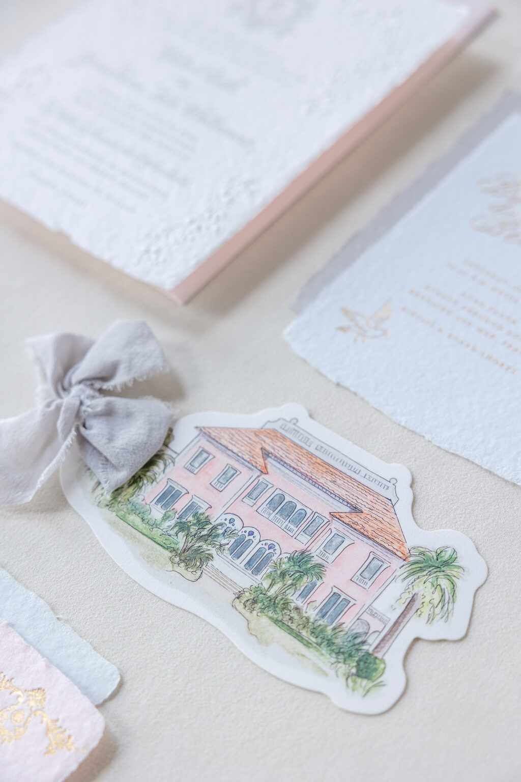
The custom die-cut reply card showcases artwork depicting the venue on the front. The reverse side of the card includes a website for more information and a custom QR code guests could use to reply, or rather, répondez s’il vous plaît.
Reply Card
digital: cmyk (front) + custom blue (back)
paper: smooth cotton white 1-ply
card size: 6.5 x 3.5
die: #CD329
finishing: assemble with custom supplied ribbon
job: #65821
Welcome Party Card
foil: gold matte
paper: bella handmade soft gray
card size: a-6 deckle edge
job: #65821
A rehearsal dinner card, a welcome party card, and an invitation to a goodbye party held the day after the ceremony round out the suite. All of these cards feature gold matte foil stamping on handmade paper. A formal border sets the rehearsal dinner card apart, while a floral sprig differentiates the welcome part card, and fun seagull motifs make the beach day card stand out.
This understated invitation suite is lovely, and we were thrilled to bring this vision to life. Are you interested in creating your own deckle edge invitations? Contact us to get started or work with one of our dealers to create your custom wedding invitations.