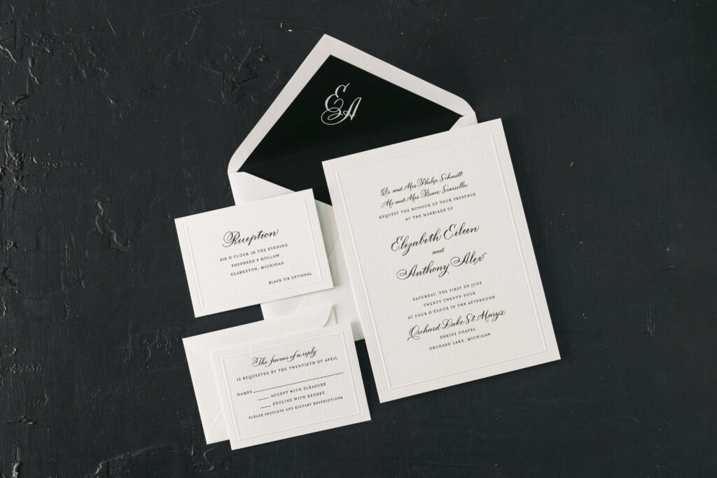
The hand calligraphy on Elizabeth and Anthony’s invitation suite is swoon-worthy, but that’s not all these elegant invitations have going for them. This couple worked with our dear friends at Lee’s Paperie to create their dream invitations. From a custom envelope liner to an unexpected surprise on the reception card, see what makes these wedding invitations with hand calligraphy so stunning.
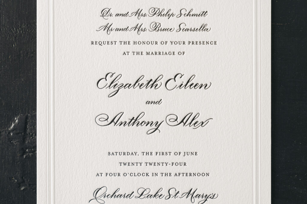
This chic and classic invitation suite is a customization of our Braxton design. They overall design of the invitation is similar to the inspiration with the difference being the use of black letterpress for all of the text. The Oliva hand by Nicole Black is graceful and elagently flows across the invitation, as well as the reply card and the reception card. The remaining text appears in a serif font that adds to the formality while complementing the curves and flourishes of the hand calligraphy.
Invitation
letterpress ink: black
emboss: blind
fonts: mrs eaves
hand calligraphy: olivia by Nicole Black
papers: bella cotton white 2-ply
card size: f-8
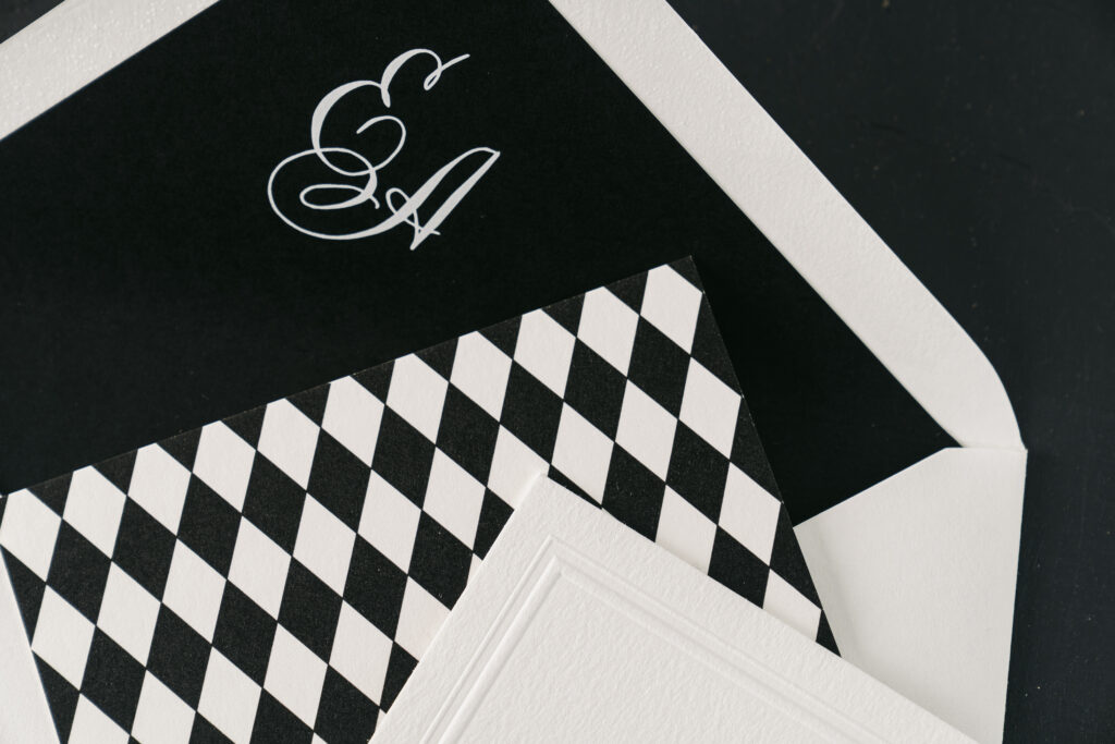
envelope liner: custom monogram digitally printed in white on black text
envelope: white cotton text pointed flap
envelope addressing: black letterpress on the back
job: 70675
Reply Card
letterpress ink: black
emboss: blind
fonts: mrs eaves
hand calligraphy: olivia by Nicole Black
papers: bella cotton white 1-ply
card size: a-5
envelope: white cotton text pointed flap
envelope addressing: black letterpress on the front
job: 70675
Reception Card
digital ink: black
fonts: mrs eaves
hand calligraphy: olivia by Nicole Black
papers: bella cotton white 1-ply (front) + bella cotton white 1-ply (backer)
card size: a-5
finishing: flush mount front and backer together
job: 70675
The blind emboss double line border provides a subtle yet refined look. Embossing creates a raised impression and smoothes the texture of our decadent cotton paper. The crispness of the border plays off the pillowy texture of the paper.
The envelope liner features the couple’s first initials hand calligraphed, creating a charming monogram. The monogram is digitally printed in white ink on black stock, the reverse of the printing on every other piece in the suite, which features black ink on white stock.
The reception card is unique because it was printed as two cards, a front and a backer, which were then mounted or duplexed together. The back of the reception card bears a geometric harlequin pattern that is playful yet befitting a black-tie affair.
These wedding invitations with hand calligraphy were a joy to work on. We wish the best to Elizabeth and Anthony, and thank you to Lee’s Paperie for bringing this job to us. Do you have visions of hand calligraphy or back patterned suite cards? Reach out to share your ideas or work with one of our dealers to receive expert assistance bringing your ideas to life.
We printed these Monet-inspired invitations for a garden party hosted by The Baltimore Museum of Art. Our friends at Papers Plus helped them envision an alternate layout, keeping the design close to the sample with just a few alterations to art placement. The bright, floral-inspired hues made the perfect introduction to a spring-time garden soiree.
digital inks: myrtle + cmyk | embossing: blind | fonts: 0pen sans regular/semibold italic/bold/extrabold | paper: bella smooth cotton bright white duplexed 2-ply | envelope: bella cotton white | liner: monet pattern in cmyk | customization #61090
We are over the moon to announce that our Monet design by Sierra Detrick placed Bronze in the FSEA(Foil and Specialty Effects Association) Gold Leaf awards. The design placed in the best use of letterpress category. We’ll let the designer herself Sierra take it from here to tell us a little more about the makings of Monet:
What was the inspiration behind Monet?
I knew I wanted to do something a little more edgy, haphazard almost. I pictured this texturized, vibrant, modern suite in my head when I started. Projects begin by challenging myself internally. I’m usually a little more precise and controlled in my work so I wanted to see if I could create something that was the opposite of that.
How did you decide on the color palette you wanted to use?
I’m attracted to this fun, crazy late ’80s/ early 90’s vibe coming back on the scene. I thought back to my childhood with color palettes and patterns found in old cartoons like the Rugrats and my mother’s teal bridesmaid dresses with the puffed up sleeves. I felt the maroon grounded out the craziness of the other two colors. I knew the design itself was going to feel more modern so I was set on a retro color palette, but I was nervous about it. I wasn’t convinced it was going to be well-received because it was kinda out there!
What went into the technical process of making Monet?
My technical process was the exact opposite of technical. I went to the store, grabbed some acrylic paint, spread out a bunch of white Bristol paper and went to town for a few hours throwing paint on paper in an uncontrolled manner. I had no idea if this was going to work. I was just playing around and hoping I liked what landed on the page. The spare room in my apartment was covered with these heavily brush-stroked and texturized paintings that took days to dry because the paint was slathered on so thick. You couldn’t walk in that room for about a week.
How did it feel to find out you were nominated for an award and then how did it feel to find out you won Bronze?
I wasn’t in the office the day it was announced to the company so my friend and coworker texted me the news and I instantly started to cry. I was elated to find out I placed Bronze. It made me grateful for the mentorship and encouragement of my colleagues and everyone in the company who brought the suite to life. I have a seriously amazing team behind me that pushes me to be the absolute best designer I can be. Thanks for loving those crazy colors I was freaking out about!
Digital inks: Myrtle + CMYK | Embossing: Blind | Font: Surfside | Paper: Bella Smooth Cotton Bright White Duplexed 2-ply | Invite Size: F-8 | Edge Painting: Myrtle | Liner: Monet pattern in CMYK | Envelope: Bella Cotton Bright White
Tim celebrated his 50th birthday at the FlyNYON terminal this past March. To kick things off, these blind embossed birthday invitations set the tone for the celebration to come. They opted for Bella Gray paper in 2 ply that gave the embossing even further dimension. To add more vibrancy, Silver Matte foil added a level of shine to a more tone on tone palette. Similarly, Silver Matte can be spotted on the geometric envelope liner pattern. And finally, a big thanks to Ink Papery for helping us create aeronautical invitations!