Andrea Streeter’s Pantheon design marries the history and drama of ancient times with bold typography inspired by Roman architecture.

couple | columns | decor | dress | couple | statue | dresses | cake
We customized our Spinnerette design to create these abstract floral bridal shower invitations for Maria’s springtime party. Our friends at Invitations & Company helped them settle on sophisticated typography and a pretty palette of blind deboss printing and rose gold foil. A solid foil liner added more shine and elegance.


letterpress ink: blind deboss (no ink) | foil stamping: rose gold shine | font: gill | paper: bella cotton white 1-ply + 2-ply | envelope: bella cotton white pointed flap | foil stamped liner: classic color pattern in rose gold shine | customization #41099
Our friends at Written and Wrapped helped Hannah and her family customize our Harvest design for her spring Bat Mitzvah celebration. Their sweet and ladylike take on the design feels young and fresh and very different from the rustic elegance of the original. They played up their pastel palette of gray and pink throughout the suite, from the polka dot envelope liner to the subtle hint of pink edging the invitation.


letterpress inks: pewter + cherry blossom | paper: bella cotton white 1-ply | edge painting: cherry blossom | envelope: bella cotton white | liner: sweet polka pattern in pewter + cherry blossom | customization #41833
Just in time for the upcoming summer holiday, we’re introducing you to Racheal Bumbolo‘s latest design, Arundel. “My main source of inspiration came from the Maine coast,” says Racheal. “My family has vacationed near Arundel for the past few summers and I love everything – the shops and small towns and of course the beaches, wharfs, ports, and hiking trails. For this design I imagined a sophisticated coastal soirée in shades of blue and neutral sandy colors reminiscent of the beach. Keeping the typography simple and minimal adds flexibility for this design to fit any venue or occasion.”

boat | pearls | shoes | bridesmaid | bench | chairs | ring | couple | socks | river club
Designer Lindsy Talarico brought in soft touches of blush, a romantic script font and sweet magnolia flowers to leave you falling head over heels for her new Love Letter design.

bouquet | rings | table setting | bride | letter | cake | shoes | venue | couple

“My main source of inspiration for this customization of Culver was the venue itself and the surrounding arts district of Los Angeles. Cool vibes, art, creativity and innovation abound,” says designer Racheal Bumbolo. “A clean slate along with minimalist font treatment sent this one home for me. I feel most comfortable with designs like this; there is just something about quintessential, modern design that puts me in the zone!”

letterpress inks: black + shale | fonst: swiss + lile dahliya | paper: white | invite size: sq-7 | liner: tavish pattern in aquamarine + capri | original design + customization by Racheal Bumbolo
photos

Vibrant coloring and patterns along with a dramatically flourished script font give an upbeat yet sophisticated feel to this bold bridal shower invitation inspiration based on our Morocco design.

letterpress ink: aquamarine | fonts: sophia + poetica | paper: white | invite size: sq-6 | liner: custom morocco pattern | original design + customization by Sierra Detrick
photo | photo | photo
Designer Sierra Detrick is no stranger to worldly inspiration. “Growing up, I based many of my projects in school and in personal pieces around multi-cultural arts,” she says. “The diverse creativity of the world still heavily influences me today.”
She found inspiration for her Morocco design in the vibrant hues and intricate details seen often in Moroccan design. “I was really taken with modernized versions of the Moroccan-style tiling I was seeing in home design,” says Sierra. “I decided to create my own tile pattern that could be used throughout a wedding invitation suite and paired it with a very simplistic but elegant body of text. I didn’t want the copy to compete too much with this vibrant pattern, but I still wanted it to be able to stand on it’s own. Ted Clausen’s ornate hand calligraphy added just the right amount of sophistication.”

photos | photo | photo | photo | photo | photo | photo | photo
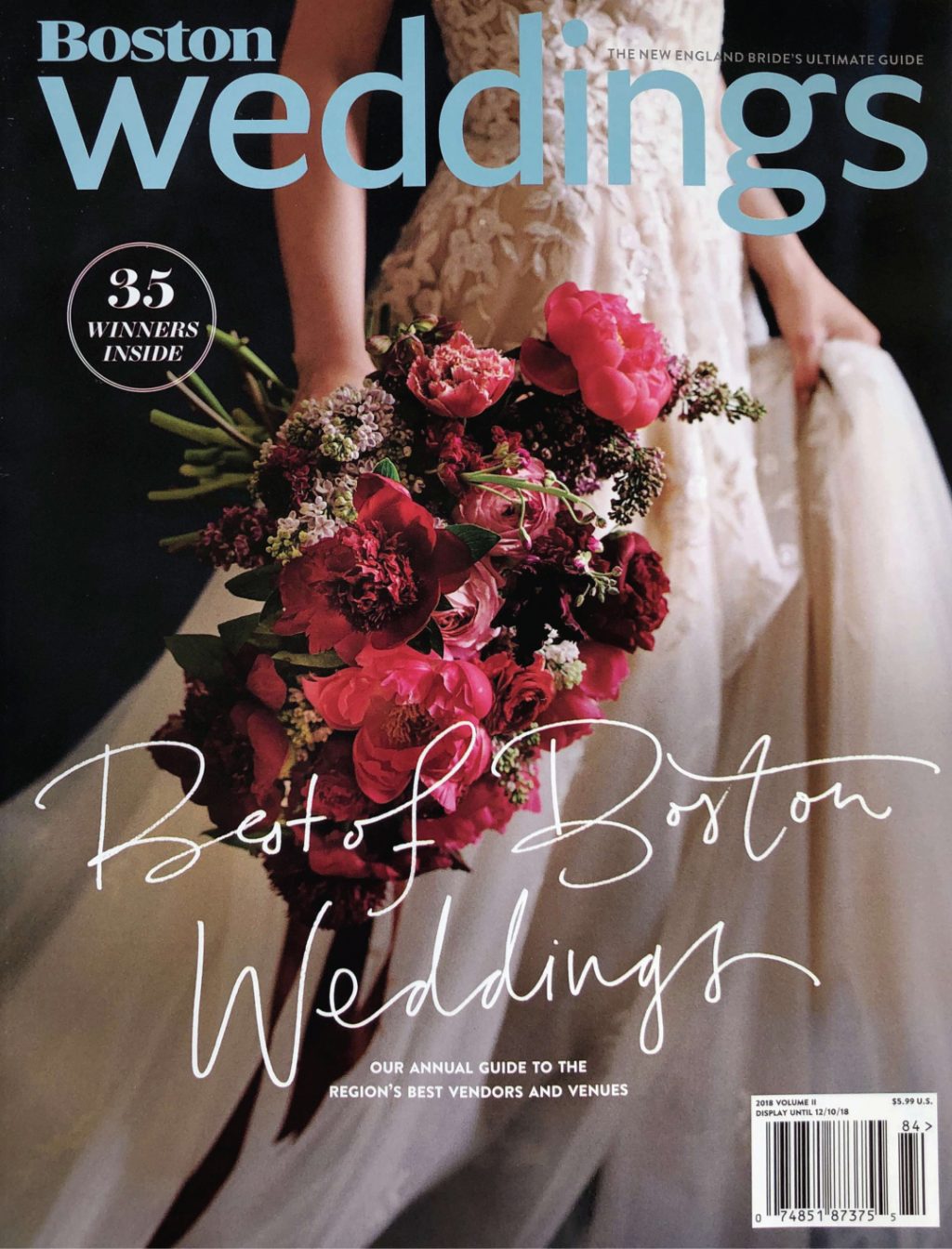
Awarded by Boston Magazine for the second year in-a-row, our friends at Fete Collection received the 2018 Best of Boston Weddings award for Best Stationery.
“We are over the moon and honored to win the Best of Boston Weddings award for Best Stationery this year! (and for the second year-in-a-row!),” says owner Julie Pike. “We are thrilled to be selected along with some of our amazing creative colleagues who make this work such a blast. We consider ourselves so lucky to be in this industry of many strong local entrepreneurs who kill it every day, 8 days a week, in the pursuit of creative freedom and work that inspires. And we are blessed to have amazing clients who trust us so wholeheartedly with their love stories and setting the tone for their special day.”
Congratulations to Fete Collection on receiving this prestigious award!

Pictured above is our Alchemy design by Jessica Downs, shown foil stamped in maple shine.
Bright and bold hues of blue and yellow feel sweet, sophisticated and fresh paired with this preppy customization of Lindsy Talarico‘s Montblanc design. The clean and classic style is softened a bit with the addition of the pale blue liner from our flora collection.

letterpress inks: carolina + cobalt | fonts: austin + brandon | paper: white | invite size: f-8 | liner: flora 4 | original design+ customization by Lindsy Talarico
table setting | couple | shoes
