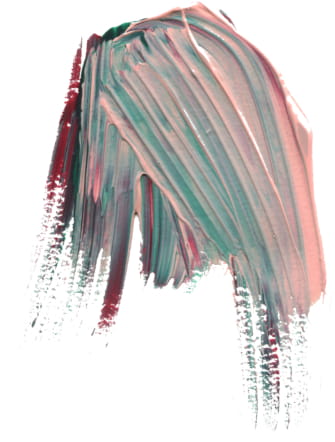
We are over the moon to announce that our Monet design by Sierra Detrick placed Bronze in the FSEA(Foil and Specialty Effects Association) Gold Leaf awards. The design placed in the best use of letterpress category. We’ll let the designer herself Sierra take it from here to tell us a little more about the makings of Monet:
What was the inspiration behind Monet?
I knew I wanted to do something a little more edgy, haphazard almost. I pictured this texturized, vibrant, modern suite in my head when I started. Projects begin by challenging myself internally. I’m usually a little more precise and controlled in my work so I wanted to see if I could create something that was the opposite of that.
How did you decide on the color palette you wanted to use?
I’m attracted to this fun, crazy late ’80s/ early 90’s vibe coming back on the scene. I thought back to my childhood with color palettes and patterns found in old cartoons like the Rugrats and my mother’s teal bridesmaid dresses with the puffed up sleeves. I felt the maroon grounded out the craziness of the other two colors. I knew the design itself was going to feel more modern so I was set on a retro color palette, but I was nervous about it. I wasn’t convinced it was going to be well-received because it was kinda out there!
What went into the technical process of making Monet?
My technical process was the exact opposite of technical. I went to the store, grabbed some acrylic paint, spread out a bunch of white Bristol paper and went to town for a few hours throwing paint on paper in an uncontrolled manner. I had no idea if this was going to work. I was just playing around and hoping I liked what landed on the page. The spare room in my apartment was covered with these heavily brush-stroked and texturized paintings that took days to dry because the paint was slathered on so thick. You couldn’t walk in that room for about a week.
How did it feel to find out you were nominated for an award and then how did it feel to find out you won Bronze?
I wasn’t in the office the day it was announced to the company so my friend and coworker texted me the news and I instantly started to cry. I was elated to find out I placed Bronze. It made me grateful for the mentorship and encouragement of my colleagues and everyone in the company who brought the suite to life. I have a seriously amazing team behind me that pushes me to be the absolute best designer I can be. Thanks for loving those crazy colors I was freaking out about!
Digital inks: Myrtle + CMYK | Embossing: Blind | Font: Surfside | Paper: Bella Smooth Cotton Bright White Duplexed 2-ply | Invite Size: F-8 | Edge Painting: Myrtle | Liner: Monet pattern in CMYK | Envelope: Bella Cotton Bright White
We worked with Gus and Ruby to create these Navy letterpress and floral wedding invitations. Our Rose 4 envelope liner served as the inspiration for this set. This rose image placed onto the invitation, reply card as well as the envelope liner kept the floral theme consistent and sweet. Navy letterpress for the typography added another touch of color to the suite. A script font added to the names of the bride and groom allowed the stars of the show to stand out from the rest.
Letterpress: Navy | Digital: CMYK | Fonts: Grace & Jubliant | Design: Custom Library | Paper: 2-ply Bella Smooth Cotton | Liner: Rose 4 in CMYK| Customization: 44063 | Gus and Ruby Letterpress
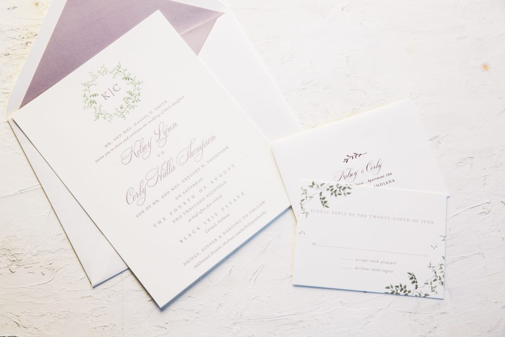
Oliver’s Twist helped bring Kelsey and Corby’s Wisteria letterpress wedding invitations to life. Script accents added to the bride as well as the groom’s name created a soft touch. The watercolor cartouche at the top held the monogram of the happy couple. Additionally, botanicals carried to the corners of the reply card mimicked the cartouche from the invitation. A small motif added to the front of the reply envelope kept the floral theme. Finally, the envelope liner tied everything together in Wisteria.
Poeme worked with Alexa and Richard to create these traditional black letterpress invitations with foil accents. They chose Gold Matte to accent the names of the bride and groom on the invitation. This accent foil color carried over to the reply as well as the details cards kept everything consistent. They chose a serif font for the typography with touches of script on the invitation to make the names pop. Black envelopes added contrast to the suite.
We helped bring Elizabeth and David’s black letterpress save the dates with a personal pet touch to life. They kept the design clean in a serif font as well as touches of script added to the mix. Black letterpress ink made the save the date easy to read and sets a classic tone right from the start. Finally, a sweet pet illustration added to the top of the save the date is sure to make their guests smile when they open their envelopes.
Letterpress: Black | Fonts: Bentham & Mon Voir | Design: Custom Created | Paper: 1 ply Bella Smooth Cotton White |Customization: 42054 | Bella Figura
Risa and Guilherme worked with our Bella Figura Manhattan store to create these botanical letterpress wedding invitations in Pewter. Inspired by Mannon, this couple made the design their own by changing up the color palette and fonts. Touches of hand-drawn motifs used in different ways warmed up the layout in Celadon ink. They even created a coordinating flat thank you set also printed in the same color scheme. Finally, an envelope liner continued the softness from the botanicals on the cards.
Melissa and Alexander worked with Papel New York to create these New York inspired letterpress wedding invitations. Our Bright Lights design served as the diving off point for this set. Hand-sketched illustrations of the city skyline carried through added a playful yet appropriate design element to the suite. Their reply postcard with a brownstone motif nodded to their Brooklyn venue location. The couple kept their suite clean in Black letterpress ink with digitally printed envelopes also in Black to coordinate. Finally, the skyline on the envelope gave guests a glimpse into what’s to come inside the envelope!
Letterpress: Black | Fonts: Streamline + Declan | Design: Bright Lights | Paper: 2 ply Bella Cotton Ivory | Size: A7 | Customization: 44042 | Papel New York
Our friends at Gus and Ruby helped us to to create these black letterpress graduation invitations for Demetria. Wedding invitations are typically the name of our game, but it doesn’t stop there. Whether it be gradutation, baby announcements as well as shower invitations – we can create just about anything you dream up. These invitations inspired by our Rexford design kept a clean aesthetic using typography. A modern script font stretched across the top of each piece to keep the viewer’s interest. To play up the set, a geometric envelope liner printed in Rose Gold Shine added a punch of unexpected color.
Letterpress: Black | Fonts: Futura Melika | Design: Rexford | Paper: 2 ply Bella Cotton White | Size: F8 | Liner: Diego pattern in Rose Gold S Black letterpress graduation invitations inspired by Rexfordhine | Customization: 43718 |Gus and Ruby
Rachel and Sean worked with Magnificent Milestones who helped us create these navy letterpress wedding invitations. A modern script font played up a more simple typed based layout. The reply set, as well as the accommodations cards printed in Navy, kept consistent with the invitation. Inspired by our Astral design, this set took elements from the original design and used those on the envelope liner. Finally, this custom liner printed with an ombre fade allowed the gold matte foil pattern to pop overtop.
Letterpress: Navy | Fonts: Aster Bold and Sans Capitals | Design: Astral | Paper: 1 ply Smooth White | Size: F8 | Liner: Custom Astral pattern in Prussian Blue + Gold Matte | Customization: 44819 | Magnificent Milestones
Jonathan’s silver foil 60th birthday invitations set the tone for a celebration to come. Hosted by his family and friends, this set inspired by our Alchemy design. It came together thanks to the help of our friends at Gus and Ruby. Our Bella Black paper created a contrasting backdrop to the Silver Shine foil printed on both sides. On the reverse, guests will find a Henry David Thoreau quote that captures what it means to live. Finally, we create a custom pattern to add a graphic pop to this otherwise type based set.
Our friends at Wynwood Letterpress helped us bring these subtle floral letterpress wedding invitations to life. The suite kept a monochromatic color palette. They used our Bella Light Gray paper for their envelopes as well as Fog letterpress for the typography. Blind debossed drawings of florals anchored the top left as well as the bottom right of the invitation. An envelope liner in our Marble 4 pattern added an unexpected contemporary twist to a floral forward set.
Letterpress: Fog + Blind Deboss | Fonts: Melika and Streamline | Design: Custom Library | Paper: 1 ply Bella Smooth Cotton White | Size: F8 | Liner: Marble 4 in CMYK | Customization: 47244 | Subtle floral letterpress wedding invitations with marble envelope liner Wynwood Letterpress
Christina and John created their tropical foil save the dates with the help of our Bella Figura store in Manhattan. Inspired by our Lani design, these save the dates set a tropical tone for their wedding to come. Typography in Tawny Matte foil added a subtle metallic accent to the blind debossed palm. Additionally, charcoal letterpress kept the color palette neutral for the block type. Finally, the envelope liner tied the tropical theme of this set together.