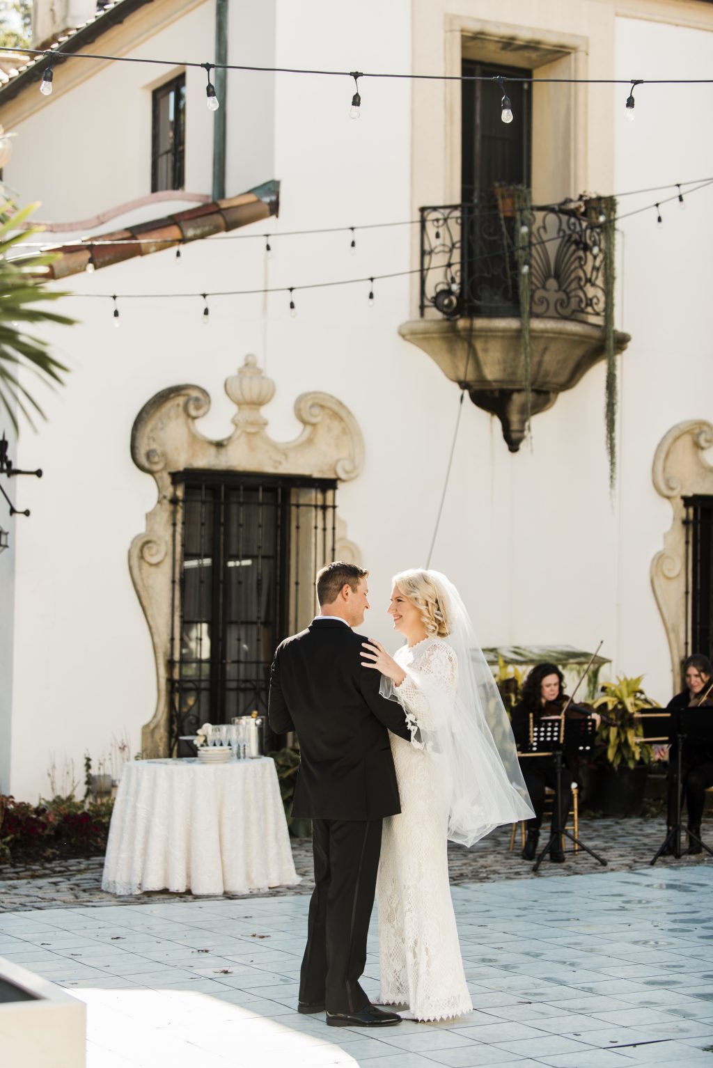
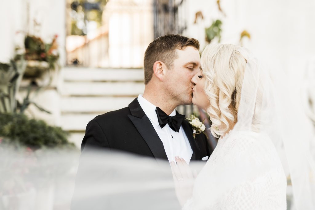
We were so excited for the opportunity to work with Meghan and Sam on their wedding invitation suite printed on our Bella Handmade paper. Meghan is a wedding planner turned bride who has so much to share about planning during a pandemic. Their previous plans were uprooted and as a result, this couple decided to have a private, intimate ceremony with just their immediate family at the Vanderbilt Mansion. We’ll let Meghan take it from here to share more about her day and advice that she has for future couples out there!
Q: As a bride, how did you ultimately make the decision that you did regarding your wedding? How did it make you all feel?
A: I was incredibly stressed out planning a wedding during COVID and all the uncertainty that surrounded it. I tend to be Type-A as well as a perfectionist so having it micro is very special to me. I get to focus on the beautiful intimate details as well as safely celebrating the day with my nearest and dearest. My family and colleagues have been very supportive of my decision to scale back. This has been a huge weight lifted for me.
Q: What good things have come from a smaller, more intimate wedding?
A: Saving money is a huge bonus! I also feel less pressure to create a large wedding and entertain several guests. Now I get to focus on my immediate friends and family while indulging in beautiful details.
Q: Do you have any plans for a larger celebration later on? If so, what specifically do you hope for and if not, how come?
A: As of now, I do not have any plans for any further celebrations. If we ever celebrate down the line it would be something more casual when things are safer with our extended family and friends.
Q: As a planner, what suggestions do you have for working with vendors when they have to make changes?
A: Be open and honest. I was really nervous communicating with my vendors at first. I felt like I was initiating a break-up. Luckily, most of my vendors were very accommodating with my changes to downsize my event. Most deposits are non-refundable so read through the fine print if you need to sever any ties with vendors whose services you no longer need. Also, let your vendors know as soon as possible about any of your changes so they can hopefully accommodate your updated plans.
Q: As a planner, what is the best piece of advice you have for couples navigating wedding planning in the era of Covid?
A: Remember that at the end of the day that it is about the love between you and your partner. It is very easy to get consumed in the elaborate details of hosting a grandiose soiree. For myself personally I took the time to grieve the loss of my original vision that I had planned for so long. Once I came to terms of what is in store for weddings in regards to covid I was able to reimagine my vision on a smaller scale and really think about what truly mattered to me. Be conscious of CDC mandates and regulations, be flexible with changing your vision and vendors and realize that guests might not be able to travel to celebrate with you the way you had initially intended.
Q: Anything else you’d like to share with us?
A: Don’t feel pressured to succumb to what everyone else is doing. At the end of the day what matters is you and your spouse exchanging your vows and honoring your love for one another. Do what feels best for you while remaining COVID conscious.
Two words that come to mind when we think of the inspiration behind this customization are organic and glam. This design is made for a classic black and white affair, elevated with lovely greenery and earth toned spaces, gardens, and sparkly chandeliers. All giving way to a new look for our Modena design.
Foil: white matte | Font: Ivory + Melvin and Emily script | Paper: black | Invite size: F-8 | Liner: Everly in green shine foil | Original design + customization by Racheal Bumbolo
Simple elegance and delicate detail are a perfect combination for ringing in the new year! Inspired by our Minett design, this card takes a modern twist on holiday glam with classic, monochromatic colors enhanced by a touch of gold luster. We can’t wait to see what kind of customizations you dream up in the new year!
foil: white matte and gold matte | font: didot + lunar alchemy |paper: gray | holiday card size: A-6 | liner: adeline in white on white gold text | original design by Jessica Downs + customization by Alyssa Tidd
There are so many different ways you can customize any of our designs from wedding invitations to holiday cards. The options are endless! For this customization, we swapped out the original Rigby design’s warm ombré palette for a more calm, cool color palette. The sparkling foil colors mimic the shimmering brightness of falling snow on a winter day. We wish you all nothing but peace, love & joy this holiday season!
foil: ice shine and tawny shine | font: austin + charoe | paper: blue | holiday card size: A-6 | liner: classic color in tawny shine foil on white text | original design by Jessica Downs + customization by Alyssa Tidd
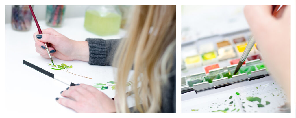
We can’t think of a better year to spread some holiday cheer than this year. We’re excited to share an inside look into the creation of a personalized holiday card. Kara Gordon of Magnificent Milestones worked with us to make this one extra special. Kara shared, “Similar to a family photo, I think an illustration makes a holiday card truly unique. My (current) favorite illustration is the family home. For many of us, it’s where we live, work and learn. There is a new appreciation for our homes this year: it’s time to pay tribute!” To turn a classic holiday card into something a little more unique, our graphic designer Katie Magee illustrated the home of Nick, Whitney and Josie. The family opted for our Lawson Holiday card design as the backdrop for their illustration. We will let Katie take it from here to describe what goes into making custom artwork as well as more thoughts from Kara. We can’t wait to see what holiday creations come through our shop next!
Q: What is the most rewarding part of illustrating for specific client customizations?
Answer from Katie: For me, I love seeing the client’s vision come to life. We’re often illustrating something of importance to them, be it their home or wedding venue, a beloved pet, or maybe a favorite flower, so it feels really great to help them incorporate something that’s truly personal to them into their stationery.
Q: Tell us about the process behind creating a client-specific illustration. What are the behind the scene steps?
Answer from Katie: Line illustrations are a fairly simple process – mainly just making sure I have a good, high-resolution reference photo to work from, and then getting to work drawing on my iPad! Watercolor illustrations require a bit more setup, including lightly sketching out the illustration in pencil, making sure I have all the colors I need in my palette, and then building up layers of color to create the illustration. It also requires more time and patience with waiting for the layers of paint to dry.
Q: What kind of instructions help you most from a client to make the illustration the best it can be? What do you need to hear from them?
Answer from Katie: It’s always helpful for them to provide as much detail as possible! Do we need to omit anything from the reference photo? Will we be changing the color of anything? If it’s a line illustration, do they want it more on the minimal side, or with lots of detail? Each illustration is different, but providing us with as much detail as possible helps us to get things right the first time.
Q: What do you hope for once an illustration is finally complete?
Answer from Katie: Simply that it brings joy to the client! Nothing makes me happier than knowing that I was able to bring their vision to life.
Q: Why do you think people should continue to send out holiday cards each year, specifically this year?
Answer from Kara of Magnificent Milestones: I love sending and receiving holiday cards every year… but this year is undoubtedly different. There are friends and family members that I haven’t seen in over 7 months so I will be racing to the mailbox this holiday season. It’s different than a text or a Facebook post that receives a quick glance. These cards are on display for the entire holiday season and put a smile on my face every time I walk by them.
With summer winding down, we’re dreaming of cooler nights, fresh mountain air, and our favorite cozy sweater. We’ve taken our Arboretum design and introduced a soft color palette and a wispy script to fit that feeling, appropriate for any nature inspired wedding.
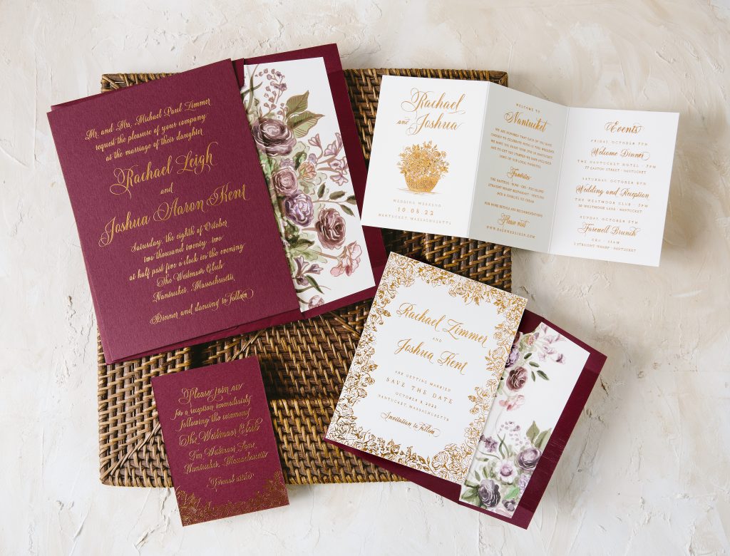
We had the pleasure of creating six exclusive suites with our friend Heidi Daniels of Parchment Fine Papers in Nantucket and The Customs House in Wellfleet, Massachusetts – and now we can share them with you!
Chadwickwas imagined for a classic black tie wedding at The Wauwinet, a luxury hotel nestled on the shores of Nantucket Island. A timeless palette of black letterpress and gold foil is complemented by a custom, hand-drawn duogram and elegant vintage Nantucket artwork featuring ships and maps to honor the island’s history. Beveled, gold foil edging and a vellum wrap adorn the save the date to set the tone for an elegant celebration.
The Chadwick suite, featuring a vellum wrap, gold foil bevel, and custom duogram.
A bohemian, autumn beach wedding was the inspiration for the Westmoor suite. Floral illustrations of bold bouquets filled with succulents, hellebores, garden roses, anemones, and ranunculus show off a deep jewel toned palette in shades of of plum, cranberry, sage, and copper. An illustration of an iconic Nantucket Lightship basket filled with flowers on the events card is a special nod to Nantucket.
The Westmoor suite, featuring Currant paper and gorgeous watercolor and illustrated florals.
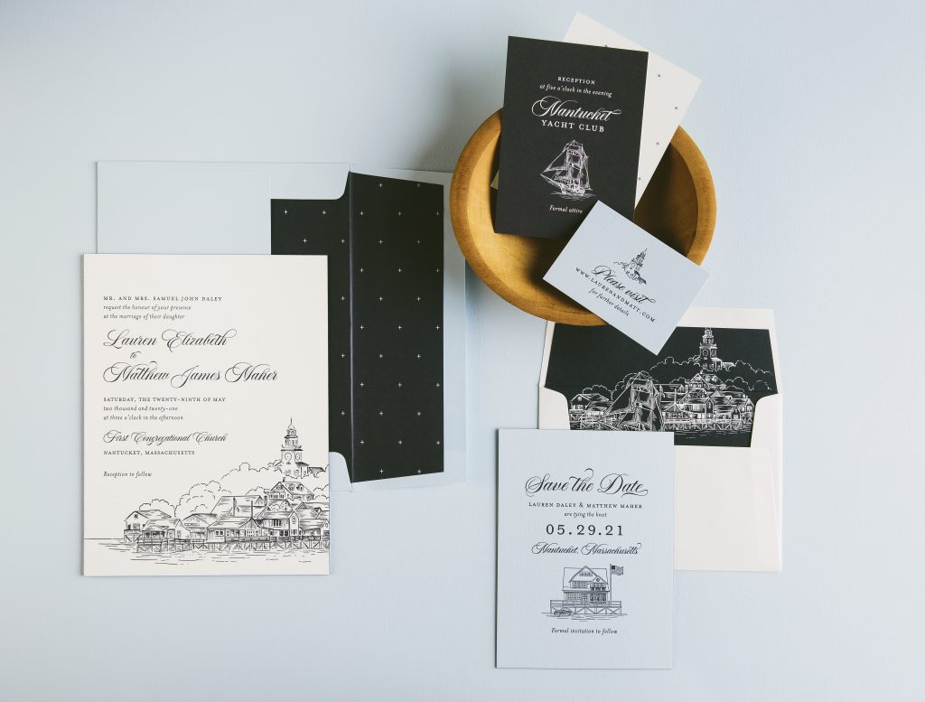
Nantucket Harbor was the main inspiration for the Dockside suite. As you sail into the harbor, you are greeted with a skyline of church steeples and historic sea captain’s homes. A hand-illustrated rendering of the harbor takes center stage on the main invitation while crisp blues and traditional fonts give give this suite a classic, tailored look.
The Dockside suite, featuring Blue and Pastel Blue papers and an illustration of Nantucket Harbor.
The maritime-themed Compass suite was inspired by vintage maps and Nantucket’s famous Gardiner’s Corner mural. In fact, the mural is featured on the envelope liner and the duogram on the invitation and save the date was created from its historic compass motif. The Nantucket Whaling Museum, where we imaged this couple having their reception, inspired the petite whale motif used throughout the suite. Moody blues, representative of the sea, and tawny foil, mimicking the light of the North Star, pair perfectly in this seafarer’s dream suite.
The Compass suite, featuring Blue paper and envelopes, a custom illustrated cartouche and the iconic Gardiner’s Corner sign.
The closing days of summer in Nantucket were the inspiration behind the Lighthouse suite. The colors are a bit cooler and slightly muted making this entire set feel soft and sweet. A hand-painted watercolor map, highlighting iconic landmarks of Nantucket, sets the perfect mood for a local couple’s big day!
The Lighthouse suite, featuring Light Gray envelopes and a variety of watercolor artwork (don’t you love the whale?!)
The Sailor suite was envisioned for a wedding set back on the mainland where sailing is still the heart and soul of the people. Nautical illustrations of sailboats, buoys, lobsters and anchors are playfully used throughout the set. With carolina blue and navy letterpress, along with a fresh modern layout, you can almost feel the wind in your hair.
The Sailor suite, featuring a vellum belly band, more illustrations, and an adorable thank you card (aw, shucks!).
We’ve taken the Capone design out of the city and placed it into a paradise oasis. This tropical inspired wedding invitation sets the tone for any modern yet warm affair. The geometric shapes work beautifully for a modern bohemian styled wedding paired with a neutral color palette to soften the mood. We can’t wait to see what kind of Capone inspired customizations are dreamed up next!
COVID-19 has forced many couples to rethink their wedding plans, postponing their weddings or opting for smaller, more intimate ceremonies with larger celebrations to follow. With that comes even more questions about handling wording scenarios properly and effectively. We’re here to help answer any of your wedding etiquette questions, so please don’t hesitate to reach out! Below we provided examples of COVID-19 wedding wording scenarios from our etiquette guide that might be of help:
SENDING NEW SAVE THE DATES:
Your original wedding date has changed, and you need to send a new save the date to your guests:
Please save a NEW date to celebrate Alex and Kate September 21, 2021 San Diego, California www.alexandkate2021.com
or
Save our new date The wedding celebration of Sarah Collins and Andrew Mitchell in Palm Beach, Florida has been rescheduled for December 12, 2021 Formal invitation to follow
SENDING UPDATES AFTER SENDING INVITATIONS:
Your original wedding date has changed, and you need to send an update to your guests:
Dear friends and family, We have made the decision to move our wedding celebration to the weekend of October 10-12, 2021. We can’t wait to celebrate with you! Love, Carolyn and David For more information and to RSVP for the new date, please visit our wedding website: www.carolynanddavid2021.com
Your wedding has been postponed without a new date, and you need to send an update to your guests:
During this challenging and unprecedented time, We regret to inform you that Carly and Frederick’s wedding Has been postponed. We will keep you updated when more information is available. The Campbell and Monterey families
HOSTING A VIRTUAL WEDDING:
Your wedding ceremony will be live-streamed so that guests can join virtually:
Change of Plans Due to the current public health crisis, we are unable to share this day in person with all of our friends and family. We would love for you to join us virtually and witness the celebration of our marriage. Please visit our website for details on accessing our special day. www.loisandandy.com
DOWNSIZING OR CANCELING YOUR WEDDING:
You’ve sent invitations but have decided to host a small ceremony with your closest friends and family and will celebrate with the rest of your guests at a later date:
Considering the uncertainty arising from the ongoing pandemic and to ensure the wellbeing of our loved ones, we have made the difficult decision to abbreviate our wedding ceremony and celebration. We apologize for any inconvenience this may cause our intended guests. We will be married this year in an intimate ceremony and look forward to celebrating with you all in the future.
You can find more examples via our etiquette guide so be sure to check that out for ways to solve these scenarios. Again, we are here to help take the stress out of wording and put the excitement back into wedding planning!
Our Pura Vida design was recently chosen as the winner of the Wedding Invitation category of the 2020 LOUIE Awards, a Greeting Card Association competition that recognizes outstanding greeting cards, invitations, and announcements.
Pura Vida’s modern typography and island-inspired color palette are accented by a fun palm leaf diecut and a tropical flora and fauna envelope liner.
We worked with our friends at Rock Paper Scissors in Ann Arbor, Michigan to create custom suites inspired by popular wedding venues in Michigan. We’ve recently added them to our collection, and today we’re sharing some behind the scenes details from the designers that helped bring these suites to life.
Zingerman’s Cornman Farms was the main inspiration for our Hales suite. A custom illustration of the farm itself and a sprinkling of vintage vegetable motifs pay homage to their famous farm-to-table vision and capture the picturesque romance of the farm. Formal fonts give a refined, ethereal feel while the color palette of rosebud and copper brings to mind a dreamy September affair. The suite is named for the farm’s Executive Chef and Managing Partner, Kieron Hales.
Hales suite, featuring rosebud letterpress ink and copper matte foil stamping on white Bella cotton paper. Foil edging in copper matte and a Rosebud envelope carry through the warm and romantic color palette.
Our Gable suite pairs classic, modern typography with colorful florals inspired by The Valley at Frutig Farms, a gable roof barn built circa 1840. “The venue is very spacious so it was important to keep the look open and soft with a splash of color from the vintage flowers,” says designer Racheal Bumbolo. A venue illustration was the perfect accent on the vellum belly band, and the warm-toned floral accents throughout bring to life the words of Rock Paper Scissors owner Lisa Roberts who compared the barn to a “fall haven of floral magic”.
Gable suite, featuring cobblestone letterpress ink and warm-toned florals printed on our Bella smooth cotton white paper. A light and airy vellum belly band with a venue illustration complements the simple, modern typography.
Our Seger suite was inspired by the historic Colony Club of Detroit and the prosperity of the city in the 1920s. The venue itself is adorned with the finest, most luxurious details including classic black and white checkered floors, gold leaf ceilings, impressive crystal chandeliers, and Louis XVI décor. A vintage Detroit map, gold matte foil, and black paper were absolute must-haves for this sleek suite.
Seger suite, printed in gold matte foil on our Bella smooth cotton ivory paper. Black ink, paper, and envelope bring a sophisticated feel and pair nicely with the vintage map and formal typography.
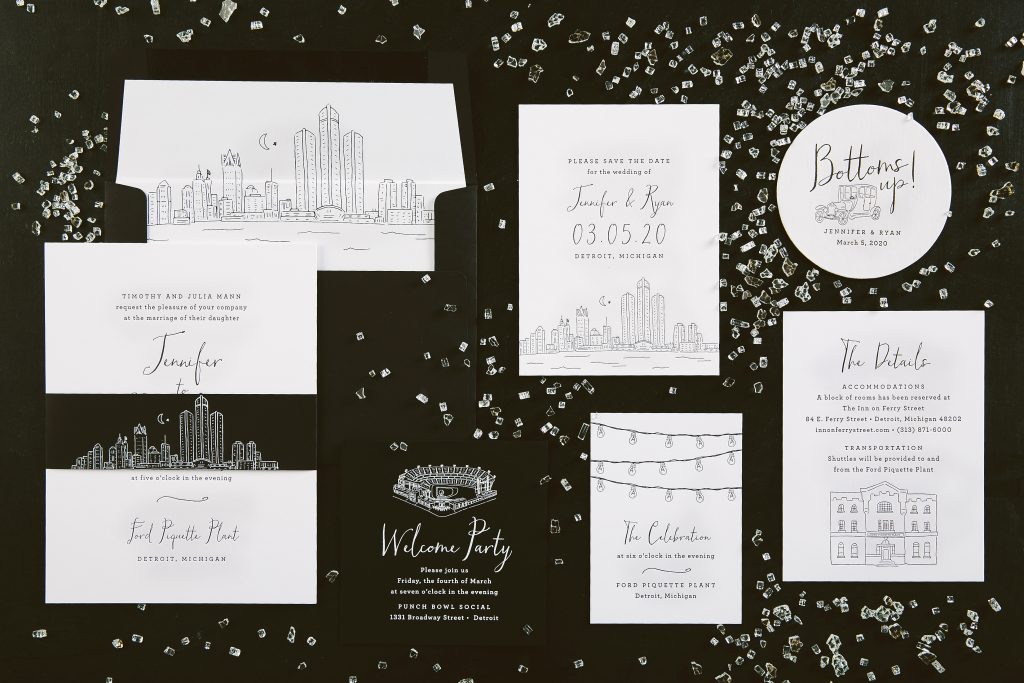
The Ford Piquette Plant, birthplace of the Model T, inspired the Henry suite. It showcases a modern city feel with a touch of grit. Stark black and whites, in contrast with edgy hand illustrations of the plant, the Detroit skyline, and the beloved Model T, bring this suite to life. “Henry provides a true representation of a cool urban couple wanting to say ‘I do’ in the heart of Detroit,” says designer Lindsy Talarico.
Henry suite, printed in black letterpress on our Bella smooth cotton bright white paper. Whimsical typography and illustrations and black paper accents give a modern, fun feel to this suite.
We are proud to announce that two of our designs stood out among the rest and took home awards from the Foil and Specialty Effects Association. Their websites states, “Since its inception in 1992, the Foil & Specialty Effects Association has worked toward industry awareness and growth. It serves as a resource and educational platform for decorating technologies, including foil stamping, embossing, cold foil technologies, specialty coatings, laminates and laser cutting.”
Our Vertex design won the bronze award for best use of holographic elements with its embossed foil. Our Prism Shine foil really bounces off the page against the Bella Gray backdrop. We can’t wait to see what else comes through our shop using this new foil color!
Our Agua design won Gold for best use of letterpress with its ombré type. With the trend of ombré in the forefront of the design world, we couldn’t wait to push the envelope with what we could do! We used Flamingo into Capri letterpress inks to bring this design to life.
We are over the moon to be recognized for cutting edge print processes and we can’t wait to see what our talented team brings to life next!
Below you’ll find photos of these award winning designs from photographer Carina Skrobecki and stylist Cozbi Jean!