We are thrilled to announce Bella Figura won three FSEA Awards this year! Each year the Foil & Specialty Effects Association (FSEA) hosts the Gold Leaf Awards to highlight creativity in the printing industry.
Florence by Leslie Johnston won Gold in the category of “Announcements/Invitation – Difficult”
Lawrence by Katie Magee won Bronze in the category of “Announcements/Invitation – Creative”
Amoret by Alyssa Tidd won Silver in the category of “Letterpress”
You can see all the inspiring FSEA winners here. Congratulations to all the winners!
Glynis and Collin worked with our friends at Papier Girl to create their beautiful invitation suite. A modern layout is accented by espresso letterpress. Letterpressed floral elements on the reply card tie in perfectly with our Hawthorne liner pattern.
letterpress ink: espresso | paper: bella smooth cotton white 2ply + 1ply | fonts: modern symphony script + adobe garamond pro | envelope liner: hawthorne pattern in CMYK on white | envelope: white square flap | customization #61397
We worked with Lesley at Papier Girl to help bring Hailey and Jake’s classic formal wedding invitation suite to life. Our Modernity suite was the starting point, updated to our signature F-8 size. A black details card with foil stamping is the perfect contrast to the invitation and reply cards. The vintage print floral liner and silk bow keep things feminine and timeless.
letterpress ink: black | foil stamping: gold matte | paper: bella smooth cotton ivory 1ply + 2ply, bella black 1ply | fonts: addington + amira madison + faroe | envelope liner: white flower pattern on ivory | envelope: bella black square flap | customization #61370
Staci and Brandon worked with our friends at Simply Invitations to create their perfect wedding invitation suite. The Adina and Triton designs combined to make something completely unique. Black letterpress and platinum shine foil stamping are used throughout, in addition to subtle debossed florals. A classic color platinum shine envelope liner ties everything together, and makes the invite stand out.
letterpress inks: black + deboss | foil stamping: platinum shine | paper: bella cotton white 3ply + 1ply | bevel: 45 degree in platinum shine | fonts: adora bouton + poetica | envelope liner: classic color in platinum shine envelope: bella cotton white square flap | customization #58509
We worked with Alexandra Partow Events to bring Jason’s Mitzvah invitations to life, and they were stunning! In this personalized twist on our Muse Mitzvah invite, gold prism shine is featured throughout the suite. Touches of opaline shine add dimension to the invite card. Black shine foil completes the look of the stationary.
Campbell and Benjamin worked with our friends at Penny Post to create their invitation beautiful suite. Chambray letterpress throughout the suite is the prefect compliment to the waters of the Chesapeake Bay, which was a stunning ceremony background. The details card features Maryland crab motifs, another nod to the gorgeous venue location.
Our friends at Phantastic Papers assisted Lauren and Anthony to create their crisp, modern, typography- driven invites. Khaki letterpress brings the varied fonts to life for a modern invitation suite.
We worked with our friends at Oliver’s Twist to create Breann and Quentin’s stunning invitation suite. We started with our Loley design, and customized it to fit the wedding colors and style. Copper shine foil stamping and tea rose letterpress on the invitation pairs beautifully with the foil stamped khaki reply card. Floral details from our elegant garden pattern are featured on the reply card and liner. The liner and envelope bring bolder tones of rose; we love how the suite came together.
foil stamping: copper shine | letterpress ink: tea rose | paper: bella smooth cotton white 2ply + khaki 1ply | fonts: karin + sweet sans | envelope liner: elegant garden pattern in copper shine on old rose | envelope: rosebud square flap | customization #63877
We are thrilled to announce that Bella Figura won three Louies this year–one in each category we entered. The Louie Award, given by the Greeting Card Association to celebrate “best cards in the industry for over 30 years”.
Serengeti by Leslie Johnston won in the category of “Invitations & Announcements – Non-Wedding”
Gweneth by Alyssa Tidd won in the category of “Invitations & Announcements – Wedding”
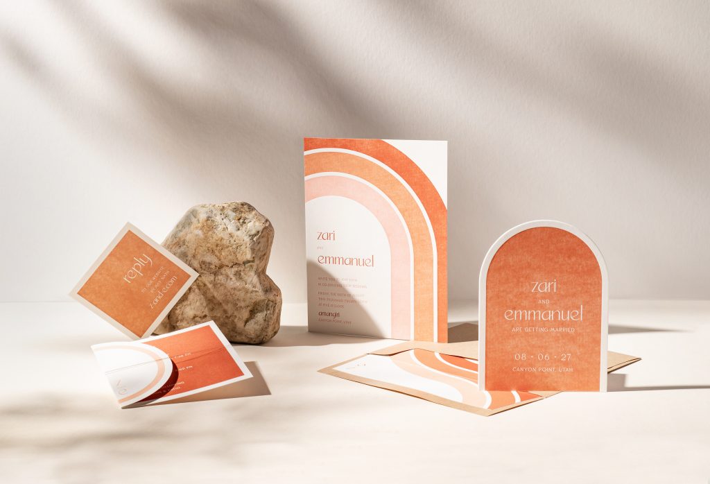
Zari by Katie Magee, Amoret by Alyssa Tidd, and Maisey by Jessica Downs won in “Letterpress Printing.” This category recognizes the tradition and artistry of letterpress, including overall design, creativity, and craftsmanship.
Our friends at If It’s Paper in Raleigh worked with Laura and Frank to bring their classic wedding invitations to life. Our Abbey sample was the starting point, customized with espresso letterpress throughout. A customized, two-color version of our Yennicott liner adds touches of chambray, and ties the whole suite together. We love the creative placement of the wedding web address on the outer envelope flap.
We are over the moon to share yet another regional collection! We created these designs specifically for our friends at Broadway Paper. The city of Milwaukee inspired the invitations that you will see pictured below. We’ll let our designers take it from here to describe more about their creative process working on the designs below:
Sopra
Villa Terrace was the main inspiration for the Sopra suite. An Italian Renaissance-style home turned into an art museum and garden set the stage for a warm and traditional suite. Taking notes from the home and an old-world feel, a luxurious foil map liner of Milwaukee was a must.
Sullivan
With a 180 degree view of Lake Michigan’s aqua waters, The Pilot House of Milwaukee heavily influenced our Sullivan design. Watercolor was a must for this suite, so we transformed the Milwaukee skyline into a vibrant work of art in a fresh color palette of pinks, blues and greens. Modern, crisp font treatments balanced out the entirety of the suite while hints of rose gold shine foil added extra sparkle.
Calatrava
The Milwaukee Art Museum, a work of art itself, inspired this modern suite. The venue’s grand sweeping architecture, bold lines and sleek + simple color palette were reflected into the Calatrava design by combining modern typography with Light Gray paper, White Matte foil, embossing, and soft metallics with Pearl and Silver Matte foil as accents to tie it all together.
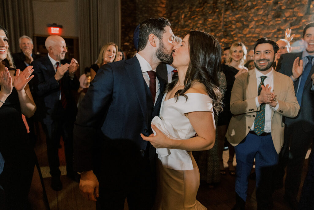
We had the pleasure of working with Michelle and David at our NYC studio. They reimagined our Hillock suite for their autumn wedding at Blue Hill at Stone Barns. We’ll let Michelle take it from here to share more about their wedding details!
CAN YOU SHARE WITH US A BIT ABOUT YOUR WEDDING AND YOUR INSPIRATION FOR THE EVENT?
We have both always loved the Fall season and knew that we wanted to get married during peak fall foliage timing! We also both envisioned a “New York adjacent” wedding, so when we toured the grounds of Blue Hill at Stone Barns and they had a mid-late October date available – we knew it was the place we wanted to get married. Our invitations and entire wedding aesthetic were really inspired by the venue – incorporating a classic, clean design throughout the entire celebration.
WHAT ADVICE DO YOU HAVE FOR COUPLES CURRENTLY PLANNING A WEDDING?
Bring on vendors that have past experience with your venue. I know this isn’t possible for every couple, but for us it was really important to work with people who could help guide our “day of” plan. We had a lot of different rain & COVID backups, so we really wanted a team we could trust to help make the day as seamless as possible!
HOW DID YOU CHOOSE YOUR INVITATION DESIGN & INK COLORS?
It was fairly seamless for us when looking at and ultimately agreeing on our wedding invitation design. We gravitated toward designs that were clean and classic. We ultimately fell in love with the vintage root vegetables motifs, which worked nicely with the fact that our venue is a working four-season farm. We were able to use a custom pattern as an envelope liner and added them to our Details card, and then later used them for our Table Cards. We also easily agreed on the color, Stone, which was a grayish/green. Also, after we had ordered our invitations we realized the font we chose was Garamond, which is actually the font they use in all American editions of Harry Potter. Early on in our relationship we bonded over our obsessive love of Harry Potter – so this felt especially “meant to be”!
WHAT SURPRISED YOU MOST ABOUT YOUR WEDDING?
How much love and support we received! It was truly so amazing to have everybody we loved and who loved us in a room together – cheering for us and celebrating the beginning of our marriage.
WHAT WAS YOUR FAVORITE MOMENT?
Immediately after the ceremony, we went off into a room by ourselves (the yichud, a ritual in Jewish weddings where the couple spends a few minutes in isolation after the ceremony). We were able to have 15 minutes to be with each other, sip some champagne, and enjoy some bites from our cocktail hour. Most importantly, we were able to take some deep breaths and enjoy being together one on one for the first time as husband and wife! It was a really great moment to take a breath and ground ourselves while also preparing for the reception!
FAVORITE DESIGN ELEMENT OF YOUR BIG DAY?
The peak fall foliage! We truly got so lucky with the fall colors on our October weekend – it was everything we hoped for when we booked the venue 13 months prior.