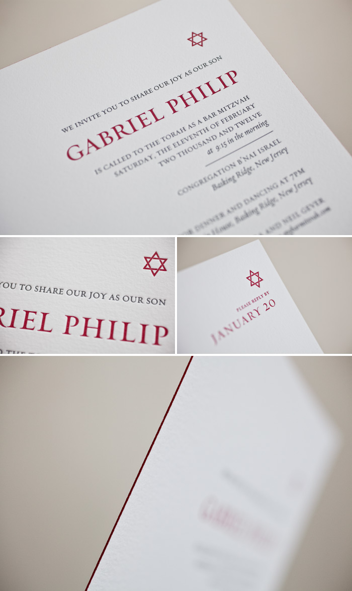
We tend to focus a lot on all the lovely wedding invites we create around here, but truth be told we also print a TON of Bar and Bat Mitzvah invitations (and they’re always a blast!). We can adapt any of our invite designs into a Bar/Bat invite very easily by changing up the wording, adding Hebrew characters, or – as is the case with this Amici (from designer Ian Koenig) customization, by adding a small star of David from our motif library. Loving the simple beauty of this one.
inks: pewter + cardinal | font: requiem | paper: 1-ply white | invite size: sq-7 | edge painting: cardinal | client coordinator: chris gannon | in-house designer: sarah walroth
The Cascade letterpress wedding invitation is the perfect match for this timeless bride. A mix of modern shapes for him and soft script for her- think classic elegance with modern flare.
cascade customization = inks: charcoal + chartreuse | fonts: sophia + jubliant | paper: white | invite size: f-8 | liner: antique geometrics | edge painting: wisteria | original design by Kelle Anne McCarter | customized by in-house designer Brenda Fox |
embellishment suggestions: foil stamping : silver matte

(Photo Credits: Ashleigh Taylor Photography)
Our Harbor Beach design (by Jessica Tierney) looks ultra modern in this letterpress wedding invitation submitted by our friends, Francis Orr in Corona del Mar, California. The color combination of sand and charcoal inks are so subtle, yet crisp. The anchor motif is replaced with a simple monogram and repeated throughout the suite. Charcoal grounds this set from the edge painting to the solid envelope liner. We love the beauty and simplicity that makes the letterpress printing shine.
inks: charcoal + sand | fonts: holden + aurora | paper: 1-ply white | invite size: SQ7 for inner envelope | liner: classic color pattern in charcoal ink | edge painting: charcoal | client coordinator: christie jones | in-house designer: racheal decker

Our new collection of letterpress wedding invitations has arrived, and we’ve introduced 83 new invitation designs (plus metallics: foil stamping, foil edging and lots of other cool new embellishments!) for the 2012 wedding season. Since everything at Bella Figura is completely customizable, we thought we’d show you a ‘before and after’ look at some of our favorite new invitation designs to show how a change of color, fonts, and design placement can completely transform an invitation design.
First up: the La Salle invitation design by Ian Koenig. The original design is soft and romantic in camel + pewter inks, and features three fonts, but takes on a completely regal look with new inks (regalia and charcoal), corner rounding, and new fonts: Vessa + Jubilant.
Suggested embellishments: We think this design would look gorgeous with a European formal patterned envelope liner in regalia ink and a coordinating custom postage stamp.
Details: letterpress inks: regalia + charcoal | fonts: vessa + jubilant | paper: bella cotton white 1-ply | size: f-8 | corner rounding

Next up: Rustic Jolene – an earthy design with a folk-art feel – is completely transformed with a drastic (but gorgeous) change in design placement. Prussian blue and cornflower blue inks create a stunning two-tone effect, and the square size, corner rounding, and sophisticated fonts complete the look.
Suggested embellishments: a white cotton pocketfold with a monogram letterpress printed in Prussian blue would add a nice finishing touch, along with an envelope liner in our woodstock pattern in cornflower + Prussian blue inks.
Details: letterpress inks: prussian blue + cornflower blue | fonts: daisy + moravia | paper: bella cotton white 1-ply | size: sq-7 | corner rounding

Rococo Elegance, created by Beth Barr, one of our new designers for 2012, takes on a more floral feel in this elegant customization. Hand calligraphy accents and ivory paper give the design a soft, romantic feel.
Suggested embellishments: keep it simple with a European formal patterned envelope liner in taupe ink.
Details: letterpress inks: light peach + taupe | font: botany | paper: bella cotton ivory 1-ply | size: f-8 | hand calligraphy accents: spencerian style | corner rounding
 (more…)
Let’s face it, the wedding industry produces a lot of one-hit wonders. It is extremely important to us here at Bella Figura to encourage sustainability as we practice eco-friendly letterpress printing (and living!). That’s why we use tree-free papers, low VOC inks, and FSC certified papers (and we also support these amazing environmental causes). If you are wondering how to make your letterpress or foil stamped invitations even more eco-friendly we have some tried and true tricks of the trade to reduce waste without compromising on style!
1. Use a postcard!
Think about using reply postcards or even Save the Date postcards! This cuts down on the amount of paper (envelopes) and also keeps the costs lower!

2. Condense Information.
There are a lot of activities and information that go into a wedding celebration! From accommodations, directions, rehearsal dinners and reply cards, you can choose to create a wedding website that hosts all the important details! You can include the url on your invitations, or create 1 separate card (think website cards!) explaining that the website is the place for all the wedding details. If you’re determined to get it all on paper, choose 1 insert card as opposed to several and print on both sides if you have lots of details to include.


3. Don’t double up.
Skip the formalities and just use 1 outer envelope vs. an inner envelope and an outer envelope combination. The inner envelope is meant to specify exactly who’s invited. It is completely acceptable to choose just 1 envelope (which is more eco-friendly). If you’re concerned about extra guests, you can always designate the number of guests on the reply card or reply postcard by adding an extra line that states “We have reserved __ seats in your honor”, then fill in the number accordingly. (more…)
This customization of our Gramercy (designed by Amy Graham Stigler) letterpress wedding invitations, sent to us by our friends at The Village Invites 2, is creativity at its best! Gone are the original leafy designs which are replaced by a beautiful branch motif in blind deboss. The color selection of pewter for the text is absolutely beautiful! When this invite is coupled together with the wedding events/reply card its a sight to behold. The outer envelope liner, shown here in shell ink, is just the icing on the cake.
inks: blind deboss + pewter | font: sans capitals | calligraphy: the harrison hand calligraphy, by Patricia Mumau | paper: 1-ply white| invite size: f-8 | liner: classic color pattern in shell ink

This customization of our Love Notes (by Kamal) letterpress wedding invitation design has us in the mood to celebrate! For an even more festive look, replace the cherry ink and edge paint with red shine foil.
love notes customization = inks: cherry + silver | fonts: danube | paper: white | invite size: f-8 | liner: elegant ombre in charcoal and white | original design by Kamal | customized by in-house designer Sarah Walroth |
embellishment suggestions: edge painting: cherry ink

(Photo Credits: Mark Brooke).
We love sharing photos of the real weddings and letterpress invitations that our fabulous Bella brides send us, but we especially love when we get to feature the wedding of someone we know personally! For today’s real wedding, we worked with Lin Logan of The Stationery Company in Denver and her daughter Jennifer for Jennifer’s letterpress wedding invitations, and we are so thrilled to share details from the big day! Jennifer chose our elegant Jolie design for her October celebration, and we letterpress printed her wedding invitations in pewter and champagne inks. Spencerian hand calligraphy accents by Debi Zeinert added a gorgeous touch of elegance to the sophisticated set, which included a festive reception card and a handy info card that let guests know about accommodations, transportation, and the couple’s wedding website. We are completely smitten with this gorgeous fall wedding — read on to learn about the inspiration behind this fabulous event!

Can you share with us a bit about your wedding and your inspiration for the event?
Our absolute favorite time of year is the fall, so John and I decided that we definitely wanted a fall wedding. With so many of our friends’ weddings taking place in the summer months, we felt like having it at this time of year would allow us to really be creative and different and also give our guests an evening they would never forget during a time when life seems to move at a bit slower pace. That really served as our inspiration for the entire event. We wanted to find a venue that truly showcased the beautiful fall colors of Colorado while also conveying a sense of casual-elegance that would make everyone feel right at home. When we came across Crooked Willow Farm, we felt no other venue could have captured all of these things more perfectly…so with that decision crossed off the list, we then began planning the wedding of our dreams in a Big Red Barn in beautiful Larkspur, Colorado. What could be more “Fall” than that?

How did you choose your invitation design & ink colors?
I think that when most of us think of fall, we think of the traditional fall color palette of reds, oranges and yellows. Once again, trying to think a bit more out of the box, we came up with the color palette of charcoal gray and butter yellow. We felt the palette was warm and inviting and best of all, DIFFERENT! Choosing letterpress on luxurious cotton paper by Bella Figura only enhanced our vision, and they worked with us on such a personal yet effortless level that I felt no stress with regard to the invitations. Our initial vision for the invitation was achieved. When dreaming about how this palette would be reflected in all aspects of our wedding…from the bridesmaid dresses, the flowers and of course, the invitations, we were sold on it immediately. From there we watched all the details unfold so beautifully in sticking with this color theme. We wouldn’t have changed a thing.


What surprised you most about your wedding?
What surprised us most was how quickly the day went. We wanted to hang on every moment of the day as long as we could but all in all, each moment passed along to the next so much faster than we anticipated. What also surprised me was how nervous I felt moments before I walked down the isle. And furthermore, I was also surprised by the immediate calm I felt just moments later as I saw John for the first time and was walking down the isle with our eyes locked on one another. (more…)
We’re excited to start off the new year with a bit of glitz! Our Modern Fete letterpress design is fun and festive with it’s bursts of color reminiscent of confetti and tinsel that just shout a good time! For a touch of sparkle, swap our navy and fuchsia letterpress inks for indigo and purple shine metallic foils.
modern fete customization = inks: navy + fuchsia | fonts: adelais + memphis | paper: white | invite size: f-8 | liner: elegant ombre pattern in fuchsia and pale gray ink | original design by amy graham-stigler | customized by in-house designer: racheal decker
embellishment suggestions: foil edging: indigo shine

(Photo Credits: Jill Thomas)
These simple, yet wonderfully unique letterpress birthday invitations sent to us by our friends over at By Invitation Only in Arizona are a real treat! The set features our Modern Light design (by Ian Koenig) and includes a beautiful invitation to the party as well as a reply card. Each piece is printed in our espresso ink and has a charming monogram (which show off the initials for the person of honor as well as his birth date) in the top left corner. Getting these in the mail would be almost as sweet as a slice of the Birthday cake!
ink: espresso | font: requiem | paper: 2-ply ivory | invite size: sq-7 | edge painting: espresso

Edge painting and foil edging are centuries old, but here at Bella Figura we are keeping this timeless practice alive! We offer both edge painting and foil edging as embellishment options for our letterpress invitations. Want to customize your invitations by adding an edging but not sure which option to choose? We know that the process of choosing embellishments may seem a little overwhelming (especially since we’ve added a lot to our list of options for 2012), so today we’re here to tell you about the differences between edge painting and foil edging, and we’ll help you determine which embellishment will work best for you.

First here are a few thing to ask yourself:
1. Do you want a sleek, metallic shine or a reflective edge?
2. Are you using foil stamping in your suite?
3. Do you want to use an accent color outside of our letterpress inks?
If you answered yes to one or more of these questions, then foil edging may be the perfect choice!

We are completely in love with foil edging, and thrilled that we can offer this option! Shiny metallics will be really popular for weddings in 2012, so if you are looking for a trendy new way to enhance your invitations this may be the perfect fit for you. We have 12 dazzling new foil colors that are all stunning (ranging from more traditional silver, gold & copper colors to more modern teal, fuchsia & indigo). Foil edging leaves a shiny edge that we think is breathtaking. If you can’t fit foil stamped invitations into your budget but still want a special hint of shine, you can add foil edging!
1. Do you want a bright pop of color (think neons), or are you ordering a custom ink* color and want a cohesive suite? *Custom inks are an additional charge.
2. Do you want a matte finish?
3. Are you trying to keep costs down?
If you answered yes to one or more of these questions, then edge painting may be the perfect choice! (more…)
The neon trend will continue to thrive in full force in 2012, so we’ve added some amazing new neon ink colors to our collection! Make a bold statement by printing your letterpress invitations in a vibrant neon color, or consider edge painting on your stationery in a bright color to add an extra wow-factor. Read on to see our favorite new neon inks & designs, and check out our tips for how you can pull in pops of neon throughout your wedding day!
Hot off the press & letterpress printed in hot pink ink (clockwise from top left): New Horizon, a modern new design from Tara Hogan; hot pink edge painting on the trendy New Washi invitation design by Kamal; grand old English styled hand calligraphed lettering is printed in hot pink in the Royal Calligraphy design by Debi Zeinert; the New Washi invitation design from Kamal, letterpress printed in hot pink ink and foil stamped in gold shine.

Lime-aid (an electric, lime-colored letterpress ink) adds a gorgeous hint of green to the Tapestry invitation by Tara Hogan (and looks stunning when printed alongside taupe ink); lime-aid ink looks extra-modern when paired with black ink and modern fonts in the Architect design by Erin Jang. (more…)
