With winter setting in, we all can begin to look forward to the warmth of spring and the soothing pastels that compliment the Fidelia wedding invitation customization.
fidelia = inks: sand + taupe | fonts: aurora + trajan | paper: white | invite size: SQ7 | liner: classic color in celadon ink | original design by Jamie Lea Bertsch | customized by in-house designer Brenda Fox |
embellishment suggestions: edge painting: dusty pink

(Photo Credits: one | two)
Shown here in our black & sea-side letterpress inks, this Gotham (by Erin Jang) suite is a delight. The true uniqueness of this set is within the added heart motif on the invite and the option for guests to reply via the web. The natural woodgrain liner ties everything together beautifully.
inks: black + sea-side | font: futura + knockout + minimes | paper: 2-ply ivory | size: a7 | edge painting: black | liner: the natural woodgrain pattern in taupe | customization #:15406 |

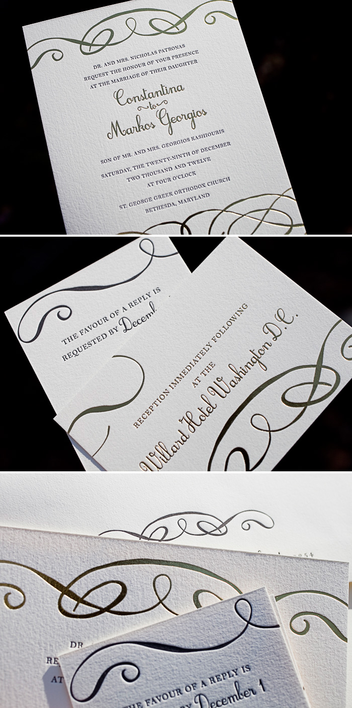
Everytime black letterpress ink is paired with gold shine foil, the end result is one we know we’re going to love. Submitted to us by our friends at Bells & Whistles in Belmont, Massachusetts, the simple flourishes at the top and bottom of the invitation give this design just enough character, while maintaining the elegant feel. We often see Amy Graham Stigler’s Tennyson design used for a black tie affair and this suite is no exception.
letterpress ink: black | foil: gold shine | fonts: botany + jovial | paper: 1-ply ivory | invite size: f8 | customization #: 15185
Letterpressed in a really sophisticated paring of Black and Sand inks, this engaging version of Ellie Snow‘s True Vintage invitation design really stands out beautifully. Thanks to Byrd + Bleecker for sending this for us to print!
inks: black + sand | fonts: strana + streamline |paper: 1-ply white | invite size: sq7 | envelope liner: sea stripes pattern in black | customization #: 15741 |

What design do you choose for a New Year’s Eve wedding? One that’s filled with confetti, calligraphy, and a combination of 3 colors – including two golds! That’s exactly what we have here in this custom letterpress and foil stamped wedding invitation suite sent over to us by Peabody Papers.
letterpress inks: antique gold + navy | foil: gold matte | fonts: aiden open + impression | calligraphy: the Clermont calligraphy hand, by Debi Zeinert | custom calligraphy monogram | paper: 2-ply ivory | invite size: F8 | foil edging: gold matte | customization #: 14957 |

This customization of our Leigha Spring is fun and feminine with it’s monochromatic palette of coral hues!
leigha spring customization = inks: light peach + watermelon | fonts: willow + streamline | paper: white | invite size: A-7 | edge painting: wine | liner: classic chevron in light peach + wine | original design by Jessica Tierney | customized by in-house designer Andrea Streeter
embellishment suggestions: pocketfold in jute

(Photo Credits: Love is a Big Deal)
This unique custom design was sent to us by our friends over at Salutations in Chapel Hill, NC. This z-fold style invitation blends the beauty of our copper shine foil with vine letterpress ink into one amazing package.
letterpress ink: vine | foil: copper shine | paper: 1-ply white | card size: 13.875 x 6.25 flat (4.625 x 6.25 folded) | customization #: 15430 |

This set’s actually based around Ben Whitla‘s Irving design, but the client decided to jazz things up with some sweet chevron action on some of the pieces. The Dandelion Patch strikes again with this lovely set, which comes complete with matching coasters to soak up all the suds.
inks: pale gray + pewter + sherbet | paper: 2-ply white | invite size: sq7 | edge painting: sherbet | liner: custom chevron pattern in pale gray + pewter + sherbet inks |customization #: 15492 |

We’ve combined our prussian blue ink and gold shine foil to create the look for this charming letterpress invitation suite. Our Alpine design is definitely one our most popular when it comes to winter weddings – and this customization is one of the prettiest we’ve seen. The icing on the cake has to be the the quote on the inside of the pocketfold which reads the weather outside is frightful, but the wedding inside is delightful!
ink: prussian blue | foil: gold shine | fonts: aurora scipt and poetic block | paper: 1-ply white | invite size: f8 for pocketfold | pocketfold: silver| customization #: 15624 |

By adding the pine tree motif to this Drawing Room customization, we have turned quirky and modern into rustic and elegant. Earthy hues give this invitation warmth, yet the over all look is very clean and crisp.
Drawing Room customization = inks: taupe + cream | fonts: saint andrew | paper: white | invites size: f-8 | envelope liner: natural woodgrain in olive | edge painting in hazel | original design by Sarah Walroth | customized by in-house designer Lindsy Talarico

(Photo Credits: Save the Date Events)
Take a look at this gorgeous custom submitted design sent to us by our wonderful friends over at Pretty as a Picture. The color combination of amethyst and british rose really shows the detail of the submitted artwork.
inks: british rose + amethyst | fonts: moravia block + MeaCulpa ROB | paper: 2-ply ivory | invite size: f8 | customization #: 15647 |

Did you know that our wedding programs can be letterpress printed on both sides? Our True Vintage design (by Ellie Snow) is the perfect choice for this day of wedding piece. We always suggest using our 2-ply paper when printing on both sides to make sure that each side showcases the beautiful, deep impression that letterpress offers.
inks: charcoal + wisteria | fonts: streamline + sans capital + danube | paper: 2-ply white | invite size: #10 | customization #: 15669 |

