Our Simple Charms wedding invitation design was the perfect introduction to Elizabeth and Edmund’s sunset wedding in California. A mid-century modern color palette and a mosaic tile inspired pattern complimented the whimsical hand calligraphy of Debi Zeinert.

letterpress inks: mesa + taupe | font: holden | paper: bella cotton 1-ply + 2-ply white | edge painting: mesa | envelope: bella cotton white | hand calligraphy: paisley style | envelope liner: refined mosaic pattern in chartreuse + taupe inks | customization #19121 | Seaside Papery
Jessica and Cameron were inspired by a vintage flyer when customizing our retro-cool Tara wedding invitation design for their autumn garden wedding. They added Gold Matte foil and more vintage design elements along with their own very personalized wording. To make sure guests had all the details, a double-sided direction/map card, accommodations card and brunch card were included.

letterpress inks: pool + espresso | foil stamping: gold matte | fonts: moravia + billhead + knockout + pyramid | paper: bella cotton 2-ply ivory | foil edging: gold matte | envelope: bella cotton ivory | envelope liner: european formal pattern in pool ink | customization #19205
Marlo and Adam kept things simple with relaxed fonts and a beachy color palette on their customization of our Breakers wedding invitation design. The Jute pocketfold kept their wedding events itinerary and other enclosures close at hand for guests traveling to the Bahamas for the celebration.

letterpress inks: desert + atlantic | fonts: madaline + sans capitals | paper: bella cotton 1-ply + 2-ply white | edge painting: papaya | pocketfold: jute | customization #17260 | Sweet Paper
Using our Ornate Flourish wedding invitation design as inspiration, Sara and Alexander swapped swirls for starfish for their elegant, beach-side wedding. For a touch of nautical inspiration, they added Navy edge paint and a metallic Blue Pearl envelope liner.

foil stamping: tawny matte | fonts: jubilant + grace | paper: bella cotton 1-ply + 2-ply white | edge painting: navy | envelope: bella cotton white | metallic envelope liner: blue pearl | customization #18796 | Village Invites
Emma and David customized our Traditional Palm wedding invitation design with a cheerful pastel color palette. To differentiate the rehearsal dinner card from the invitation, ink and foil colors were reversed – keeping the invitation the star of this romantic beach inspired stationery suite.
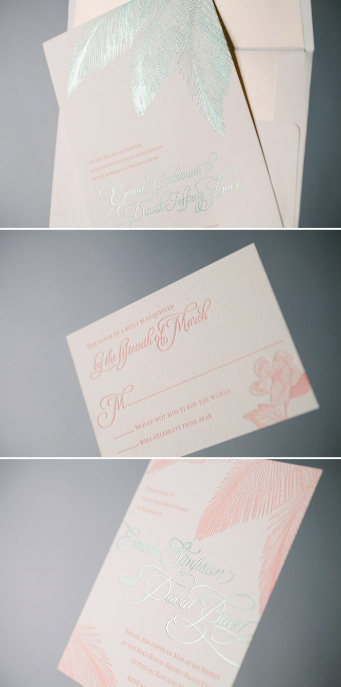
letterpress ink: british rose | foil stamping: mint shine | fonts: jubilant + grace | paper: bella cotton 1-ply ivory | envelope: bella cotton ivory | metallic envelope liner: white gold | customization #19751
For their recent wedding in Belize, Mary and Stig gave our Breakers wedding invitation design a colorful makeover with Mint Shine foil. They kept things formal with a neutral letterpress ink and metallic envelope liner but added a whimsical sea turtle motif to their reply card.
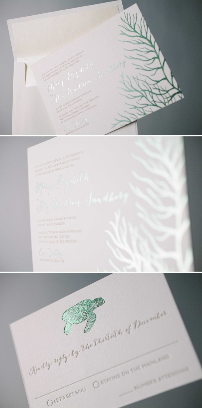
letterpress ink: desert | foil stamping: mint shine | fonts: marilyn + pike | paper: bella cotton 1-ply + 2-ply white | envelope: bella cotton white | metallic envelope liner: opal | foil edging: mint shine | customization #20579
For some of us here in the Northeast, winter has worn out its welcome. We’re dreaming of tropical sunsets, sandy beaches and this customization of our Traditional Palm wedding invitation design. Golden palm fronds, Sarah Hanna’s stunning hand calligraphy and a design inspired custom envelope liner beckoned guests to join Dana and Seth at their Mexico destination wedding.

letterpress ink: prussian blue | foil stamping: gold shine | font: brandon | paper: bella cotton 1-ply + 2-ply white | hand calligraphy: honoured style by sarah hanna | envelope: bella cotton white | envelope liner: design inspired pattern in antique gold + prussian blue inks | customization #18928 | Judy Paulen Designs
This customization of the Waterfront design would be perfect for a sophisticated wedding by the sea. Custom hand calligraphy by Elizabeth Hardin in stunning Gold Shine foil sets the tone for this elegant wedding, while traditional blues and soft neutrals bring in a refined nautical look.

waterfront customization = letterpress inks: blind deboss + prussian blue | foil stamping: gold shine | font: holden | paper: white | invite size: f-8 | liner: martha’s vineyard vintage map pattern in color + prussian blue | hand calligraphy accents: parks style | original design by Courtney Jentzen | customized by in-house designer Jessica Tierney
Photo credits: flowers and bar cart | bride & groom
We can’t get enough of Kelle McCarter’s inspiration for her her whimsical Cascade invitation suite. Created from modern, hand drawn free form blooms, Cascade is designed to be a celebratory piece with delicate calligraphy accents and effervescent flower petals cascading across the invitation. Check out more of Kelle’s inspiration on Pinterest, and be sure to shop all of her designs (they’re on sale through March 31, 2014!).

Images, from top: Cascade customization | cascading peonies | blush gown | cake
Today we’ve got more inspiration from Kelle McCarter, our March designer of the month. Kelle shared a little inspiration behind her brand new Gournay design with us – take a look!
There is nothing like the textural beauty of letterpress and, when it takes its ultimate form with an intricate blind deboss impression, the result is stunning. The ornate, floral pattern of Gournay, all in white, is regal with classic hand calligraphy in elegant black.

Check out more of Kelle’s inspiration for Gournay on Pinterest! And be sure to shop Kelle’s entire collection, which is on sale now through March 31, 2014!
Today we’re proud to share the latest edition of Paperswell magazine, a beautiful publication designed and published by Bella Figura calligrapher and designer Kelle McCarter! This Flowers/Ladies/Art issue features flower-themed projects from seventeen of Kelle’s favorite designers, publishers, letterpress lovelies, bookmakers, shop owners, stationers and mixed media artists. Not only does this beautiful publication provide a pretty spread of beautiful art, it’s also helping a good cause: all of the proceeds from Paperswell are donated to the Golden Retriever Rescue of the Rockies, which is an organization in Golden Colorado whose mission is to rescue and find loving homes for abused and abandoned Golden Retrievers. Purchase your issue of Paperswell today!

We love seeing what inspires the designers who help create our collection of letterpress wedding invitations. “Elegance in simplicity. That is the inspiration for Colette. Elegant calligraphy with a pointed pen sweeps across the width of its edges with languid tails and lower case lettering. It embodies the drama and femininity of its namesake – Sidonie Gabrielle Colette, the famous modern French writer whose romantically fervent novels reflected her own impassioned life.”
A befitting setting for Colette includes textural elements extracted from nature. Feathers, nests, branches, and woven textures are a striking juxtaposition to sparkling lights, shiny metallics and gold leaf and make a beautiful artisan presentation.”
Check out more of Kelle’s inspiration for Colette on Pinterest, and be sure to take a look at Kelle’s entire collection of designs, which is on sale during the month of March!

Images, from top: gowns | table | colette customization | cake | chandelier | shrug
