Concluding our letterpress calligraphy love fest (for now!) — here are some really sweet escort cards that feature letterpress printed calligraphy. What a great keepsake this would make for your guests…these escort cards are from our Classic Calligraphy letterpress design. In addition to offering letterpress printed calligraphy, we do offer calligraphy services (for envelopes, place cards, etc.) through our favorite calligrapher ever Debi Zeinert.

This letterpress wedding invitation is printed in a custom dark blue ink and features lots and lots of gorgeous, hand-drawn calligraphy by our master calligrapher Debi Zeinert.


Even the M line on the reply card highlights the calligraphy….lovely! Shows how even a single calligraphy letter can totally make a card shine.

Letterpress accents on the classy letterpress coasters too….

Here’s our New Calligraphy design as a save the date – in moss ink, with moss edge painting, on our ultra-thick 2-ply cotton paper (the 2-ply paper really lets the edge painting stand out). The mix of the modern & the historical in this letterpress calligraphy design is so cool, and the moss ink color is full of personality too.


Continuing our letterpress calligraphy love fest…here are a few more calligraphy treats.
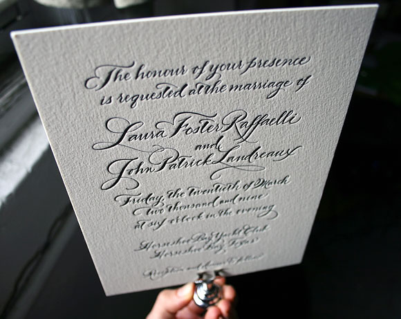
Black ink seems so right for calligraphy invitations – it’s the original letterpress ink from hundreds of years ago, and black has stayed in fashion ever since. This is the Classic Calligraphy design using the Spencerian calligraphy style, letterpress printed on our 2-ply cotton paper. Totally timeless. And notice how special each of the first letters of the bride’s and groom’s names are – I love how the “L” of the bride is intertwined already with the “P” of the groom.
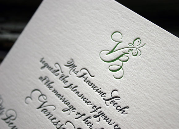
We often do calligraphy invitations in one color — but wow, when you add a second color–and add that to a custom monogram in fact — what an effect! The butterfly monogram is sweet and sophisticated and uses the bride & groom’s first letters of their first names. More black ink — how can you go wrong there? — but the garden green ink ads a bit of fun. This is another variation on the Classic Calligraphy design, Spencerian style.
Stay tuned for a very cool calligraphy save the date — in green!

Incorporating calligraphy into your letterpress wedding invitations strikes us as one of the season’s best wedding trends. Actually, calligraphy has been a popular design element for, oh, several hundred (or thousand?) years, but we’ve been seeing calligraphy a whole lot in our favorite wedding invitations this year. Though script fonts are great, nothing – absolutely nothing! – compares with hand lettered calligraphy, where every single letter is a totally unique work of art. Bella Figura’s calligrapher is the amazingly talented Debi Zeinert, who has been making our letterpress brides so happy for years now.

So for the next few posts, we’ll focus on some really gorgeous calligraphy invitations. Let’s start with this Nonpareil invitation – it’s honestly one of the prettiest things we have ever seen! And what an inspired customization too (check out the Nonpareil original invitation here). It’s true, we’re letter junkies over here, but check out the calligraphy accents: look at that A! The M! Just lovely. Clients can choose from about 10 different styles of calligraphy, but this style (the Clermont style) feels perfect: modern, elegant, with a little bit of cool. Also note that both the reply information AND reception information is on the invitation itself – it’s eco (less paper!) and keeps cost down too (no reply card/envelope/reception card to worry about!). Colors are black & fuchsia – so perfect!

We think it’s smart to do the thank you note and coaster in 1 color, to keep costs down. If you’re trying to save money, keep the 2 color design for the invitation, and do the rest of the pieces in 1 color.

Learn more about letterpress calligraphy designs at Bella Figura, or about having your envelopes addressed by our calligrapher as well.

Excuse us if we gush about the colors of this letterpress wedding invitation (in the Somersby invitation design) but — we are in love with these colors! The inks are perfect and stylish and sophsticated shades of pink: papaya & fuchsia that play off each other and interact in this lovely way. And check out the reply card – mainly papaya, but with a line of fuchsia (wow!). Monochrome colors will be a hot wedding trend for 2009, we’re predicting. You choose a color, then choose shades of those colors, and then everything looks perfect together. Monochrome colors offer a clean, eye-pleasing look, and make choosing flowers, decor, and even bridesmaid dresses easier (choose any shade of pink, for instance!). Monochrome letterpress wedding invitations are (trust us) also very, very pretty. Enjoy!


Here’s a sweet keepsake letterpress coaster that would fill any guest with joy. The design is from our Majorca letterpress wedding invitation suite. (see more photos of our letterpress coasters here)

Here are two more variations of our bestselling Deveril letterpress invitation design: an elegant letterpress save the date in navy, and a letterpress menu, tied with a ribbon & finished with a jewel (wow!). We love the Deveril design for a lot of reasons, but in part we love its historical and joyful nature, its sophistication, and its warm sweet energy all its own.


Here is another great version of the Deveril letterpress wedding invitation— this time in classic black ink with gold edge painting (the edge painting made all of us here swoon….just perfect!). Black ink, by the way, shows no signs of losing its elegance or popularity for this wedding season. Enjoy these photos of winter sunlight!


We’ve been a big fan of Frolic’s blog for awhile — beautiful and dreamy photography and lots of inspiration for weddings & life & design. So we were blown away when we heard that Chelsea, Frolic’s editor, is starting to donate 5% of their sponsor fees to charity. Way to go!!! Imagine if all small (and large) businesses did the same….how could the world not get better? (Photos above, spotted by Frolic: on the left, a Gabrielle Revere photograph from Bust magazine, inspired by Twin Peaks. On the right, photo by Cherry Blossom Girl). (By the way, check out Frolic’s sweet post about Bella Figura’s new site, and see Frolic’s favorite BF invitation designs here)